

A shopper lands on your store, sees the wrong currency, and leaves before the page even settles. That’s the real cost of a weak market selector.
A strong shopify market selector helps visitors reach the right country, language, and pricing fast. As a result, bounce drops, localization gets more accurate, and trust builds earlier in the session. For stores using Shopify Markets in 2026, that first choice often decides whether a visitor shops or bails.
Wrong country sessions hurt conversion before checkout
When shoppers land in the wrong market, the damage starts right away. Prices feel off. Shipping expectations look wrong. Sometimes products or payment options change later, which feels even worse.
That mismatch doesn’t just create confusion. It also wastes paid traffic, muddies analytics, and lowers confidence in the whole store. If someone from Canada lands on your US market, they may see USD, different shipping rules, or items that won’t ship to them. By the time they fix it, if they even try, the session is already fragile.
For many stores, the biggest issue is trust. If product pages show one context and checkout shows another, shoppers feel tricked. That’s why your selector should work together with multi-currency features for Shopify stores, not sit apart from them.
Public 2026 data doesn’t isolate bounce caused by market selectors alone. Still, general Shopify ecommerce benchmarks put healthy homepage bounce rates around 20 to 40 percent. If market-mismatched landings sit well above that, the selector and redirect logic deserve a hard look.
If the first screen says “wrong market,” shoppers assume the rest of the experience will be wrong too.
Smart Shopify market selector design helps people choose fast
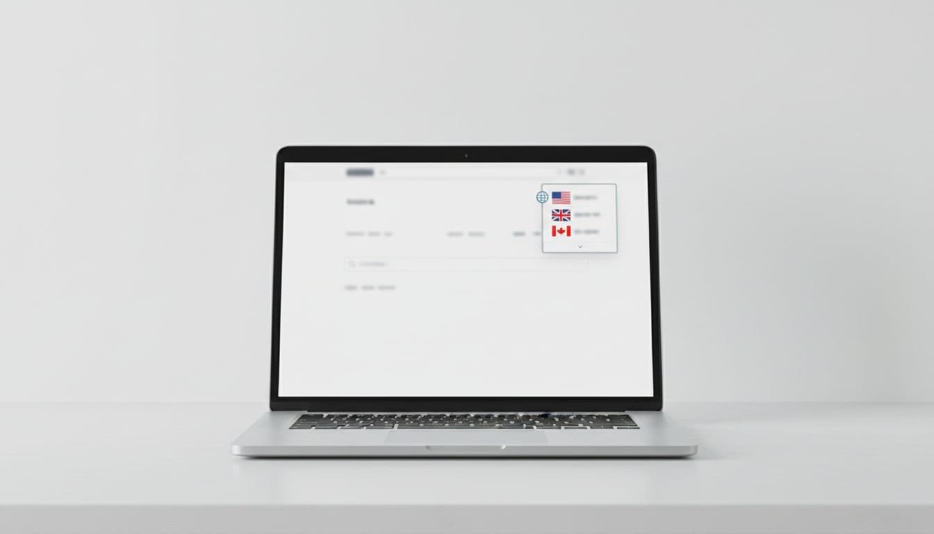
A selector only works if people can find it. On Shopify, the safest placement is in the header, near account or cart links, with a footer version as backup. Shopify’s own country and language selector UX guidelines point in that direction for a reason: that’s where shoppers already look for settings.
Keep the control visible on mobile, too. Hiding it deep in a hamburger menu is like putting a store sign in the stock room. People won’t hunt for it.
Use plain labels. Country names should come first, then currency, then language if needed. “Germany, EUR, English” beats a lonely flag icon every time. Flags alone are risky because they mix country and language, and they create ambiguity for places with shared languages.
Microcopy matters more than most teams expect. Good copy removes doubt in one line. For example, “Ship to Canada, prices in CAD” tells the shopper what changes. “Looks like you’re in Germany. Switch to EUR?” feels helpful, not pushy. “You can change country anytime” lowers the fear of making the wrong choice.
Also, keep the chosen market sticky. If a visitor selects France on a product page, that choice should stay through cart and checkout. After theme edits or app installs, run a Shopify theme audit checklist so the selector still works on desktop, mobile, and slow connections.
Automatic redirects vs user choice, pick the pattern that fits
GeoIP can guess a shopper’s country well, but it isn’t perfect. VPNs, border regions, travel, and shared devices all create false signals. So the best setup is rarely “always redirect” or “never redirect.” It depends on how much changes between markets.
Shopify supports automatic storefront redirection, and it can be useful when markets truly differ in currency, shipping rules, tax display, or catalog. However, hard redirects should be used with care. Poor redirect setups can also create crawl issues for international SEO, as explained in this piece on Shopify international SEO with Markets.
Here’s a simple way to choose the pattern:
| Situation | Best pattern | Why |
|---|---|---|
| Strong GeoIP match, market rules differ a lot | Auto-redirect with visible notice | Fast path to the right storefront |
| Traveler, VPN, or border-region traffic | Recommendation modal | Lets users confirm before switching |
| Same catalog, minor price changes | Manual selector only | Avoids extra interruption |
| Returning shoppers | Remember prior choice | Repeat visitors want continuity |
The takeaway is simple. Use automatic help when confidence is high, then keep user control visible. A soft prompt usually beats a forced jump.
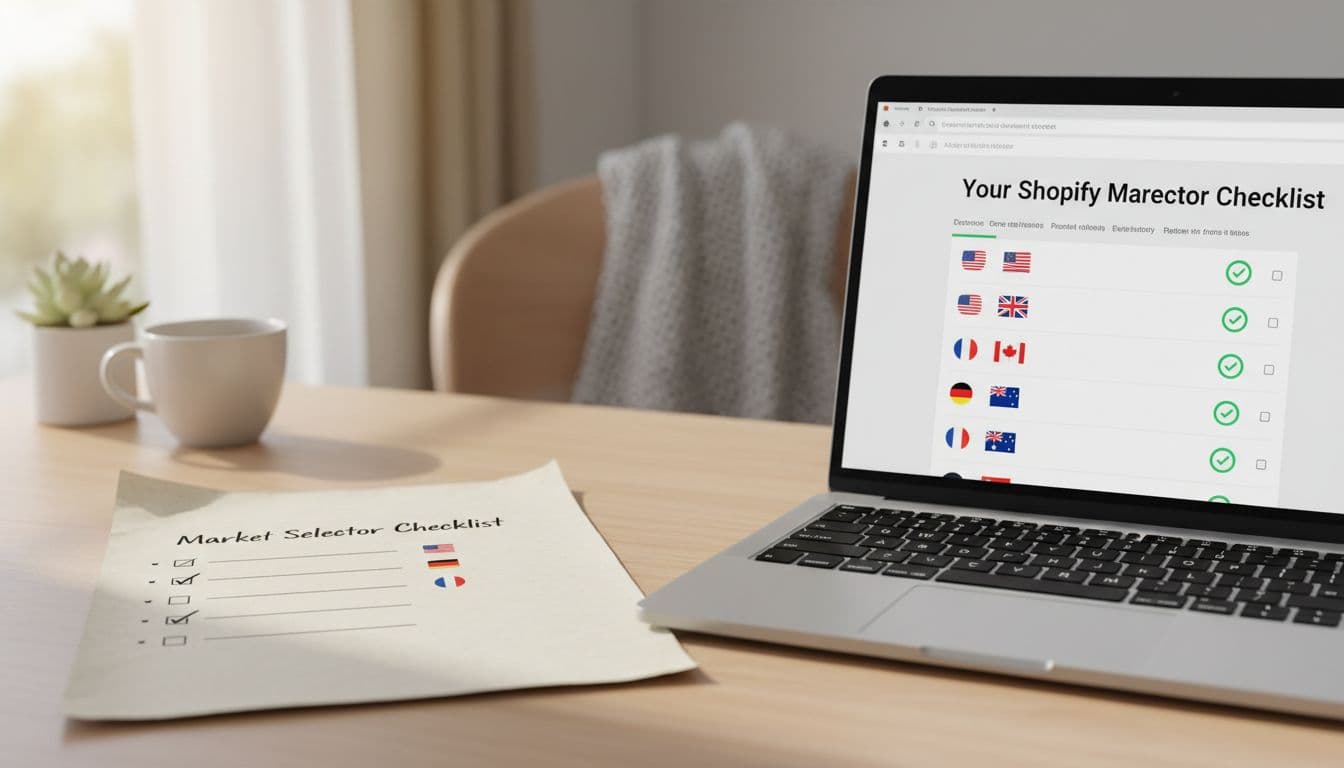
A practical checklist for a Shopify market selector that converts
Before launch, review the basics that affect bounce rate, trust, and localization accuracy.
- Place it high: Show the selector in the header, and keep it accessible on mobile.
- Label it clearly: Use country name plus currency, and language where relevant.
- Hide inactive markets: Don’t offer countries you can’t ship to or support.
- Keep choices persistent: The selected market should stay through product, cart, and checkout.
- Offer an easy override: After auto-detection, let shoppers switch in one tap.
- Track the right metrics: Watch bounce by market, switch rate, checkout drop-off, and support tickets about price or shipping confusion.
One more practical tip: test real edge cases. Try incognito mode, mobile Safari, VPN traffic, and repeat visits with saved cookies. That’s where weak logic usually shows up.
Conclusion
A better shopify market selector does one simple job well: it gets shoppers into the right storefront before friction piles up. That improves trust, protects conversion rate, and makes your localization work pay off. Put the selector where people expect it, write microcopy that removes doubt, and only auto-redirect when confidence is high. If visitors can fix the market in a second, wrong country sessions stop being an easy way to lose revenue.