

A bundle can feel like a helpful set menu, or like a complicated order form. The difference is UX.
A good Shopify bundle builder increases average order value because shoppers understand the deal fast, trust the rules, and feel in control. A bad one creates “Wait, what am I buying?” moments, then people bounce or buy less.
Below are bundle builder UX patterns you can ship without turning the page into a puzzle, with microcopy you can adapt right away.
Match the bundle flow to shopper intent (so it feels obvious)
Shoppers arrive with different goals. Some want a curated kit. Others want control. If your bundle builder fights that intent, it feels like friction.
Start by choosing one dominant mental model:
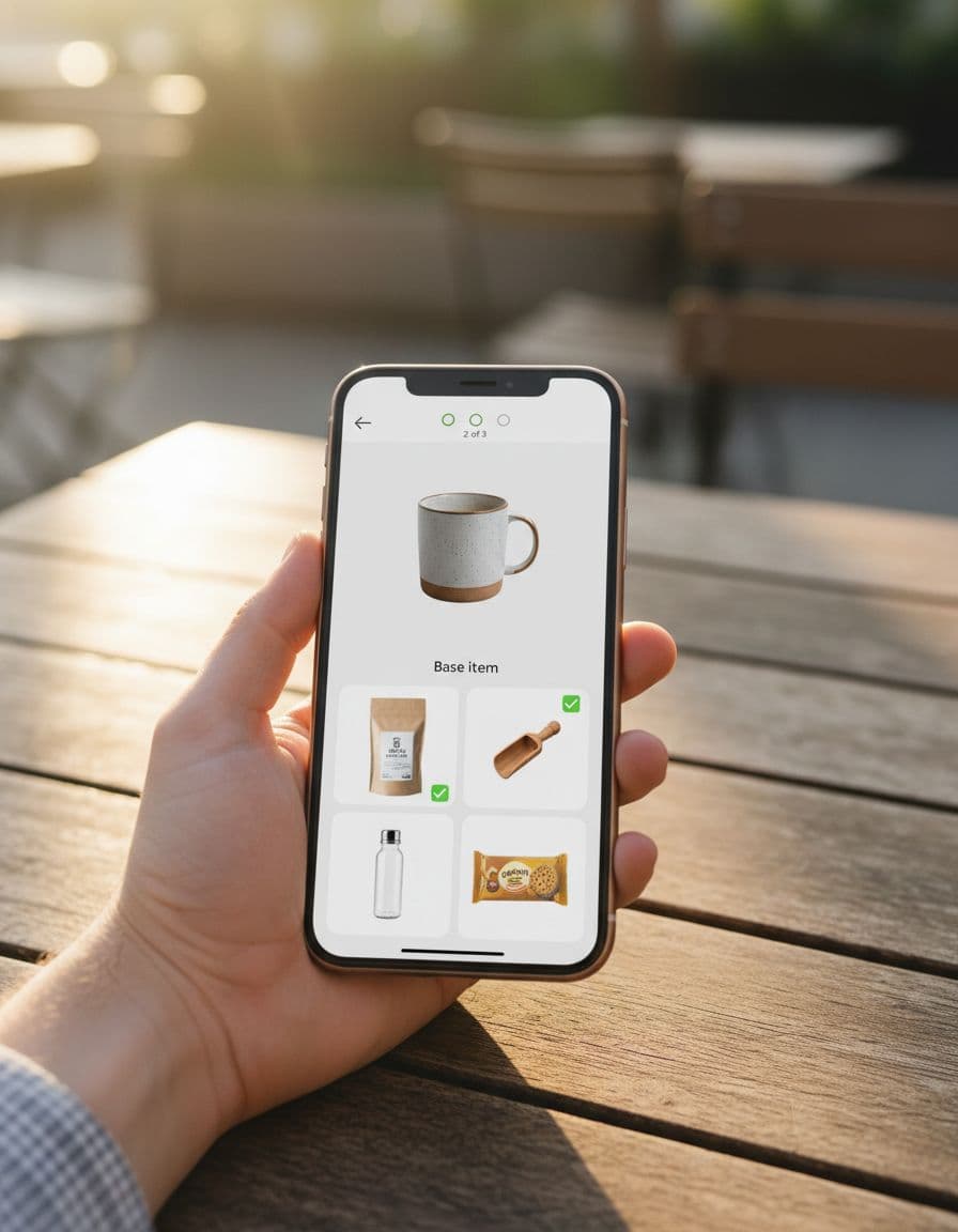
- “Pick a base, then add-ons” for routines (skincare, supplements, coffee gear).
- “Build a set” for collections (outfits, room bundles, camera kits).
- “Mix and match X items” for variety packs (snacks, socks, tea).
Keep the first screen simple: one decision, one action. If you need education, answer it in-place, not with a detour. A short FAQ block near the builder often prevents support chats and exits (see these product page FAQ UX patterns for conversions for the same “answer-doubt-fast” approach).
Microcopy that sets expectations without hype:
- “Choose 1 base item, then add any 2 extras.”
- “Your bundle ships together, items can be different scents.”
- “Discount applies at checkout, you’ll review before paying.”
One more rule: don’t surprise shoppers with a different flow in cart. If it’s a build-your-own bundle, keep the editing experience consistent from builder to cart.
For bundling strategy context (types, examples, positioning), Shopify’s own guide is a solid baseline: Shopify’s product bundling guide.
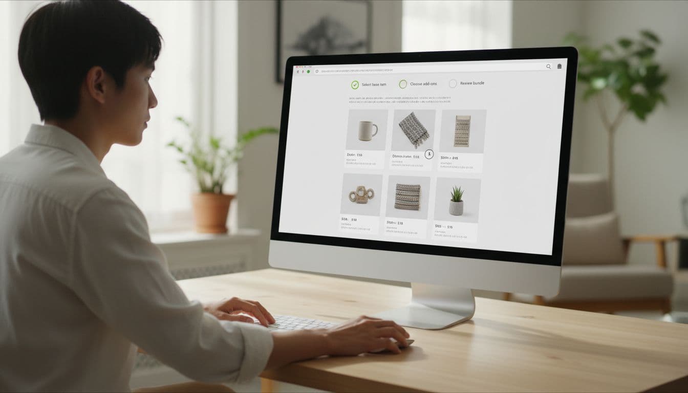
Use progress and system status to prevent “Where am I?” confusion
Bundle builders fail when they hide state. People need to know what’s required, what’s optional, and what happens next.
A few patterns tend to work well:
- Stepper with labels (not just dots) when there are 3 to 5 stages.
- Persistent bundle summary that updates as they select items.
- Clear completion rules shown before they scroll.
Microcopy examples that reduce second-guessing:
- Progress label: “Step 2 of 3: Choose add-ons”
- Helper line: “Pick 2 more to unlock bundle pricing.”
- Confirmation state: “Bundle complete. Review and add to cart.”
UI do/don’t bullets for clarity:
- Do show “Selected 2 of 3” near the item grid, not only in the header.
- Do keep the primary button disabled until requirements are met, then explain why: “Select 1 more item to continue.”
- Don’t change button labels every click (“Next”, “Continue”, “Proceed”) unless the action truly changes.
- Don’t hide removal controls. If they can add items, they must be able to undo in one tap.
If a shopper can’t explain the bundle rules in one sentence, the UI is doing too much talking and not enough guiding.
Make bundle pricing feel real (without looking pushy)
Pricing is where AOV lifts, or where trust drops. The goal is simple: show the value clearly, then let shoppers decide.
Three price cues work together:
- Anchor to the total of individual items (“Value”).
- Show the bundle price (what they pay).
- Show the savings (what changed, and why it changed).
Use calm language. Avoid anything that sounds like pressure.
Microcopy examples:
- “Bundle price: $72 (save $8)”
- “You’re saving 10% because you picked 3 items.”
- “Add 1 more item to save 15% (optional).”
This quick table helps teams pick a price layout that fits the bundle type:
| Bundle type | Best price display | Why it reduces confusion |
|---|---|---|
| Curated kit | “Kit price” + “Worth” line | Shoppers want reassurance, not math |
| Mix and match | Live “Total” + “Savings” | People expect the total to change as they add |
| Tiered discount | “Buy 2 save 10%, buy 3 save 15%” | Encourages the next step without hiding rules |
For discount ranges and tier ideas, this reference is useful: Growth Suite on bundling and volume discounts.
Also, consider combining bundle UX with threshold UX in the cart. If free shipping is part of your store’s value story, align the messages so they don’t compete (related: free shipping threshold UX that increases AOV).
Put eligibility rules upfront and design for error prevention
Most bundle confusion comes from “Why didn’t my discount apply?” or “Why can’t I add this?” Don’t make shoppers discover rules by failing.
Common eligibility rules you should surface early:
- Variant limits (size must match, only certain colors qualify)
- Inventory limits (bundle quantity tied to lowest-stock item)
- Subscription exclusions (or inclusions)
- Shipping constraints (hazmat, oversized, pre-order timing)
Microcopy that keeps it neutral and helpful:
- “This item isn’t eligible for bundles (limited edition).”
- “Only in-stock items can be bundled right now.”
- “Choose the same size for all 3 items.”
Error-prevention patterns that save the sale:
- Smart defaults: preselect the most common size, scent, or finish, but make it easy to change.
- Guardrails, not pop-ups: gray out incompatible options with a short reason line.
- Inline validation: show issues next to the problem item, not as a generic banner at the top.
Treat the bundle builder like a configurator, not a category page. Prevent invalid states instead of explaining them after the fact.
Design the bundle builder for mobile first (because that’s where confusion costs more)
On mobile, every extra scroll and tap costs attention. Keep the page thumb-friendly and predictable.
Patterns that usually help:
- Sticky bundle summary bar with items count, savings, and a single CTA.
- Bottom sheet add-on picker instead of sending shoppers to new pages.
- Large tap targets for add and remove, with clear selected states.
Microcopy that works well in tight spaces:
- “Add 1 more”
- “Selected”
- “Swap”
If you support “save for later,” make it a real continuation path, not a dead end. Bundles often get built across sessions, especially for gifts. Related patterns in wishlist UX patterns boosting AOV translate well to “resume your bundle” experiences.
Quick pre-launch checklist for a higher-AOV bundle builder
- Rules are visible before interaction, including exclusions and size constraints.
- Progress is obvious, and the current step has a clear goal.
- Price math is transparent, with value, bundle price, and savings.
- Invalid choices are prevented, not punished with errors.
- Mobile layout keeps one primary action, with a sticky summary and easy undo.
- Cart shows the same bundle structure, and edits don’t reset selections.
Conclusion
A Shopify bundle builder should feel like a guided choice, not a test. When you make steps visible, defaults sensible, and rules impossible to miss, shoppers add more without feeling pushed. The best part is that clearer bundle UX usually cuts refunds and “discount didn’t apply” tickets too. Review one bundle flow this week and ask: does it explain itself in five seconds, on a phone?