

A five-star average can still miss the real question: will this work for me? That gap is where product review ux matters most. When reviews help shoppers judge fit, quality, and tradeoffs, they buy with clearer expectations and send fewer products back.
By 2026, strong review modules are no longer a nice extra. They are part of the product page baseline. Buyers expect verified proof, fast filtering, recent feedback, and honest negatives, especially as fake or low-trust content gets easier to spot.
Trust starts with proof that feels real
Shoppers trust reviews when the system shows its work. A “verified purchase” label is the clearest starting point because it answers a simple fear: was this written by someone who actually bought the product? Recent market reporting still points to verified reviews and real customer content as top trust signals, and that matches the broader direction of product page trust signals.
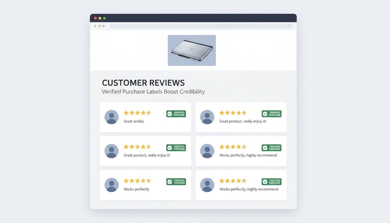
Still, the badge alone isn’t enough. Credibility rises when each review includes useful context, such as purchase date, product variant, and reviewer profile data tied to the category. For apparel, that might mean height, usual size, and size bought. For furniture, it could mean room type, assembly time, or durability after three months.
Review filters also carry a trust job. Filters by rating, size, color, use case, and media type help shoppers find “people like me” faster. That reduces guesswork. It also reduces the false comfort of a high average rating that hides mixed fit or compatibility feedback.
As Baymard’s 2026 product page UX research keeps showing, product pages are decision pages. Reviews should support that decision, not distract from it. On mobile, this matters even more because most review reading now happens on a phone, often mid-scroll and under time pressure.
A good test is simple. Can someone scan the review area in ten seconds and tell whether feedback is real, recent, and relevant to their situation? If not, trust drops before the first review gets read.
Attribute-specific ratings turn reviews into decision tools
An overall star score is blunt. It tells shoppers how people felt, but not why. Better product review ux breaks that score into product attributes that match return risk.

For apparel, “fit,” “comfort,” and “fabric quality” usually matter more than the headline rating. For electronics, “battery life,” “setup ease,” and “compatibility” matter more. For beauty, “shade match,” “skin feel,” and “staying power” often predict satisfaction better than stars.
The patterns below show why the review module affects both conversion quality and return rate.
| Review pattern | Shopper question answered | Likely return impact |
|---|---|---|
| Attribute-specific ratings | Is it good where it matters to me? | Fewer expectation-mismatch returns |
| Fit and use-case filters | What do people like me say? | Lower size and suitability returns |
| Photo or video review filter | Does it match the listing? | Fewer “not as pictured” returns |
The takeaway is straightforward: the closer the review UI gets to the shopper’s real decision, the lower the risk after delivery.
Fit cues deserve special attention. “True to size,” “runs narrow,” “works for wide feet,” or “best for small spaces” reduce post-purchase surprise. So do findability cues, such as sticky filter chips, jump links to review photos, and a search box for recurring concerns like “shrinks,” “heavy,” or “charger.”
The best review experience doesn’t chase a prettier average. It reduces the gap between what buyers expect and what arrives.
Reviews also shouldn’t carry the whole burden alone. When shoppers need policy detail, sizing rules, or shipping clarity, pair the module with product page FAQ UX for higher conversions so answers stay near the buying moment.
Review summaries, recency, and critical feedback reduce buyer remorse
Most shoppers don’t read dozens of reviews. They skim, sample, and decide. That’s why summary modules matter. A strong summary shows average rating, total review count, attribute highlights, and a quick view of the most-mentioned pros and cons.

Recency is just as important as volume. A product with 2,000 reviews can still mislead if most feedback is old, tied to an earlier formula, or written before a quality issue was fixed. Show review dates clearly. If the product changed, segment reviews by version, size, or release period.
Surfaced critical feedback is where trust either holds or breaks. If every visible review is glowing, the module looks managed. Buyers know that. A better pattern is to show a balanced slice, including common complaints, then add merchant context when useful. If customers often say a jacket runs short in the arms, say it in the summary. If a blender had a packaging issue last year but not now, note the fix beside recent reviews.
This approach can feel risky to teams chasing short-term conversion lifts. In practice, it improves decision confidence. A shopper who sees the downside and buys anyway is less likely to return the item out of surprise.
Good summaries also support post-purchase satisfaction because they set honest expectations before the order. After checkout, that same trust should continue through order tracking UX cutting WISMO tickets, where clear status updates prevent a new wave of doubt.
Conclusion
Strong review design works like a candid store associate. It shows proof, helps shoppers find relevant voices, and makes tradeoffs visible before the click. If your review module only proves popularity, it leaves too much uncertainty in the cart. Build for decision confidence, and both trust and return rates will move in the right direction.