
A shopper can tolerate one more field. They usually won’t tolerate one more decision.
That’s why the payment method selector matters so much in the checkout experience. Right before the final click, its user experience (UX) can lower doubt or create it. For checkout teams, this small UI block shapes trust, cognitive load, and completion rates more than its size suggests.
Key Takeaways
- Prioritize payment methods by context—wallets first on mobile, saved cards for returners, local options for regions—to guide shoppers to the fastest safe path and cut choice overload.
- Group methods by type (wallets, cards, BNPL) with progressive disclosure to lower cognitive load, trim visual noise, and make checkout feel shorter.
- Build trust with clear context like shipping promises, accessibility via labeled radio buttons and keyboard navigation, and expectation-setting for redirects.
- Test sort order, visible options, and metrics like payment-step exit rate or time to selection; avoid mistakes like icon-only rows or hiding cards.
- The best selector feels invisible: it removes doubt by putting the right option upfront for the right shopper.
Why the payment selector changes trust in seconds
At the payment step in the checkout flow, shoppers stop asking, “Do I want this?” They start asking, “Do I trust this enough to pay?” Your selector answers that question fast as part of the user experience (UX).
A cluttered selector feels risky. Ten logos, including third-party payment methods, two tabs, hidden fees, and an unexpected redirect can make checkout feel longer than it is. In contrast, a clear order of options feels calm. It tells people, “Here’s the fastest safe path for you,” and supports frictionless checkout.
That matters because hesitation often comes from choice overload, not missing coverage of available payment methods. When every method gets equal weight, the shopper has to sort the list mentally. That raises cognitive load at the worst time and leads to checkout abandonments.
A better pattern is simple. Put the preferred payment method first, based on device, shopper state, and market. Then keep the rest visible, but secondary. For example, show a wallet first on a supported phone. Show a saved card first for returning users. Keep manual card entry close by as a reliable fallback.
Progressive disclosure helps too. Don’t expand every form at once. Show the selector first, then reveal only the fields tied to the chosen method. That trims visual noise and makes the checkout flow feel shorter.
Trust also depends on context around the selector. A payment option won’t calm anyone if shipping costs or delivery timing still feel fuzzy. That’s why clear shipping promises during checkout often lift confidence before payment even starts.
The selector also works better inside broader guest checkout UX patterns for mobile, where shoppers don’t hit a login wall before they can pay.
If shoppers pause to decode payment choices, the selector is already adding friction.
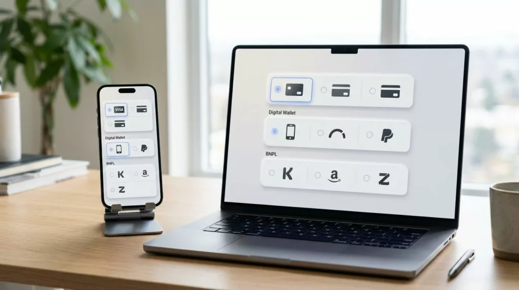
How to show cards, wallets, BNPL, and local methods without overload
A strong payment selection interface doesn’t try to advertise every payment rail. It guides the shopper to the best match.
Credit cards still matter, so don’t bury them behind a hard-to-find tab. At the same time, digital wallets like Apple Pay and Google Pay, along with PayPal-style express options, often deserve higher placement because they cut typing. That matters most on phones, where thumb effort and keyboard switching slow people down fast.
A practical way to reduce hesitation is to group available payment methods by payment source type, not by vendor count. Put wallets together, credit cards together, and alternative payment options together. This creates a cleaner scan path and lowers the “where do I click?” moment.
This quick model works well for many stores:
| Checkout context | Put first | Keep visible next |
|---|---|---|
| Supported mobile device | Apple Pay or Google Pay | Card, PayPal-style option |
| Returning shopper | Saved card | Wallet, manual card |
| Higher-order value and eligible cart | Buy now pay later with plain terms | Card, wallet |
| Localized market | Preferred local method | Card, global wallet |
Buy now pay later needs extra care. If it’s eligible, show it clearly, but don’t make it louder than every other option. Shoppers should understand installment cost before they choose it. Surprise terms create doubt, not lift.
Regional preference matters too. For global customers, deliver localized payment experiences by showing local methods early for the right shoppers. A buyer in one country may expect cards and PayPal. Another may look for iDEAL, Bancontact, or Pix. Don’t force everyone through the same global order if behavior differs by locale.
On mobile, keep tap targets large, rows easy to scan, and the selected state obvious. If a method opens a bank redirect or app switch, say so before the tap. That tiny bit of expectation-setting can prevent a lot of drop-off.
Frequently Asked Questions
Why does the payment method selector impact checkout completion so much?
Shoppers shift from ‘Do I want this?’ to ‘Do I trust this?’ at payment, and a cluttered selector creates hesitation through choice overload. A clear, prioritized list feels calm and guides to the safest fast path. This small UI shapes trust and rates more than its size suggests.
How should you order payment methods to reduce hesitation?
Put the preferred method first based on device, shopper state, and market—like Apple Pay on mobile or saved cards for returners—with cards as reliable fallback. Group by type (wallets, cards, alternatives) for a clean scan path. Keep the rest visible but secondary to avoid mental sorting.
What role does accessibility play in the payment selector?
Use real radio buttons or equivalents with clear text labels, logical keyboard order, and visible focus states for screen readers and all users. Error recovery keeps details intact on failure without resetting progress. Poor accessibility loses orders from non-sighted or keyboard users.
How do you test and avoid common selector mistakes?
Compare variations like sort order or wallet placement, tracking hesitation signals such as exit rate and time to selection, plus region/device completion. Steer clear of icon-only rows, hiding cards, or showing unavailable methods. Audit for redirects warnings and plain BNPL terms.
Does context outside the selector affect its performance?
Yes, fuzzy shipping or delivery timing undermines even a great selector, so pair it with clear promises. It shines in guest checkout flows without login walls. The selector ties into overall UX, so fix pauses before purchase.
Accessibility, testing, and mistakes that quietly hurt completion
Accessibility should shape the selector from the start. If the method list works only for sighted mouse users, you’ll lose both orders and trust.
Use real radio buttons when possible, or match their behavior closely. Every option needs a clear text label, not icons alone. Screen readers should announce the method name and any key detail, such as extra verification or installment timing. Keyboard users should move through the list in a logical order, with a visible focus state and strong color contrast.
Error recovery matters just as much. If payment fails, keep the selected method, credit card details, and order object intact for recurring payments. Don’t kick people back to the top of the page. Don’t clear credit card fields unless security rules require it. Update primary button microcopy to set clear expectations, and don’t show a vague banner that says “Something went wrong.” Say what happened and what the shopper can do next.
For testing, start small. Compare sort order, grouping, number of visible options, or wallet placement. Test diverse methods like bank debits and real-time payments. Also test whether showing a “recommended” method helps or creates suspicion. On international stores, test localized method priority by country or currency.
Watch metrics that point to hesitation, not only final conversion. Useful signals include payment-step exit rate, time to first method selection, payment-method-specific failure rate at the payment gateway, completion by device on mobile and desktop sites, and completion by region. The choice of payment method can influence fraud and disputes. If one method gets many taps but low success, the issue may be technical or copy-related.
Common mistakes show up again and again:
- Showing third-party payment methods that aren’t available for the current device or cart
- Hiding cards too deeply while pushing one promoted option
- Using icon-only rows that look nice but scan poorly
- Forgetting to warn users about redirects, 3DS, or app switches
The best selector feels almost invisible. It reduces work instead of asking shoppers to study the page.
One extra decision can kill momentum. A better payment method selector removes that decision by putting the right option in front of the right shopper at the right time.
The payment selection interface ties directly into the overall checkout experience and user experience (UX). Audit your payment step this week, starting with the default payment method. Count moments of doubt, not just payment methods, and fix the first pause before purchase.