
On mobile, a product page (PDP) in an online store is a long hallway. Shoppers walk past photos, reviews, and FAQs, and the door they need (Add to cart) often ends up behind them.
A sticky add to cart bar fixes that, but only if it behaves like a good mobile citizen. It must respect iOS and Android safe areas on mobile devices, handle variants without frustration, avoid layout shift, and stay accessible for everyone.
This guide breaks down what to include, how it should behave, and what to measure so you can ship a sticky bar that lifts PDP conversion instead of adding clutter.
What a mobile sticky add to cart bar needs to earn the tap
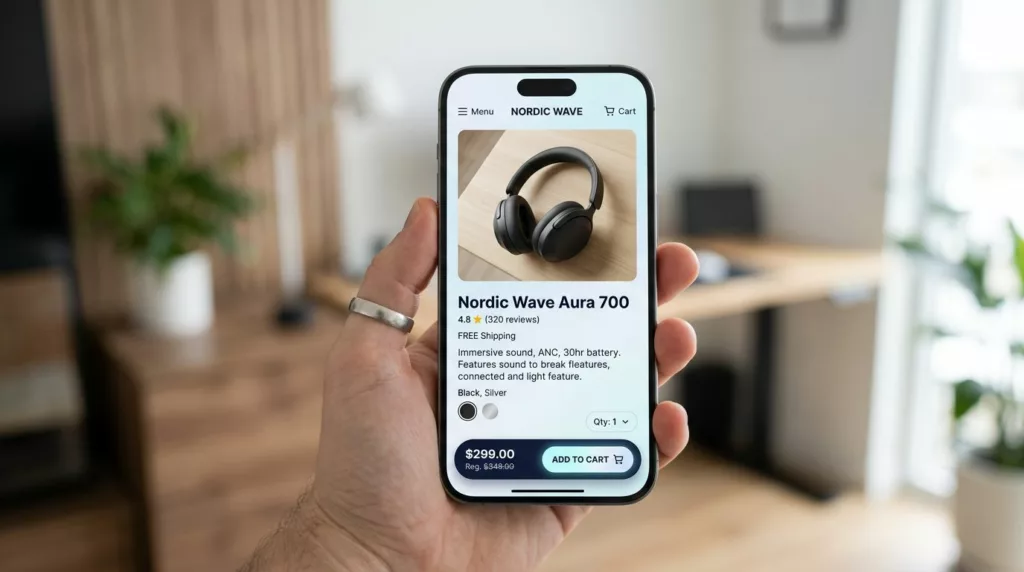
The sticky add to cart bar works because it compresses the decision into one glance, boosting conversion rates. The rule is simple: show what changes, and keep everything else quiet.
At a minimum, include:
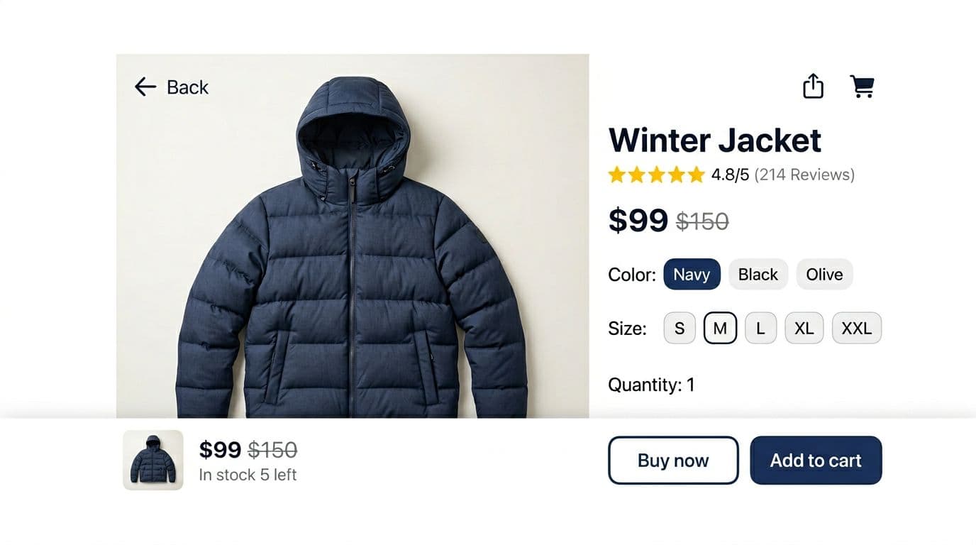
- Price (and sale formatting when needed)
- Product details (the shopper’s current size, color, pack, or subscription for the shopping cart)
- Primary CTA (Add to cart, Add to bag, or equivalent)
- Stock messaging (in stock, low stock, or out of stock)
A small thumbnail also helps, especially when users scroll far past the hero image. It anchors them back to the product they intended to buy.
Keep the bar short, usually 64 to 80 px tall, because mobile screen space is expensive. If you need a second action (like a quick buy button or buy now button), treat it as secondary and visually lighter. Unlike a cart slider, this setup prioritizes thumb-friendly sizing. For broader context on button sizing and thumb reach, these mobile add-to-cart button designs are a useful reference when you’re standardizing PDP patterns.
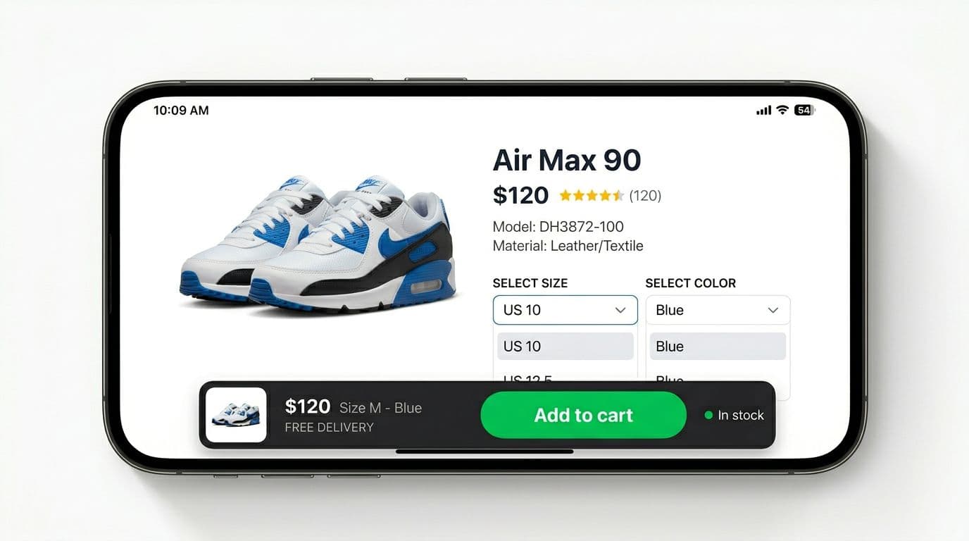
A layout that reads fast (and doesn’t feel cramped)
Most teams get the layout right by splitting the bar into two zones:
Left zone (context): thumbnail, price, and a one-line product details summary.
Right zone (action): one large CTA button with a 44 px minimum tap target.
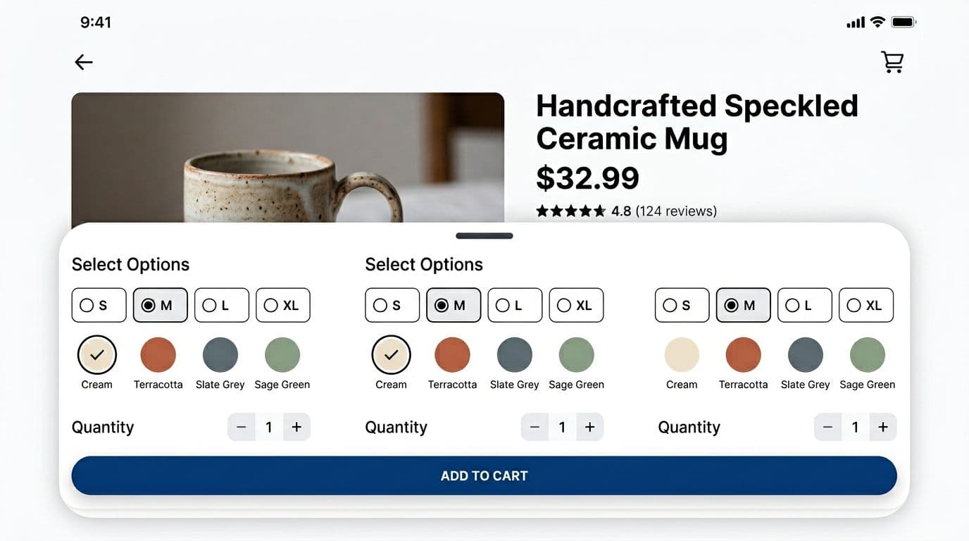
Truncate long variant names instead of wrapping. Wrapping increases height and causes jitter as the user changes options. If you offer a quantity stepper, consider placing it in the variant drawer, not the sticky bar, unless your catalog truly needs it at all times.
If you want a reality check on what a strong product page needs overall (beyond the sticky bar), Blink Commerce has a clear breakdown of high-converting PDP anatomy that pairs well with this implementation work.
Stock messaging that reduces doubt, not trust
Stock lines can help, but only when they’re accurate and calm. “In stock” reassures. “Only 3 left” works as an urgency feature for high-demand items, yet it can also feel pushy if it’s always present.
Treat stock as a state, not a slogan:
- Show low-stock only when it’s real and consistent across channels.
- Use out of stock to switch the CTA to a waitlist or notify flow.
- Avoid flashing counts that change on refresh, shoppers notice.
Behavior rules that prevent mis-taps and dead ends
The best sticky add to cart bars don’t appear instantly. They show up at the moment the shopper loses the primary call to action on ecommerce websites.
A reliable pattern is: show the sticky add to cart bar after the user scrolls past the main PDP add to cart button. You can detect this with an Intersection Observer watching the add to cart button. That avoids scroll listeners that drain performance.
Once the bar appears, keep interactions predictable:
- Tapping the variant summary opens a cart drawer (bottom sheet) with selectors.
- Tapping Add to cart either adds immediately (when ready) or routes the shopper into missing required choices.
Here’s a simple rule set you can share with design and dev in the same doc.
One table is enough to align everyone on states:
| Situation | CTA label | Enabled? | Tap result |
|---|---|---|---|
| All required variants selected, in stock | Add to cart | Yes | Add item, show success feedback |
| Required variant missing | Select size (or Select options) | Yes | Open cart drawer, focus first missing option |
| Out of stock for selected variant | Out of stock | No | Keep cart drawer access available, offer notify if supported |
| Add request in progress | Adding… | No | Show loading, prevent double taps |
| Add succeeded | Added | No (briefly) | Announce success, then return to normal |
A sticky add to cart bar should never let a shopper “fail” in their customer experience after a tap. If something is missing, guide them forward with the next best action.
If you want additional CRO-oriented sticky add to cart bar ideas for Shopify-style PDPs, this 2026 guide on sticky add-to-cart best practices is a helpful comparison point for patterns and test ideas.
Accessibility requirements (non-negotiable on purchase UI)
Treat the sticky bar and drawer like a small application inside your PDP.
Minimum requirements:
- ARIA labels: make the button name specific when possible (example: “Add size 10, blue to cart”).
- Cart drawer semantics: use
role="dialog"(or an equivalent dialog pattern) with a clear accessible name. - Focus management: move focus into the cart drawer on open, trap focus inside while open, then return focus to the element that opened it.
- Reduced motion: if
prefers-reduced-motionis set, remove slide animations and fade gently, or appear instantly.
Also include an aria-live region for add-to-cart confirmation so screen readers hear the outcome.
Mobile-safe implementation details (plus what to measure)
Mobile UI problems often come from “almost fixed” behavior, especially for a sticky add to cart bar in your Shopify store. The bar looks right in one device and breaks in another. Use a Shopify app to simplify mobile-safe implementation without custom coding hassles.
Safe-area insets, fixed vs sticky, and zero layout shift
On iOS, the home indicator can overlap bottom UI. On newer Android devices, gesture navigation can do the same. Your bar should pad itself using env(safe-area-inset-bottom) (and still look fine when that value is zero), all with customizable CSS for flexible styling.
For positioning:
- Use
position: fixedfor the classic always-visible bottom bar. - Consider
position: stickyonly when the bar should stay inside a container, but be careful, sticky can fail inside parents with certain overflow rules.
Avoid layout shift by reserving space. The simplest approach is adding bottom padding to the PDP content equal to the sticky bar height (plus safe-area). Do that only when the bar is active, otherwise you waste screen space above the fold.
For deeper button and CTA hierarchy patterns that influence this component, see these sticky add-to-cart bar mobile patterns.
What to track, success metrics, and A/B testing hypotheses
Track events that explain not just conversion, but friction:
- sticky_bar_shown
- sticky_variant_drawer_opened
- sticky_cta_tapped
- add_to_cart_succeeded (with source = sticky vs main CTA)
- add_to_cart_failed (include error type)
- variant_missing_prompted (when CTA routes to selection)
Success metrics should include:
- Mobile add-to-cart rate on PDP
- Checkout start rate from PDP sessions to monitor the checkout process
- Purchase conversion rate for mobile product page visitors
- Time to first add-to-cart
- Variant selection completion rate (especially for size-based products)
- Cart abandonment rate reduction
- Metrics tied to increase AOV, sales and revenue, and conversion boosters like quicker PDP actions
Good A/B testing hypotheses for 2026:
- Show sticky bar only after the main CTA leaves view vs after 25 percent scroll.
- Replace disabled “Add to cart” with enabled “Select size” that opens the drawer.
- Add a calm stock line (in stock or low stock) vs no stock line.
- Display price only vs price plus selected variant in the sticky bar.
- Test a countdown timer for urgency vs no timer.
- Include cart upsell prompts vs standard CTAs.
Quick checklist (ship-ready)
- Sticky add to cart bar appears only after scrolling past the main PDP CTA.
- Bar includes price, variant summary, primary CTA, stock state, and optionally a thumbnail.
- CTA never dead-ends, missing variants open the drawer and focus the first missing option.
- Out-of-stock disables purchase, yet keeps variant changes available.
- Safe-area padding handled for iOS and Android gesture areas.
- No layout shift, space reserved when the bar is active.
- Drawer is accessible (ARIA, focus trap, return focus, escape to close).
- Reduced motion supported.
- Events tracked for visibility, taps, success, and errors.
- Sticky checkout bar optimized for quick checkout in your Shopify store.
- One A/B test hypothesis defined before launch.
A sticky add to cart bar is small, but it sits at the moment of truth, helping to boost sales and cut cart abandonment. When it’s calm, clear, and measurable, you get more confident taps and fewer abandoned PDP sessions.