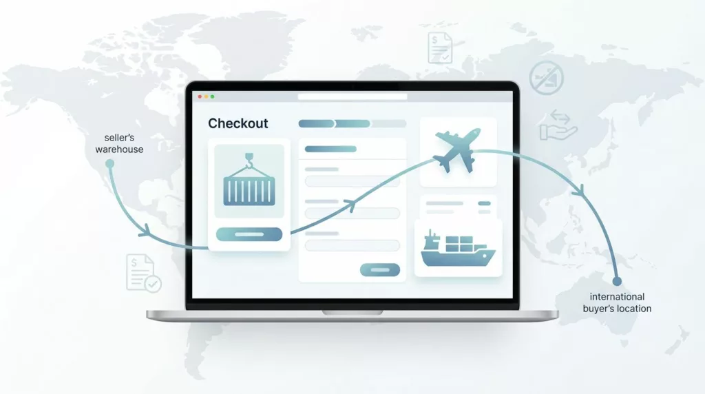

International buyers do not quit checkout because the product price is unclear. They leave when freight, duties, and responsibility show up too late.
In B2B export checkout, that confusion gets expensive fast. A buyer may like the quote, then stop when they cannot tell who pays customs or where risk changes hands. Strong Incoterms checkout UX puts those answers in the path of purchase, not in a buried policy page.
The goal is simple, make the shipping decision readable, believable, and hard to misread. The first step is deciding where Incoterms belong in the flow.
Why Incoterms belong in export checkout
Incoterms change the buyer’s cost, the seller’s duties, and the handoff point for the shipment. That makes them part of the purchase decision, not a footnote. If the buyer only learns the term after payment, the checkout has already asked for trust it has not earned.
The strongest pattern is to explain the term at the moment the buyer chooses shipping. That can be the shipping step, the quote review step, or the account-specific delivery screen. It should not live only in a help article.
If a buyer has to decode shipping terms, your checkout is asking them to do legal work mid-purchase.
The copy should use plain language first, then the trade term. If your team needs a shared reference for trade language across product and support, a B2B eCommerce glossary can help keep terms consistent.
What buyers need to see before they choose a term
The page should answer three questions before the buyer scrolls past the shipping step. Who handles freight? Who pays import charges? What changes after selection?
A compact layout works better than a dense explanation. The buyer wants fast clarity, not a contract lesson.
| Buyer question | Better on-page copy | Why it works |
|---|---|---|
| Who handles freight? | “Choose who arranges shipping.” | It sets the decision in plain language. |
| Who pays import charges? | “Import duties may be billed locally.” | It warns about landed-cost surprises. |
| What changes after I select it? | “Your shipping options update below.” | It shows the page will react. |
Use the Incoterms code as a label, but do not make the code do all the work. “DAP” or “DDP” means little on its own to many buyers. A short sentence next to it does the real job.
A small helper line under the field is usually enough. Something like “Choose the term that matches freight, customs, and delivery responsibility” gives buyers a frame before they compare options. That kind of direct copy is the same style that improves checkout UX fixes that reduce abandonment.
If you only support a few terms, show only those terms. Hidden options create doubt. Clear options create motion.
Copy patterns that make Incoterms easier to choose
Good checkout copy does three things. It names the trade term, explains the business impact, and shows the next step.
The field label can stay short. The helper text should carry the meaning. A confirmation line can restate the choice after selection.
- “Shipping terms” works as the label.
- “Choose who handles freight and import charges” works as the helper text.
- “You selected DAP, import charges may be billed locally” works as the confirmation.
That pattern is easy to scan and easy to translate. It also keeps the buyer focused on the decision, not the jargon. For more examples of tight, behavior-focused patterns, see proven checkout UX fixes to reduce abandonment.
A buyer should never need a tooltip just to know whether the price includes delivery or duty. Tooltips are fine for nuance, but the main message has to live in the form itself. The same rule shows up in How to optimise your company’s e-commerce checkout, where short, direct copy does more work than long explanations.
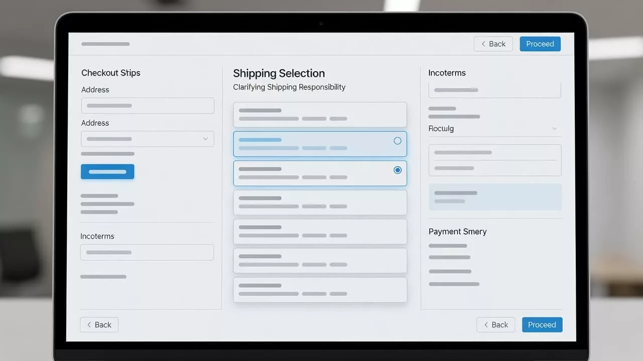
Choosing the right control for the checkout
The control should match the size of the decision. If the buyer is choosing between two or three supported terms, radio buttons are clearer than a dropdown. They keep the options visible and reduce hunting.
For repeat customers, prefill the last accepted term only when the account agreement supports it. That feels helpful. It also avoids forcing the buyer to make the same choice on every order. When a buyer can change the term, the page still feels respectful.
If the selected term changes the checkout total, show the update immediately. Buyers should not have to submit the form to discover a new freight charge or duty note. That is where many B2B teams end up with one more review step than they planned.
The right page structure depends on how much the term affects the rest of the order. If Incoterms are one small decision in a larger export flow, compare your setup with the one-page vs multi-step checkout comparison. Some teams need a separate step. Others only need a compact panel with a live summary.
Broader build choices matter too. A B2B ecommerce website development strategy often treats checkout as a set of business rules, not just a form. That view helps product teams work with ops, tax, and shipping owners before the UI ships.
Trust grows when cost and responsibility stay visible
Landed-cost clarity is where Incoterms messaging earns its keep. Buyers want to know what is included now and what might appear later. If the page hides that distinction, the final number feels unstable.
Show the responsibility line close to the total. A buyer should not have to hunt for it in the footer.
Estimated total: $18,420
Freight included, import duties billed locally
That kind of copy works because it separates the quote from the local charges. If you can calculate duties, say so. If you cannot, label the amount as an estimate and explain what remains open.
The same rule applies to shipping status updates. If the shipping term affects transit time, duty handling, or delivery method, spell it out next to the price change. Buyers read totals as promises, so the page has to be precise.
When teams review this area, they often see a clear pattern. The more visible the cost logic is, the fewer buyers ask sales to decode the quote later. That is one reason many teams keep checkout tight and explicit, as noted in this checkout optimisation guide.
Catch mismatches before they turn into support tickets
Incoterms often trigger validation problems. A term may not be available for a destination. A shipping method may not match the account. A duty rule may need manual review. The UI should catch those issues in the form, not in a support inbox.
Use direct error copy. “DDP is not available for this destination. Choose DAP or contact sales.” That sentence does three jobs at once. It explains the problem, shows the fix, and keeps the buyer moving.
If several fields depend on the Incoterms choice, surface the problem in one place and point to the exact field. A buyer should not have to guess which part of the page broke. For a good pattern here, see designing effective checkout error summaries.
Support teams also benefit from consistent wording. The message in checkout should match the message in order confirmation, shipping emails, and internal macros. When the same terms appear in every touchpoint, agents spend less time translating the order for the buyer.
A few small guardrails help a lot:
- Keep the first message short.
- Show what changes after selection.
- Repeat the chosen term in the order summary.
- Use the same words across checkout and support.
That consistency lowers friction after the sale and gives international buyers a cleaner path to repeat orders.
Conclusion
Incoterms work best in checkout when they answer the buyer’s question before the buyer has to ask it. Plain labels, visible responsibility, and immediate feedback turn a confusing trade term into a clear purchase step.
The strongest Incoterms checkout UX does not hide complexity. It explains it in the right place, with the right amount of detail, and with words buyers can trust. When that happens, export checkout feels less like a negotiation and more like a confident next step.