
Headless sounds like freedom: design what you want, ship faster, and stop fighting a rigid theme. Then reality hits. A small team now owns more moving parts, more handoffs, and more ways to break the storefront.
This guide keeps it practical. You’ll learn when headless commerce UX is actually worth the effort, what changes in day-to-day design workflows, and how to measure results without adding process bloat.
When headless commerce UX is worth the complexity (and when it isn’t)
Headless means your storefront is separate from your commerce engine. In 2026, that often looks like a React or Next.js storefront consuming APIs from a commerce backend (for products, pricing, inventory, cart, checkout) plus a CMS (for editorial content). The upside is control. The cost is coordination.
Small teams tend to win with headless when at least one of these is true:
- You need multi-channel experiences (web, app, kiosk, embedded commerce, partner portals) from one backend.
- Performance is holding you back, and you can’t fix it inside your current theme.
- Your catalog and merchandising logic are complex (bundles, subscriptions, regional rules, B2B pricing).
- You run frequent experiments and want to test UX without theme constraints.
For a broader view of tradeoffs, skim a current headless e-commerce platform buyer’s guide and compare it to your own constraints, not someone else’s stack.
Headless isn’t “more flexible for free.” It’s a trade: you buy UX control with integration work and ongoing governance.
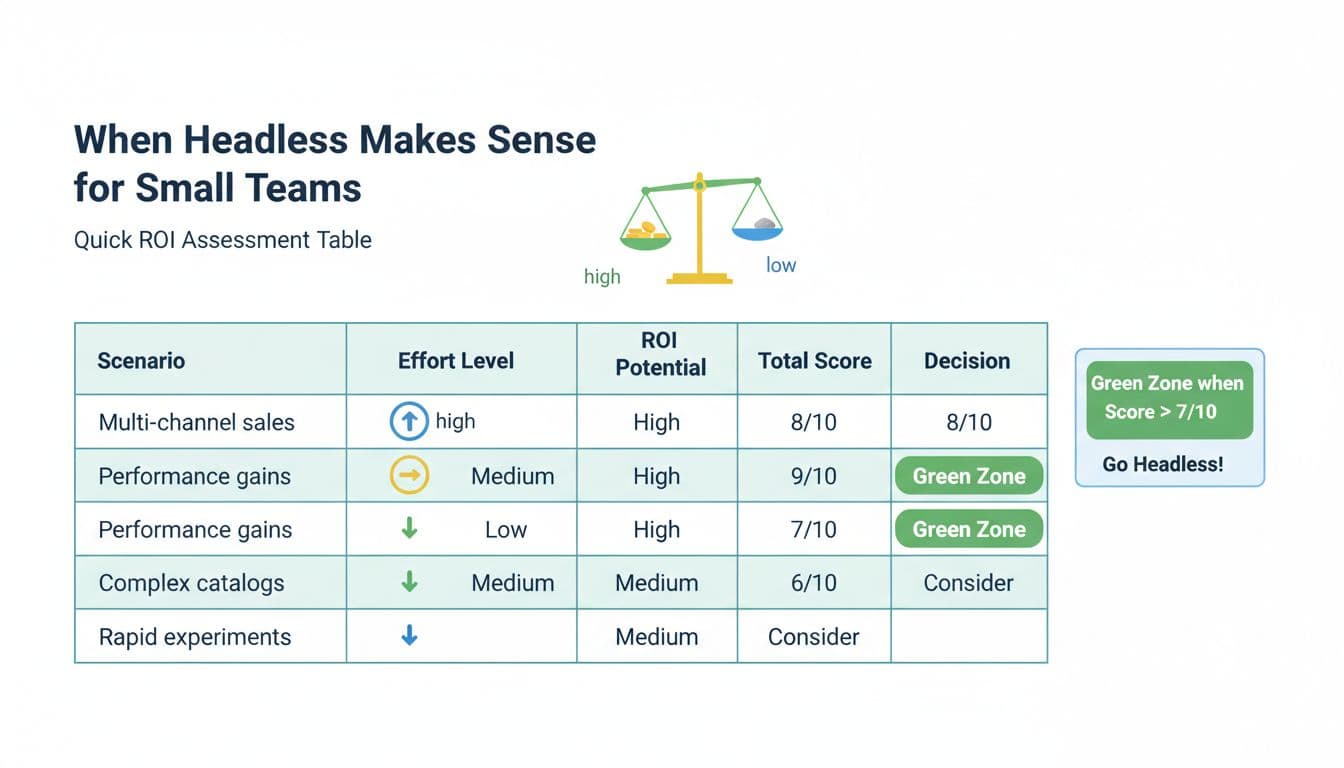
Here’s a simple ROI and effort scoring table you can use in a 30-minute decision meeting. Score each line 0 to 3, then total it.
| Scenario (small-team trigger) | ROI potential (0-3) | Effort (0-3, higher = harder) | Notes to validate |
|---|---|---|---|
| Need multiple storefronts or channels | 3 | 2 | Count channels you must support in 12 months |
| You’re failing performance goals on mobile | 3 | 2 | Check LCP, INP, CLS on key templates |
| Catalog rules cause UX workarounds | 2 | 3 | Identify top 10 “can’t do this” requests |
| You run tests monthly (or want to) | 2 | 2 | Confirm you can ship variants safely |
| Marketing needs page control without dev | 2 | 2 | Define which pages must be CMS-driven |
| Checkout constraints block key UX | 2 | 3 | Map your real checkout limitations |
Quick read: if ROI totals 10+ and effort totals 12 or less, headless is usually worth piloting. If ROI is under 7, you’re probably better off improving your current storefront first.
A lightweight readiness checklist (keep it honest):
- One owner for the storefront UX, not “everyone.”
- A plan for preview environments (design needs to see real data).
- A shared definition of “done” for components and templates.
- Agreement on what lives in CMS vs commerce data.
- A minimal analytics plan (events, funnels, Core Web Vitals).
- Commitment to maintain a design system, even if it’s small.
If you want additional UX framing from a design perspective, this article on UI and UX tips for headless commerce is a useful companion read.
What changes in design workflows once the front end is decoupled
In a theme world, design often happens at the “page mock” level. In headless, the page is assembled from components fed by content models and product data. That flips your workflow: your team spends less time polishing a single layout, and more time defining reusable parts that survive new templates.
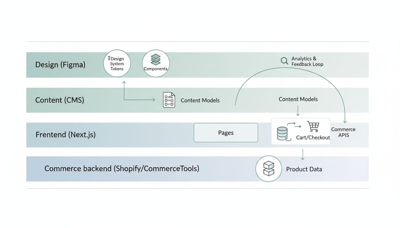
A practical mental model for small teams: design tokens and components are your “product,” and pages are just assemblies.
That leads to three workflow shifts:
First, you’ll design states, not screens. A PDP “Add to cart” isn’t one button. It’s loading, success, error, disabled, and out-of-stock. If you want a concrete example to spec well, see these mobile add-to-cart button designs and mirror the level of state detail in your component definitions.
Second, content becomes structured. Your CMS editors won’t “write a page,” they’ll populate fields. That’s great for reuse, but only if the content model matches real UX needs. Here’s a simple content model example for a product page header, vendor-neutral and easy to implement:
| Content type | Field | Type | Used by component | Notes |
|---|---|---|---|---|
| Product (commerce) | title | string | ProductTitle | Source of truth is commerce |
| Product (commerce) | images | array | MediaGallery | Include alt text rules |
| Product (commerce) | price | money | PriceBlock | Support strike-through price |
| PDP Module (CMS) | valueProps | array of strings | TrustRow | Keep to 3-5 items |
| PDP Module (CMS) | faqItems | array (Q/A) | PDPFAQ | Don’t duplicate global FAQ |
If you’re already improving PDP confidence, pairing headless work with product page FAQ UX for conversions helps you decide which questions belong in CMS fields versus support docs.
Third, your “handoff” becomes a living contract. Small teams move faster when specs are consistent. A component spec template that works well in 2026 looks like this:
| Spec section | What to include | Example detail |
|---|---|---|
| Purpose | User goal and business goal | “Reduce hesitation at add-to-cart” |
| Props and content | Inputs the component needs | price, availability, promoLabel |
| States | All UI states | loading, error, OOS, success |
| Accessibility | Keyboard and screen reader needs | focus order, aria-live for cart |
| Analytics | Events and properties | add_to_cart_click, variant_id |
| Performance | Guardrails | avoid layout shift, image sizing |
Toolchain note (keep it light): component-driven development works best when design and dev share naming and states. Figma libraries plus a component playground (often Storybook) is enough. Your storefront can be Next.js with modern routing and server rendering, but the UX win comes from the workflow, not a framework choice.
Measurement and governance that keeps headless from turning into chaos
Headless makes it easier to ship changes. It also makes it easier to ship inconsistent changes. The fix isn’t more meetings, it’s tight measurement and clear ownership.
Start with two measurement layers:
1) Core Web Vitals on money pages
Track LCP, INP, and CLS on home, PLP, PDP, cart, and checkout entry. Watch regressions by template. When you change image handling or filters, you’re often changing UX more than visuals.
2) Funnel metrics tied to user intent
At minimum: PDP view to add-to-cart, add-to-cart to checkout start, checkout start to purchase. Then add one “quality” metric like return rate, support contacts, or cancellation rate (depending on your business).
Post-purchase matters too. If your headless work improves returning-customer flows, it should show up in faster repeat purchases and fewer dead ends in accounts. This guide on reorder flow UX for repeat purchases is a strong reference for what to instrument after checkout.
Governance is where small teams either stay fast or get buried. Keep it simple:
- Assign a design system owner (even part-time) who approves component changes.
- Version your component library (semantic versioning works well), and publish short release notes.
- Set deprecation rules (how long old components can live, and who updates pages).
- Define “content boundaries” so CMS editors can’t break layouts with unbounded inputs.
Experimentation needs guardrails. Without them, every test becomes a one-off component that nobody maintains.
A small-team experimentation rule set that prevents mess:
- Every test must declare primary metric and at least one guardrail (for example, conversion rate plus CLS).
- A test variant must reuse existing components unless a new component is approved.
- When a test wins, merge it into the design system, then delete the experiment code path.
- Keep personalization honest. Rules-based personalization is often enough early on, before deeper tooling.
If you’re working with Shopify as a backend and a custom storefront, this perspective on designing UX for Shopify headless stores offers good reminders about consistency and performance, even if your exact stack differs.
Conclusion
Headless can be the right call for a small team, but only when the UX upside pays for the extra ownership. Start with a simple ROI and effort score, then pilot one slice (often PDP and cart) before rebuilding everything. Treat components and content models as first-class deliverables, and measure headless commerce UX with both Core Web Vitals and funnel outcomes. If your workflow stays clear, headless won’t feel like “more work,” it’ll feel like control.