

A shopper who wants to buy now isn’t looking for a registration chore. They’re trying to finish a task with as little effort as possible. That’s why guest checkout ux still deserves close attention in 2026.
Why make a ready buyer stop to invent a password? Current ecommerce benchmarks put cart abandonment around 70 to 75 percent in Q1 2026, with mobile usually higher than desktop. So the bottom line is simple: the easier your guest flow feels, the more first-time buyers make it through.
Make the guest path impossible to miss
Hidden guest checkout links create friction before the form even starts. If buyers see a dominant sign-in box and a faint “continue without account” link, many will pause. Some will leave. A stronger pattern is to place “Continue as guest” beside sign-in, with equal visual weight and plain wording.
That choice lines up with the conversion impact of guest checkout vs account creation, and it also avoids common checkout UX mistakes like mandatory logins. If you want accounts, ask after payment, not before it.
A common desktop pattern is a two-option start screen. A better one preselects guest and leaves sign-in available for returning buyers. On mobile, skip modal detours. Start the form on the same screen.
Once the path is clear, reduce the workload. Keep forms single-column. Ask only for data tied to payment, delivery, or fraud review. Use address lookup, card scanning, browser autofill, and inline validation. If a product is digital, hide shipping fields at once. If billing matches shipping, keep that box checked by default. Phone number is a good example. If you only use it for delivery exceptions, make it optional and say why.
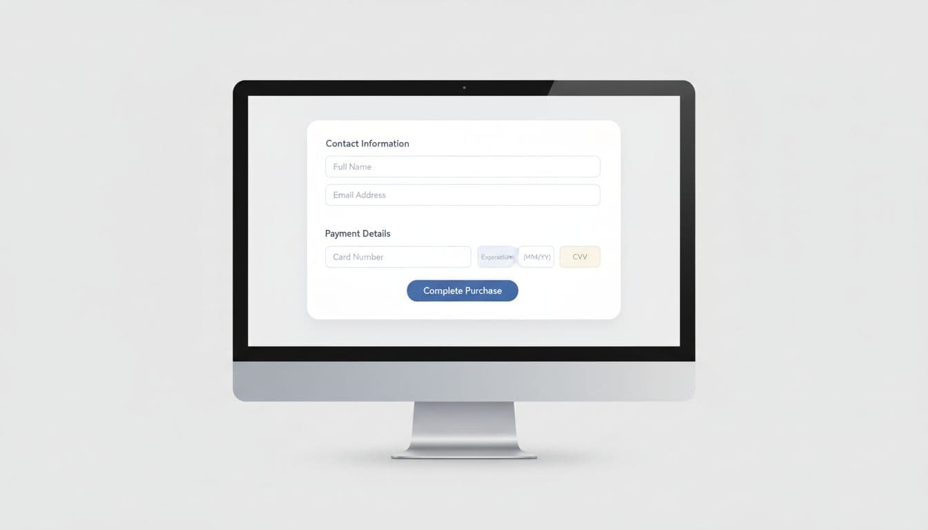
On desktop, show the order summary next to the form so buyers don’t need to backtrack. On mobile, shorten the scroll and use the right keyboard for each field. Email should open the email keyboard, ZIP should open number entry, and card fields should support wallet handoff when available.
If a field doesn’t help payment, delivery, or risk checks, it probably doesn’t belong in guest checkout.
Remove doubt before the payment step
Form friction matters, but uncertainty often hurts more. A buyer may tolerate a few taps. They won’t tolerate surprise shipping, vague delivery timing, or a payment page that feels risky.
Recent 2026 checkout optimization benchmarks still point to unexpected costs as a major reason for abandonment. So surface shipping, taxes, fees, and delivery windows early. The best pattern is simple: show estimated totals in cart, confirm them again before payment, and let shoppers edit items without losing their place. For example, if expedited shipping changes the delivery promise, show the new date right away. Don’t hide it inside a late review step.
Trust cues also need restraint. A wall of badges looks noisy. Instead, place a few calm signals near the payment area: accepted payment methods, secure payment language, and clear help options. Let buyers know they can track the order by email, even as a guest. That removes one of the common reasons stores push accounts too early. When a payment error appears, keep entered data intact and explain the fix in plain words.
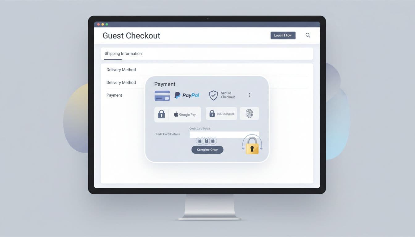
Payment choice matters, too. Cards alone won’t cover enough buying habits, especially on phones. Add wallets and relevant local methods, then keep the fallback card form easy. After the order is complete, offer account creation as a convenience. That can unlock order history and future guest reorder UX patterns without blocking the first sale.
Adapt the flow for mobile first, then measure what breaks
Mobile is where most guest checkout ux problems show up. In Q1 2026, mobile abandonment sat around 73 to 75 percent, while desktop tracked closer to 65 to 68 percent. That gap isn’t just about traffic quality. It’s often about cramped forms, weak error handling, and too much context switching.
Wallet buttons near the top can remove half the typing on a phone. Sticky CTA buttons also help, as long as the total stays visible. Good mobile checkout lowers cognitive load one decision at a time. The best cognitive load reduction patterns keep progress visible, trim distractions, and respect thumb reach.
These patterns usually work best when each device gets its own treatment.
| Pattern | Mobile checkout | Desktop checkout |
|---|---|---|
| Progress | Use short step labels and a compact summary drawer | Keep a visible summary rail beside the form |
| Inputs | Turn on autofill, address lookup, and wallet buttons early | Support paste, tab order, and fast field correction |
| Errors | Show inline fixes close to the field | Highlight the field and keep the full page stable |
| Payment | Prioritize Apple Pay, Google Pay, and saved cards | Show broader payment choice without crowding the form |
The goal isn’t two separate experiences. It’s one checkout logic shown in the best format for each screen.
Then measure the flow like a product, not a page. Track guest-option views, guest starts, field-level errors, coupon use, payment failures, and completion by device. Also compare guest and account paths side by side. Review drop-off by shipping country, payment method, and new versus returning visitor. Friction rarely hits every segment the same way. If one field causes repeated exits on mobile, fix that field first. Small changes often beat large redesigns because they isolate the real blocker.
Conclusion
Guest checkout ux works when it respects buyer intent. Let first-time shoppers finish fast, show the full cost early, and offer trust without forcing a login. Then invite account creation after the sale, when the relationship has already started. If checkout feels lighter, abandonment usually falls.