
Shopping for gifts gets messy fast. Your shopper may know the person, the budget, and the deadline, but not the product. That gap is where gift finder quiz UX does its best work.
A good quiz feels like a helpful store associate. A bad one feels like paperwork. If the flow is slow, vague, or nosy, people leave before the first recommendation appears.
Why gift finder quizzes speed up buying decisions
A gift quiz isn’t a lead form with prettier buttons. It’s a product discovery tool for people who already feel decision fatigue. They don’t want more options. They want fewer, better ones.
That changes the UX job. Each question should remove uncertainty. If a question doesn’t sharpen the recommendation, cut it. If it can wait until after the results, move it.
A quick audit often reveals the biggest friction points:
| Weak pattern | Better pattern |
|---|---|
| Email gate on step one | Show results first, ask for email later |
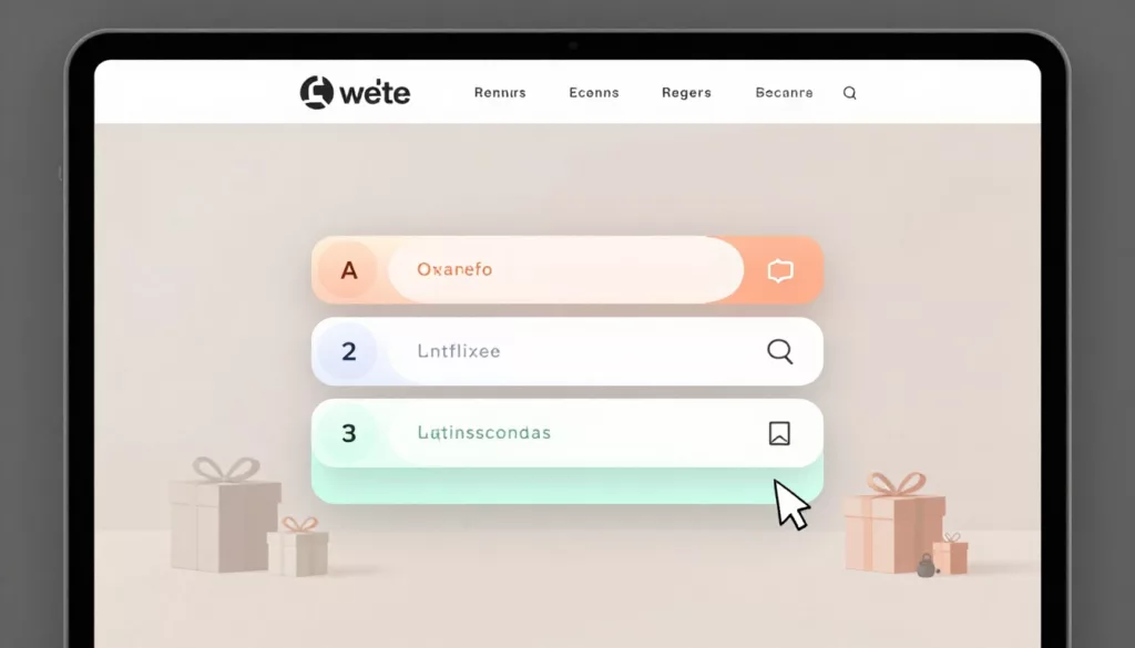
| Long text lists | Use image tiles or short answer chips |
| Abstract questions | Ask about budget, occasion, and recipient |
| Ten equal results | Show three to five ranked picks |
The broader impact of UX design on e-commerce conversion rates shows up here too. When the quiz feels easy, shoppers keep moving. When it feels like work, they bounce.
Treat the quiz like assisted selling, not data capture.
Think of the quiz as triage, not a personality test. If someone landed from a gift guide or a paid ad, they need help narrowing the field fast. Questions about recipient type, price range, and delivery timing usually do more work than style jargon ever will.
Design quiz questions that feel easy to answer
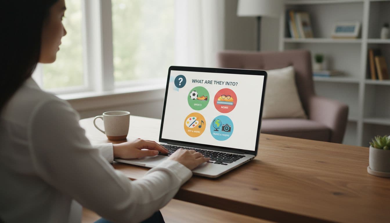
Start with the easiest, least personal questions. Recipient, occasion, budget, and shipping timing are low-friction prompts. They also give your logic strong signals early.
Harder questions should come later, and only if they improve the result. For example, “Which style fits them best?” is harder than “Do they like cozy, practical, or playful gifts?” Recognition beats recall because it lowers cognitive load.
Keep one decision per screen. On mobile, stacked questions and tiny controls turn a quick quiz into a chore. A visible progress bar helps because shoppers can see the finish line, and a back button reduces fear of making the wrong choice.
In many stores, four to seven questions are enough. Past that point, every extra step needs a clear job. If you ask about favorite colors, hobbies, and product materials, but none changes the result, you’re adding choice paralysis instead of removing it.
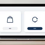
A few patterns tend to work well across gift categories:
- Image-based answer cards for interests, occasion, or gift vibe
- A “not sure” option for low-confidence questions
- Short answer sets, usually two to four choices per step
- An email ask after results, not before
For more flow ideas, Typeform’s product recommendation quiz guide is a useful reference for keeping the path short and focused.
If your quiz sends shoppers to product pages with size or color choices, support the handoff with solid mobile product variant UX tips. Otherwise, the quiz solves one problem and hands them another.
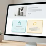
Make the results page feel like expert guidance
The result is the payoff. It’s also where many brands lose momentum. They collect helpful answers, then dump shoppers into a generic grid with too many cards and no explanation.
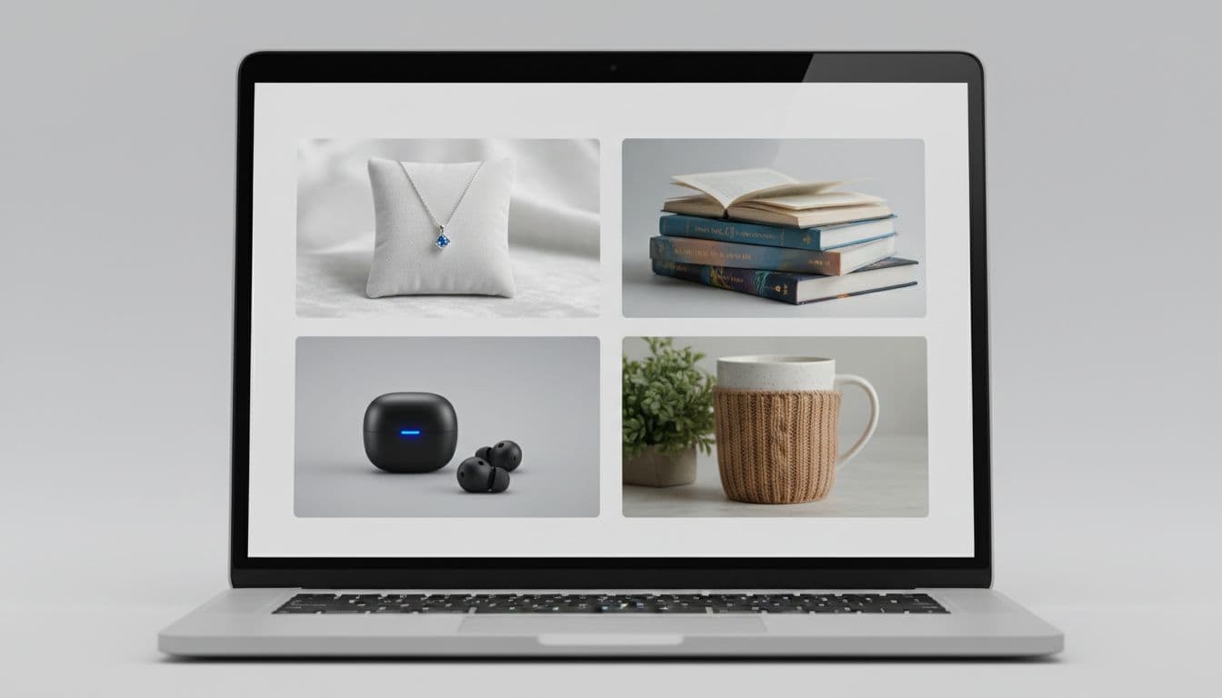
A better result page feels curated. Show three to five products, rank them, and tell the shopper why each one fits. Small reasons like “under $50,” “ships fast,” or “great for book lovers” do more than fill space. They build trust in the recommendation.
Keep the answer summary visible, or at least easy to edit. Shoppers often want to change the budget or occasion without starting over. That small control can save a session that would otherwise end in frustration.
Most importantly, weight the right signals. Budget, age group, recipient type, and shipping cutoff usually matter more than soft taste signals. If your logic treats “likes blue” the same as “needs it by Friday,” the quiz will feel random.
When shoppers click through, the product page needs to finish the job. Helpful details, returns info, and buying reassurance can sit close to the CTA, much like these product page FAQ UX patterns.
Track time-to-choice, not only completion rate
Completion rate matters, but it doesn’t tell the full story. A quiz can get finished and still slow people down.
Watch how long it takes to reach results, how often people edit answers, which result cards get clicks, and how many quiz users add to cart. Also review exits by question. One weak step can quietly drag down the whole flow.
If you want more examples of quiz-based product discovery, this guide to product recommendation quizzes for ecommerce stores is a helpful benchmark.
The best tests stay close to revenue. Try fewer answer choices, fewer result cards, or clearer shipping cues. Then measure which version gets shoppers to a confident choice faster.
The best gift quiz removes work
Gift shopping slows down when the store asks shoppers to do too much thinking. A strong gift finder quiz UX cuts that effort by asking better questions, trimming weak choices, and showing fewer, better products.
Start with low-friction prompts. Keep the flow short. Then make the result page feel earned, not guessed.
If your quiz still feels like a form, rework one step this week and measure time-to-choice, not only completion rate.