

Free shipping can lift average order value, but it can also backfire. Shoppers don’t mind a nudge, they mind feeling cornered.
The goal of a free shipping threshold isn’t to trick people into adding junk. It’s to make the deal clear, help them decide faster, and keep checkout honest. When it’s done well, it feels like a helpful tip from a good store associate, not a pop-up that won’t take “no” for an answer.
Below are UX patterns, copy examples, and test ideas you can ship without hurting trust.
Set a threshold that protects margin and still feels fair
A threshold is a pricing decision wearing a UX costume. If the math doesn’t work, no progress bar will save it.
Start by answering one question: “If an order qualifies for free shipping, can we afford it on most baskets?” That depends on product margin, pick-and-pack cost, carrier cost by zone, and return rate. For teams that need a quick starting point, resources like Growth Suite’s free shipping threshold strategy can help frame the tradeoffs, but your numbers should drive the final call.
A practical approach:
- Use your recent orders to estimate average gross margin dollars per order.
- Subtract average fulfillment and shipping costs for the segment that would qualify.
- Set the threshold where the extra margin from the typical “top-up” item covers the shipping subsidy.
Also, decide what “free shipping” means in plain terms. Is it standard shipping only? Does it exclude oversized items? If yes, say it early and repeat it in the cart. Hidden exceptions feel like a bait-and-switch.
One more UX point: surface shipping costs before checkout when possible. Baymard’s research has long shown that unexpected extra costs drive abandonment, and shipping is a big part of that. Their ongoing cart abandonment rate research is a useful reminder of what shoppers punish.
If free shipping has conditions, show them like terms on a shelf label, not like fine print on page five.
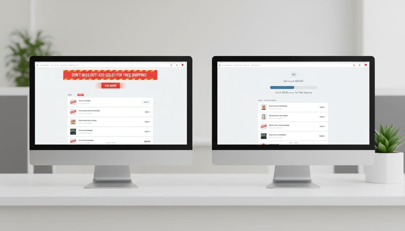
Smart ways to show the free shipping threshold (without pressure)
The best threshold UI is calm, consistent, and easy to ignore. Think “status indicator,” not “alarm.” It should also match the moment. A shopper on a product page needs different help than a shopper in the cart.
Good placements that tend to work:
- Cart and mini-cart: highest intent, easiest to act on.
- Sticky add-to-cart area on mobile: great for quick clarity near the tap moment (see these mobile add-to-cart button patterns for higher conversions).
- Checkout: last chance, but also where pushiness feels worst. Keep it informational.

A strong component setup usually includes:
- A single progress bar (no animation by default).
- A short line of copy, updated live.
- An optional “Add something small” action that opens a curated drawer (not a full category detour).
- A dismiss control, especially if it repeats across pages.
Here are real-world scenarios and recommended UI responses you can copy, paste, and adapt:
| Scenario | Recommended UI copy | Recommended behavior |
|---|---|---|
| Cart total is $42, threshold is $50 (you’re $8 away) | “Add $8.00 more for free standard shipping.” | Show 3 to 6 “top-up” items that fit the cart (low return risk, ships same method). |
| Cart total is $49, threshold is $50 (you’re $1 away) | “You’re $1.00 away. Any item qualifies.” | Suggest the cheapest eligible add-on, or let shoppers apply a saved item or sample. |
| Cart total is $58 (qualified) | “Free standard shipping unlocked.” | Replace progress with a confirmation state. Don’t keep selling. Offer “Continue to checkout.” |
| A heavy item makes free shipping unavailable | “Free shipping isn’t available for oversized items.” | Explain why, link to shipping policy, and show the actual shipping quote early. |
| Customer’s address is remote, shipping differs | “Free shipping available in the contiguous US.” | Detect location after ZIP entry (or clear country selector). Show regional threshold and options. |
| Multiple shipping speeds exist | “Free standard shipping over $50. Express shown at checkout.” | Don’t imply free express. Keep “standard” explicit, and show ETA ranges. |
Copy tip: avoid “Spend more!” or “Don’t miss out!” It frames the store as needy. Better wording describes the benefit and the exact delta.
If you want to tie this into a broader conversion mindset, it helps to align threshold UX with your overall friction reduction plan (see how better UX lifts online store conversions).
Ethical persuasion rules (and where teams cross the line)
Threshold UX is persuasion, so it needs guardrails. If shoppers feel manipulated, they don’t just abandon, they remember.
Keep these rules in your design review checklist:
First, never hide real shipping costs to make the threshold feel better. If shipping is $8, say $8. If it varies by zone, say that and show an estimate once you have a ZIP.
Second, don’t use fake scarcity (“Free shipping ends in 10:00” when it doesn’t). Timers belong to real deadlines only.
Third, make opt-outs easy. Repeated banners can feel like nagging. Add “Hide” on the cart message, and if the shopper dismisses twice, suppress it for that session.
Fourth, don’t over-personalize the nudge. “We noticed you like discounts” feels creepy. “Add $8 for free shipping” feels normal.
Finally, be careful with add-on suggestions. If you push unrelated items, the shopper feels hustled. If you suggest something that completes the purchase (filters for a vacuum, spare laces for shoes), it reads as service.
A/B tests for threshold UX (with guardrails that protect trust)
Test the UX, not just the dollar amount. The threshold number can be right while the experience loses orders.
This table shows test ideas with clear hypotheses and what to watch so you don’t trade short-term AOV for long-term trust:
| Test | Hypothesis | Variants | Monitor (beyond AOV) |
|---|---|---|---|
| Progress bar vs text-only | Visual progress reduces effort and increases top-ups | A: “$8 away” text only, B: text + progress bar | Checkout conversion rate, bounce from cart, time in cart |
| Curated add-on drawer | Fewer choices increases attach rate | A: open collection page, B: in-cart drawer with 6 items | Add-on return rate, item margin mix, support tickets |
| Confirmation state | Stopping the sell after unlock improves checkout completion | A: keep suggesting items, B: “Unlocked” state + checkout CTA | Checkout completion, drop-off at payment step |
| Early transparency | Showing shipping estimate on cart increases trust and reduces abandonment | A: shipping shown at checkout, B: shipping estimate in cart | Abandonment, refund requests, “shipping cost” complaints |
Run tests long enough to cover weekday and weekend behavior, then segment by device and new vs returning shoppers. Also, log dismiss actions. A higher dismiss rate often predicts lower trust, even if AOV rises.
For broader guidance on choosing a threshold and measuring impact, Convertwise’s threshold selection guide offers additional angles to test.
Internationalization: currency, VAT, and delivery expectations
Global stores often copy-paste the US pattern and wonder why it breaks. International shoppers anchor on different norms: VAT visibility, duty risk, and delivery speed expectations.

A few UX rules that prevent confusion:
- Local currency first: show thresholds in the shopper’s currency, with sensible rounding (no awkward decimals).
- Tax clarity: if your market expects VAT-inclusive pricing, ensure the threshold uses VAT-inclusive totals too. If it’s exclusive, say “before tax.”
- Delivery promise: “Free shipping” with a vague ETA feels risky. Add an ETA range for standard shipping once location is known.
- Duties and fees: if duties may apply, don’t imply the threshold covers them. Use copy like “Shipping free, duties may apply.”
Operationally, international thresholds often need to vary by region because shipping cost curves differ. Many teams set one base policy and then adjust by country groupings (EU vs UK vs AU, for example). If you need more ideas on tuning thresholds without increasing abandonment, Nivara’s guide to optimizing free shipping thresholds is a useful complement.
Conclusion
A well-designed free shipping threshold doesn’t guilt shoppers into adding items. It tells the truth, shows the shortest path to a benefit, and gets out of the way.
Audit your threshold math, then audit your tone. If the UI still feels pushy, it probably is. What would change if your store treated the threshold message like a helpful receipt note, not a sales pitch?