
If shoppers can’t find what they came for, they won’t “browse a bit.” They’ll bounce. That’s why ecommerce navigation patterns matter as much as your product cards and checkout.
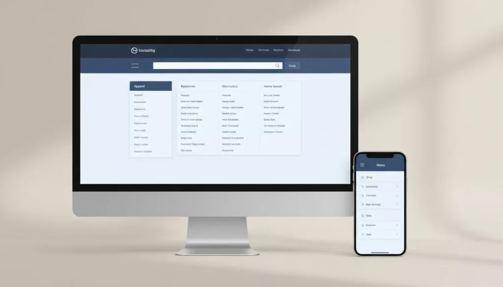
The goal of primary navigation is simple: make it easy to answer, “Where am I, what else is here, and how do I get to the right list?” This improves the user experience for shoppers and facilitates product discovery. Mega menus, sticky headers, and mobile category UX can all help, but only when they fit your catalog and your users’ intent.
Match navigation to your catalog size (and how people shop)
Understanding ecommerce navigation patterns
A good navigation menu is like a store directory. It’s not there to impress, it’s there to reduce wrong turns. Start by choosing patterns based on catalog breadth and subcategories, not internal org charts.
Here’s a quick framework that works in practice for user experience:
- Small DTC (single line, under ~50 SKUs): keep top primary navigation shallow. Use a few clear product categories, then let filters do the work.
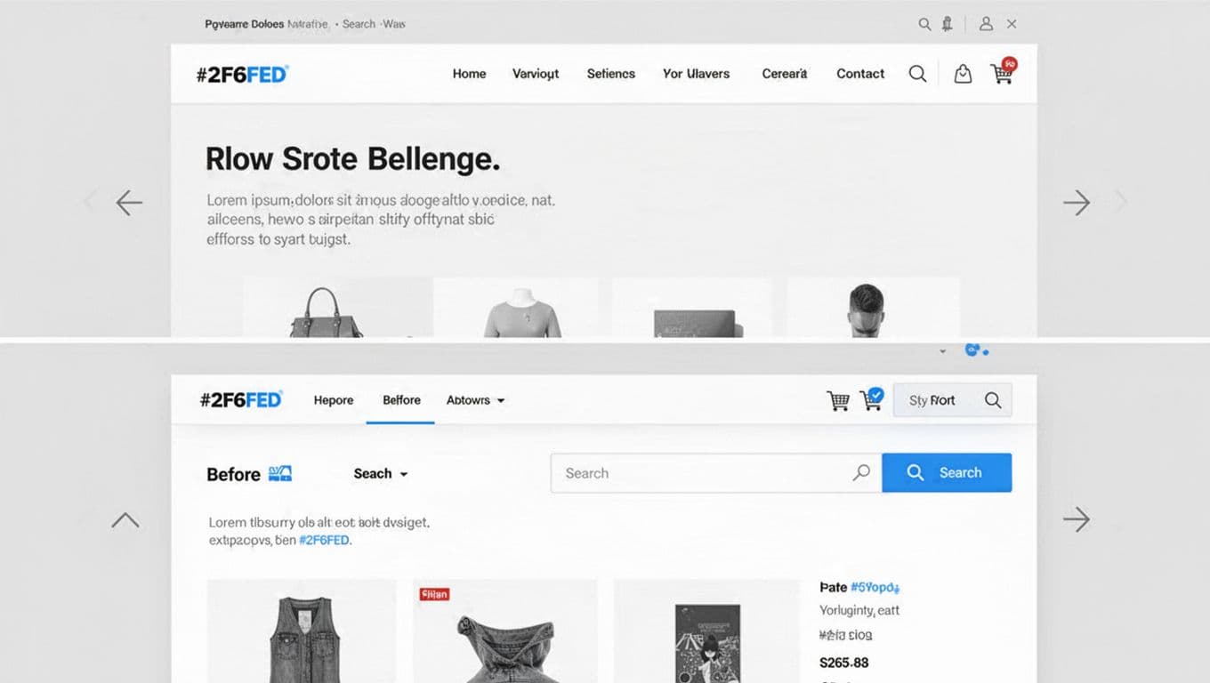
- Large catalogs (fashion, department, marketplace): accept that browsing is a primary mode. You’ll need strong product categories structure, predictable grouping with subcategories, and fast exits to search and filters.
One sentence test: if a shopper can’t name the category they need, they’ll use search; if they can, they’ll browse. Your navigation should support both without making either feel “secondary.”
This table helps teams align on navigation structure before arguing about UI chrome:
| Scenario | What shoppers need most | Pattern that usually wins | Common failure |
|---|---|---|---|
| Small DTC | Quick reassurance and fast path to best sellers | Simple primary navigation header + strong search functionality + faceted search + curated collections | Too many categories that feel empty |
| Fashion (1,000s of SKUs) | Fast scanning by gender, product type, and occasion | Mega navigation menu on desktop, drill-down product categories on mobile | Overlapping labels (“Shoes” vs “Footwear”) |
| Marketplace | Intent-based entry (category, brand, deal, need) | Hybrid taxonomy + search-first header | Navigation menu becomes a dumping ground for every team |
For more broader UX context that supports these choices, reference these research-backed navigation guidelines.
Now lock in your taxonomy rules early with solid navigation structure and site hierarchy, because UI can’t fix a messy tree.
Here are practical “do and don’t” checks that prevent most category UX issues:
| Do | Don’t |
|---|---|
| Group by how people shop (type, use-case, recipient) | Group by internal teams or supplier structure |
| Keep labels concrete (“Women’s Jackets”) | Use vague labels (“Collections”, “Explore”) |
| Make parent categories clickable | Force a choice before any results show |
| Limit duplicates, pick one home for an item | Put the same items in many categories “just in case”; rely on carousel slides for category navigation |
If your taxonomy feels political, your navigation menu will feel confusing.
Desktop mega menus and sticky navigation that stay out of the way
Mega menus: design for scanning, not reading
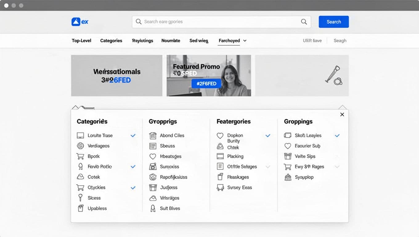
A mega menu is a promise: “You can see the store in one glance.” Keep that promise by focusing on scannability with clear visual cues in the navigation menu user interface.
Concrete heuristics that hold up in audits:
- 3 to 4 columns max for most retail. More columns increase cursor travel and error; add a hover delay to reduce accidental activations in drop-down menus.
- 5 to 7 top-level categories is a good ceiling for the header. Past that, consolidate.
- Group items into 4 to 8 links per group with visual cues, then add a group heading that’s a real word, not a slogan.
- Use consistent labeling conventions: plural nouns for types (“Sneakers”), adjectives for segments (“New In”), and avoid mixing (“Shop”, “Sneakers”, “The Edit”) in the same level.
- Include one “escape hatch” per menu: “View all subcategories” for the parent category, plus visible search.
For large fashion, group by “Women”, “Men”, “Kids”, then by product type, then by highlights (New, Best sellers, Sale). For small DTC, skip the mega menu drop-down menus and put effort into curated collections and search suggestions.
Edge cases matter on desktop too:
- Internationalization: long German or Finnish labels will blow up columns. Allow two-line wrapping, and avoid forced truncation that creates duplicates (“Accessories” vs “Access…”).
- Personalization: “Recently viewed” can live inside the menu, but don’t reorder core navigation structure per user. Stability beats cleverness.
- Logged-in state: show “Orders” and “Saved” when signed in, but keep the category map identical.
If you want a reality check on how often navigation falls short, Baymard’s benchmark highlights common pitfalls in homepage and category navigation UX.
Sticky navigation: keep the tools, drop the weight
Sticky navigation helps when pages are long and users bounce between lists, PDPs, and search. The mistake is keeping the full navigation menu stuck.
Rules that avoid “header creep”:
- Shrink on scroll to search, cart, and one menu entry (plus account if it’s critical).
- Maintain keyboard focus order and visible focus states, especially inside stuck elements.
- Avoid heavy menu scripts on scroll events. Jank kills perceived speed.
From an accessibility angle, keyboard and screen reader support often breaks in complex headers. Keep landmarks clear, label controls, and test real tabbing. Brand Vision’s overview is a useful reminder of what teams miss in accessible navigation for complex sites.
Mobile Navigation UX, Category Navigation, and What to Measure
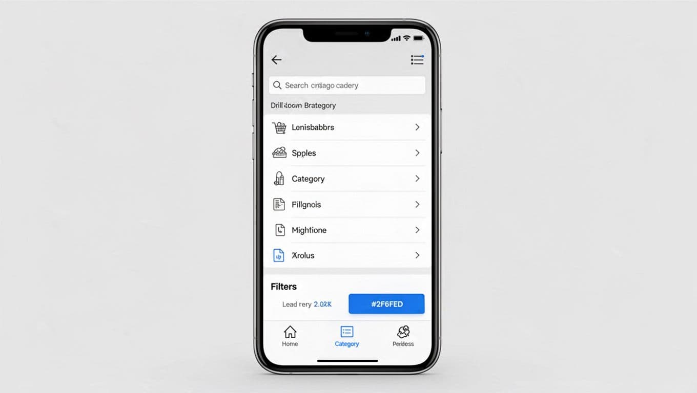
Category navigation on mobile is less about menus and more about “Can I recover from a wrong tap?” In a mobile-first design, your patterns should favor clear forward and back movement to enhance the overall user experience.
Practical mobile navigation heuristics:
- Use large tap targets (44 by 44 px minimum) in the navigation menu. Space matters as much as size.
- Prefer a vertical navigation drill-down list with a clear back over giant accordion stacks.
- Show breadcrumbs or a “Back to results” pattern on PDPs, because the browser back button is fragile.
- Put filters and sort where they’re always reachable from category lists, not hidden behind a second navigation menu.
- Keep the search entry obvious from the hamburger menu. Many shoppers won’t browse on mobile, they’ll type.
Industry write-ups keep pointing to the same gap: mobile navigation drives a huge share of traffic, yet conversion rates lag when discovery is weak. Digital Applied summarizes this tension (with current mobile stats) in its mobile commerce optimization guide.
Don’t ignore mobile edge cases:
- Long labels: let categories wrap to two lines, and avoid all-caps. All-caps increases truncation. Use iconography and thumbnail images to improve scanning on small screens.
- Personalization: a “For you” category can help, but keep it separate from the canonical tree.
- Search integration: autosuggest should show categories and brands with semantic search, not only products. Add “Search in Women’s Jackets” once a user is in a category.
Finally, treat category navigation as a measurable system. Track events that reveal friction, not vanity clicks, to boost conversion rates and user experience:
One table is often enough to align design and analytics:
| Event to track | What it tells you | How to act on it |
|---|---|---|
| Navigation menu open (desktop and mobile) | Navigation reliance vs search reliance | If opens are high but clicks are low, grouping or labels are failing |
| Hover intent (desktop) | Whether people aim for a category but hesitate | High intent with low click suggests unclear grouping or scary volume |
| Category click depth | How deep users go before products appear | If depth climbs, add “View all” earlier or simplify levels with breadcrumbs |
| Search usage from header | Whether users bypass browsing | If search dominates, improve autosuggest and add category shortcuts with breadcrumbs |
| Filter entry from PLP | Whether people can refine efficiently | Low filter entry with high exits suggests filters are hidden or slow, especially in vertical navigation |
Conclusion
Good ecommerce navigation patterns feel almost invisible, because shoppers don’t notice what doesn’t get in the way. Keep desktop mega menus structured, complement header elements with footer navigation and homepage design, make sticky headers compact, and treat mobile category UX as a drill-down flow with strong back behavior. Then measure the real signals, not opinions, to refine your navigation menu for optimal user experience and product discovery. What would your numbers say if you removed one category level tomorrow?