
Checkout is your cashier line. A high Cart Abandonment Rate here directly tanks your Ecommerce Conversion Rate. If it feels slow, confusing, or risky, shoppers step out of line and disappear.
This guide focuses on improving the Checkout Process with specific Checkout UX fixes you can ship without a redesign. Each change includes a clear signal, a concrete UX tweak, a quick example (microcopy or behavior), and what to measure so you can prove impact.
If you want a research baseline to compare against, Baymard’s benchmark is a solid reference point: Checkout UX best practices and pitfalls.
Make the checkout feel predictable (before people start typing)

Photo by Kindel Media
A simple rule: Clear information reduces Friction Points; don’t surprise people with cost, effort, or uncertainty after they’ve committed time.
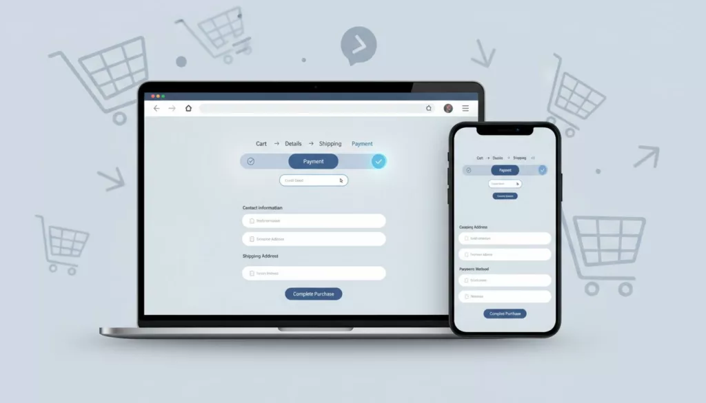
1) Show a real progress indicator (Impact/Effort: High/Low)
Signal: Step drop-off spikes between “Shipping” and “Payment”. Change: Add “Cart > Details > Shipping > Payment > Review” with current step label. Example: “Step 2 of 4: Shipping”. Measure: checkout_step_viewed, step completion rate, time per step. Mobile/A11y: Keep it sticky but compact; announce step changes via aria-live.
2) Offer Guest Checkout by default (Impact/Effort: High/Med)
Signal: Users quit on account screens or password errors, since forcing account creation is a mistake instead of offering Guest Checkout. Change: Put “Continue as guest” first, create account after purchase. Example: “Save your details after checkout (optional)”. Measure: account_prompt_viewed, checkout_completed, drop-off at login. Mobile/A11y: Big tap targets; don’t trap focus in login modals.
3) Keep an editable order summary on every step (Impact/Effort: Med/Low)
Signal: Back button use rises, cart edits cause abandonment. Change: Show mini summary with Cart Quantity Selector to edit quantity, remove, and promo link. Example: “Edit cart” opens a side sheet, not a new page. Measure: order_summary_expanded, cart edit success rate, return-to-checkout rate. Mobile/A11y: Sheet needs visible close, focus returns to trigger.
4) Reveal full cost early (shipping, tax, Hidden Costs) (Impact/Effort: High/Med)
Signal: Drop-off jumps when Hidden Costs and Shipping Charges change late. Change: Add a “Calculate Shipping Charges and tax” estimator in step 1. Example: “Enter ZIP to see total, no surprises with Shipping Charges.” Measure: total-change frequency, shipping_quote_loaded, completion rate. Mobile/A11y: Use numeric keypad for ZIP; clear labels, not placeholder-only.
5) Display Estimated Delivery Date, not just speed names (Impact/Effort: Med/Med)
Signal: Shipping method toggles spike, then exits. Change: Show “Arrives Tue, Feb 24” beside each option; clearly communicate Order Cutoff Time. Example: “Express: Arrives tomorrow, $14.95”. Measure: shipping_method_selected, shipping step drop-off, support chats about delivery. Mobile/A11y: Keep rows tappable; ensure contrast for secondary date text.
6) Surface returns and exchanges at checkout (Impact/Effort: Med/Low)
Signal: High exits on review step, especially for apparel. Change: Add a short line with a policy link near the Pay button to highlight clear Return Policies, which build trust particularly when offering various Fulfillment Options. Example: “Free returns within 30 days.” Measure: returns_link_clicked, checkout completion, post-purchase return-related contacts. Mobile/A11y: Link must be a real link with focus state.
Make forms faster and more forgiving (less typing, fewer errors)
If your checkout feels like filling out a tax form with friction points from long forms, people bail, especially on mobile. These fixes reduce effort, prevent rage taps, and improve the mobile experience. For broader UX patterns beyond checkout, see e-commerce design best practices.
7) Turn on autofill correctly (Impact/Effort: High/Low)
Signal: Long completion time, high field abandon on mobile. Change: Add correct autocomplete tokens per field (name, email, address-line1) to streamline form fields. Example: Browser suggests saved address instantly. Measure: time to complete, field interaction count, checkout_completed. Mobile/A11y: Don’t disable autocorrect for names; keep labels persistent.
8) Add address lookup with a manual fallback (Impact/Effort: High/Med)
Signal: Address errors and failed deliveries. Change: “Search address” typeahead, plus “Enter manually” link. Example: “Start typing street, we’ll suggest.” Measure: address_suggestion_selected, address error rate, delivery failure rate. Mobile/A11y: Suggestions must be keyboard navigable, with clear focus.
9) Reduce fields and hide optional ones (Impact/Effort: High/Low)
Signal: High exits mid-form, lots of empty optional inputs. Change: Strategize required and optional fields by removing “Company” and “Address line 2” unless requested. Example: “Apt, suite, etc. (optional)” behind a link. Measure: form completion rate, time per step, field drop-off. Mobile/A11y: Keep the add-link large enough to tap.
10) Use the right keyboards and input modes (Impact/Effort: Med/Low)
Signal: Mobile typo rate high on phone and ZIP. Change: Set numeric keypad for phone/ZIP/card, email keyboard for email. Example: Phone field shows a dial pad. Measure: field error rate, correction loops, field_error_shown. Mobile/A11y: Keep helper text for formats; don’t rely on color alone.
11) Adaptive Error Messages, but only after intent (Impact/Effort: High/Low)
Signal: “Submit” triggers a wall of errors. Change: Deliver adaptive error messages on blur, show one clear message per field. Example: “Card number looks short (needs 16 digits).” Measure: errors per session, submit failure rate, payment step drop-off. Mobile/A11y: Error text must be announced and tied to the input.
12) Add an error summary and move focus to first error (Impact/Effort: Med/Med)
Signal: Users miss errors, especially on long mobile screens. Change: Top-of-form summary with links, auto-focus first invalid field (if account creation is needed, password creation requirements should be clear to avoid frustration). Example: “Fix 2 fields: Card number, ZIP.” Measure: repeated submit attempts, time to fix errors, completion rate. Mobile/A11y: Ensure visible focus ring and logical tab order.
13) Never wipe entered data after an error (Impact/Effort: High/Low)
Signal: Rage clicks, repeated typing in recordings. Change: Persist all fields, including shipping choice and promo state. Example: After card failure, address stays filled. Measure: payment_failed to payment_success recovery rate, abandonment after error. Mobile/A11y: Keep cursor position sensible when returning to a field.
Reduce payment anxiety (trust, options, and fewer declines)
People hesitate when money enters the picture, especially due to security concerns that kill conversions. Use proof, clarity, and flexibility. Stripe also summarizes practical patterns here: checkout screen best practices.
14) Put express pay first, but don’t hide card pay (Impact/Effort: High/Med)
Signal: Mobile drop-off on payment step, slow completion. Change: Show Apple Pay, Google Pay, PayPal above card form when eligible as top Payment Options. Adding Social Proof like “Trusted by 10k+ shoppers” near the pay button can help. Example: “Pay faster with Apple Pay.” Measure: express pay adoption, checkout completion rate, time to pay. Mobile/A11y: Buttons need accessible names and enough spacing.
15) Add local payment methods and BNPL where it fits (Impact/Effort: Med/High)
Signal: High payment failures by region, low conversion internationally. Change: Offer region-appropriate Payment Options (and only a few), including a variety of BNPL and local methods. Example: “Klarna Pay in 4 (no fees if on time).” Measure: payment success rate, payment_method_selected, completion by country. Mobile/A11y: Provide short, plain disclosures and readable terms links.
16) Make security cues specific, not decorative (Impact/Effort: Med/Low)
Signal: Hovering on payment, exits without errors. Change: Add concise, relevant Trust Signals near payment fields. Example: “Encrypted payment, we never store full card details.” Measure: payment step drop-off, trust badge interactions, completion rate. Mobile/A11y: Don’t use low-contrast gray for trust text.
17) Reduce false declines with better failure states (Impact/Effort: High/Med)
Signal: payment_failed events spike, especially for certain issuers. Change: Show the reason when safe, and offer a next-best action. Example: “Bank declined this charge. Try another card or Apple Pay.” Measure: retry success rate, failures per method, support tickets. Mobile/A11y: Keep message near the action buttons, announce it to screen readers.
Remove “small” friction that quietly kills conversion
These essential checkout optimization steps target the paper cuts. Each one seems minor until you stack them.
18) Make promo code entry optional and calm (Impact/Effort: Med/Low)
Signal: Promo field causes distraction, coupon hunting, exits. Change: Collapse it behind “Add promo code”. Auto-apply without page reload. Use urgency and scarcity (e.g., “offer expires in 10 mins”) carefully to avoid increasing friction points. Example: “Have a code?” expands inline. Measure: promo expand rate, abandonment after expand, completion rate. Mobile/A11y: Expansion must keep focus and not jump the page.
19) Show currency clearly and keep it consistent (Impact/Effort: High/Med)
Signal: International shoppers abandon at totals, FX confusion. Change: Display currency code (USD, CAD) and keep it fixed through checkout. This form of personalization reassures global users. Example: “Total (USD)”. Measure: abandonment by country, refund requests for FX confusion. Mobile/A11y: Don’t tuck currency into tiny, low-contrast text. For global setups, see multi-currency features for e-commerce.
20) Make consent and marketing opt-ins honest (Impact/Effort: Med/Low)
Signal: Complaints, chargebacks, email unsub spikes. Change: Unchecked marketing box, clear order updates vs promos. Example: “Email me order updates” (required), “Send deals” (optional). Measure: opt-in rate, spam complaints, refunds. Mobile/A11y: Labels must be clickable, not just the checkbox.
21) Don’t let contrast and focus states fail at the finish line (Impact/Effort: High/Low)
Signal: Mis-taps on Pay button, users can’t see what’s selected. Change: Ensure button contrast, visible focus, clear selected states for shipping and payment. Example: Selected method shows a border plus “Selected”. Measure: misclick rate (clicks with no state change), step drop-off on mobile. Mobile/A11y: Follow WCAG contrast and focus guidance, start with color contrast best practices.
Copy-paste checklist for your ticket backlog
- Add progress indicator with step names and
aria-live - Default to Guest Checkout, offer account after purchase
- Persistent, editable order summary on every step
- Early Shipping Charges and tax estimator before payment
- Shipping options show delivery dates
- Returns/exchange reassurance with policy link
- Correct
autocompleteon all fields - Address lookup plus “Enter manually”
- Remove or hide optional fields (company, address line 2)
- Set proper keyboards (
inputmode) for email, phone, ZIP, card - Inline validation on blur with one message per field
- Error summary that moves focus to first error
- Persist all entered data after errors and back navigation
- Express pay buttons above card form when eligible
- Add region-relevant payment methods and BNPL
- Specific security microcopy near payment fields
- Payment failure states with clear next action
- Collapsible promo entry, apply without reload
- Currency code shown and consistent through checkout
- Honest opt-ins, unchecked marketing by default
- High-contrast buttons, visible focus, clear selected states
- Monitor Cart Abandonment Rate regularly
- These are core Checkout UX tasks
Conclusion
Cart abandonment often looks mysterious in dashboards, but it’s usually plain friction. Pick 3 fixes with High impact and low effort, ship them, then measure step drop-off and error rates week over week. If the checkout process is still seeing drop-offs, consider exit-intent popups or recovery emails. If you need a broader UX foundation that supports checkout improvements, start with how to design user-friendly e-commerce sites and tighten the flow from product page to payment. These fixes, combined with retargeting ads, help build long-term customer loyalty and improve the overall ecommerce conversion rate.