
Few things drain checkout momentum faster in online retail than not knowing how much is left. When shoppers hit payment and still can’t tell if they’re close to done, doubt grows fast.
That doubt is step anxiety. It comes from hidden work, unclear effort, and fear of losing time or entered data. A good checkout progress indicator works like mile markers on a highway (or a checkout progress bar). It tells people where they are, what comes next, and how near the finish line feels.
The pattern looks small on screen, but the details shape whether it calms shoppers or pushes them out to meet user expectations.
Key Takeaways
- Step anxiety from unclear checkout length drives abandonment; a progress indicator calms it by showing where shoppers are, what’s next, and how much is left—like mile markers on a highway.
- Design for trust: use plain labels (Shipping, Payment), keep step count consistent, make current/completed states obvious, and preserve data on edits so the indicator doesn’t lie.
- Works for multi-step or one-page checkouts; on mobile, prioritize short labels, checkmarks, and space-saving to avoid friction.
- Judge by the one-second test: can shoppers instantly grasp position, next step, and total? Test drop-off rates and usability with first-timers.
- Good indicators feel boring and finite, boosting completion without shortening the actual flow.
Why step anxiety shows up in ecommerce checkout
Shoppers don’t experience checkout as a flowchart. They experience it as effort and step anxiety, which often leads to cart abandonment. Every new screen, field, and pause racks up interaction cost and makes them ask, “How long will this take?”
That question gets louder in a multi-step checkout. If the first screen says “Continue” with no sense of length, people brace for more work than may exist. As a result, perceived effort rises before actual effort does.
A progress indicator cuts that mental load because it provides psychological sense of control, turning an open-ended task into a bounded one. “Step 2 of 4” feels manageable. “Continue” feels risky.
Checkout friction also stacks. Surprise shipping, forced sign-in, weak error states, and lost form data all make people feel trapped mid-process. Broad summaries like this checkout optimization guide keep pointing to the same pattern in checkout flow: uncertainty and interruption are expensive.
If shoppers can’t tell how long checkout will take, they often assume the worst.
There’s also a design trap here. Some teams think fewer screens always win. Not always. As argued in this piece on the checkout flow paradox, breaking work into clear stages can help when each stage feels short and predictable. In other words, structure can lower anxiety, even when the number of screens stays the same.
This starts before payment, too. If entry into checkout is confusing, friction arrives early. That’s why solid guest checkout UX patterns often pair well with a clear step indicator.
How to design a checkout progress indicator people trust
A calming indicator does one job first: it tells the truth. If you show four steps in a linear process, don’t reveal a fifth later. Nothing breaks trust faster than a moving finish line.
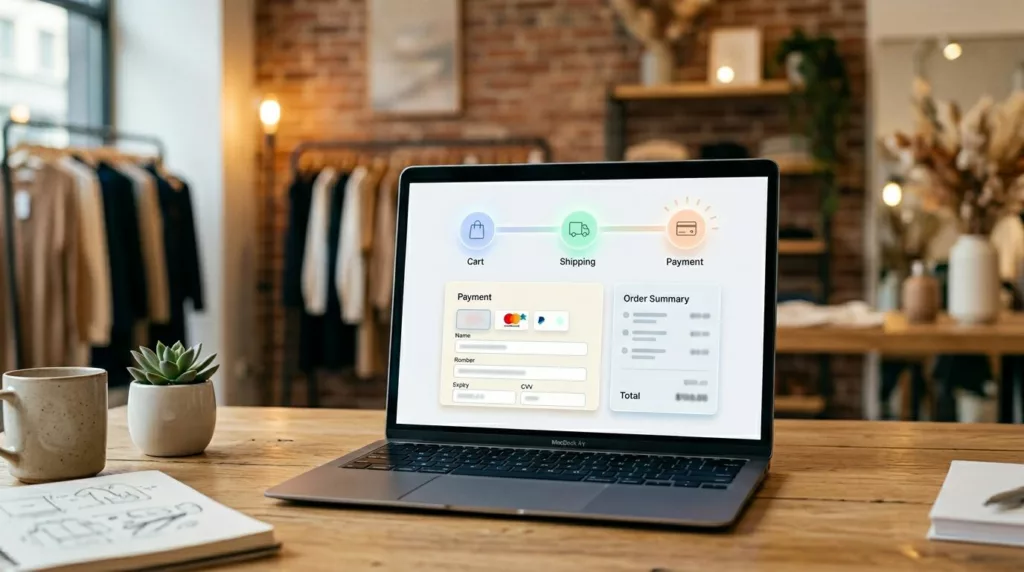
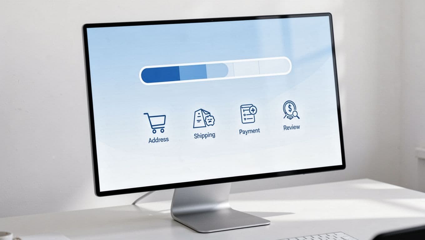
Use plain step titles. “Shipping,” “Payment,” and “Review” beat internal terms like “Fulfillment” or “Stage 3.” Most stores don’t need more than three to five steps. Once the count grows, the indicator starts advertising complexity.
Keep the current step obvious. Use contrast, a filled state, or a clear marker. Also show completed steps differently from future ones with visual validation. Shoppers need to know the completion of steps, not only where they are now.
Labels matter, but behavior matters more. If users go back to edit shipping, don’t wipe payment data unless security rules require it. When progress survives edits, the flow feels stable. When it resets, the indicator becomes a liar.
For one-page checkout, the same rule applies. You may not need a classic stepper, but you still need visible section status. Completed sections can collapse with checkmarks. Open sections should show what’s next. The point isn’t the shape of the UI. The point is reducing uncertainty.
A simple checklist helps:
- Show total steps from the first checkout screen.
- Use short labels people understand at a glance.
- Keep the count consistent across the whole flow.
- Let shoppers move back without losing valid data.
If your team is mapping state logic, whether using a custom eCommerce platform or WooCommerce, this multi-step checkout design reference is a useful reminder that validation, back navigation, and state persistence all affect whether a progress indicator feels honest.
Good and bad implementations look different in one second
The fastest way to judge a status indicator is the one-second test. Can a shopper scan it and answer three things: where am I, what’s next, and how much is left?
This quick comparison shows where the pattern helps, and where it adds friction.
| Pattern | Good implementation | Bad implementation |
|---|---|---|
| Step naming | Uses plain labels like Shipping and Payment | Uses vague terms like Continue or Details in breadcrumbs style |
| Progress state | Distinguishes current, completed, and upcoming steps | Shows identical dots or links with no meaning |
| Step count | Keeps the same total from start to finish | Adds new steps late in the flow |
| Editing | Allows safe backtracking with saved data in the payment UI | Resets fields or changes progress unexpectedly |
The bad versions usually share one flaw: they make shoppers decode the interface while trying to buy. Tiny dots without labels, breadcrumb-style text, or overly long step names force extra thinking at the worst moment.
Good interactive progress indicators feel boring, and that’s a compliment. They reduce surprise. They don’t compete with the form. They quietly guide the shopper by answering the next question before it becomes stress.
Frequently Asked Questions
What is step anxiety in checkout?
Step anxiety arises when shoppers can’t gauge how much effort or screens remain, turning checkout into an open-ended task that feels risky. It stacks with surprises like hidden steps or lost data, spiking abandonment. A progress indicator bounds the process, making “Step 2 of 4” feel manageable.
Why does a checkout progress indicator reduce abandonment?
It provides psychological control by answering “How long will this take?” before doubt builds, lowering perceived effort. Honest indicators with clear labels and consistent counts turn friction into guidance. Bad ones add decoding work; good ones quietly reassure in one glance.
How do you design a trustworthy progress indicator?
Show total steps from the start, use plain titles like “Shipping” not “Stage 3,” distinguish current/completed/upcoming visually, and let edits preserve progress. Avoid moving finish lines or resets that break trust. For one-page flows, use section checkmarks instead of bars.
What are mobile best practices for progress indicators?
Keep labels short to fit tight space—use “2 of 4” with checkmarks for done steps. Avoid wrapping horizontals that push forms down; prioritize thumb-friendly visibility like in add-to-cart patterns. Ensure screen readers announce status clearly.
How do you test if your progress indicator works?
Apply the one-second test: can users scan where they are, next step, and total? Track metrics like step drop-off, back-button use, and completion rates, especially mobile. Run usability tests with first-time shoppers watching for pauses or questions about remaining screens.
Mobile and accessibility rules that keep the pattern useful
In the mobile version, space gets tight fast. Long horizontal steppers often wrap, shrink, or push form content too far down. Then the indicator creates friction instead of reducing it, especially when vertical alignment of labels suffers.
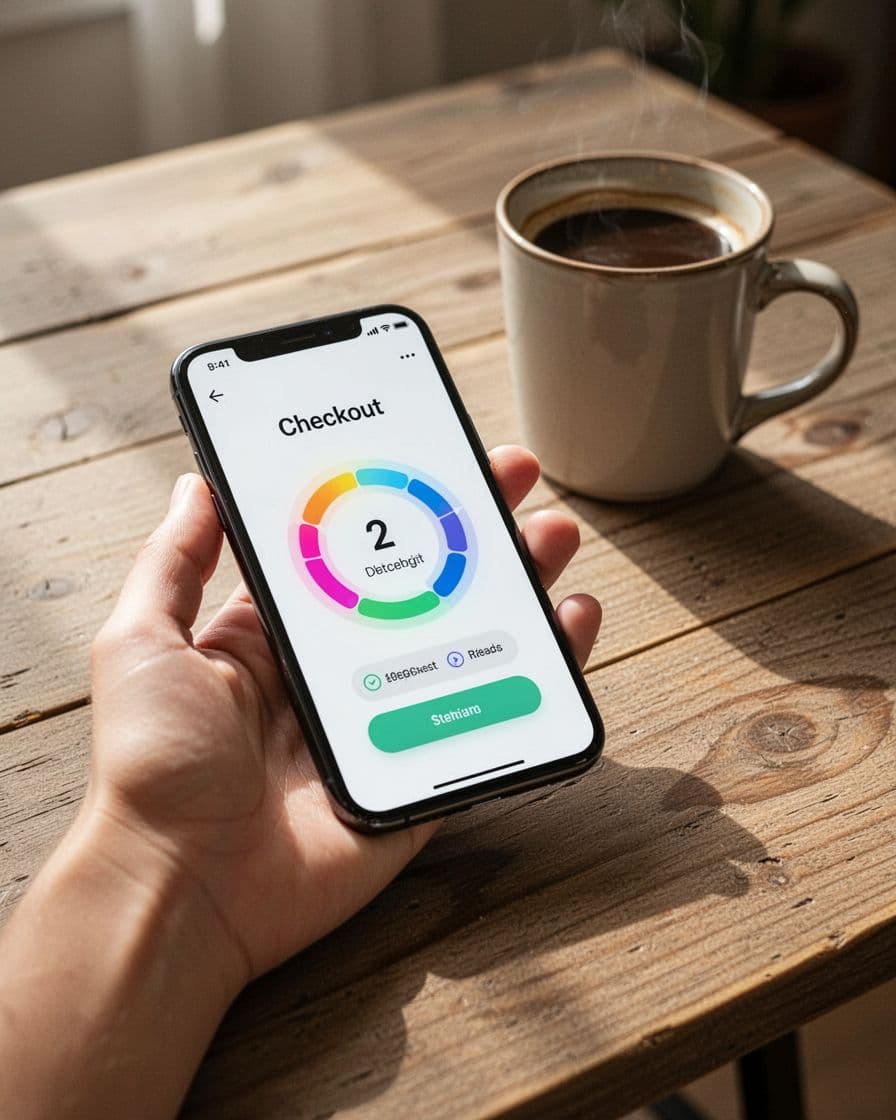
Short labels help. So does showing “2 of 4” with a clear step title nearby. Some teams switch completed steps to checkmarks and keep only the current label visible. That works well because it saves space without hiding progress.
The same thumb-friendly thinking behind mobile add-to-cart button patterns applies here. Keep the progress visible, readable, and light on vertical space.
Accessibility needs the same care, especially with helper text, validation messaging, and error states to guide users through mistakes. Don’t rely on color alone. Screen readers should hear the current status, such as “Step 2 of 4, Payment.” Use aria-current="step" when relevant, keep contrast strong, and make focus navigation order logical. If completed steps are interactive, they must look and behave like interactive controls.
Testing should go beyond clicks. Measure step-level drop-off to gauge shopper satisfaction and its impact on final conversion rates for the overall checkout experience, plus:
- checkout completion rate
- back-button use
- form reset rate after edits
- mobile completion by screen size
Run usability tests with first-time shoppers, not only loyal customers. Watch where they pause. If people ask “How many more screens?” your indicator isn’t doing its job.
A good checkout progress indicator doesn’t make checkout shorter. It makes checkout feel finite. That’s what lowers anxiety.
Open your flow on desktop and phone this week. If a shopper can’t tell where they are and how much is left in one glance, fix that before you redesign anything else.