
The fastest way to lose a BNPL sale is to make it feel slippery. Shoppers use buy now, pay later to soften the upfront cost, but they pull back when terms show up late or read like fine print.
Strong BNPL UX does the opposite. It lowers price anxiety early, keeps the option easy to scan, and explains the obligation before commitment. That’s how you lift conversion without creating doubt that shows up later as drop-off, complaints, or chargebacks.
Place BNPL in the buying path, not at the last second
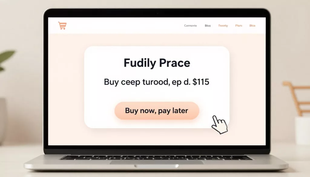
BNPL works best when it appears at the first moment price resistance appears, on the product page, in the cart, and again at payment. The message should answer one question fast: what do I pay now, and what happens next?
Show the installment amount next to the full price, not instead of it. Keep the full price visually primary. Then place the BNPL line as secondary support, close to the main CTA, shipping summary, or returns cue. That hierarchy helps shoppers compare options without feeling like the store is steering them into credit.
Research on highlighting credit options during checkout points the same way. Visibility helps, but clarity is what keeps momentum.
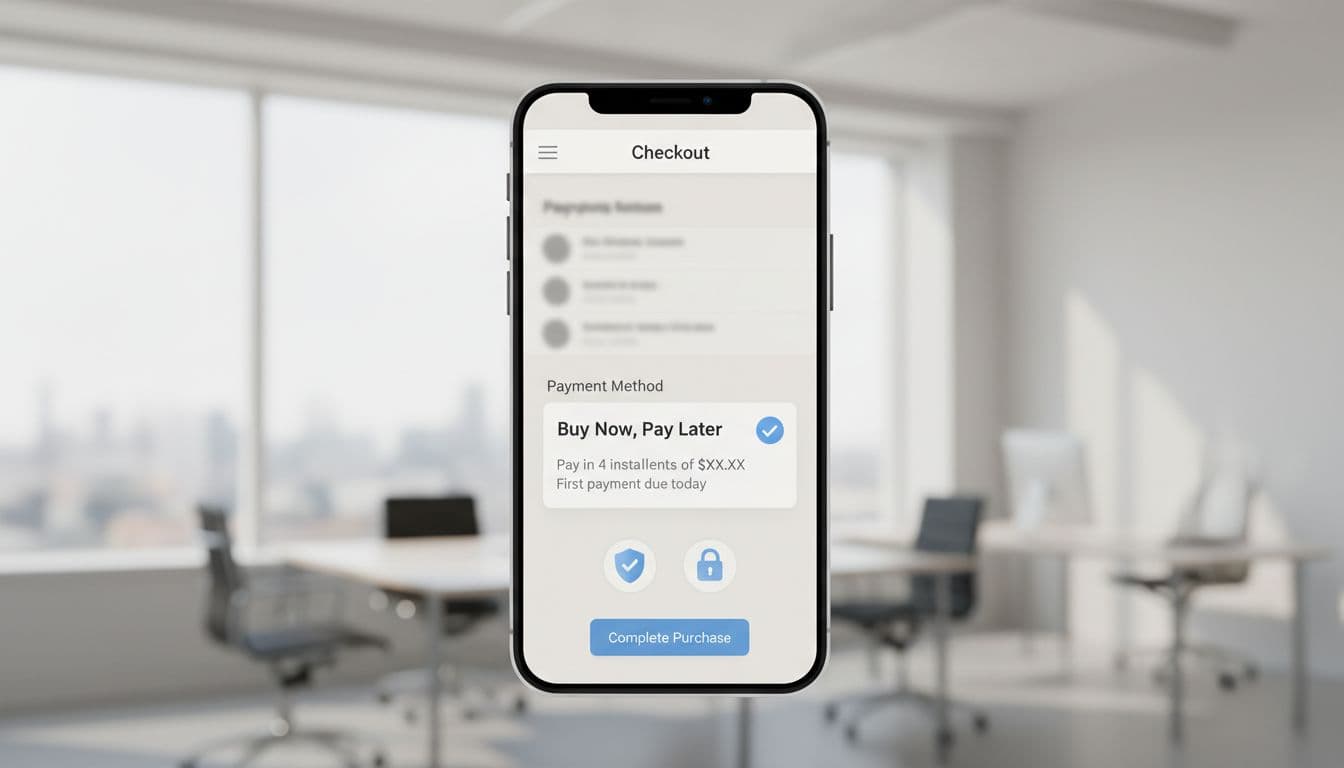
On mobile, BNPL should sit inside the same scan path as shipping, delivery, and payment methods. If shoppers must tap a vague icon or wait until the payment step to find it, the option arrives too late. The checkout itself should follow the same low-friction rules as solid guest checkout UX patterns, because every extra account prompt or redirect adds doubt.
Consistency matters too. If the product page says “4 payments of $25,” the cart and checkout should repeat that exact framing, alongside the provider name. A good pattern says, “Pay $25 today, then 3 more payments every two weeks.” A risky one says, “From $25,” with no schedule, no total, and no fee cue. One feels like a receipt preview. The other feels like ad copy.
Use disclosure timing and repayment clarity to close trust gaps
Most trust gaps start in the space between promise and disclosure. If the product page says “Pay in 4” but the payment step hides due dates, fee rules, or approval details, shoppers feel the floor move under them.
Good BNPL UX uses staged disclosure. At product and cart level, show the payment rhythm and any headline condition. Before the shopper selects BNPL, open a short explainer panel or modal with due dates, total payable, provider name, and what happens if a payment is missed. After selection, repeat the same facts in the order summary. This is the same lesson behind avoiding surprise shipping costs: surprises hurt more when they appear late.
This quick check helps teams spot the line between persuasive and risky patterns:
| Good BNPL pattern | Risky BNPL pattern |
|---|---|
| Show full price and installment side by side | Lead with installment only |
| Reveal schedule, total, and fee rules before selection | Hide terms until provider handoff |
| Let shoppers choose BNPL intentionally | Preselect BNPL as the default |
| Explain approval checks in plain language | Use vague “subject to approval” copy only |
The left side lowers mental work. The right side shifts risk onto the shopper.
If a shopper can’t explain the repayment plan after one glance, the design is asking for too much trust.
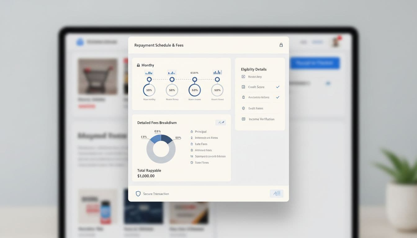
Plain language beats a tooltip full of legal copy. If there are no late fees, say that. If late fees may apply, say when. If approval depends on provider checks, say that before the handoff, not after a failed attempt. The broader trust-first UX playbook fits BNPL well because it treats clarity as part of conversion, not a tradeoff against it.
Responsible BNPL UX wins more in 2026
In 2026, BNPL sits closer to regulated credit design than simple payment UI. Providers are tightening approval checks, mobile flows rely more on wallet-like speed, and teams face more pressure to explain automated decisions clearly, according to this 2026 BNPL outlook. Fast face ID or one-tap approval helps, but speed doesn’t excuse thinner disclosure.
Persuasion still has a place. You can highlight flexibility, surface BNPL near high-consideration products, and remind shoppers when the order total fits a plan well. Yet the line is simple: prompt, don’t push. Don’t auto-select BNPL. Don’t use fake countdowns. Don’t bury missed-payment outcomes. And don’t write personalized copy that sounds like debt targeting.
The same logic behind ethical free shipping prompts applies here. A calm nudge helps when it respects choice. Pressure may lift clicks for a week, but it often shows up later in support tickets, disputes, and lower repeat purchase rates.
Measure BNPL UX beyond raw conversion. Track option views, selection rate, approval drop-off, checkout completion, provider exit rate, FAQ clicks, and payment-related support contacts. If BNPL uptake rises while confusion also rises, the design didn’t improve. It only moved the problem downstream.
The best BNPL UX isn’t louder. It’s calmer. Show it early, explain it before commitment, and keep the full cost visible from first tap to order review.
Audit one live flow this week, from product page to confirmation. If a shopper can’t tell what they pay today, what they owe later, or what fees may apply, fix that first. Trust is what makes the conversion stick.