

The Power of Contrasting Colors: How to Use Complementary Shades to Increase Sales
Color plays a crucial role in the world of e-commerce. It has the power to evoke emotions, influence purchasing decisions, and ultimately, boost conversion rates. As an online business owner, it is essential to understand the psychology behind color and how to use it effectively to drive sales. In this article, we will explore the top color schemes that have been proven to increase e-commerce conversion rates, with a focus on the power of contrasting colors.
Contrasting colors are two colors that are opposite each other on the color wheel. These colors create a strong visual impact and can be used to draw attention to specific elements on a website. When used correctly, they can create a sense of balance and harmony, making the overall design more visually appealing. But how exactly do contrasting colors affect e-commerce conversion rates?
Firstly, contrasting colors create a sense of urgency and can encourage customers to take action. For example, using a bright red “Buy Now” button against a dark blue background can create a sense of urgency and prompt customers to make a purchase. This is because red is associated with energy and excitement, while blue is associated with trust and security. The combination of these two colors can create a powerful call to action, leading to an increase in conversions.
Secondly, contrasting colors can help to highlight important information and make it stand out. In the world of e-commerce, it is crucial to communicate key information such as discounts, promotions, and product features to customers. By using contrasting colors, you can draw attention to these elements and make them more noticeable. For example, using a bright yellow font against a dark green background can make a discount offer pop and catch the customer’s eye.
Moreover, contrasting colors can also create a sense of trust and credibility. When used correctly, they can make a website look more professional and polished. This is especially important for e-commerce businesses, as customers need to feel confident in their purchases. By using contrasting colors, you can create a visually appealing website that instills trust in your customers, leading to an increase in conversions.
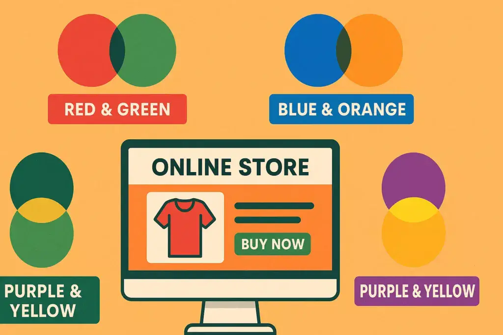
So, which color combinations work best for e-commerce websites? The most popular and effective contrasting color combinations are red and green, blue and orange, and purple and yellow. These combinations have been proven to increase conversion rates and are commonly used by successful e-commerce businesses.
Red and green are complementary colors that create a strong visual impact. Red is associated with passion and excitement, while green is associated with growth and balance. This combination is often used by e-commerce businesses to create a sense of urgency and encourage customers to take action.
Blue and orange are another popular contrasting color combination. Blue is a calming color that evokes trust and security, while orange is a vibrant color that represents energy and enthusiasm. This combination is often used to create a sense of balance and harmony, making the website more visually appealing to customers.
Lastly, purple and yellow are a bold and eye-catching combination. Purple is associated with luxury and sophistication, while yellow is associated with happiness and optimism. This combination is often used by e-commerce businesses to create a sense of trust and credibility, as well as to draw attention to important information.
In conclusion, the power of contrasting colors should not be underestimated in the world of e-commerce. By understanding the psychology behind color and using it effectively, you can increase conversion rates and drive sales for your online business. Experiment with different color combinations and find the one that works best for your brand and target audience. Remember, a well-designed website with the right color scheme can make all the difference in the success of your e-commerce business.
The Psychology of Color: Understanding How Different Hues Affect Consumer Behavior

Color plays a significant role in our daily lives, from the clothes we wear to the products we buy. It has the power to evoke emotions, influence our moods, and even affect our decision-making. This is especially true in the world of e-commerce, where businesses are constantly looking for ways to increase their conversion rates. In this article, we will delve into the psychology of color and how different hues can impact consumer behavior, ultimately leading to higher conversion rates.
First and foremost, it is essential to understand that different colors have different meanings and associations. For example, red is often associated with passion, excitement, and urgency, while blue is associated with trust, reliability, and calmness. These associations are deeply ingrained in our minds and can subconsciously influence our perception of a brand or product.
When it comes to e-commerce, the color scheme of a website can make or break a customer’s decision to make a purchase. Studies have shown that 85% of consumers cite color as the primary reason for buying a particular product, and 80% believe that color increases brand recognition. Therefore, businesses must carefully consider their color choices to create a visually appealing and persuasive website.
One of the most popular color schemes used in e-commerce is the combination of blue and orange. Blue, as mentioned earlier, is associated with trust and reliability, making it an ideal choice for e-commerce websites. It also has a calming effect, which can help reduce any anxiety or hesitation a customer may have about making a purchase. On the other hand, orange is a warm and energetic color that can create a sense of urgency and encourage customers to take action. This combination of blue and orange is often used by e-commerce giants like Amazon and eBay, and it has proven to be highly effective in boosting conversion rates.
Another color scheme that has gained popularity in recent years is the use of a monochromatic color palette. This involves using different shades of the same color, creating a clean and cohesive look. Monochromatic color schemes are visually appealing and can create a sense of sophistication and elegance. They are also easy on the eyes, making it easier for customers to navigate through a website and make a purchase. This color scheme is often used by luxury brands, as it conveys a sense of exclusivity and high-quality products.
In addition to the color scheme, the placement of colors on a website can also impact consumer behavior. For instance, the use of a bright and eye-catching color for the “Add to Cart” button can draw a customer’s attention and encourage them to make a purchase. Similarly, using a contrasting color for the “Checkout” button can create a sense of urgency and prompt customers to complete their purchase before leaving the website.
It is also essential to consider the target audience when choosing a color scheme for an e-commerce website. Different demographics may have different preferences and associations with colors. For example, studies have shown that women tend to prefer softer colors like pastels, while men are drawn to bolder and brighter colors. Therefore, businesses must understand their target audience and choose a color scheme that resonates with them.
In conclusion, the psychology of color is a crucial aspect of e-commerce that businesses cannot afford to overlook. The right color scheme can evoke emotions, influence moods, and ultimately lead to higher conversion rates. By understanding the meanings and associations of different colors and considering the target audience, businesses can create a visually appealing and persuasive website that drives sales and boosts their bottom line.
Creating a Cohesive Color Palette: Tips for Choosing and Implementing a Successful Color Scheme for Your E-commerce Site
Color plays a crucial role in the success of any e-commerce website. It has the power to evoke emotions, create a sense of trust, and ultimately influence purchasing decisions. In fact, studies have shown that 85% of consumers base their purchasing decisions on color alone. This makes it essential for e-commerce businesses to carefully consider their color scheme in order to boost conversion rates.
Creating a cohesive color palette is not just about choosing pretty colors that look good together. It requires a strategic approach that takes into account the psychology of color, brand identity, and user experience. In this article, we will discuss some tips for choosing and implementing a successful color scheme for your e-commerce site.
Understand the Psychology of Color
Before diving into the process of choosing colors, it is important to understand the psychology behind them. Different colors evoke different emotions and can have a significant impact on how customers perceive your brand. For example, blue is often associated with trust and reliability, while red is associated with excitement and urgency. It is important to consider the emotions you want to evoke in your customers and choose colors accordingly.
Stay True to Your Brand Identity
Your color scheme should be a reflection of your brand identity. It should align with your brand values, mission, and target audience. For example, if your brand is all about luxury and sophistication, you may want to stick to a more muted and elegant color palette. On the other hand, if your brand is geared towards a younger audience, you may want to incorporate brighter and more vibrant colors. It is important to maintain consistency in your color scheme across all aspects of your e-commerce site, from the logo to the product images.
Consider the User Experience
The user experience should always be a top priority when choosing a color scheme for your e-commerce site. The colors you choose should not only look visually appealing but also enhance the functionality of your site. For example, using a high contrast color scheme can make it easier for users to navigate and find what they are looking for. Additionally, it is important to consider the accessibility of your color scheme for users with visual impairments. Make sure to choose colors that are easy to read and do not cause strain on the eyes.
Limit Your Color Palette
When it comes to color schemes, less is often more. Having too many colors can be overwhelming for users and can make your site look cluttered. It is recommended to stick to a maximum of three to four colors in your palette. This will create a cohesive and visually appealing look for your e-commerce site. You can also use different shades and tones of the same color to add depth and dimension to your design.
Test and Refine
Once you have chosen your color scheme, it is important to test it out and gather feedback from users. This will help you identify any potential issues or areas for improvement. You can also use A/B testing to compare the performance of different color schemes and make data-driven decisions. Remember, your color scheme is not set in stone and can always be refined and adjusted based on user feedback and data analysis.
In conclusion, creating a cohesive color palette for your e-commerce site requires a combination of understanding the psychology of color, staying true to your brand identity, considering the user experience, and testing and refining. By following these tips, you can create a color scheme that not only looks visually appealing but also boosts your e-commerce conversion rates. Remember, the right colors can make all the difference in creating a successful and memorable online shopping experience for your customers.