Color isn’t just cosmetic when it comes to retail—it’s business-critical, playing a major role in how customers perceive brands. If you’ve ever felt unexpectedly drawn to a store or product, the colors might have had something to do with it. Colors can stir emotions and influence behavior in surprising ways.
Visualize the power of color: studies show that color increases brand recognition by up to 80 percent. That’s some serious impact! But it’s not just about recognition; colors can also turn casual shoppers into loyal customers. They can evoke feelings of trust, urgency, or excitement, all impacting a buyer’s mindset as they navigate your store.
Consistency is queen in the color game. When a brand’s colors are consistent across every channel—be it in-store, online, or even in ads—it builds a recognizable identity. It’s like a visual voice your brand uses to say, ‘Hey, it’s us!’ without uttering a single word.
Bottom line, getting the color story right means you’re setting up a mood and experience that resonates with customers from the get-go. It’s an important tool in your retail toolbox, one that can make shoppers linger a little longer and buy a little more.
Evaluating Your Brand’s Core Identity and Target Audience
Before picking colors, nail down who you are as a brand. Moving forward without knowing that can lead to mismatched vibes that confuse your customers rather than connect with them. Taking time to reflect on your brand’s core values and goals gives you the foundation for a color palette that genuinely represents you.
It’s crucial to understand what your target audience loves and responds to. Dive into their demographics: age, gender, lifestyle, and even geographic location can all influence color preferences. Think about it like a personalized playlist, curated perfectly to their taste but with visual appeal. What colors make them tick? Which shades might they find appealing or downright off-putting?
Align those bright, eye-catching colors with your brand message. If your brand stands for eco-friendliness, greens and browns might mirror your earthy ethos. If you represent something more energetic and creative, maybe vibrant reds and oranges match your spirit. Only when your colors scream ‘you’ will your audience hear what you’re all about.
The magic of aligning your color choices with your brand identity and audience preferences isn’t just in looking good—it’s about creating a powerful, emotional connection with everyone who engages with your store. It’s really about making those connections feel effortless and genuine.
Exploring the Basics of Color Theory for Effective Communication
Color theory might sound intimidating, but it’s essentially the backbone of any good design. It’s like the secret sauce that holds the entire visual recipe together. At its core, color theory helps you understand how colors mix, match, and contrast, taking your store’s aesthetic to the next level.
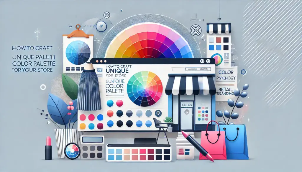
The color wheel is your starting point, breaking down colors into a visual circle where you can see how they relate to one another. Primary colors like red, blue, and yellow form the basis. When combined, they create secondary colors like green, orange, and purple. The mix gets even richer with tertiary colors, offering plenty of shades to play with.
Colors are more than just a pretty face—they stir emotions and reactions. Think about the calming nature of blue or the energizing feel of yellow. Every color tells a story, and that story impacts how customers feel. Is your brand comforting and serene? Blues and greens could be your go-tos. Looking to excite and energize? Bold reds might be your heroes.
Accent colors are the icing on your design cake. They draw the eye to specific areas, giving your customers visual cues on where to focus. Whether it’s an ‘Add to Cart’ button or a special promotion, accent colors can help guide actions seamlessly and intentionally.
In the end, being intentional with color choices not only communicates your brand effectively but can also lead to a more gratifying shopping experience for your customers, making them want to come back and choose your store time and time again.
Steps to Crafting a Unique and Memorable Color Palette
Crafting a standout color palette is less about guessing and more about using the right tools and know-how. There are heaps of resources out there, like digital color palette generators and design platforms, that let you play around with colors until you find that perfect match. These tools allow you to visualize how colors look together before making any commitments.
When creating a color palette, think of it as an adventure of trial and error. Start by picking a primary color—a shade that captures the essence of your brand. Then, build around it by selecting complementary colors and an accent to complete the mix. Testing these choices in various lights and settings helps solidify your selections and ensure they look amazing on different devices and environments.
To really get a sense of what works, you might want to create some mock-ups or samples. See how your choices translate into real-world applications, from packaging to digital platforms. Gathering feedback from your team or even loyal customers can give you insight and fresh ideas you might not have thought of on your own.
Check out some case studies of brands that nailed their color palettes. Seeing what works for them can inspire your journey in crafting something that stands out. Learning from real-world examples can shed light on strategies and elements that you might want to incorporate into your palette.
Creating a color palette tailored to your brand is all about ensuring it speaks in your unique voice across everything you do. It’s not about sticking to the trends but rather building something that will resonate with your customers and make your store unforgettable.
Implementing and Sustaining Your Color Palette Across Your Store
Once you’ve crafted your perfect color palette, the next step is to weave it into every part of your store’s presence, both online and offline. Think of it like knitting a sweater—each color plays its part to create something cohesive and warm for your customers to experience.
For physical stores, pay attention to the details from wall paint to merchandise layout. The goal is for your colors to create a seamless visual journey from the moment a customer spots your storefront to the time they leave with a purchase. In digital spaces, the task is to layer your colors consistently—from your website’s UI to those catchy digital adverts. Every pixel counts!
Creating a style guide is your ticket to maintaining consistency. This guide acts like a compass, ensuring everyone involved with your brand uses the colors correctly. It’s where you document everything about your color choices, from hex codes to usage rules, which can be a lifesaver when onboarding new team members.
Colors aren’t set in stone. Keeping an eye on market trends and staying open to feedback can be invaluable. Colors that resonate today might evolve, or your audience might grow. Being adaptable allows your palette to evolve while still staying true to your core identity. You might want to refresh certain elements of your palette occasionally, ensuring your store continues to feel fresh and engaging.
Incorporating your unique color palette into every facet of your brand helps ensure your store isn’t just a place to buy things—it’s an experience. By maintaining and evolving it mindfully, you’re ensuring your brand remains relevant and captivating in your customers’ eyes.


Thierry’s article on crafting a unique color palette for a store is a fantastic deep dive into the power of color in branding. The breakdown of color theory, emotional triggers, and practical steps for implementation makes this a must-read for any business owner looking to build a strong visual identity. The emphasis on consistency across all brand touchpoints is particularly valuable—colors aren’t just about aesthetics; they create familiarity and trust. I love the analogy of color as a “visual voice”—it really highlights how a well-chosen palette can communicate brand values without a single word. The practical steps, from evaluating brand identity to using digital tools for palette creation, offer actionable guidance that makes the process feel approachable rather than overwhelming. The reminder to adapt and evolve color choices over time is also key. Overall, this article is an insightful, engaging guide for any retailer looking to harness the power of color effectively.
Hey Andrejs,
I really appreciate your thoughtful feedback! I’m so glad the article resonated with you. Color truly is a “visual voice,” and when used intentionally, it can speak volumes about a brand’s identity and values. You’re spot on about consistency—familiarity builds trust, and a cohesive palette helps brands stand out in a crowded space.
I love that you mentioned the importance of evolving over time—staying adaptable keeps things fresh while staying true to the core identity. Thanks again for sharing your insights!
Best,
Thierry
Color psychology in branding is wild—how a simple hue can shift moods and drive action is seriously underrated. Love the focus on consistency too; nothing kills brand identity faster than mismatched colors. Question: How often do you think brands should tweak their palettes to stay fresh without losing recognition? Trends shift fast, but consistency is key!
Hey Genie,
Totally agree—color psychology is such a powerful (and often underestimated) tool in branding! Consistency really does make or break brand recognition, so I’m glad that point resonated with you.
Great question! I usually suggest brands revisit their color palette every few years—subtle tweaks can keep things feeling fresh while maintaining familiarity. It’s all about evolving with your audience and trends without losing that core identity. Balance is key!
Thanks for sharing your thoughts and sparking a great discussion!
Best,
Thierry