
Guest Checkout UX Patterns That Cut Friction and Cart Abandonment
A shopper who wants to buy now isn’t looking for a registration chore. They’re trying to finish a task with...
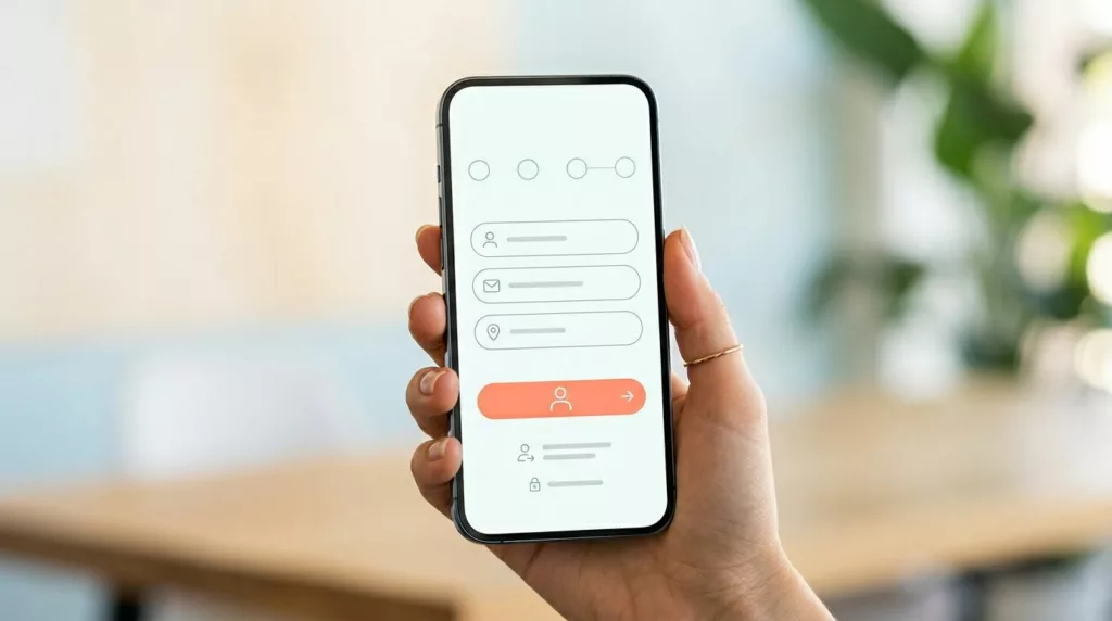
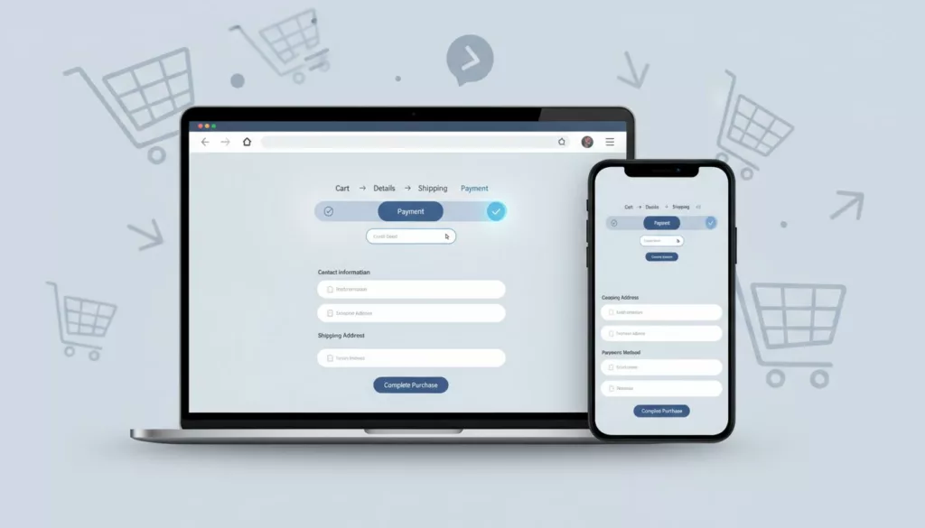
Guest Checkout UX Patterns That Reduce Mobile Checkout Friction
On a phone, checkout fails for small reasons. A hidden guest option, a long form, one bad error message, and...

BOPIS UX That Cuts Pickup Confusion at Every Touchpoint
What turns a convenient pickup order into a support ticket? Usually, it’s not the product. It’s the gap between what...
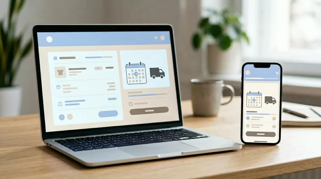
Estimated Delivery Date UX Patterns That Cut Checkout Drop-Off
Why do shoppers quit when they’re already in checkout? Often, the price is fine, the product is right, and the...
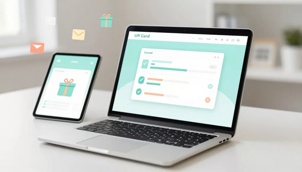
Gift Card Page UX That Increases Purchases and Cuts Confusion
Gift cards should be the easy win in your store. The shopper already wants to buy, they just need to...

Reorder Flow UX in 2026: Repeat Purchases, Subscriptions, and Account Pages That Sell
A first-time purchase is a handshake. A second purchase is trust, and trust is where margins get healthier. In 2026,...
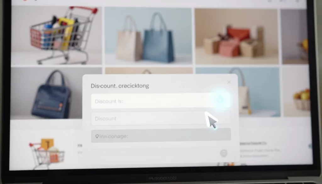
Discount Code Field UX Patterns That Reduce Checkout Abandonment
The discount code box can feel like a trap door on the checkout page. Shoppers spot it, think “Maybe I...

Passwordless Login UX for Ecommerce: Magic Links and OTP
Passwords are like a spare key hidden under the doormat, easy to use, but also easy to misuse. For online...

Checkout Form UX Patterns That Reduce Address Entry Time
Every extra second spent typing an address feels like waiting in a slow line. Shoppers aren’t comparing your checkout to...
Checkout UX Fixes That Reduce Cart Abandonment, 21 practical changes (with examples)
Checkout is your cashier line. A high Cart Abandonment Rate here directly tanks your Ecommerce Conversion Rate. If it feels...