
If your best customers subscribe, why does your pricing page feel like a math test? Brands often seek landing page inspiration to solve this common pain point.
Great pricing page design does one job: it helps a shopper choose quickly and feel good about it later. For DTC and subscription stores, that means more than listing prices, as expectations have shifted to modern pricing plans. You’re selling delivery cadence, flexibility, shipping value, and a promise they won’t regret the subscription plan.
This guide provides design inspiration from industry leaders through three practical systems: clarity first, smart anchoring (without tricks), and plan comparison tables that work on mobile in 2026. Explore this landing page inspiration to elevate your own page.
Clarity that matches how DTC subscriptions actually work
Most pricing pages fail because their UI UX design answers the wrong first question. Shoppers rarely start with “Which plan is cheapest?” They start with “What do I get, how often, and what happens if I need to change it?”
Put the “delivery math” up top
Above the plans, clarify the subscription model in one tight block. Use plain language and concrete defaults. This landing page inspiration keeps things scannable.
Good clarity bullets (keep it to 2 to 4 lines total):
- Delivery cadence: “Ships every 4 weeks (change anytime).”
- Subscription savings: “Save 15% on every recurring order.”
- Shipping threshold: “Free shipping over $45 (applies to subscribers too).”
- Subscription option: “Skip, pause, or swap products in your account.”
That’s it. If you add ten benefits, you add doubt.
Make the unit of value obvious
DTC shoppers think in shipments, not seats. Show price in the way the product is consumed, especially for each subscription plan:
- “$24 per delivery” works better than “$24/mo” when cadence varies.
- For bundles, add quantity cues: “2-pack”, “4-pack”, “8-pack”.
- If you offer “subscribe & save”, make the savings explicit, but keep it honest. Don’t compare against a price no one pays.
A simple pattern that reduces confusion is: Price per shipment plus effective monthly range in smaller text. That helps shoppers who budget monthly without forcing them to calculate.
Do and don’t (quick CRO checks)
- Do show what’s different between plans in the first 5 seconds of scanning.
- Do explain shipping and cancellation near the CTA, not buried in FAQ.
- Do include enterprise pricing and a “contact sales” CTA for wholesale or corporate gifting.
- Don’t hide fees until the checkout page. Shipping surprises kill trust.
- Don’t mix two decision axes at once (for example, cadence and size and perks) unless your table makes it painless.
For broader pricing page design ideas, design inspiration, and pricing page examples, it helps to look at how SaaS pricing page teams structure decision pages, then adapt the principles to shipments and product quantities. See SaaS pricing page best practices with examples for more pricing page examples.
If people need to scroll to learn “Can I cancel?”, you’re paying for churn upfront.
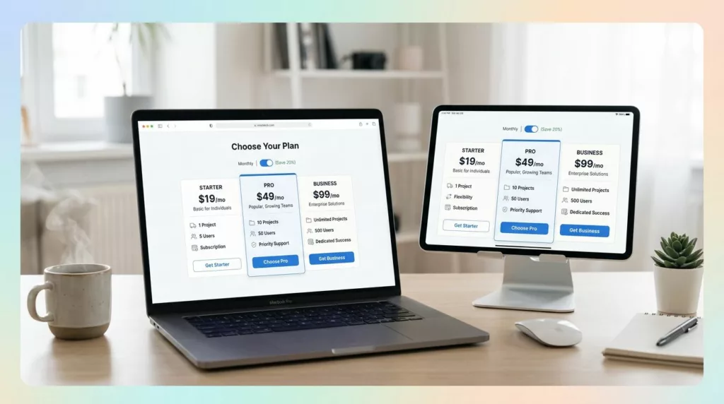
Anchoring and tier strategy (2 vs 3 plans) without sketchy pressure
Anchoring isn’t manipulation. It’s guidance. You’re helping shoppers understand the “normal” choice, while still letting power users choose differently, such as enterprise pricing options via contact sales on your SaaS website.
When to use 2 tiers vs 3 tiers
Two tier cards work when the product is straightforward:
- One main subscription plan, one premium version (extra perks, faster shipping, bigger box).
- Or “Subscribe” vs “One-time” (with subscription option clearly favored, but not forced).
Three tier cards work when shoppers naturally segment:
- Quantity-based (light, medium, heavy users).
- Bundle-based (core product, plus add-ons, plus full routine).
- Service-based perks (priority support, free gifts, early access), with enterprise pricing via contact sales for custom pricing on a SaaS website.
Keep it stable: if you constantly change tier cards week to week, returning visitors lose confidence.
A quick rule: if the “middle” plan doesn’t have a clear audience, you don’t need three tier cards.
Anchoring patterns that feel fair
Highlight a best plan, but earn it with real differences in solid pricing card UI and UI UX design.
What “fair highlight” looks like:
- A subtle “Most popular” badge.
- Slightly stronger border or background.
- One extra benefit that explains why it’s popular (for example, “Free shipping included” or “Best value for 2+ deliveries”).
- Testimonials from real users to build trust.
What to avoid (dark-pattern energy):
- Pre-selecting the most expensive plan without explanation.
- Hiding the cheapest plan behind a toggle or “contact sales”.
- Using fake scarcity like “12 people bought this plan today” on a pricing page.
If you want a deeper run-through of pricing-page cues like hierarchy, toggles, and reassurance blocks, this breakdown of pricing table best practices covers the UI mechanics well and offers landing page inspiration.
Microcopy that reduces churn fears (and lifts conversion)
People hesitate because they picture being trapped. Your tier cards should answer that fear in one line.
Use short, concrete microcopy under each CTA:
- “Cancel anytime, no fees.”
- “Skip a shipment in two taps.”
- “Change delivery every order.”
- “Pause for up to 3 months.”
Also, match the microcopy to DTC realities:
- If shipping thresholds differ by plan, say so plainly.
- If gifts require a minimum, name it right there.
- If the discount applies only to recurring orders, don’t blur it.
A clean subscribe framing that works across categories is:
- “Subscribe (save 15%)” vs “One-time (full price)” Because it tells the truth without shaming the one-time buyer.
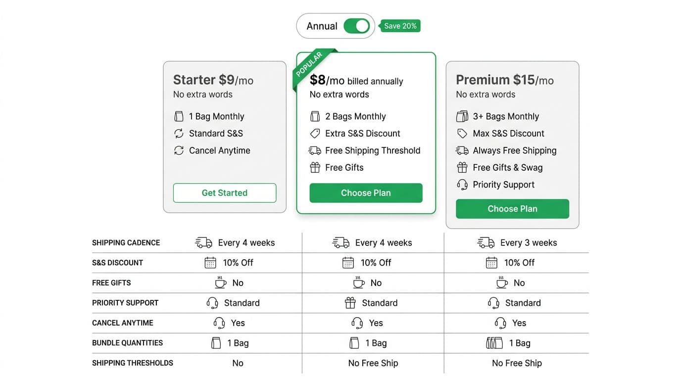
Plan comparison tables that drive decisions on mobile (plus what to measure)
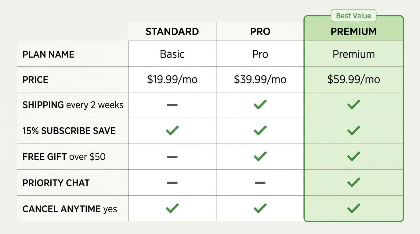
Tier feature tables with feature checkmarks work when they reduce scanning effort, avoiding content heavy pricing pitfalls. They fail when they read like internal documentation.
Recommended row order (DTC subscription edition)
Set context with the rows shoppers care about first, then the perks. For products requiring quantity estimation, add a usage-based calculator early.
| Row order | Row label | What it answers in plain language |
|---|---|---|
| 1 | Price per delivery | “What will I pay when it ships?” |
| 2 | Delivery cadence options | “Can I do every 2, 4, or 6 weeks?” |
| 3 | Subscription discount | “How much do I save, and on what?” |
| 4 | Shipping and thresholds | “Do I get free shipping?” |
| 5 | Flexibility (skip, pause, swap) | “Am I stuck with this?” |
| 6 | Bundle size or quantity | “How much product arrives?” |
| 7 | Free gifts or add-ons | “Any bonus value?” |
| 8 | Support or VIP perks | “What do I get if something goes wrong?” |
One strong takeaway: put “cancel/pause/skip” above “priority support”. Churn anxiety is the first barrier. This applies to DTC and SaaS pricing pages alike.
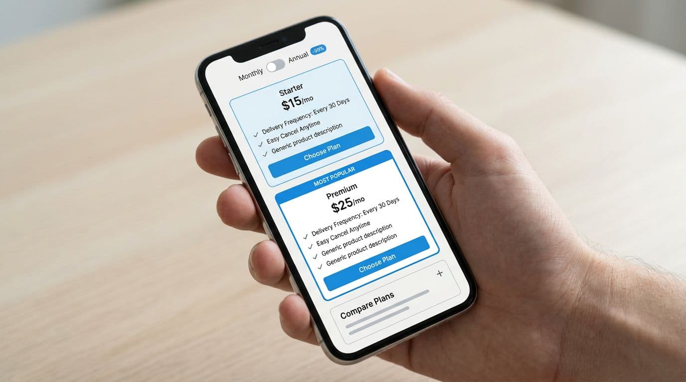
Make tables mobile-native in 2026
Most pricing traffic is mobile, so a desktop-only grid won’t cut it. Ensure cross-platform consistency, including mobile app pricing. Use one of these patterns for your comparison table:
- Stacked cards + “Compare plans” accordion (best for 3 tiers; great landing page inspiration).
- Sticky plan headers with horizontal scroll for columns (best for 2 tiers).
- Row-by-row expanders so shoppers can scan, then open details. Incorporate UI UX design principles here.
Keep the labels short. Replace paragraphs with tooltips only when needed. Leverage web design components and Tailwind CSS templates to build mobile-first tables efficiently.
For more table layout ideas and common pitfalls, this 2026 guide to pricing comparison tables offers landing page inspiration, design inspiration, pricing page examples, and adaptations for usage-based pricing or enterprise pricing with contact sales buttons. Also include a FAQs section at the bottom, and another for contact sales queries in enterprise tiers. Tailwind CSS templates speed up these web design components.
What to measure (so you don’t “optimize” into churn)
Don’t judge a pricing page by conversion alone. Track three layers, plus specifics for usage-based pricing models:
- CTR to checkout from pricing: Are people moving forward, or bouncing after confusion?
- Plan mix: Did your “best plan” highlight shift selection toward a healthier AOV and margin?
- Early churn and retention: Watch week-2 and month-2 churn by plan. A plan that converts but churns fast is a slow leak.
Testing in 2026 also needs to be privacy-safe. Favor first-party events, aggregated reporting, and longer test windows when traffic is split across devices. If you can’t measure cleanly, keep changes smaller and focus on clarity. Always end with FAQs to address objections.
A pricing page that “wins” conversion but increases month-1 churn is not a win.
Conclusion
Your pricing page is a decision guide, not a billboard. When pricing page design centers on cadence, flexibility, and honest comparisons, shoppers choose faster and stay longer. A smart pricing strategy enhances this with clear UI UX design principles. Start by making delivery and change policies obvious, then use anchoring to guide, not corner. Finally, treat your comparison table like a mobile tool, measure plan mix and retention, not just clicks, and draw landing page inspiration from top SaaS pricing page examples. These pricing page examples offer design inspiration for everything from starter tiers to enterprise pricing with prominent “contact sales” options, providing fresh landing page inspiration to elevate your results.