
Refund requests in ecommerce returns don’t start at the warehouse. They start when a customer feels stuck, unsure, or suspicious. Your returns page ux is the moment you can turn “I want my money back” into “I’ll swap it, keep it, or take credit.”
The goal isn’t to trap people. It’s to remove uncertainty, present fair options, and guide decisions with clear tradeoffs. Done right, you’ll reduce refunds, lower support tickets, and keep customer loyalty and brand trust high across Shopify, Magento, or custom builds.
Make the returns page feel obvious, not like a scavenger hunt

If customers can’t find self-service returns info fast, they’ll email support or file a chargeback. So first, make entry points predictable: footer “Returns & Exchanges,” order confirmation emails, and account order history. Then keep the page itself calm and structured, like a good concierge who answers the top questions before asking for paperwork.
Start with a short “return policy” snapshot above the form, using plain language and scannable rows:
- Window: “Returns accepted within 30 days of delivery.”
- Condition: “Unworn, tags attached, original packaging.”
- Cost: “Free exchanges, $6.95 return label fee deducted from refunds, handled with return label automation.”
- Timing: “Refunds issued 3 to 5 business days after inspection.”
Next, reduce dead ends with an eligibility check before the full return process. Two fields are usually enough: order number and shipping ZIP (or email). Add real-time feedback like “Order found” and “This order is outside the return window.” That one line prevents a long, angry form submission.
Microcopy matters because it signals fairness:
- “You can still choose a refund at the end.”
- “We’ll show the fastest option based on your reason.”
- “Need help? Chat is available Mon to Fri.”
Also, keep policy detail available without dumping it all upfront. Use progressive disclosure: short summaries with “See details” accordions for exceptions (final sale, bundles, gifts). For broader operational guidance, compare your approach to established shopify returns handling best practices, then adapt the wording to your brand voice.
If the first screen feels like fine print, customers assume the process will be painful. Keep it human, then get precise.
Use an exchange-first flow that feels like help, not pressure
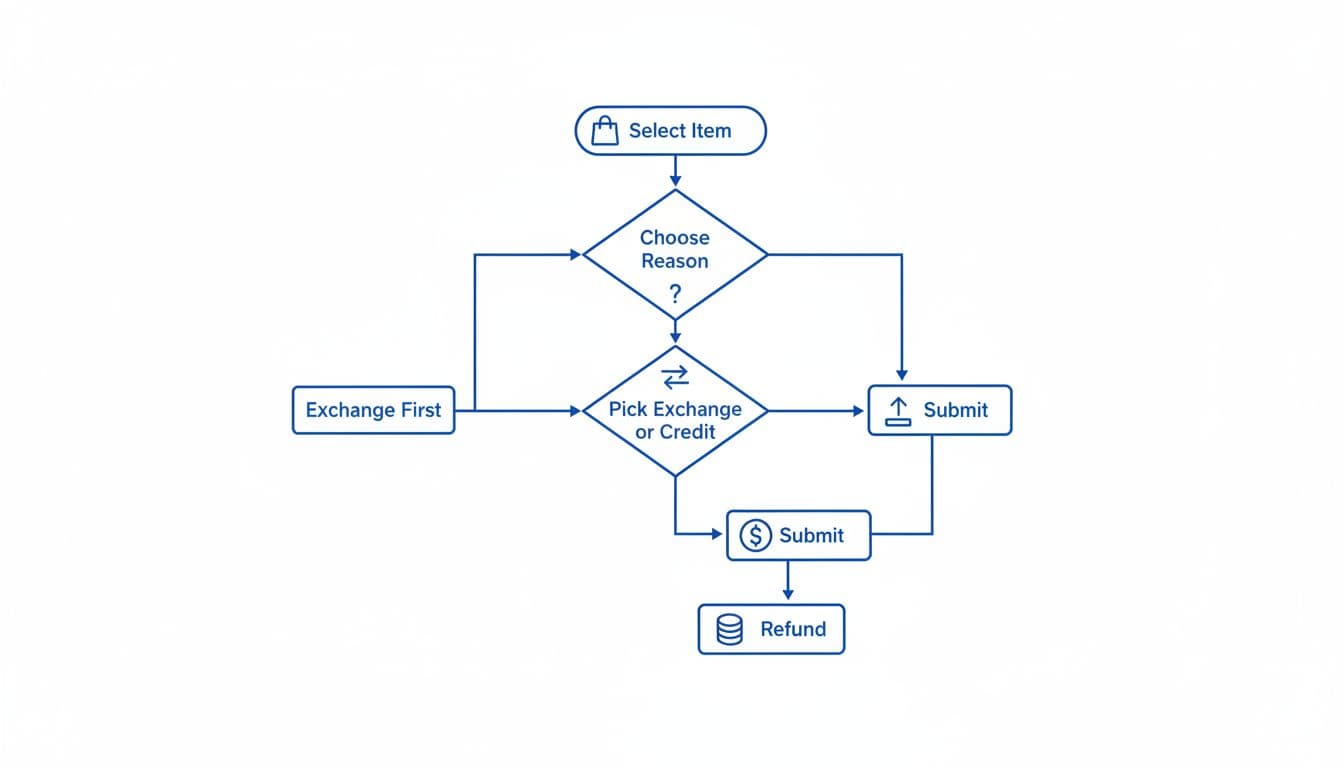
“Exchange-first” doesn’t mean “refund-hidden.” It means you lead with the option that solves the customer’s problem fastest. Most refunds happen because the buyer wants a working item, the right size, or confidence it’ll arrive on time. Your returns page ux should enhance the return experience and customer journey by matching those intents with clear outcomes.
A simple, trustworthy order works well:
- Instant exchanges (size, color, replacement)
- Store credit (instant, sometimes with a bonus)
- Reship / replacement (damage, missing items)
- Repair (durables, electronics, premium goods)
- Refund (always available when eligible)
Show only what applies, based on the return reasons and inventory allocation. If the item is out of stock, don’t tease an exchange. If the order looks like fraud or a high-risk claim, route to review without accusing the customer.
Here’s a quick way to frame the options so they don’t feel manipulative:
| Option shown | Best for | UX cue that reduces refunds |
|---|---|---|
| Exchange | Wrong size, prefer another color | “Arrives faster than a refund” |
| Store credit | Gift returns, unsure what to pick | “Instant credit, keep shopping today” |
| Reship / replacement | Damaged, missing parts | “We’ll replace it, no need to reorder” |
| Repair | Premium items, minor defects | “Fixing is fastest and reduces waste” |
| Refund | When nothing else fits | “Refund process to original payment method” |
Notice the language. Each option states a benefit, not a threat.
For deeper strategy context, it helps to review current thinking on return outcomes and controls like ecommerce return optimization and apply what fits your policies and risk model.
The fastest path often wins. If exchange or replacement is quicker, many customers will pick it willingly.
Nail the form details: fewer errors, fewer refunds, fewer tickets

Once customers start the return, every extra step is a chance to abandon the exchange and demand a refund via customer support. Tight user interface details in the self-service portal prevent that.
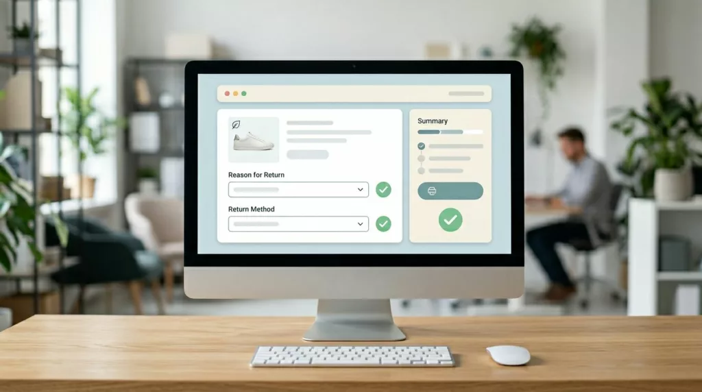
Keep inputs minimal and forgiving. Use one item per row with a clear thumbnail, size, and SKU. Then add quantity selectors only when multiple are purchased. For “reason,” offer 6 to 10 choices max, with a short optional note. If you need more detail, ask a follow-up question based on the selected reason (conditional logic), not a big text box.
Leverage your returns data and product descriptions to identify why items are coming back, then craft targeted field guidance that reduces back-and-forth:
- Damage claims: ask for 1 to 3 photos with a hint like “Include the shipping box and the damaged area.” Explain storage and retention briefly.
- Sizing issues: add a quick sizing and fit prompt such as “Too small / too big / fit is off in shoulders,” with details on product sizing. Then offer an exchange suggestion if in stock.
- Late delivery: show carrier scan data if you have it, then offer reship or credit before refund.
Microcopy you can steal and adapt:
- “Choose what you’d like instead. We’ll reserve it for 20 minutes.”
- “Want store credit? You’ll get it instantly after submission.”
- “Refunds return to your bank in 5 to 10 business days after approval.”
The confirmation screen is where many brands miss an easy win in the return process. Summarize the decision in plain language, show the next step, and set expectations:
- Outcome selected (exchange, credit, refund)
- Shipping label status with shipping updates (download now, emailed, QR code)
- Timeline (inspection, credit timing, replacement ship date)
- Return status link with tracking information (“Track your return”)
Finally, cover trust basics. Make terms clear at the decision point (label fee, restocking, final sale). Keep the flow accessible with proper labels, focus states, and keyboard navigation, aligned with UX patterns that reduce returns. For privacy, collect only what you need, explain why you need it, and avoid storing photos longer than necessary.
Conclusion
A strong returns page ux doesn’t “reduce refunds” by adding friction. It reduces refunds by giving customers the quickest fair outcome, with clear terms and predictable steps. Start with findable entry points and a policy snapshot, then guide people through exchange-first decisions, and finish with a form that prevents mistakes. If your returns page feels calm and honest, customers often choose options that keep revenue in the business through better product returns management while still feeling respected. Over time, a well-designed returns page ux can lower return rates.