

A quick view modal should feel like a tasting spoon, not a full meal. It lets shoppers sample key details, compare options, and keep scanning without losing their place in a grid.
When it works, it reduces pogo-sticking to the PDP (product detail page), speeds up evaluation, and encourages exploration. When it’s messy, it becomes a cramped mini-PDP that slows the page and adds decision stress.
Below are practical quick view modal UX patterns you can ship in a design system, plus edge-case handling, accessibility requirements, and the analytics that prove whether it’s helping.
When quick view helps product discovery (and when it doesn’t)
Quick view shines when shoppers browse visually and need lightweight confirmation before committing to a PDP click. Apparel, home decor, beauty, and accessories often fit this mode. In those categories, the main job is quick: “Is this roughly my style, price range, and size?”
Baymard’s research explains why quick views can work well for visually driven catalogs, especially when the UI keeps people oriented in the list they were scanning (see Baymard’s guidance on mobile and desktop quick views).
However, quick view can backfire for spec-driven products. If buyers must compare detailed specs, compatibility, or technical constraints, a modal often hides the very content they need. In those cases, quick view should either be limited (image, price, availability, short highlights) or skipped entirely in favor of a strong PDP entry point (see Baymard’s caution on spec-driven quick views).
A quick view modal earns its keep when it answers “should I look closer?” in under 10 seconds. If it tries to answer “should I buy?” for every product type, it tends to lose.
A simple product-type rule helps teams avoid endless debates:
- Visual-first goods: Quick view can support add-to-cart (with guardrails).
- Spec-first goods: Quick view should push “View details” earlier, with strong info scent (compatibility, key specs, fit notes) and fewer controls.
If you’re aligning stakeholders on why this matters to revenue, tie it back to fewer friction points across the funnel, as outlined in UX design impact on conversions.
Essential anatomy of a high-performing quick view modal
A reliable quick view modal has consistent anatomy across categories. That consistency is what lets shoppers move fast, because they don’t have to re-learn the layout every time.
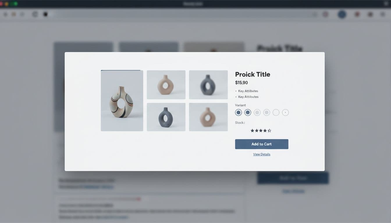
Recommended modal structure (what to include by default)
Use this as a build checklist for your component:
- Header: product title (clamped), close button, and optional “Back to results” label for context.
- Media: 1 to 4 images, plus video only if it loads fast and starts muted. Support swipe and arrow keys.
- Price and promos: current price, compare-at price, promo badge, and any membership pricing if applicable.
- Key attributes: 3 to 6 scannable bullets (material, fit, dimensions, top benefit), not a paragraph.
- Availability: in-stock, low stock, backorder date, pickup options if relevant.
- Variant selectors: color, size, pack size, with clear disabled states and error messaging.
- Ratings and review count: a trust shortcut that reduces “open PDP just to verify.”
- Primary CTA: “Add to cart” when all required options are selected.
- Secondary CTAs: “View details” (PDP), “Save” (wishlist), and optionally “Compare” if your site supports it.
For CTA behavior details on small screens, keep it consistent with your PDP approach, including thumb reach and confirmation states (see sticky mobile add-to-cart buttons).
Copy that prevents misclicks
Labeling matters more in a modal because it’s a fork in the road:
- Prefer “View details” over “Learn more.” It signals a real page with full specs, shipping, and returns.
- Keep “Add to cart” literal. Avoid cute labels that slow scanning.
- If a selection is required, make the CTA say “Select size” (or “Choose options”) instead of showing an error after a click.
UX patterns that reduce pogo-sticking and encourage exploration
Good quick view UX protects browsing momentum. That means fewer dead ends and fewer “open PDP, hit back, lose my scroll” loops.
Pattern 1: Keep the grid context intact
On open, preserve scroll position and don’t refresh the underlying list. On close, return focus to the triggering product card. This is small, but it’s the difference between “browse” and “reset.”
Also consider next/previous navigation inside the modal (especially on desktop). It supports exploration without constant open-close cycles.
Pattern 2: Progressive disclosure, not content dumping
A modal should show the minimum that supports a decision, then offer escape hatches:
- Show shipping and returns as a one-line summary near price or CTA (for example, “Free returns in 30 days,” “Arrives Tue to Thu”).
- Link deeper policy content from “View details,” not inline walls of text.
If your PDP uses a well-structured FAQ to remove doubt, your modal’s job is to tease that safely, then route the shopper to the PDP (see product page FAQ UX tips).
Pattern 3: “Save” as a first-class action for discovery
Discovery doesn’t always mean immediate purchase. A strong “Save” or wishlist CTA supports exploration without pressure, especially when shoppers browse for gifts or compare styles across tabs.
Place “Save” near the primary CTA, but keep it visually secondary. Then, make saved items useful later with variants and stock awareness, as described in wishlist UX patterns boosting AOV.
Pattern 4: Fast feedback, zero surprises
When someone taps “Add to cart,” confirm immediately (loading, then success). Don’t close the modal automatically unless testing proves it helps. Many shoppers want to add multiple items from the grid.
A practical default:
- Success toast inside modal plus a secondary “View cart” link
- Keep “View details” available for those who want more proof
Edge cases, accessibility, and measurement (so it holds up in production)
Quick view breaks when real catalog complexity shows up. Plan for it up front.
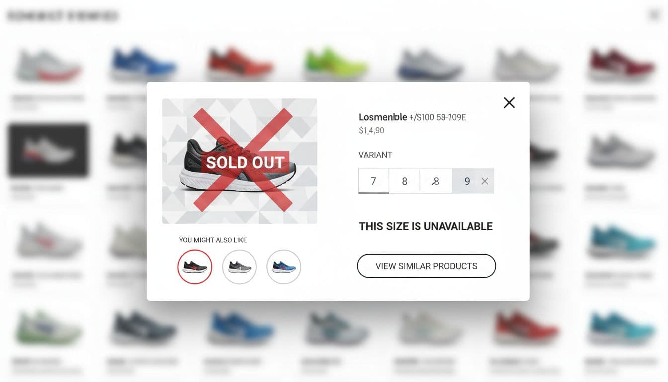
Edge-case handling that avoids dead ends
One sentence before this table: use these defaults to keep shoppers moving even when the ideal path fails.
| Scenario | Do | Don’t |
|---|---|---|
| Out of stock | Show “Out of stock,” offer “Notify me” or “View similar,” keep “View details” | Hide the CTA with no next step |
| Many variants | Add “Popular sizes” ordering, show disabled options, keep selection state visible | Use long dropdowns that reset after each change |
| Size guide needed | Provide a size guide link that opens a nested panel (not a new tab) | Force a full PDP visit for basic sizing |
| Subscription option | Default to one-time purchase, let users switch | Start on subscription with unclear terms |
| Bundles or kits | Show what’s included in 3 to 5 bullets | Hide bundle contents behind tiny tooltips |
| Long titles | Clamp to 2 lines and keep full title in accessible name | Let titles push price and CTA below the fold |
| Returns and shipping compliance | Summarize near CTA, link full policy on PDP | Bury policies, then surprise users later |
Accessibility requirements for a quick view modal
Treat accessibility as part of the component contract:
- Use proper dialog semantics (ARIA
dialogoralertdialogas appropriate), witharia-labelledbytied to the product title. - Implement a focus trap inside the modal, restore focus to the trigger on close.
- Support Escape to close, plus a visible close button with a clear accessible name.
- Lock background scroll while open, but don’t break iOS scroll behavior.
- Respect reduced motion preferences, avoid large zoom animations on open/close.
- Announce errors and add-to-cart success via an
aria-liveregion.
If a keyboard user can’t open quick view, select a size, and close it without getting lost, the feature isn’t done.
Instrumentation events and KPIs that show discovery lift
Track quick view as a browsing tool, not just a conversion shortcut. This table is a solid baseline:
| Event or KPI | What it answers | Why it matters |
|---|---|---|
| Modal open rate | Are shoppers using quick view from the grid? | Validates placement and affordance |
| Time in modal | Do people scan or stall? | Flags clutter and slow loading |
| Variant selection rate | Can users configure without friction? | Predicts add-to-cart potential |
| Add-to-cart from modal | Does quick view support purchase? | Measures direct value |
| PDP click-through from modal | Does it drive deeper evaluation? | Measures discovery flow |
| Downstream conversion | Do modal users purchase later in session? | Avoids optimizing for shallow metrics |
| Modal latency | How fast does content appear? | Slow modals kill trust and usage |
For performance, monitor Core Web Vitals impacts (CLS shifts, interaction delays) and API timings for price, inventory, and media.
Conclusion
A quick view modal is a browsing multiplier when it stays focused: quick media, clear price and availability, tight attributes, and honest escape hatches to the PDP. Design it for real catalog mess (variants, stock, policies), ship it with accessibility as a requirement, and instrument it like a first-class funnel step. The best sign you got it right is simple: shoppers keep exploring, and they don’t lose their place.