

Most shoppers can spot a random upsell in seconds. When a product recommendation widget ignores the page, the price, or the shopper’s choice, it feels like shelf noise.
That same widget can raise average order value when it behaves like a good store associate. It should feel helpful, not pushy, and the reason behind each suggestion should be easy to see.
Relevance starts with shopping context, not guesswork
Random recommendations usually come from weak logic. A site shows the same “best sellers” everywhere, or it chases clicks without reading the moment. As a result, trust drops fast.
A better widget starts with page intent. On a product page, lead with complements before substitutes. In the cart, show low-friction add-ons. After purchase, show replenishment or routine builders. Context changes the job.
Just as important, the logic should be explainable in plain language. “Complete the look” says more than “You may also like.” “Works with your device” beats a vague carousel title every time.
If the label doesn’t explain why the items are there, the widget feels random.
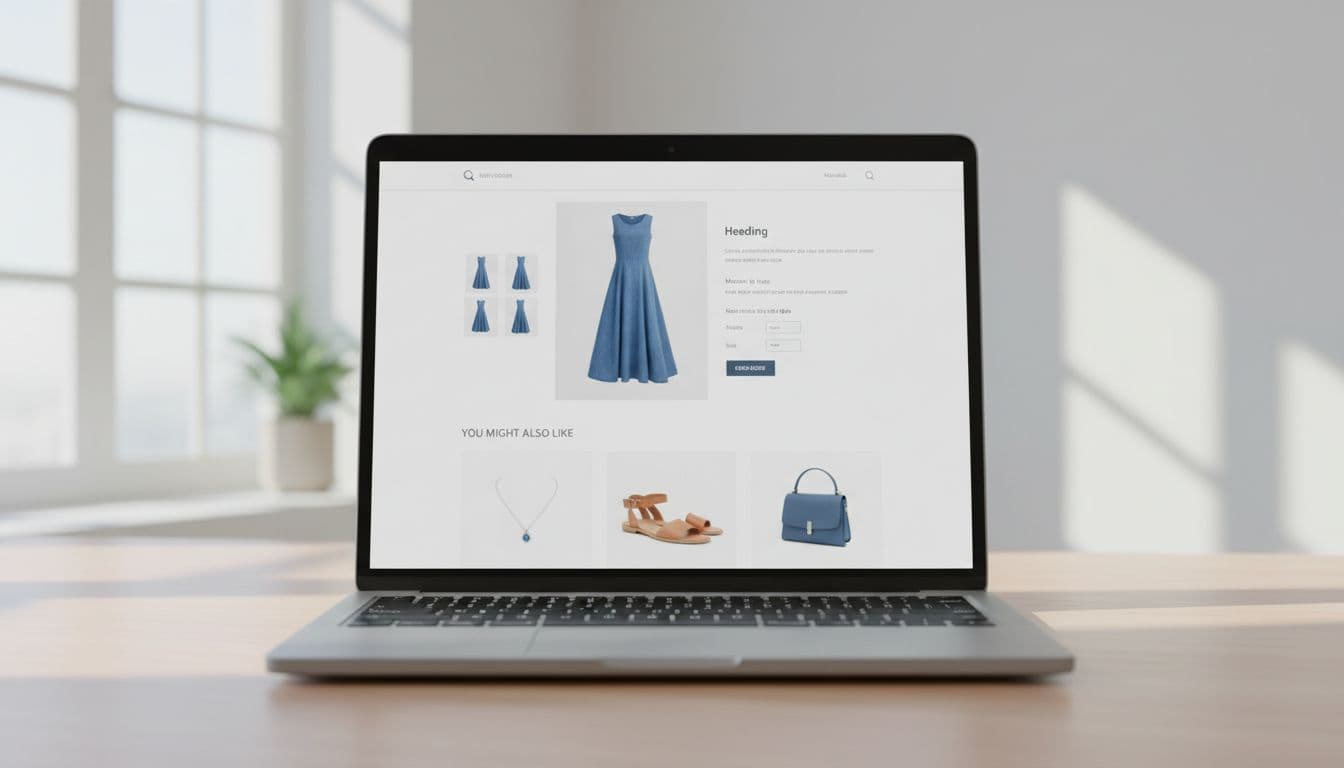
The pattern holds across categories. On an apparel PDP for a blue dress, matching heels, a belt, or a cardigan make sense because they complete an outfit. In beauty, a vitamin C serum can lead naturally to SPF, a gentle cleanser, or a moisturizer for the same skin concern.
Electronics need even tighter logic. A laptop should surface a sleeve, a hub, or a charger with the right wattage. Home goods work the same way. A sofa can recommend a side table with a similar finish or a lamp sized for the same room style. A random rug with no fit cue feels like merch pressure.
Shoppers also read context from their own selections. If someone picks a queen-size duvet or a dark walnut desk, the widget should react. That’s why selected variants, stock state, and compatibility rules matter more than broad “personalization” claims.
Placement and design cues make recommendations feel helpful
Where you place the widget changes how it feels. On a PDP, it often works best below the buy box or below the first content block, where the shopper has enough context but hasn’t left the decision flow. In the cart, it should sit after the line items, not compete with checkout.
Visual hierarchy matters, too. The main product should stay dominant. Recommendation cards should look secondary, with fewer choices, smaller card weight, and one clear action. Three or four items usually beat a long slider because they reduce scan cost.
Labeling does more work than many teams expect. For apparel, “Complete the look” signals styling help. For beauty, “Build your routine” frames the add-ons as a sequence. For electronics, “Works with your setup” lowers risk. For home goods, “Pairs with this room style” gives the shopper a design reason.
Price anchoring helps when it feels fair. A $120 dress can support a $24 belt or $36 earrings. A $300 blender can support a lower-cost accessory or a better warranty, not another expensive appliance. Beauty often wins with small add-ons under a mental impulse threshold. Meanwhile, home goods can mix one higher-ticket companion with a low-cost finishing piece.
This quick table shows how label choice shapes trust:
| Category | Better widget label | Trust cue to show |
|---|---|---|
| Apparel | Complete the look | Same color family or style |
| Beauty | Build your routine | Same concern or skin type |
| Electronics | Works with your device | Fit, port, or power match |
| Home goods | Pairs with this room | Size, material, or finish match |
Social proof closes the loop. A star rating, a review count, or a short proof point can help, especially when it reflects the use case. For stronger trust signals, borrow from these product review UX best practices. Also, if size, color, or finish changes the right add-on, align the widget with your mobile product variant UX tips.
Measure AOV lift without hurting conversion rate
AOV alone can lie. If the widget raises basket size but lowers conversion, you may lose revenue overall. That’s why the best scorecard starts with revenue per visitor, then reads AOV as part of the story.
Use a real test, not a before-and-after hunch. Hold logic and placement steady in the control, then change one variable at a time. If you test label, position, card count, and ranking together, you won’t know what worked.

The core metrics are simple. Track widget click-through rate, attach rate, AOV, revenue per visitor, and order conversion rate. Then add guardrails: cart abandonment, checkout completion, return rate, and page speed. That last one matters because a slow widget can erase its own gain.
A short scorecard keeps teams honest:
| Metric | What it tells you | Guardrail beside it |
|---|---|---|
| AOV | Basket growth | Order conversion rate |
| Attach rate | Recommendation relevance | Return rate |
| Revenue per visitor | Net store impact | Checkout completion |
Segment results by device, traffic source, and shopper type. New visitors often need simpler, safer suggestions. Returning shoppers may respond better to higher-fit add-ons. Also, watch category-specific fallout. Beauty can spike shade-mismatch returns. Electronics can create compatibility pain. Home goods can increase regret if size cues are weak.
Finally, don’t over-credit the widget. An order that includes a recommended item isn’t proof the widget caused it. Compare exposed users against an eligible holdout group when you can. Then tie the results back to broader ecommerce optimisation tips for 2026, because recommendation UX works best when the rest of the shopping flow is already clean.
Shoppers don’t want magic. They want a recommendation they can understand at a glance.
When a product recommendation widget is context-aware, clearly labeled, and easy to trust, it can raise AOV without adding doubt. Audit one widget this week, and ask a blunt question: can a shopper tell why these items appeared?