
A badge can save a click or sabotage a product card. When every item says New, Sale, Trending, Limited, and Best Seller at once, shoppers stop trusting all of it.
Strong product badge ux does one thing well. It helps people judge value faster, without covering the photo, price, rating, or add-to-cart path. The trick is to treat badges like shelf signs in a good store, small, useful, and rare.
Build product badge UX around a clear hierarchy
Badges steal attention, so each one needs a job. Start by ranking badges by decision value, not by stakeholder enthusiasm. A “20% Off” label often answers a real buying question. A vague “Hot” label usually doesn’t.
This quick matrix keeps badge choices honest:
| Badge type | Helps the shopper decide? | Best use |
|---|---|---|
| Discount or price-based | High | When savings are real and current |
| Trust badge | High | Verified reviews, free returns, warranty |
| Stock or urgency badge | Medium | Only with accurate inventory rules |
| Novelty badge | Low to medium | New arrivals, but only for a short window |
The takeaway is simple: pick one primary badge per card, and make every extra badge earn its space.
If a badge doesn’t reduce doubt or improve comparison, it doesn’t deserve a slot.
Then tie the hierarchy to business goals. High-margin items may deserve a discount badge. High-return items may benefit more from “Free Returns” or “True to Size” cues. If you use “Top Rated” or “Verified” labels, they should align with your product review patterns for trust. Don’t pair them with a bare star score and call it proof.
Good teams also define badge expiry rules. “New” shouldn’t stay on a product for six months. “Low stock” shouldn’t appear at 40 units. Specific rules keep the UI credible.
Prevent label overload by designing the whole card
A badge never lives alone. It competes with the image crop, price, rating, swatches, and CTA. That means badge design is really layout design.
On listing pages, the product image usually wins first attention. Place badges in a predictable corner. Keep them small enough that the item still reads at a glance. This badge size and placement research shows how fast mobile grids break when labels overlap titles or photos.

Avoid repeating the same message in multiple places. If the price block already shows a markdown, don’t also add a loud “Sale” sticker unless the badge adds new meaning. If reviews already show a strong rating and count, a “Top Rated” badge may be redundant.
A few rules work across most catalogs. Use one badge shape system. Limit semantic colors. Keep copy to one to three words. Reserve bright colors for urgent states, not for everything. If a badge isn’t clickable, don’t style it like a chip.
Implementation matters too. Teams can add labels quickly, especially with platform tutorials. Even a product labels on Shopify guide makes setup look simple. The harder job is deciding which labels deserve to stay.
Where badges belong on listings and product pages
Product listing pages are for scan speed. Product detail pages are for proof. Your badge strategy should change with that context.
On a listing page, one badge is often enough. Good candidates are “Best Seller,” “Free Shipping,” or a discount flag. Each helps the shopper sort options fast. Keep placement stable across the grid, because shifting labels make cards look misaligned and noisy.
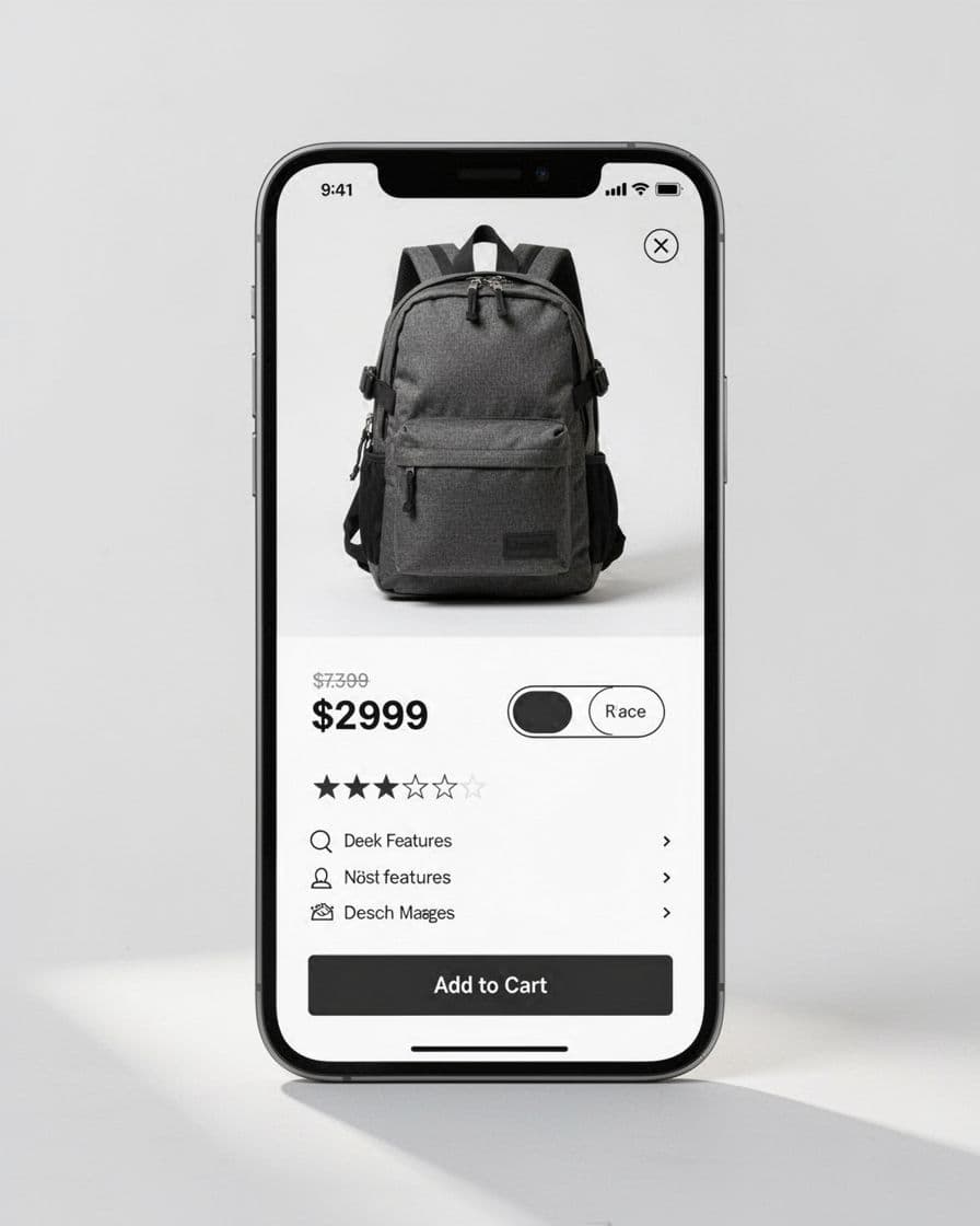
On a product page, you have more room, but not unlimited room. Place badges near the purchase block where they support the decision. “Free Returns” belongs near price or delivery info. “Limited Stock” belongs close to quantity or variant selection. If your offer depends on order value, keep it consistent with your free shipping threshold UX. Otherwise, the label may promise more than the cart can prove.
Keep badges from crowding stronger signals. Pricing, ratings, and the CTA usually matter more than decorative labels. A useful rule is proximity by meaning. Savings badges sit near price. Trust badges sit near reviews, returns, or shipping. Stock badges sit near selection controls. That structure keeps the page organized instead of sprayed with stickers.
Mobile badge UX needs stricter limits
Mobile is where weak badge decisions show up fast. Space is tight, thumbs block content, and overlays can hide the exact thing people came to inspect.
Use shorter copy on mobile than desktop. “Low stock” beats “Only a few left in inventory.” Also, reduce persistent badges to the minimum. One on a product card is usually enough. Two on a product page can work if one is price-related and the other is trust-related.
Placement matters even more on small screens. Don’t cover the top of the image if shoppers need to inspect color, texture, or fit. Don’t let badges push the title below the fold. And don’t turn every inventory message into an overlay. On mobile PDPs, stock states often work better beside size or color controls. That pairs well with clear low stock size labels.
One last detail gets missed a lot: accessibility. Badge contrast must hold up in sunlight. Screen readers need useful labels. If a badge changes after a variant pick, the update should be noticeable without causing layout jumps.
When every product shouts, value disappears. Better product badge ux makes the few labels you keep feel more credible, because each one supports a real choice.
Run one template audit this week. Remove the weakest badge from your cards, PDP, and mobile view, then watch whether clarity improves clicks, add-to-cart rate, and purchase quality.