Passwords are like a spare key hidden under the doormat, easy to use, but also easy to misuse. For online stores, that pain shows up as password resets, abandoned checkouts, account takeovers, and data breaches, issues that passwordless systems help prevent.
A good passwordless login UX fixes the friction in the shopper’s user experience without opening new security holes. Magic links and one-time passcodes (OTP) can feel effortless for shoppers, but only if the UX handles edge cases, phishing, and delivery failures with care.
This playbook focuses on magic links and one-time passwords in registration and login flows, what to ship, what to measure, and what to say in the UI so they protect against account takeover while supporting conversion instead of slowing it down.
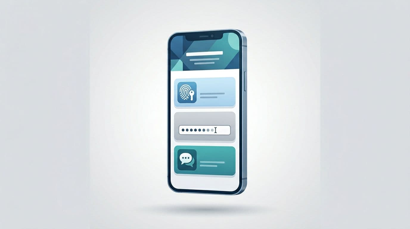
Pick the right passwordless authentication methods for the moment
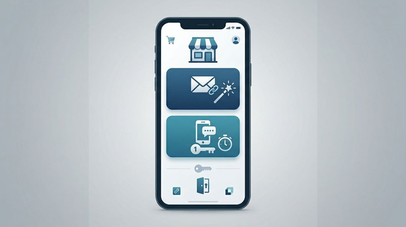
Magic links and one-time passwords (OTPs) solve the same job for passwordless accounts, the modern standard. They prove the shopper controls an email or phone number. The best stores treat them as complementary, not competing.
Use this table as a product decision tool:
| Decision factor | Magic link (email) | OTP (email or SMS) | Passkeys |
|---|---|---|---|
| Best for | Desktop shoppers, returning customers who live in email | Mobile shoppers, fast entry, limited email access | Biometric-enabled devices, high-security needs |
| Main UX risk | Link opens on the wrong device, link expires | Code entry friction, resend loops | FIDO2 or WebAuthn support required |
| Main security risk | Link forwarding, phishing lookalikes | SIM swap (SMS), brute-force attempts | Device theft without recovery |
| Typical mitigation | “Only works on this device” binding, short expiry | Rate limits, attempt limits, device signals | Multi-device sync, backup codes |
A practical default:
- Offer Email magic link and mobile-first SMS OTP at sign-in and in checkout.
- Remember the last successful method per device, but don’t hide the other option.
If you need a quick technical overview of how magic links and OTP differ at a systems level, this comparison is a solid reference: magic links vs passkeys vs OTP.
Also, consider placement. In checkout, login is a means, not the goal. If you want an example of how passwordless can fit into a checkout login moment, see passwordless login at checkout patterns.
Magic links that don’t confuse shoppers (or get ignored)
Magic links feel simple because the user does one thing: tap. They improve the user experience by removing friction, but the UX breaks when the tap happens on a different device, the email lands late, or the shopper can’t find it.
Start by designing the “waiting” screen as a first-class page, not a spinner.
Recommended UI and microcopy (drop-in examples):
- Primary message: “Check your email for a sign-in link.”
- Helper line: “It may take a minute. Check spam or promotions.”
- Secondary actions: “Resend email” and “Use a code instead”
- Privacy note: “We’ll only use your email to sign you in.”
Then, handle the two states that cause the most support tickets:
1) Link opened on a different device
- Show a clear explanation: “This link was requested on a different device.” This UI cue helps mitigate phishing risks.
- Offer a safe path: “Send a new link to this device” or “Use a code instead”
- Avoid blamey copy like “Invalid link.”
2) Expired link
- Say what happened and what to do next: “That link expired. Send a new one?”
- Don’t auto-send on page load. Ask first; it reduces email spam complaints.
One more detail that matters: confirm success inside the store, not just in email. After login, show a lightweight confirmation state (“You’re signed in”) and return shoppers to where they left off (cart, checkout, or account page).
For implementation-oriented teams, this doc outlines common mechanics behind both approaches: email magic links and OTP basics.
Gotcha: Treat magic links like short-lived session keys in session management. If a link can be forwarded, it can be stolen.
One-time passwords entry UX that’s fast, accessible, and hard to abuse
One-time passwords can be the quickest path on mobile, but only if you remove “tiny hurdles” that add up. Think of one-time passwords like a door with six locks. If each lock is fiddly, people quit. This entry process is a critical part of the onboarding experience for new customers.
Core UX requirements to lower the interaction cost for the shopper:
- Auto-advance inputs (or use a single field that displays six slots).
- Support paste and OS auto-fill where possible.
- Show resend as a timer, not a dead button (“Resend in 25s”).
- Always offer “Change email/phone” right under the code fields.
- Keep the shopper’s context (don’t dump them on an account homepage after verification).
Microcopy that reduces panic:
- Code sent: “We sent a 6-digit code to +1 (555) 123-4567.”
- Wrong code: “That code didn’t work. Try again.”
- Too many tries: “For your security, try again in 10 minutes.”
During this identity verification process, mask contact details by default. It helps privacy and prevents “number harvesting” attacks where bots probe your login form to confirm accounts.
Finally, design for latency. If delivery takes 30 seconds, your user experience shouldn’t feel broken. A resend timer plus “Try email instead” is usually enough.
Fraud prevention and privacy guardrails (built into the UX)
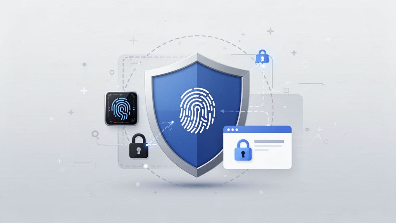
Passwordless login UX, powered by FIDO2 standards and security keys, does not mean risk-free. In ecommerce, login is a fraud surface because it unlocks saved addresses, order history, store credit, and loyalty points.
Keep security strict with passwordless MFA, but explain it in plain language. Friction is easier to accept when it has a reason.
A short do/don’t list for teams shipping magic links and OTP:
- Do bind magic links to the requesting device when possible (enhanced by biometric authentication), then say so (“This link works only on this device.”).
- Don’t include sensitive account details in the email or SMS.
- Do rate limit by IP, device fingerprint, and identifier (email/phone) together, not just one.
- Don’t reveal whether an account exists. Use neutral copy (“If an account exists, we’ll send a link.”).
- Do cap OTP attempts, then cool down. Also log suspicious patterns for review.
Privacy details that build trust without adding clutter:
- Put a single line under the CTA: “No passwords. No spam.”
- Link to privacy policy only if you already have one in checkout, otherwise keep it minimal.
- Don’t ask for phone unless you plan to use it, and explain why.
If your UX makes it easy to request unlimited codes, someone will automate it.
Recovery and fallback that won’t derail checkout
Even great delivery fails sometimes. So, your recovery path needs to be visible before the shopper gets stuck.
A strong fallback model for stores:
- Primary: magic link or OTP
- Secondary: “Try another method” (switch email to SMS, passkey autofill for shoppers with previously saved credentials, or link to code)
- Tertiary: passkey (using fingerprint and face ID for local verification with decentralized biometrics that offer more privacy than a traditional password manager) or password (if you support it), then support
Keep recovery copy calm and specific:
- “Didn’t get it? Try SMS instead.”
- “No access to that email? Use a different address.”
- “Still stuck? Contact support” (pre-fill the email/phone they entered, but don’t expose it on screen)
For checkout, preserve the cart and shipping selections across every retry. A smooth recovery path drives higher conversion rates, but if login resets the checkout form, your authentication flow becomes a conversion tax.
Conclusion
Passwordless login UX streamlines managing passwordless accounts and solves password fatigue for the modern shopper. It can feel like a shortcut, but the UX still needs guardrails. Magic links and one-time passwords serve as the starting point for most stores; when designed with clear states, helpful microcopy, and sensible limits, shoppers move faster and fraud gets less room to operate. Start by tightening the “waiting,” “expired,” and “wrong device” moments, then add recovery that keeps checkout intact. As a final design consideration, try device-initiated authentication or a QR code for cross-device registration and login consistency. The best test is simple: can a first-time shopper finish login in under a minute, even when something goes wrong?