
Nothing kills shopping momentum like clicking “Add to cart” and hitting a wall. An out-of-stock moment feels like showing up at a restaurant and being told your order “isn’t a thing anymore”.
The good news is you can still earn the sale, just not always today. The goal of strong out of stock page UX is simple: keep trust, capture intent, and offer a clear next best action instead of a dead end.
Below is a practical playbook you can apply to Shopify, Magento, WooCommerce, or custom storefronts without turning your product detail page (PDP) into a cluttered apology.
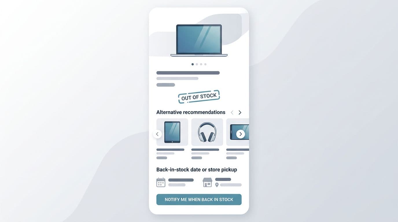
Make the stock status instantly clear (and still shoppable)
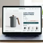
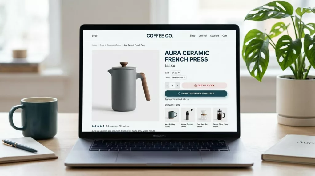
First, don’t make people hunt for the truth. Put the status near the title and primary CTA area, where the price and “Add to cart” normally live. Then replace the primary CTA with the best next action (notify, view alternatives, find in store), while keeping the rest of the page useful.
Clarity comes from specifics. “Out of stock” is a start, but it’s not a plan. If you have an ETA, show it. If only one variant is unavailable, say so and keep the available variants purchasable. If inventory changes quickly, explain what “available” means (for example, “ships in 2 to 3 days” versus “in stock now”).
One short table helps teams align on what message belongs to which situation:
| Stock situation | What the user needs right now | Example microcopy (ready to paste) |
|---|---|---|
| Temporary stockout | Confidence you’ll follow up | “Out of stock right now. Get an email (or text) when it’s back.” |
| Discontinued | Closure plus a substitute path | “This item is no longer available. Here are the closest alternatives.” |
| Limited inventory (still available) | Urgency without panic | “Low stock. Order soon, this may sell out today.” |
If the shopper can’t buy, your job is to reduce uncertainty. Uncertainty is what triggers the back button.
For implementation, keep three rules:
- Show availability per variant (size, color) before the user commits to the wrong choice.
- Don’t hide key PDP content like reviews, specs, and shipping info. Those details help people accept a substitute.
- Keep internal search, breadcrumbs, and category links visible. Your PDP becomes a navigation hub when the item can’t be bought.
For more ideas on keeping these pages useful for both users and search visibility, see out-of-stock SEO and conversion tips.
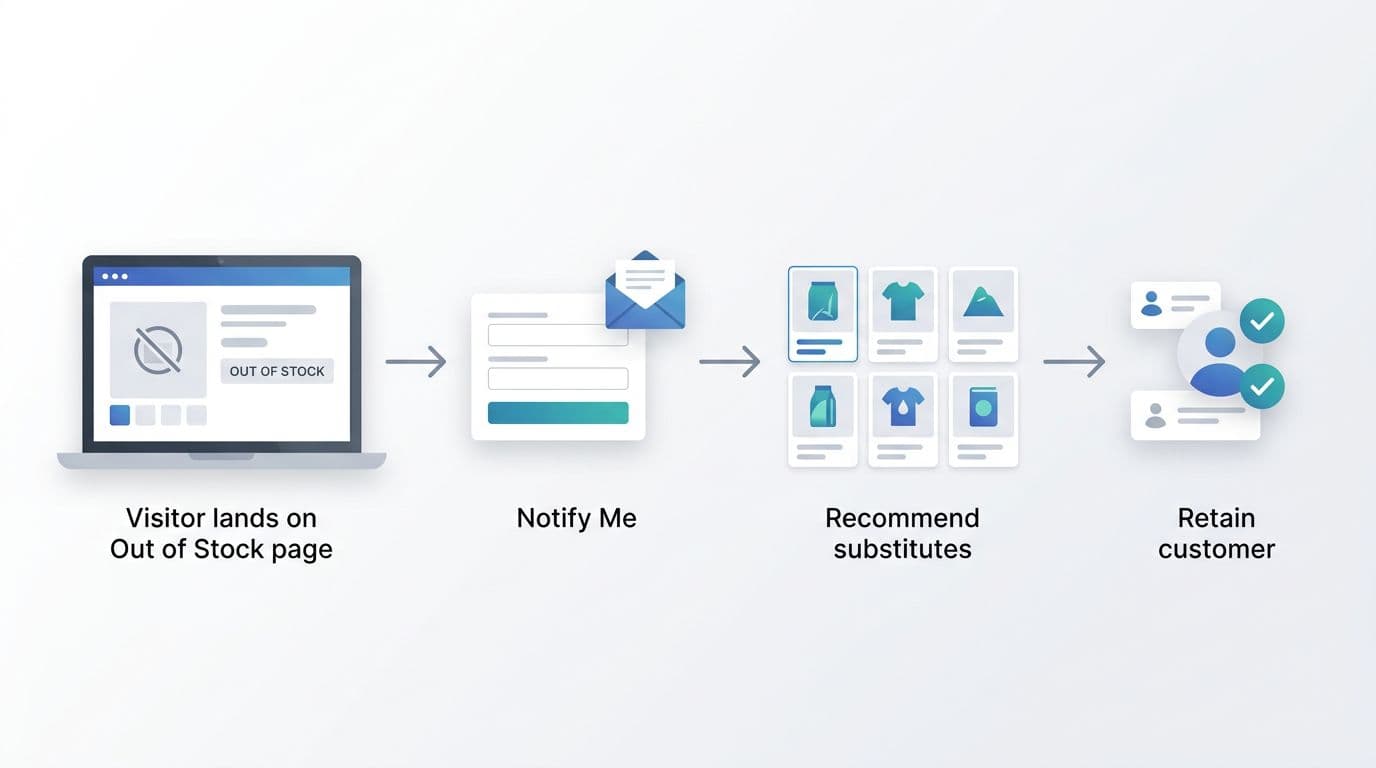
Capture intent first, then offer smart alternatives
When someone lands on an unavailable PDP, they’re telling you what they want. Your best move is to catch that intent while it’s fresh, then help them pick the next best option.
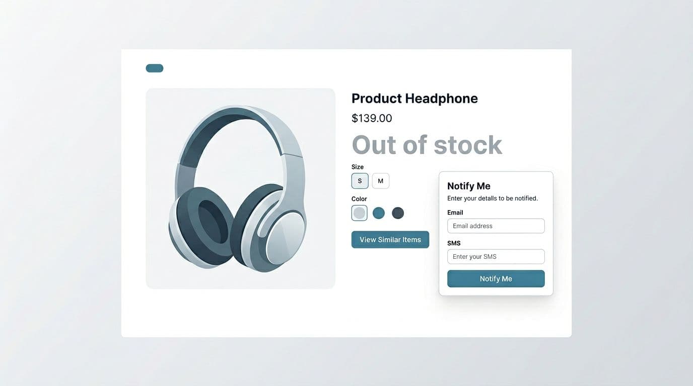
Start with an inline “Notify me” module (not a tiny link). Ask for the minimum input, usually email, optionally SMS. Place it where the “Add to cart” button normally sits, and confirm success without a page reload if you can.
Good “notify” UX has a few non-negotiables:
- Set expectations: Will they get one message or several? Can they unsubscribe?
- Confirm the variant: “Notify me when Size M, Blue returns.”
- Offer an immediate next step: “While you wait, see similar items.”
Gotcha: if you collect SMS, be explicit about consent and frequency. A saved sale isn’t worth a complaint.
Next, recommendations should feel like help, not a generic widget. Tie substitutes to the shopper’s intent: same category, same use case, similar price band, and compatible accessories. If the product has critical attributes (shade, material, fit, wattage, device compatibility), filter alternatives by those attributes by default.
A practical layout that converts:
- Notify module (primary replacement CTA)
- “Closest matches” carousel (3 to 8 items)
- Category link and on-site search
- Secondary options (waitlist for another variant, store pickup, bundle option)
If you want deeper conversion patterns and examples for this page type, CXL’s guide on optimizing out-of-stock product pages is a useful benchmark. For email and lifecycle angles, Drip’s breakdown of out-of-stock PDP conversion tactics is also worth a skim.
Handle the hard cases: discontinued items, backorders, and mixed availability
Not all stockouts are equal, so your UX shouldn’t treat them the same.
For discontinued products, don’t offer “Notify me”. It creates false hope and support tickets. Instead, switch the primary action to “View similar items” or “Shop the collection”. If you have a newer model, make that the hero substitute.
Example discontinued microcopy:
- “No longer available. Most shoppers choose the updated version below.”
- “Retired product. Explore the closest matches we still carry.”
For backorders or pre-orders, be precise about timing and risk. If dates can slip, say “estimated”. Add a shipping promise only if you can keep it.
Example backorder microcopy:
- “Available on backorder (estimated ship date: March 12). You won’t be charged until it ships.” (only if true)
- “Pre-order now. Ships in early April (estimate).”
For mixed availability (some variants available, others not), keep purchasing open for in-stock variants. Then guide shoppers away from frustration with gentle defaults, like auto-selecting an available size, or showing “In stock” chips in the selector.
What to avoid (the patterns that lose revenue)
A few anti-patterns show up again and again:
- Dead ends: a disabled button with no next action.
- Hiding stock status until after a size is picked or, worse, after add-to-cart.
- Removing the PDP entirely and sending paid traffic to a 404 or a generic category page.
- Bait-and-switch urgency: “Only 1 left” everywhere, even when the item is unavailable.
If you’re deciding whether to keep a PDP live, it helps to understand how dynamic stock can be across systems (ERP feeds, reservations, real-time decrements). Commerce for Devs explains the moving parts in how out-of-stock states happen.
Validate impact with KPIs, experiments, and a tight checklist
Treat the out-of-stock PDP like a conversion surface. You’re not measuring “purchases from this SKU”, you’re measuring recovered demand.
Core KPIs to track:
- Notify signup rate (by device, channel, and variant)
- Alternative click-through rate and add-to-cart rate from substitutes
- Exit rate from the PDP
- Revenue per out-of-stock session (substitute purchases plus later conversions)
- Time to purchase after signup (cohort lag)
Experiment ideas that are easy to run:
- Notify module above vs below recommendations
- Email-only vs email + SMS (with clear consent)
- “Closest match” ranking rules (attribute-based vs best-sellers)
- Showing ETA vs not showing ETA (when ETA accuracy is high)
In the end, the best out of stock page UX respects the shopper’s time. It tells the truth fast, then offers a path that still feels like progress.
Compact checklist (ship this):
- Stock status is visible near title and CTA
- Primary CTA becomes Notify, Find in store, or View alternatives
- Variant-level availability is clear (and defaults to in-stock when possible)
- ETA or expectation is stated when you can support it
- “Notify me” confirms chosen variant and sets message expectations
- Alternatives are relevant, not generic, and placed above the fold
- PDP content stays accessible (reviews, specs, shipping, returns)
- Discontinued items never offer waitlists
- Analytics events fire for notify submits and substitute clicks