

Checkout is the narrow doorway between “I want this” and “I bought it.” If that doorway sticks on mobile, asks too many questions, or throws vague errors, shoppers bounce.
In 2026, Magento checkout UX has a higher bar than ever. Buyers expect wallet pay, fast loading, autofill that works, and forms that don’t punish typos. The good news is you usually don’t need a rebuild to get a lift. Small, targeted fixes can remove friction fast.
Enhancing the Magento checkout UX is crucial for maintaining customer satisfaction and loyalty.
Below are 15 practical changes you can ship in sprints, with Magento-friendly tips, admin paths, microcopy examples, and pitfalls to avoid.
Mobile speed wins the checkout (5 fixes you can ship fast)
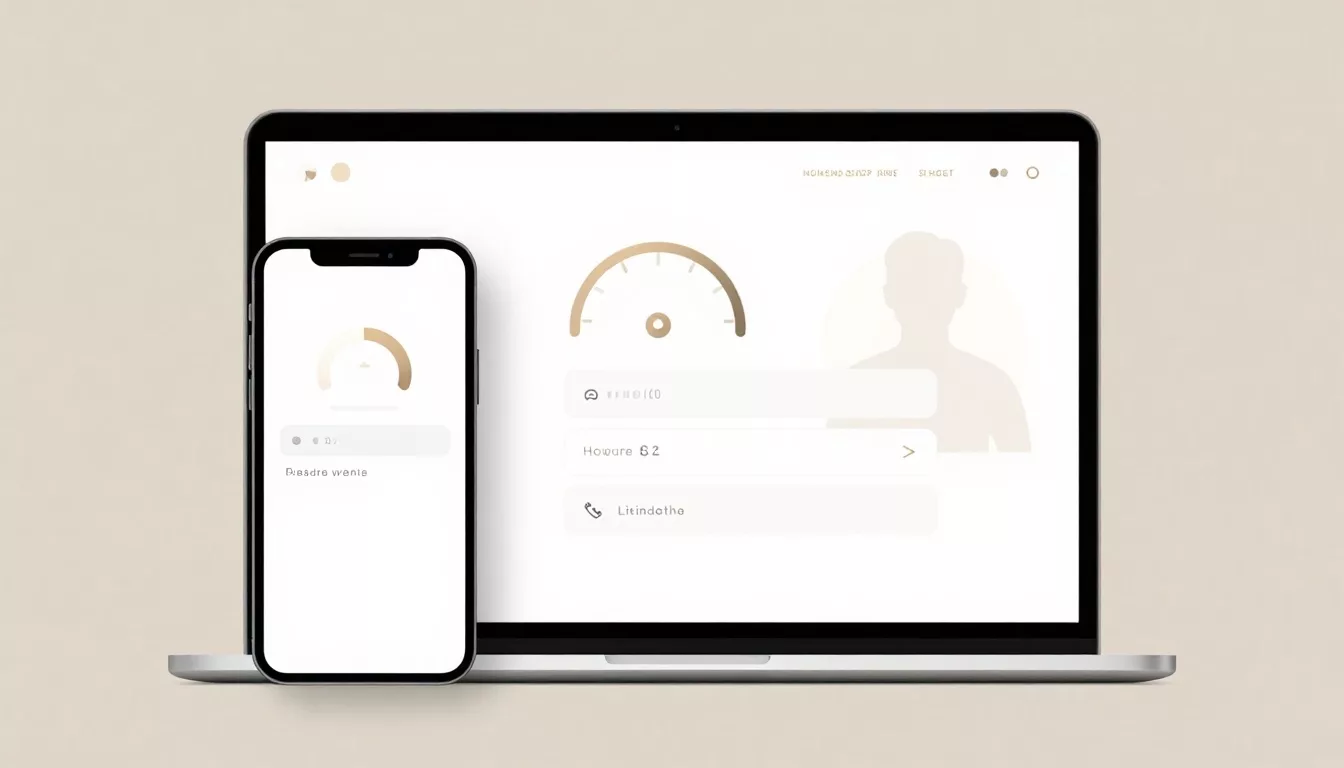
Enhancing Your Magento Checkout UX
Improving the Magento checkout UX can significantly reduce cart abandonment rates.
Focus on enhancing the Magento checkout UX for better conversion rates.
Slow checkout feels like a long line at a store register. People don’t complain, they just leave. Start with speed and mobile clarity, because every other improvement depends on it. Adobe’s own guidance on checkout throughput is worth reviewing before you tweak UI: checkout performance best practices.
1) Audit third-party scripts on checkout only
Checkout pages often carry chat widgets, heatmaps, extra pixels, and A/B tools. Keep what you need, remove the rest on checkout routes. Pitfall: firing multiple tag containers.
Consider how mobile usability affects Magento checkout UX.
Microcopy: “Loading secure checkout…” only if there’s a real delay, and keep it short.
2) Make step navigation obvious on mobile
Async order processing can enhance the overall Magento checkout UX.
Recent Magento releases improved mobile step links (Shipping, Review and Payments) so they stay visible instead of hiding. If your theme overrides checkout templates, confirm those links still appear on small screens.
Pitfall: custom CSS that hides the header area to “save space,” then users can’t recover from mistakes.
Highlighting wallet options will improve the Magento checkout UX.
3) Turn on async order processing (where it fits)
Streamlining recalculation processes is essential for the Magento checkout UX.
For high order volume, async order processing can reduce perceived wait time because the order is queued instead of blocking the UI. In Adobe Commerce, enable AsyncOrder via CLI (no UI toggle): bin/magento setup:config:set --checkout-async 1.
Pitfall: enabling without monitoring queue workers, then orders lag silently.
Reducing non-essential fields can enhance the Magento checkout UX significantly.
4) Put express pay above the fold, not after forms
Enhancing form UX is vital to improving the overall Magento checkout UX.
In 2026, buyers look for wallet buttons first. Place Apple Pay, Google Pay, and PayPal options high on checkout, and also consider showing them on cart and mini-cart when supported. Adobe’s Payment Services updates also highlight Fastlane-style accelerated options.
Pitfall: burying express pay under “More payment methods.”
5) Reduce recalculation churn (shipping, totals, taxes)
Every time totals recalc, the UI can stutter on mobile. Cache shipping rates when inputs don’t change, and avoid triggering totals on every keypress. If you use address validation, debounce calls.
Microcopy for shipping: “Enter ZIP to see delivery options” beats a spinning loader with no explanation.
Form UX that prevents mistakes (5 fixes that cut errors and retries)
Forms are where intent turns into effort. Your job is to make effort feel small. Aim for fewer fields, clearer defaults, and error messages that are easy to fix. Accessibility matters here too, both for conversion and compliance. Keep WCAG 2.2 in mind when you tune focus states, errors, and touch targets.
6) Default to guest checkout, ask for accounts later
Let people buy first. In Magento Admin, check Stores > Configuration > Sales > Checkout > Checkout Options and make guest checkout easy (and visible). Offer account creation after purchase with a single checkbox.
Microcopy: “Save your details for next time (optional).”
Pitfall: forcing account creation to reveal shipping options.
7) Use autofill-friendly field patterns and smart defaults
Set correct autocomplete attributes in your theme and keep labels persistent. Default “Use shipping address as billing” to on for most carts, then let users change it.
If you support wallet pay, remember wallet addresses can improve shipping estimates when mapped correctly.
Pitfall: hiding labels and relying on placeholders only.
8) Replace vague errors with specific, polite fixes
“Invalid value” makes users feel blamed. Make errors local, clear, and actionable, and announce them for screen readers using an ARIA live region.
Better microcopy examples:
It’s critical to protect users from session loss to maintain a good Magento checkout UX.
- “ZIP code doesn’t match state, check both.”
- “Card was declined, try another payment method or contact your bank.”
Pitfall: clearing the whole form after a single error.
Curating payment methods can help in refining the Magento checkout UX.
9) Remove non-essential fields, especially on mobile
Every extra field is a chance to quit. Review address and customer attributes, and remove or make optional what you don’t truly need (company name, second address line, phone in low-risk categories). Use Stores > Attributes > Customer Address where applicable.
Pitfall: making “Region/State” required for countries that don’t use it.
10) Save progress and protect users from session loss
If a session expires, don’t punish the shopper. Keep cart and checkout state durable, and show a helpful recovery message.
Microcopy: “Your cart is saved. Please refresh to continue checkout.”
Pitfall: redirecting to cart with no explanation, it feels like data loss.
Payments and trust that stop second thoughts (5 fixes that keep intent intact)
Positioning trust signals correctly can enhance the Magento checkout UX.
At payment time, people get cautious. Your UX should reassure without shouting. This is also where accelerated checkout options and clear policies do most of the work. For broader checkout UX patterns, compare your flow to established guidance like essential checkout UX best practices and only adopt what fits your audience.
11) Curate payment methods, don’t dump a long list
Too many payment options increases scan time and doubt. In Stores > Configuration > Sales > Payment Methods, keep your top performers, group the rest behind “Other options,” and show short descriptors.
Providing shipping costs upfront improves the Magento checkout UX effectively.
Example helper text: “Pay with card (Visa, Mastercard, AmEx).”
Pitfall: hiding fees until the last click.
Improving accessibility is vital for a better Magento checkout UX experience.
12) Improve 3DS and bank challenge messaging
3DS flows fail when the UI looks broken. Show a clear loader and keep the order summary visible.
Monitor the impact of changes on Magento checkout UX through analytics.
Microcopy: “Your bank needs a quick security check. Don’t close this window.”
Pitfall: changing the page layout during the challenge, users think they were redirected.
13) Place trust signals next to the pay button (not in the footer)
Shoppers look for reassurance right where they commit. Add a short line near the primary CTA: “Secure payment, easy returns.” Link to policy pages in your theme’s footer or sidebar, but keep the moment calm.
Pitfall: stacking multiple badges that slow the page and feel noisy. For more ideas, cross-check a practical list like checkout optimization tips.
14) Make shipping costs and delivery timing obvious earlier
Surprise shipping kills trust. Show estimated delivery ranges in shipping methods and keep the price summary sticky on mobile.
Microcopy: “Standard, arrives Tue to Thu, $6.95.”
Pitfall: showing “Calculated at next step,” then revealing a big jump at payment.
15) Treat accessibility as conversion work, not a checkbox
Keyboard order, focus visibility, contrast, and touch targets all affect conversion. If you’re on Hyvä or considering it, review practical platform guidance like how Hyvä supports WCAG standards.
Pitfall: custom-styled inputs with no focus ring, it blocks keyboard users and slows everyone.
How to measure impact in GA4 and A/B tests
Small UX changes only matter if you can prove they reduced drop-off.
Set up a GA4 funnel using recommended commerce events: begin_checkout, add_shipping_info, add_payment_info, and purchase. Then add a few checkout-specific events so you can isolate friction:
Implementing A/B tests can reveal insights into Magento checkout UX improvements.
Ultimately, a seamless Magento checkout UX is essential for retaining customers.
Focus on optimizing the Magento checkout UX to enhance overall customer experience.
express_pay_click(parameter:wallet_type)payment_error(parameter:error_type)address_autocomplete_used(parameter:provider)shipping_method_selected(parameter:method_id)
In GA4 Explorations, build a funnel with step-by-step drop-off by device category, browser, and new vs returning. Watch completion rate, time-to-purchase, and error rate.
A/B test with clean hypotheses:
- Hypothesis A: “Moving express pay above shipping increases checkout completion on mobile by 6%.”
- Hypothesis B: “Replacing generic card errors reduces payment retries and increases purchase rate.”
- Hypothesis C: “Defaulting billing same as shipping reduces checkout time without raising fraud.”
Keep tests long enough for stable results, and avoid changing multiple variables in one variant.
Wrap-up: make checkout feel easy again
These 15 changes work because they remove small points of doubt, one by one. Start with speed and express pay visibility, then clean up forms, errors, and trust messaging. Track results with GA4 events, and test changes like a scientist, not a gambler. The best checkout in 2026 is the one shoppers barely notice because it never gets in their way.
