
Most loyalty pages ask for commitment before they explain the deal. That’s backwards. A strong loyalty page feels less like a form and more like a helpful product page, with clear value, low effort, and a next step that fits the shopper’s moment.
Good loyalty program UX does two jobs at once. It lifts signups now, then supports the next order later. For ecommerce teams in 2026, that means tighter copy, mobile-first flows, accessible forms, and a post-signup experience that keeps members moving.
Show the payoff before you ask for data
Visitors decide fast. If the page opens with brand fluff, dense tier tables, or a long FAQ, many leave. Put three answers above the fold: what members get, how easy it is to join, and why it matters today.
If the benefit isn’t clear in five seconds, the form will feel longer than it is.
Start with one sharp promise. Then back it up with a short reward preview. Simple beats broad. “Join free and earn on every order” works better than vague club language. Recent coverage on top loyalty program trends for 2026 and loyalty program best practices in 2026 keeps circling the same basics: clear progress, flexible rewards, and personalization that feels useful.
Show the mechanics in plain steps: earn, track, redeem. Put fine print close to the claim, not buried below the footer. If tiers matter, preview the next level, not a wall of perks. The same clarity appears in strong ecommerce UX strategies for customer retention, where pages explain value before asking users to work.
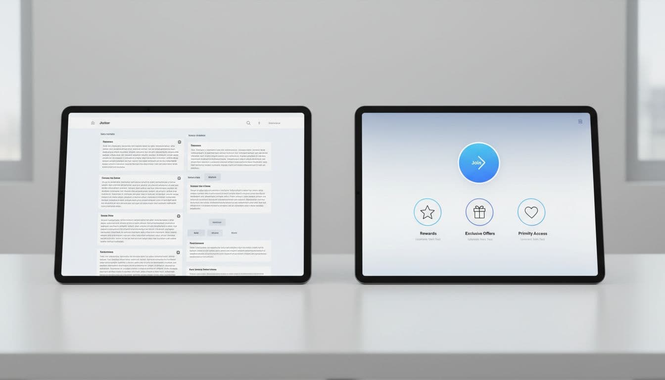
Incentive framing matters too. Pair the long-term benefit with an instant win. On a cart-linked page, say members earn on today’s order. On a product-linked page, call out early access or a first reward milestone. A loyalty page isn’t a brochure. It’s a decision screen.
Build a mobile-first signup flow people can finish
Most signups happen on phones, often from email, SMS, or an account prompt. So the path has to work with one thumb, low patience, and little room for error. A good flow feels like an express lane, not a side quest.
Ask for the least you need. Email plus a one-time code often beats a full account form. Keep inputs stacked, labels always visible, and the main CTA easy to reach on long screens. If you need multiple steps, show progress and save state when users back out.
Accessibility isn’t extra polish. It’s a conversion feature. Use high contrast, 44px tap targets, clear error text, and field labels that screen readers can announce. Don’t rely on color alone to show status. Also separate loyalty consent from marketing consent when local rules or user trust require it.
Copy should lower anxiety. Replace generic buttons like “Submit” with a clear action such as “Join and start earning.” Then tell users what happens next. If the form sits near checkout, return them to the cart with the state intact. If you’re planning the next purchase path too, borrow from these repeat purchase UX patterns for retention to keep the handoff short.
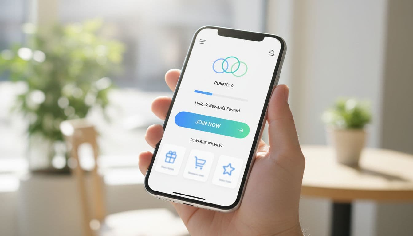
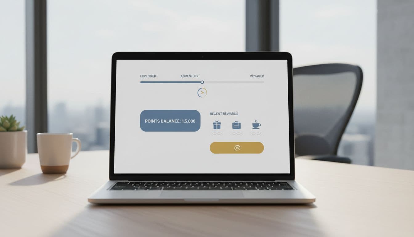
Keep momentum after signup so members buy again
Many teams treat the thank-you state as the finish line. It’s really the handoff. Once someone joins, show progress, point balance, and the fastest next action. If they signed up after checkout, confirm points earned from that order and show how close they are to the first reward. If they joined before purchase, send them back to the cart or product page with the benefit still visible.
Use onboarding in layers. Ask for birthday, size, or channel choices after the join, not before it. That keeps the first conversion light while still building a better profile over time.
A strong member area helps here. Put balances, tier progress, rewards, and recent orders in one place. This kind of loyalty balances in Shopify account UX turns the account into a retention screen instead of a settings archive.
Then make the next order easy. Surface buy-again actions, reward-eligible products, replenishment reminders, or early-access drops based on real behavior. Current 2026 reporting, including EMARKETER’s retention gap FAQ, shows why this matters. Loyalty works better when the site, app, email, and store all show the same balance and next step.
Use a small scorecard to judge the page after launch.
| Metric | What it tells you |
|---|---|
| View-to-signup rate | Is the page persuasive |
| Form completion rate | Is the flow too hard |
| First reward redemption | Does the value feel real |
| 60-day repeat order rate | Is loyalty changing buying behavior |
Track these by device, traffic source, and new versus returning shoppers. Otherwise, you won’t know if the problem sits in the pitch, the form, or the post-signup experience.
A better loyalty page doesn’t need more widgets. It needs less doubt. When shoppers can grasp the value, join fast, and use rewards without hunting, signups rise and repeat orders follow.