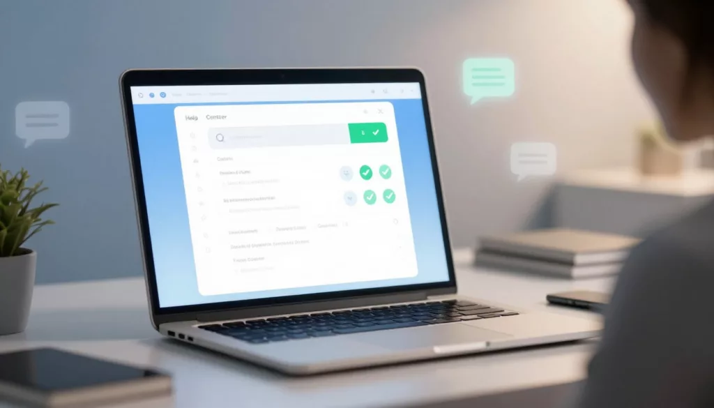

A help center can lower ticket volume, or it can become a dead archive. Users decide fast. If search misses intent, labels feel vague, and articles bury the fix, they open chat instead.
Strong help center UX does more than deflect tickets. It improves self-service success, lifts CSAT, and shows users your team respects their time. The best systems make answers easy to find, easy to scan, and easy to escalate when self-service won’t do.
Findability is the first layer of ticket deflection
Most failed self-service starts before the article. Search is the front door, so it has to understand how customers think, not how your team names things internally. That means indexing error codes, feature nicknames, billing terms, task phrases, and common misspellings.
Search also needs better ranking logic. Put proven answers first. Weight results by freshness, successful exits, and article feedback, not only keyword match. If someone types “change invoice email,” don’t show a billing overview page above the exact task.
Recent guidance on help center best practices for 2026 keeps repeating the same pattern: make search the main navigation, use task-based categories, and review zero-result queries every week. That rhythm matters because user language shifts faster than most taxonomies.

Taxonomy deserves the same attention. Keep it shallow. Group content by user jobs, such as billing, account access, integrations, and team admin, not by internal departments. People don’t care which team owns the answer. They care whether they can finish the task.
If users must understand your org chart to find an answer, the help center has already failed.
Context also matters. A help center works better when answers appear where friction starts. Modern teams use widgets, inline suggestions, and triggered help on high-friction screens. Reports on context-aware in-app help centers point to large drops in avoidable tickets because users don’t need to leave the product to look for help.
So, start with search logs, ticket tags, and page-level friction. Those signals tell you what your help center should surface first.
Articles should resolve the issue on the first screen
A page view is not a win. Resolution is. That’s why strong help center UX uses a fix-first article pattern. Lead with the answer, then list the steps, then add edge cases, permissions, and limits. Put the key action near the top, because many users won’t scroll far.
Visual hierarchy does heavy lifting here. Use one clear H1, short intro text, step headings, and tight spacing. Break long procedures into chunks. Pull warnings and prerequisites into callouts. Keep screenshots focused and current. If an image needs a red box and a paragraph to explain it, it’s probably doing too much.
This pattern works well for high-volume issue pages:
| Weak pattern | Better pattern | Why it works |
|---|---|---|
| Policy intro first | Direct answer first | Reduces time to resolution |
| Long paragraphs | Short steps with labels | Improves scan speed |
| No next action | Clear fallback path | Lowers frustration |
The same writing principle shows up in effective product FAQ design tips: use customer language, answer the “what if” fast, and keep friction close to the decision point. A help center article should work the same way. Don’t title a page “Account Configuration Parameters” if users search “change login settings.”
Trust grows when content feels current and honest. Add “last updated” dates for sensitive topics like pricing, permissions, and integrations. Name the version or plan when it matters. If the answer differs by workspace type or role, say that early. Users lose confidence when they follow six steps and only then learn they lack access.
Finally, avoid dead-end articles. Each page should offer a next best action, such as related tasks, setup docs, or escalation when the issue needs human review.
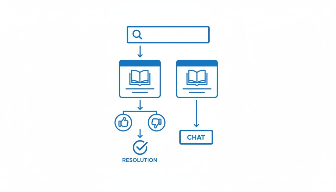
Clear escalation paths turn self-service into a trust signal
Ticket deflection should never feel like deflection. If users can’t solve the issue, they need a fast and obvious escape hatch. That path should be visible, but not louder than the article itself.
A good escalation path matches intent. Billing issues might route to a form with account context. Product bugs might open a report flow with logs attached. Time-sensitive outages should point to a status page before a contact form. Current thinking on ticket deflection strategies lands on the same point: self-service works best when it completes the task or hands off cleanly.
Feedback closes the loop. A thumbs-up or thumbs-down widget is useful only if you capture why. “Missing steps,” “outdated,” and “didn’t match my issue” are far more useful than a raw score. Feed that data into weekly content triage, then rewrite the pages that fail most often.
Analytics should go beyond pageviews. Track zero-result searches, search refinements, article exits to support, repeat visits, and article-assisted ticket creation. If users bounce between three articles before contacting support, the issue is usually structure, not content volume.
AI can help here, but only when the base is clean. Semantic search, answer summaries, and suggested articles work best when the taxonomy is tight and the source articles stay up to date. In 2026, that’s table stakes. Still, AI should never hide escalation or invent unsupported answers. Trust drops fast when support feels clever but wrong.
A weak help center feels like a maze. A strong one feels like part of the product, calm, clear, and fast.
Start with your top ticket themes and zero-result searches this week. Rewrite the pages that carry the most volume, fix search around them, and make the fallback path obvious. That’s where trust starts to show up in both deflection and CSAT.