
On a phone, checkout fails for small reasons. A hidden guest option, a long form, one bad error message, and the sale slips away. Strong guest checkout UX removes those small blocks before they stack up.
For ecommerce teams, the goal is simple: help first-time shoppers buy with less thought and less typing. The patterns below focus on visible guest access, low-effort forms, faster payment, and recovery when something breaks. Each one reduces friction because it cuts decisions, taps, or doubt.
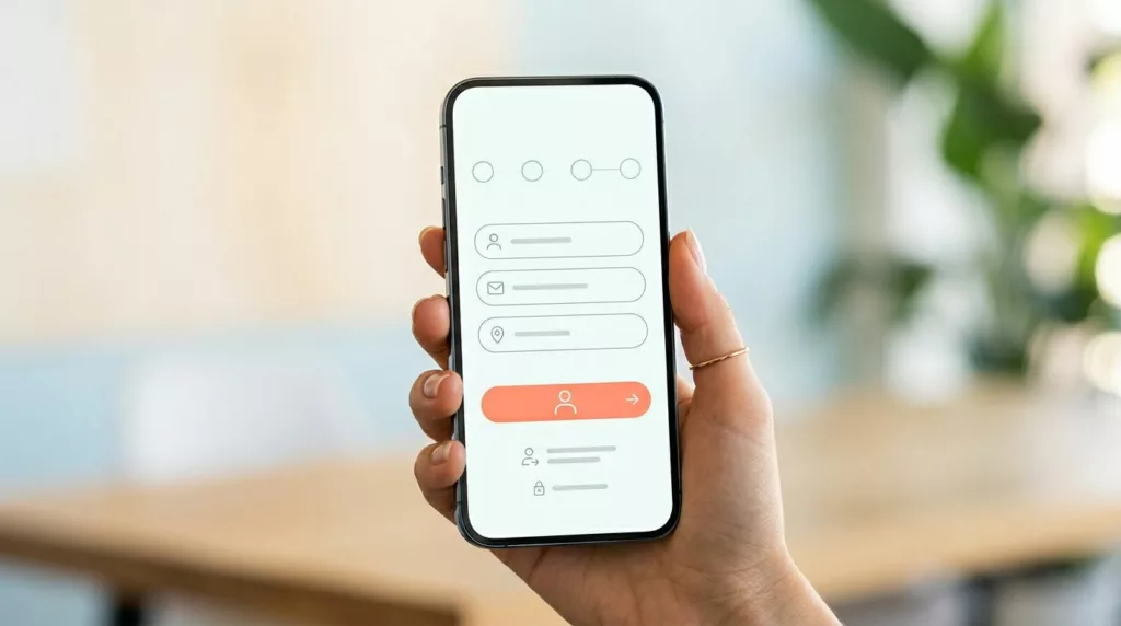
Start with a clear guest option, not an account wall
When shoppers reach checkout, momentum matters. If the first screen pushes sign-in and hides guest purchase as a text link, many people pause. On mobile, that pause is expensive. Baymard research, summarized in data on account creation drop-off, found that about 26% of shoppers abandon when sites require account creation.
Place the guest path at the same visual level as sign-in. Use a clear label such as “Continue as guest,” then keep login as a secondary option for returning buyers. Brands highlighted in visible guest checkout best practices do this well because shoppers don’t need to hunt for permission to buy. That simple change can improve checkout starts and completion because purchase intent stays intact.
Also, show a short step indicator near the top. “Shipping,” “Payment,” and “Review” is enough. A progress bar reduces friction because people can see the finish line. In other words, it turns a vague task into a short trip.
A good first screen also sets expectations. Mention shipping timing, payment methods, and returns near the action area. That trust layer supports the broader research-backed guidelines to reduce mobile drop-offs that keep people moving.
If shoppers have to decode the checkout entry point, the flow already feels longer than it is.
A simple example helps. A guest shopper taps checkout from cart. They see two buttons, “Sign in” and “Continue as guest.” The guest option is visually primary, the cart stays visible, and the next step starts right away. No password request, no dead end, no avoidable delay.
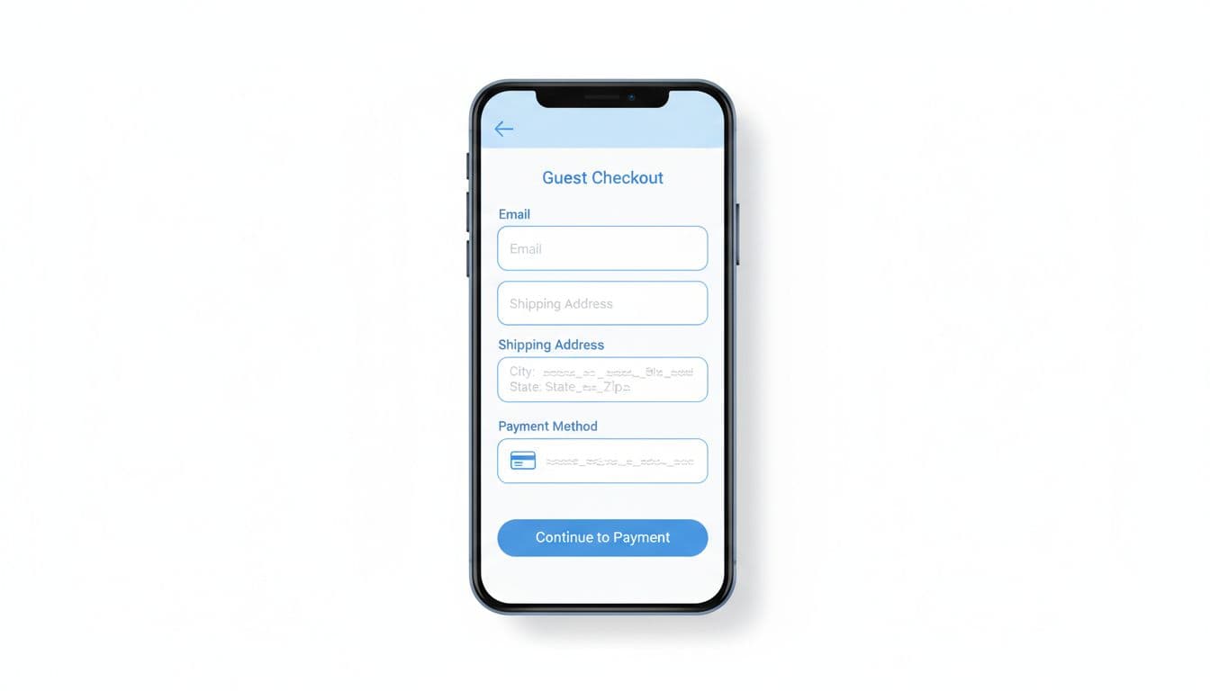
Cut typing with form patterns built for thumbs
Most mobile checkout friction comes from input burden. Every extra field asks for focus, keyboard changes, and error risk. The best guest checkout UX keeps only what the order needs right now. Fewer fields often improve completion because shoppers spend less time typing and less time fixing mistakes.
Ask for email first, then shipping address, then payment. Default billing to “same as shipping.” Split full name into one field if your back end allows it. Use address autocomplete, numeric keyboards for ZIP and card details, and proper input types for email and phone. According to this mobile checkout optimization guide, autofill and error handling are core mobile fixes because they cut taps and corrections.
Inline validation matters just as much as field count. Show errors when the user leaves a field, not after a full submit. Keep the message close to the field, say how to fix it, and never clear completed inputs. If a card fails, don’t make shoppers re-enter their address.
A short, one-column layout also helps thumb use. Wide spacing, large tap targets, and clear section labels reduce mis-taps. Teams working on mobile-first checkout enhancements often get wins from these basics before any larger redesign.
Common mistakes to avoid:
- Hidden coupon fields: Don’t let promo hunting distract from the main task.
- Extra fields by default: Skip company name unless the order needs it.
- Unneeded phone capture: Ask only if delivery or fraud checks require it.
- Blocked autofill: Let browsers and wallets do their job.
Picture an apparel store on a busy commute. A shopper can finish with email, address autofill, apartment number, and a wallet payment in under a minute. The flow feels easy not because it’s flashy, but because it respects the limits of a small screen.
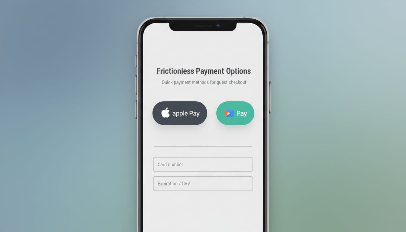
Make payment feel fast, and make failures easy to recover from
Payment is where intent turns into money. It’s also where weak guest checkout UX often breaks. Mobile shoppers don’t want to type card data if a wallet can do the job faster.
Put express options like Apple Pay, Google Pay, or PayPal above manual card fields when the device supports them. That order reduces friction because it removes the longest task in the flow. If the shopper chooses a wallet, skip any field the wallet can pass back. In many cases, that faster path improves completion because it turns a multi-step form into one confirmed action.
Still, fast payment isn’t enough. Recovery patterns matter because declines, 3DS prompts, and slow shipping quotes can stop an otherwise ready buyer. The framework in diagnose checkout failure points is a useful reminder that many drop-offs come from failure states, not just layout choices.
Keep state after every error. Preserve the cart, address, shipping choice, and any valid data. Explain what happened in plain words, then offer the next action right below the message. “Card was declined, try another card” works. “Validation error” doesn’t.
After purchase, invite account creation as a benefit, not a requirement. Pre-fill the email, explain saved tracking or faster reorders, and let the shopper skip it. That pattern protects the current sale while still supporting future retention.
Mobile checkout friction rarely comes from one big flaw. It comes from small bits of work, added at the worst moment. Guest checkout UX works when the path is obvious, forms ask for less, payment is fast, and errors don’t wipe progress. Start with the first screen, then trim fields, then fix recovery states. When buying on a phone feels lighter, completion rates usually follow.