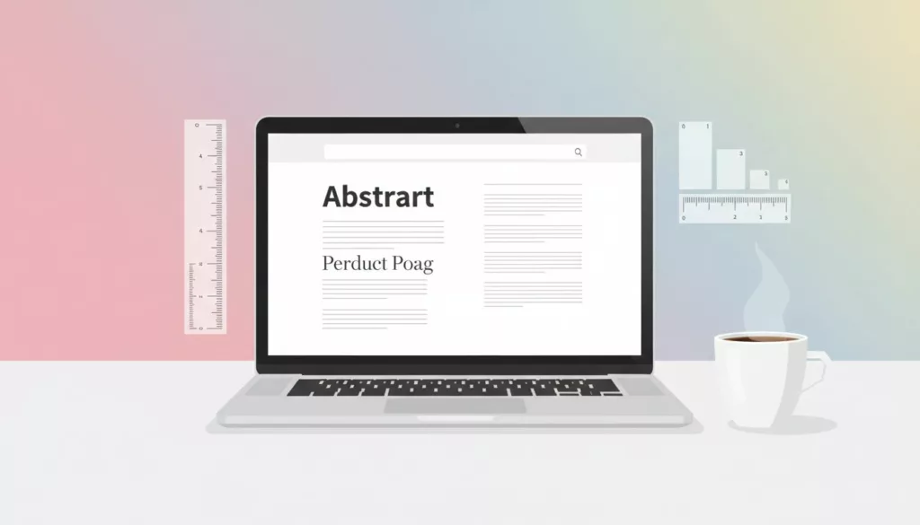

Shoppers don’t “read” a product page the way they read an article. They scan, compare, and look for proof. If your ecommerce typography feels inconsistent, they hesitate, even if the product is great.
A strong typography system fixes that. It gives you reliable font pairing, a sizing scale that works across devices, and product descriptions that people can finish without effort.
Font pairing rules that hold up on real product pages
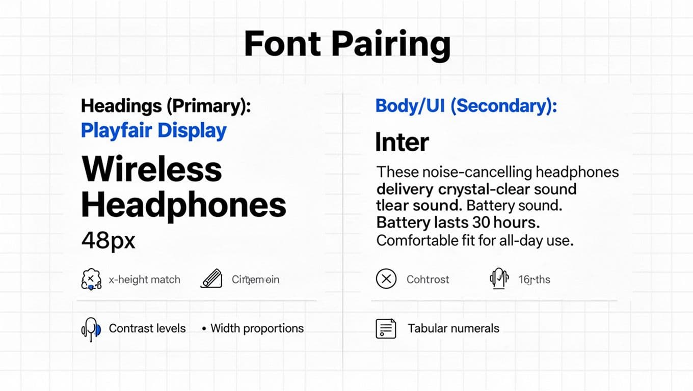
Two fonts are usually enough: one for headings, one for body and UI. A third is acceptable only when it has a clear job (for example, a monospace face for SKUs). The goal is to reduce visual “accent noise” so the product content stays calm.
Here’s a practical font pairing checklist that goes beyond “pick something modern”:
- X-height compatibility: If the body font has a tall x-height and the heading font doesn’t, headings can look tiny at the same size. Compare the lowercase “x”, “a”, and “e”. Similar x-heights make mixed type feel cohesive.
- Contrast (stroke thickness): High-contrast serifs can look sharp for headlines, but they can also shimmer at small sizes on some screens. Keep high contrast for titles, and use low-contrast fonts for body text and UI.
- Width and proportion: Pair a wide heading font with a compact body font (or vice versa) so your layout doesn’t feel heavy. Check how many characters fit in a button, badge, and filter chip.
- Numerals quality: Ecommerce lives on numbers. Choose fonts with clear “1/I/l” separation, and test price formats like
$1,299.00. Prefer fonts with tabular numerals so columns align in tables and comparison grids.
For a quick brand-level framework, Shopify’s overview is useful as a shared baseline with stakeholders: Shopify’s brand typography guide.
In addition, treat typography as UX, not decoration. It belongs beside navigation and layout decisions, like the patterns covered in this e-commerce design best practices guide.
If your prices, ratings, and specs look “almost aligned”, customers feel “almost confident”. Typography is where polish becomes trust.
2026 reality check: variable fonts are a solid default now. They let you fine-tune weight and width without loading a pile of separate font files. Still, always set a system fallback stack so a slow font download doesn’t break the page.
Type tokens that stay consistent (and map cleanly to PDP components)
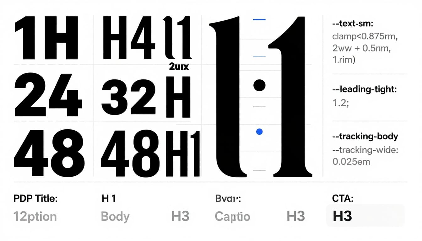
A typography system becomes usable when it’s tokenized. Tokens stop one-off overrides, because designers and devs share the same “menu” of sizes, line-heights, and tracking values.
Start with a small set of tokens you can remember. This example is intentionally boring, because boring scales ship fast and age well:
| Token | Purpose | Sample value |
|---|---|---|
--font-heading | Headings and hero type | "FrauncesVariable", ui-serif, Georgia, serif |
--font-body | Body copy and UI | "InterVariable", ui-sans-serif, system-ui, -apple-system, "Segoe UI", Arial, sans-serif |
--text-sm | Captions, helper text | 0.875rem |
--text-md | Body and UI default | 1rem |
--text-lg | Subheads, emphasis | 1.125rem |
--text-xl | Section headings | 1.25rem |
--text-2xl | PDP title (small screens) | 1.5rem |
--leading-tight | Headings | 1.2 |
--leading-normal | Body | 1.55 |
--tracking-tight | Large headings | -0.01em |
--tracking-wide | All-caps labels | 0.06em |
Next, map tokens to components. This is where the system turns into conversion-friendly structure:
| Component on PDP | Font | Size token | Line-height | Notes |
|---|---|---|---|---|
| PDP title | --font-heading | --text-2xl (mobile), --text-3xl (desktop) | --leading-tight | Keep to 2 lines when possible |
| Price | --font-body (or heading) | --text-xl | --leading-tight | Use tabular numerals for alignment |
| Promo badge | --font-body | --text-sm | --leading-tight | If all-caps, add tracking |
| Rating + review count | --font-body | --text-sm or --text-md | --leading-normal | Don’t make it lighter than body |
| Primary CTA button | --font-body | --text-lg | --leading-tight | Avoid ultra-bold unless brand needs it |
| Variant selectors | --font-body | --text-md | --leading-tight | Numbers must stay legible at a glance |
| Specs section | --font-body | --text-md | --leading-normal | Use tabular numerals in tables |
| Shipping and returns | --font-body | --text-sm | --leading-normal | Keep it readable, not “fine print” |
Typography also has to support the full journey, not just the PDP. If you’re aligning tokens across collection pages, cart, and checkout, this set of essential e-commerce UX strategies for 2026 pairs well with a type system rollout plan.
For a UX-focused perspective on why type choices change behavior, see The Power of Typography in UX.
Responsive type scale with clamp() (plus a safe fallback)
Your type scale should respond to viewport width, but it shouldn’t jump at breakpoints. clamp() is ideal for ecommerce because it keeps product pages stable while still scaling.
A simple pattern for body text looks like this (fallback first, then modern sizing): font-size: 1rem; font-size: clamp(1rem, 0.95rem + 0.35vw, 1.125rem);
Apply the same idea to headings, but keep growth restrained. Giant titles push price and CTAs below the fold on mobile. As a rule, set minimums based on readability, not brand mood:
- Body text: don’t go below 16px equivalent on mobile for product descriptions.
- Helper text: keep it at least 14px equivalent, especially for shipping, returns, and financing.
- Line-height: aim for
1.45to1.7in paragraphs, then tighten headings to1.1to1.3.
For numeric-heavy UI, add one line where it matters: font-variant-numeric: tabular-nums; This makes spec tables and price stacks look instantly more organized.
Finally, font loading can either protect your UX or quietly ruin it. In 2026, a practical default looks like this:
- Use variable fonts to reduce file count.
- Subset fonts to needed scripts and weights.
- Set
font-display: swap(oroptionalif you can tolerate brief fallback). - Keep a strong system stack so layout stays usable if web fonts fail.
If you care about performance budgets and page weight (you should), typography choices also support lighter pages. Pair type decisions with broader performance priorities from sustainable e-commerce website design tips.
Product descriptions that people can actually finish
A readable product description is more like a store associate than a brochure. It answers the next question, then gets out of the way.
Use a consistent structure, and let typography reinforce it:
- One-sentence summary (plain and specific).
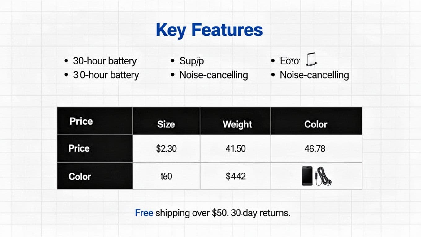
- Key features in short bullets (3 to 6 is plenty).
- Specs table for comparisons and returns reduction.
- Care, sizing, or compatibility notes as small subheads.
- Microcopy near decisions (shipping, returns, warranty) close to the CTA.
Keep sentences under 20 words most of the time. Also, cut filler adjectives that don’t help someone choose.
A spec table beats a paragraph when shoppers compare quickly:
| Spec | Value |
|---|---|
| Battery | 30 hours |
| Weight | 250 g |
| Connection | Bluetooth 5.3 |
| Warranty | 2 years |
Pitfalls that make ecommerce typography look “off”
Too many weights create noise. If you use 300, 400, 500, 600, 700, your page stops having a clear hierarchy. Pick two weights for body/UI and one for headings, then stick to them.
All-caps labels need spacing. Without it, “FREE SHIPPING” looks like a barcode. Add tracking (for example, your --tracking-wide token), and avoid all-caps for long strings.
Low contrast is another quiet conversion killer. If your “returns” text is hard to read, shoppers assume it’s complicated. Use accessible contrast rules, and validate them early with these color contrast best practices for e-commerce.
For general web typography guardrails that still apply, Wix has a solid refresher: web typography rules.
Conclusion
A strong ecommerce typography system isn’t about picking trendy fonts. It’s about making product pages feel predictable, readable, and trustworthy. Start with pairing criteria (especially numerals), then lock in tokens, map them to components, and scale responsibly with clamp(). After that, rewrite product descriptions so they scan like a well-labeled shelf, not a wall of text.
When your type system is consistent, every PDP feels easier to buy from, even before the shopper knows why.