
Cookie banners are like a store greeter who steps in front of the aisle. Done well, they build trust and let shoppers continue. Done badly, they block the path, break momentum, and quietly drain revenue.
Great cookie consent UX has one job: collect valid consent without turning a high-intent visit into a debate. That means clear choices, no tricks, and a layout that respects the shopping flow on mobile and desktop.
Below is a practical way to design consent journeys that meet modern expectations, while keeping add-to-cart and checkout moving.
Treat the banner like a checkout step, not a legal pop-up
Enhancing Cookie Consent UX for Better Engagement
The first consent touchpoint should feel calm and familiar. Shoppers should understand it in two seconds, then get back to product photos, pricing, and shipping details.
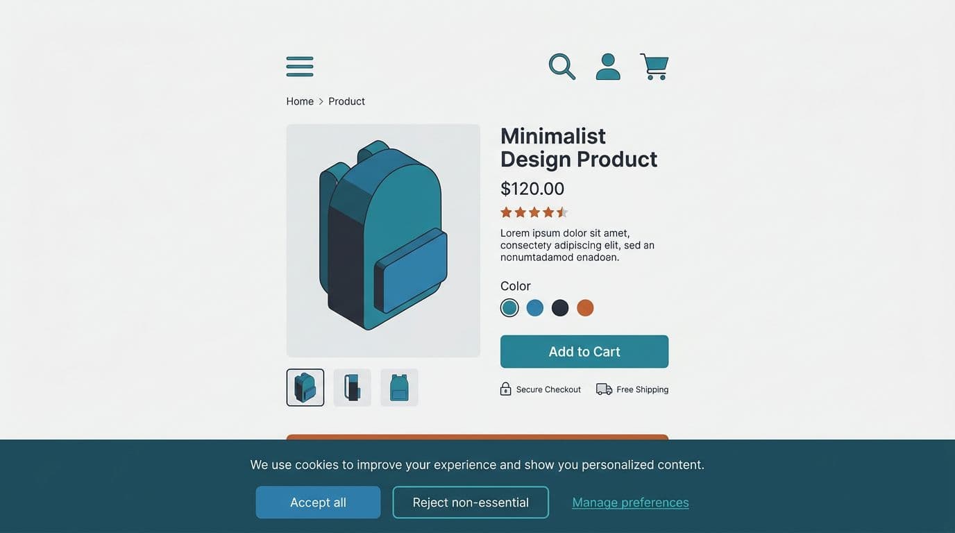
Start by choosing the right pattern. For most stores, a bottom banner works better than a full-screen blocker, especially on mobile. It reduces the “hard stop” feeling. It also avoids covering critical UI like image galleries and variant selectors.
Button design matters more than many teams admit. If “Accept all” is loud and “Reject” is hidden in a text link, you risk compliance issues and angry users. Regulators and privacy watchdogs have increased scrutiny around dark patterns in consent, so keep choices balanced and honest. DataGrail’s overview of cookie banner design without dark patterns is a good reference for what to avoid.
A few banner rules that protect conversion without pushing boundaries:
- Use plain language: “We use cookies to measure traffic and improve your experience” beats legal jargon.
- Offer three clear actions: Accept all, Reject non-essential, Manage preferences.
- Keep “Manage” useful: it should open a real preferences panel, not a maze.
- Don’t block shopping: users should still browse if they reject non-essential cookies.
Also check layout collisions. If you use sticky mobile UI (cart drawers, chat widgets, sticky add-to-cart bars), your banner must not cover them. If you’re tuning mobile purchase UI, these mobile add-to-cart button designs highlight the same principle: protect the tap moment, keep primary actions reachable.
For broader store UX consistency, align consent UI with your typography, spacing, and component rules. This is the same discipline behind proven UX patterns for online stores, just applied to privacy touchpoints.
High-performing consent UX doesn’t feel like persuasion. It feels like control.
Build a preference center people can understand in one scroll
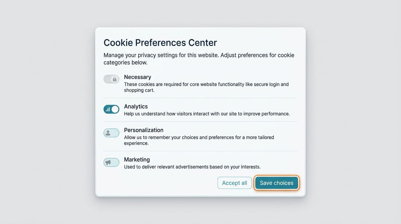
If the banner is the handshake, the preference center is the contract. It needs to be clear, scannable, and easy to exit. Most conversion loss here comes from two things: too many choices, or confusing categories.
Keep categories broad and recognizable. Many teams land on:
- Necessary (always on)
- Analytics
- Personalization
- Marketing
Then add one sentence per category. Avoid vendor lists and cookie IDs in the modal. Put those in the full cookie policy, linked from the modal. This keeps the UI readable, while still supporting informed consent.
Accessibility is a conversion feature here. If the modal fails keyboard focus, contrast, or tap target sizing, it frustrates users who already feel interrupted. Use visible focus states, readable line lengths, and strong color contrast for toggles and buttons. If you need a quick refresher on contrast thresholds and practical fixes, these color contrast best practices for e-com map well to consent UI.
This table helps teams pick the right structure without overcomplicating it:
| Pattern | Best for | Conversion risk | Compliance risk |
|---|---|---|---|
| Bottom banner + “Manage” modal | Most e-commerce stores | Low | Low (if balanced choices) |
| Full-screen consent wall | Regulated experiences, logged-in apps | Medium to high | Medium (easy to overblock) |
| Small corner toast | Returning users, low tracking needs | Low | High (often not noticeable enough) |
The preference center also needs a clear “Save choices” action and a predictable close behavior. If users hit escape or tap outside, don’t silently treat that as consent. Make the default outcome explicit.
If you’re sanity-checking what must be present for GDPR-style consent flows (and what commonly goes wrong), PrivacyChecker’s GDPR cookie banner compliance guide is a solid checklist-style read.
Technical consent setup that keeps analytics useful (and tags under control)
Great UI can’t save you if tags fire too early. In 2026, the baseline expectation in opt-in regions is simple: don’t run non-essential cookies until the user agrees. That includes many analytics setups, ad pixels, and personalization scripts.
So treat consent as a real system, not a front-end widget. Your CMP should:
- Block tags by default (until consent).
- Store consent records (what choice, when, and from where).
- Send consent signals to tools (analytics and ad platforms).
- Make it easy to change later (footer link, privacy center, account page).
If you’re implementing from scratch or cleaning up a messy tag stack, Open Door Digital’s cookie consent implementation guide for 2026 offers a practical walkthrough of the moving parts.
One more reality: measurement will change after you stop “auto-tracking” everyone. That’s normal. Many teams now rely on Google’s Consent Mode v2 signals where applicable, so tags can adapt based on user choices. Your analytics lead should plan for a transition period, with clearer expectations around modeled data, attribution gaps, and regional differences.
Gotcha: If your “Reject” button exists but your pixels still fire on page load, you haven’t implemented consent. You’ve only designed it.
Finally, test consent UX like any other conversion surface. Run QA on real devices, especially iOS Safari. Then A/B test carefully, because you can harm trust if variants feel manipulative. When you evaluate impact, segment by region and traffic source. A banner that works for EU paid traffic can behave differently for US organic visitors.
Need a broader framework for reducing friction across the journey, not just on consent? These user experience e-commerce tips for higher conversions pair well with consent improvements, because they focus on the same theme: remove avoidable hesitation.
Conclusion
Cookie banners don’t have to be a conversion tax. With balanced choices, a readable preference center, and tags that wait for permission, cookie consent UX can support both trust and revenue. Audit your current setup this week, starting with “Do we block non-essential scripts before consent?” Then fix the UI so shoppers can decide fast and keep browsing.