Every extra second spent typing an address feels like waiting in a slow line. Shoppers aren’t comparing your checkout to other checkouts, they’re comparing it to doing anything else with their time.
Good checkout form UX doesn’t just “look clean.” It removes work, prevents errors, and respects how people type on mobile. The best patterns do three things well: ask for less, auto-fill more, and recover gracefully when something goes wrong.
Ask for less, but still capture deliverable addresses
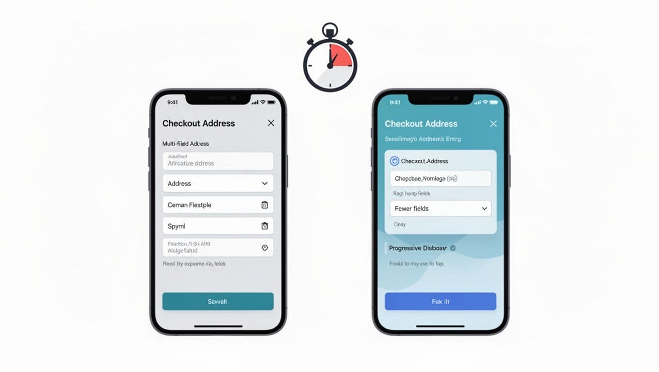
Address entry time often balloons because teams treat every address like a customs form. Start by questioning each field. If it doesn’t help deliver the package, prevent fraud, or calculate tax, it probably doesn’t belong on the first screen.
A useful benchmark is to minimize checkout fields and steps wherever possible, which aligns with Baymard’s research on minimizing form fields in checkout. Fewer fields means fewer taps, fewer errors, and fewer chances to quit.
Practical do/don’t: field strategy
- Do use progressive disclosure. Show the minimum, then reveal more only when needed (for example, company name, apartment, or delivery instructions).
- Do allow flexible formats for address lines. People paste, abbreviate, and reorder.
- Don’t make “Address line 2” look required. Most shoppers don’t need it, and many will enter junk just to move on.
- Don’t force a state or province when the selected country doesn’t use one. If you must collect a region, switch the label and rules by country.
Also, stop splitting fields just because your database likes it. “Street number” and “street name” separate fields can speed up some locales, but it also creates more failure points. If you ship internationally, start with address-line1 and address-line2, then parse on the back end if you truly need structure.
If you’re aligning this work with broader conversion goals, it helps to tie address UX back to the overall shopping journey. The guide on essential e-commerce UX tips for 2026 is a good reference point for prioritizing changes beyond the form itself.
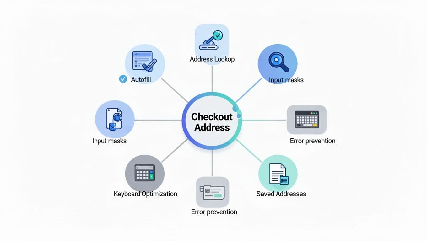
Let auto-fill and address lookup do the heavy lifting
When address entry is slow, it’s usually because the form expects perfect typing. That’s the wrong bet on mobile. Instead, design for assisted entry.
Browser and OS autofill
Make autofill “just work” by adding correct HTML autocomplete values and matching them to stable, single-purpose inputs. In practice, that means:
- Use
autocomplete="name"for full name (orgiven-nameandfamily-nameif you must split). - Use
autocomplete="street-address"if you keep a single textarea style field, oraddress-line1andaddress-line2for separate lines. - Use
autocomplete="postal-code",address-level2(city), andaddress-level1(state/region) where applicable. - Use
autocomplete="country"orcountry-namedepending on your control.
Autofill is also an accessibility win. Screen readers and voice input work better when fields are predictable.
Address lookup (typed search, not a long form)
For many stores, the fastest pattern is a search-first address lookup that fills multiple fields at once. Baymard’s guidance on fully automatic address lookup highlights why this reduces typos and rework. The key is to keep a clear escape hatch: “Enter address manually” should always be available, and it should not feel like a punishment.
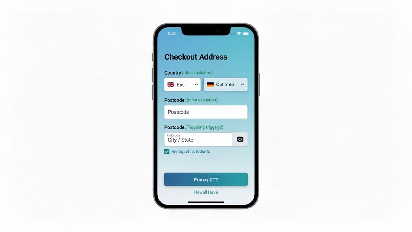
Postcode-triggered city/state fill
If you keep a traditional form, one high-impact pattern is to auto-detect city and state after postal code entry (with user confirmation). Baymard covers the usability angle in postal code-based city/state autodetection. This works best when you:
- Wait until the postal code looks complete for that country.
- Fill values but keep them editable.
- Explain silently with microcopy like “Filled from ZIP” (or a subtle hint icon), instead of a loud banner.
Speed comes from fewer decisions. Every time a shopper pauses to wonder “What goes here?”, completion time jumps.
Optimize for mobile typing, then prevent errors without being strict
Typing on a phone is a game of tiny targets and wrong keyboards. Small implementation choices can cut time without changing layout.
Implementation notes that pay off quickly
Use inputmode to request the right keyboard:
- Postal code:
inputmode="numeric"(but allow letters for countries that use them). - Phone:
inputmode="tel". - Email:
inputmode="email".
Avoid heavy input masks for addresses. Masks can fight pasting and international formats. For postal codes, light formatting hints are safer than forcing a pattern.
Here’s a compact mapping that helps teams align UX and engineering:
| Field | autocomplete | Helpful inputmode |
|---|---|---|
| Address line 1 | address-line1 | text |
| Address line 2 | address-line2 | text |
| City | address-level2 | text |
| State/Region | address-level1 | text |
| Postal code | postal-code | numeric (allow letters) |
| Country | country | text |
Validation: guide, don’t block
Over-restrictive validation is one of the biggest causes of address rage. Shoppers know where they live. If your form says their address is “invalid,” they blame you.
- Validate as they go, but show errors only after a field is touched or on submit.
- Prefer “soft warnings” for edge cases (for example, “Apartment missing?”), not hard stops.
- Allow punctuation, hyphens, and longer names. Real addresses are messy.
Don’t turn formatting rules into “truth rules.” A deliverable address can still look unusual.
Common pitfalls to fix (conversion killers)
- Shipping = billing toggles that backfire: Defaulting billing to shipping can reduce work, but the implementation often goes wrong. If you use it, make sure it truly copies values, stays in sync when edited, and doesn’t hide required billing fields in a confusing way. Baymard’s analysis of billing equals shipping defaults is a solid checklist for avoiding common failures.
- Forcing state/province: If the selected country doesn’t have states, hide the field. Don’t show it and mark it required “just in case.”
- Making Address line 2 required: Treat it as optional, and label it clearly as optional.
- Aggressive “correction” suggestions: If you suggest a standardized address, show both options and let the shopper choose.
Short checklist for faster address entry
- Keep required fields minimal and reveal extras only when needed.
- Enable browser autofill with correct
autocompleteattributes. - Offer address lookup, with a clear manual entry fallback.
- Autofill city/state from postal code where it’s reliable, and keep fields editable.
- Use mobile-friendly keyboards via
inputmode. - Avoid strict masks that block paste or international formats.
- Validate gently, focusing on deliverability over formatting.
- Handle shipping and billing defaults carefully, with predictable behavior.
Reducing address entry time is rarely one big change. It’s a set of small choices that add up. When the form feels like it’s helping, not testing, shoppers move faster and abandon less. The next time you review your checkout form UX, time it on a phone, then remove the steps that make you hesitate.