
The fastest way to lose an extra sale is to make the cart feel like a trap. Cart upsell UX works only when it helps shoppers finish what they already came to do.
That means fewer offers, better timing, and zero drama to ensure a smooth shopping experience. Your cart should act like a sharp store associate, not a kiosk that keeps interrupting. Start with the moment, then design around low effort and easy exit.
Key Takeaways
- Cart upsell UX boosts AOV when it’s relevant, low-friction, and secondary—helping shoppers complete their order like a sharp store associate, not an interrupting kiosk.
- Pre-checkout offers should focus on complementary products, small bundles, or free shipping nudges; save subscriptions and upgrades for post-purchase to avoid competing with conversion.
- Limit choices to 1-3 offers, keep UI compact with easy dismissal, and avoid heavy widgets or modals to prevent decision fatigue and protect checkout flow.
- Test upsells like checkout changes: A/B one relevant offer vs. multiples, tracking AOV alongside checkout rates, cart speed, abandonment, and device segments.
- Relevance wins over generic carousels—context-aware suggestions tied to cart items lift attach rates without taxing intent.
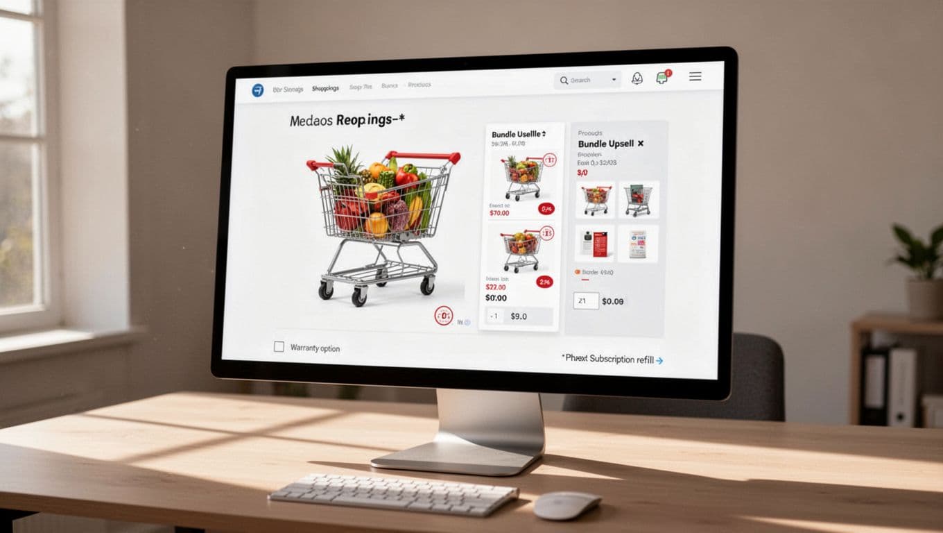
What good cart upsell UX feels like at the point of purchase
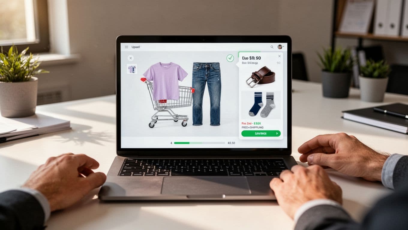
A strong cart upsell doesn’t restart browsing. It tightens the path to checkout while adding one relevant product suggestion. If the customer has jeans in the cart, complementary items like a belt or socks make sense. If they bought a camera, a memory card or low-cost protection plan can fit. If they bought vitamins, a refill pack or first subscription cycle can work.
Relevance is the whole game. Generic “you may also like” carousels usually add noise. Context-aware product recommendations feel different, especially when the reason is obvious. For more on ranking logic, see these relevant product add-on suggestions.
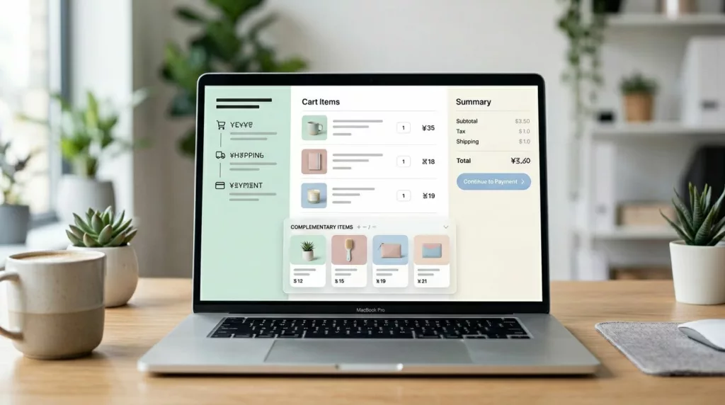
Good cart offers also stay small in both price and cognitive load. Many teams find that lower-cost complements outperform ambitious upgrades, a point echoed in cart drawer best practices. The shopper should be able to scan the offer, select size via a variant picker, grasp the benefit, and add it in one tap.
User interface design matters as much as the merchandising. Keep the offer below line items or in a secondary panel. Preserve the order summary. Keep the checkout button visible. Most importantly, make dismissal painless. A small close icon or “No thanks” lowers pressure and often raises trust.
If the upsell makes checkout harder to reach, it isn’t helping AOV, it’s taxing intent.
Keep the offer visually secondary
This is where many carts go sideways. The upsell card grows larger than the products already chosen, or it pushes totals and checkout below the fold. Don’t let that happen. Use smaller thumbnails, short titles, clear prices, and one action. Avoid full-screen modals, auto-opening drawers, and product carousel format that demand swipes.
On the mobile viewport, the rule gets stricter. Space is tight, so every extra element competes with checkout. Keep the component compact, and don’t repeat the same offer in the mini-cart, cart page, and checkout entry point.
Which upsells belong in the cart, and which post-purchase product offers belong after purchase
Pre-checkout offers should solve the current order. Post-purchase product offers can serve the next decision. Mixing those jobs is where many teams go wrong.
This quick comparison keeps the boundary clear:
| Moment | Best offer types | UX rule | Common mistake |
|---|---|---|---|
| Pre-checkout cart upsell | Complementary products, threshold-based free shipping nudges, small bundles, digital upsells, replenishment add-ons | Keep it inline, optional, and one-click | Sending shoppers back to category pages |
| Post-purchase product offers | Higher-ticket bundle upgrades, subscriptions, second-order deals | Show it after payment, with a clear decline path | Holding back items the shopper needed before checkout |
In practice, pre-checkout cart upsells work best when they reduce doubt or help complete the purchase, powered by relevance logic that draws on behavioral data for personalized recommendations. A footwear cart can suggest care spray. A skincare cart can suggest SPF or a travel-size cleanser. A stroller cart can add a rain cover or cup holder. A large-item cart can add assembly or shipping protection. Trigger these at add-to-bag confirmation for the best results.
Free shipping nudges also fit here, because they clarify value at the right time. If you use them, a free shipping calculator provides the nudge while these free shipping threshold UX patterns show how to keep the message useful instead of pushy. The best version states the gap, suggests one or two sensible top-up items, and stops selling once the threshold is reached.
Post-purchase product offers are different. The payment is done, so the offer doesn’t compete with the main conversion. That’s the better place for a full subscription pitch, a premium bundle upgrade, or a broader routine-builder set. As timing and placement guidance often points out, the same product can work or fail based on where it appears.
The rule is simple. Before checkout, help shoppers finish this order. After checkout, you can pitch the next one. These tactics directly lift Shopify store revenue by optimizing conversions at every stage.
How to raise AOV without slowing checkout or causing fatigue
The fastest way to break cart upsell UX is to add weight, friction, or too many choices. Heavy third-party widgets slow the cart, harm checkout usability, and disrupt checkout flow. Full sliders eat mobile space. Modals block exit paths. Then even a relevant offer starts to feel like clutter, hurting your average order value gains.
Keep the component light for a frictionless experience. Reuse cart data you already have. Load only the few items you plan to show. Skip autoplay, countdowns, and oversized media. If the cart drawer or cart preview modal takes longer to open because of the upsell, you have already hurt the experience. On phones, protect thumb reach and keep the call to action buttons visible, the same logic behind mobile sticky add to cart bars.
Choice count matters too. One offer often beats four. Three is usually the upper limit. After that, the shopper starts comparing the upsells instead of completing the order. That is classic decision fatigue, and it shows up fast on mobile.
What to test first
Treat cart upsells like checkout changes, not like homepage merch tests. Use A/B tests with guardrails. Compare one relevant cross-selling offer against three offers. Test a free shipping nudge against a product add-on. Try an inline warranty checkbox versus a small product bundles card. Keep the rest of the cart fixed.
Then read more than average order value. Watch checkout start rate, revenue per visitor, attach rate, dismiss rate, cart-to-checkout rate, cart speed, conversion rate, and abandoned carts. Segment by device, traffic source, and new versus returning shoppers. Also check return rate and support tickets. Average order value lift means little if you created regret or confusion, especially with drop-offs in checkout flow.
Average order value rises when the cart removes work instead of adding it. The best upsell is often the one that barely feels like an upsell at all.
Protect checkout flow first. Then let relevance, timing, and restraint do the selling.
Frequently Asked Questions
What distinguishes good cart upsell UX?
Good cart upsell UX feels helpful and optional, tightening the path to checkout with one relevant, low-cost complementary suggestion. It stays visually secondary, preserves the order summary and checkout button, and offers painless dismissal via a close icon or “No thanks.” This builds trust and avoids making the cart feel like a trap.
When should you use pre-checkout upsells versus post-purchase offers?
Pre-checkout upsells solve the current order with complements, bundles, or free shipping nudges to reduce doubt and complete the purchase. Post-purchase offers pitch higher-ticket items like subscriptions or upgrades after payment, when they no longer compete with conversion. Mixing these confuses timing and hurts results.
How do you avoid friction and fatigue in cart upsells?
Keep components light by reusing cart data, loading few items, and skipping autoplay or oversized media—especially on mobile where space is tight. Limit to 1-3 offers to prevent decision fatigue, and ensure thumb-friendly CTAs with visible checkout buttons. Heavy widgets or modals slow the experience and erode AOV gains.
What should you test first for cart upsells?
Start with A/B tests comparing one relevant cross-sell against multiples, or a free shipping nudge versus a product add-on, keeping the rest of the cart fixed. Track beyond AOV: checkout start rate, attach/dismiss rates, cart speed, abandonment, and segments by device or traffic source. Watch for unintended issues like higher support tickets or returns.
Why is product relevance crucial for cart upsells?
Relevance turns noise into value—generic carousels add clutter, but context-aware suggestions (e.g., belt with jeans, memory card with camera) feel obvious and boost uptake. Draw on behavioral data for personalization at add-to-bag or cart view. Irrelevant offers create pressure, while fitting ones clarify benefits in one scan.