
Ever watch a shopper add an item to the cart drawer, then nothing happens? They keep scrolling, open a new tab, or get distracted. In that moment, your cart drawer UX patterns decide whether the add sticks or fades.
A cart drawer should feel like a helpful cashier tray that enhances the customer experience; it catches the item, confirms it’s real, and points to the next step. When it’s vague, jumpy, or pushy, people back away.
Below are slide-out cart patterns that sustain purchase intent and keep momentum high without trapping users or hijacking the page.
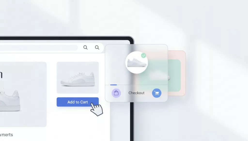
Confirm the add instantly (and don’t steal the page)
Understanding Effective Cart Drawer UX Patterns
Follow-through starts with certainty. If shoppers aren’t sure the add-to-cart button registered the item, they hesitate or double tap. That creates duplicate lines, annoyance, and mistrust.
Open the drawer when it adds value, not by default every time. A common rule: auto-open on the first add in a session, then switch to a quieter confirmation (badge count plus a short toast). Returning shoppers often know what they’re doing, so repeated interruptions can feel like speed bumps.
Keep feedback fast and layered for optimal user experience:
- A visible button state change (pressed, loading, success) prevents repeat clicks.
- The cart flyout slide-in should be quick and stable, with no layout jump.
- Accessibility in focus management matters, especially for keyboard users. Move focus into the drawer only when it opens.
Mobile needs extra care because space is tight. If the drawer covers key content or feels hard to dismiss, it can reduce adds. Pair drawer behavior with strong product page actions, including sticky CTAs and clear add-to-cart button states. This guide on mobile add-to-cart button patterns complements drawer work because it targets the same hesitation moment. A slide-in cart flyout maintains better flow than modal dialogs, which can block the page.
If you want real-world examples to critique, see Shopify cart drawer teardowns and test ideas from top Shopify stores and compare patterns across stores.
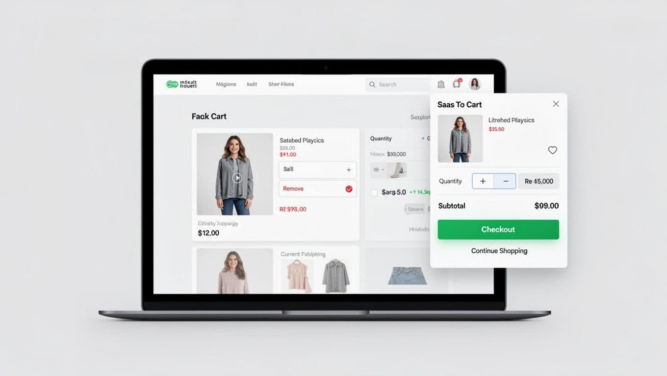
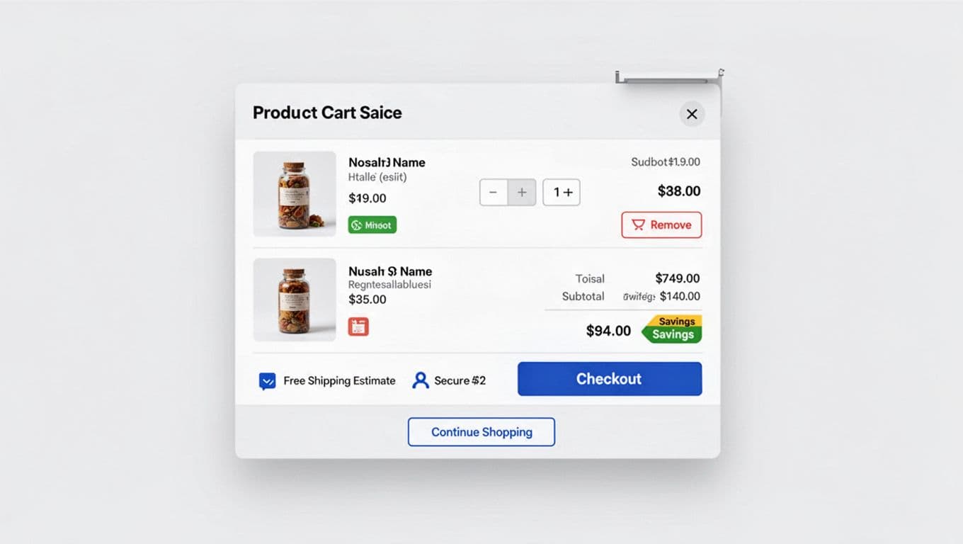
Make edits feel safe: quantity, remove, totals, and trust signals
A cart drawer isn’t just a summary, it’s a decision checkpoint. That means shoppers must be able to fix mistakes quickly without fear.
Quantity controls should be obvious and forgiving. Use plus/minus steppers, show the new subtotal right away, and avoid full redraws that make the drawer flicker. When someone removes an item, offer a short “Undo” window instead of a hard delete. That one detail prevents rage clicks and reduces support tickets. These clear edits build confidence and help boost average order value as users commit to larger purchases.
Show a compact cost breakdown that answers the questions people are already thinking:
- Subtotal and discounts (if any)
- Shipping estimate (even a range), free shipping progress bar toward the free delivery threshold
- Tax handling (simple phrasing beats legal text)
Place the most important trust signals near the checkout action, not buried in a footer. A small “free returns” signal, secure checkout badge, or payment icons like Shop Pay can calm nerves right before the click to the checkout page. For broader context on reducing checkout drop-offs, this checkout UX optimization guidance for 2026 is a useful reference.
If the drawer hides costs or constraints, shoppers assume the worst and pause.
Also, design for bad states. If an item goes out of stock, don’t just block checkout. Explain what changed, keep the rest of the cart intact, and offer a clear fix (remove item, pick another variant, save for later, or adjust a subscription model plan).
Use clear CTA hierarchy, and keep cross-sells in their place
A cart drawer works when it answers one question: “What should I do next?” Your CTA hierarchy should make that answer obvious.
Treat Checkout as the single primary action. Make it visually dominant, full-width when possible, and anchored where thumbs can reach in mobile-first UX. Then add one secondary route, usually “Continue shopping.” Anything beyond that becomes a debate, and debates slow purchases. A clear CTA hierarchy like this improves follow-through and boosts conversion rate along the path to purchase.
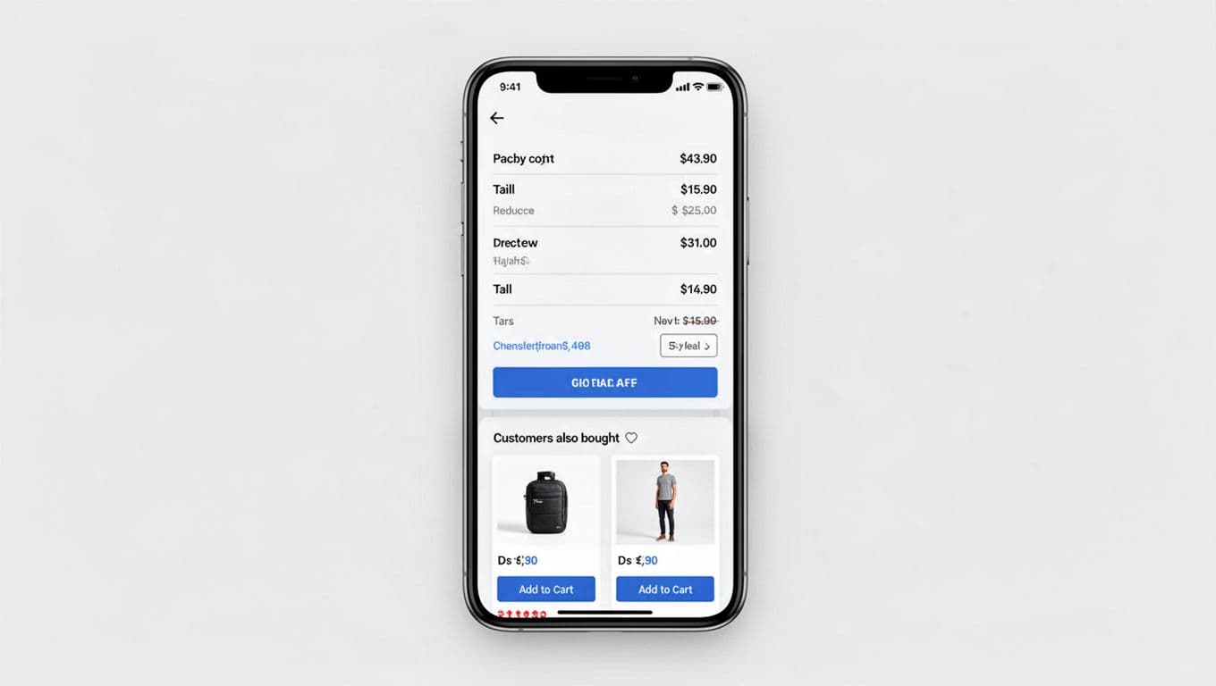
Cross-sells can help generate secondary revenue, but only when they don’t compete with checkout. Keep product recommendations and related products:
- Below the primary CTA or clearly separated
- Limited to one small module (2 items is often enough)
- Relevant to the cart (replacement filters, warranty, matching accessories)
Label the module in plain language so it doesn’t feel like a trick. Better: “Pairs well with your item.” Worse: a loud carousel that pushes the checkout button down.
Watch cart drawer height and scroll behavior. If users must scroll to find Checkout, follow-through drops. Some teams solve this with a sticky checkout button inside the drawer, while content scrolls beneath it. This setup supports accelerated checkout in the checkout flow, leading seamlessly to the checkout page.
For pattern inspiration across multiple implementations, browse cart drawer examples that convert. Also, don’t assume a drawer always wins. Site layouts and traffic mixes vary, and the right choice sometimes is a cart page or hybrid, see this cart drawer vs cart page test discussion.
If a cross-sell steals attention from “Checkout,” it’s not an upsell, it’s a detour.
Wrap-up: turn your cart drawer into a confidence builder
The best cart drawers don’t feel “busy.” They feel certain, editable, and honest about the next step. Start by tightening confirmation, then make edits safe, then lock in a clear checkout-first CTA.
Audit your drawer with session replays and a few focused A/B tests to enhance the user experience, including elements like social proof. These patterns help reduce cart abandonment. When you treat follow-through as the goal to improve the customer experience, the cart drawer stops being a slide-out panel and starts acting like a guide.