Most returns for apparel items start as a simple guess. The shopper likes the product, but sizing feels like a coin toss. When that happens, they’ll often buy two sizes, or they’ll buy one and hope. Either way, your margins take the hit.
Good size guide UX reduces returns by replacing guesswork with clear, quick answers. The best patterns don’t “add more info.” They place the right info where the decision happens, explain fit in human terms, and keep the experience accessible on every device. Clear sizing layouts improve the user experience and help boost a site’s search engine ranking.
Make size help show up at the exact decision point on the product page
If sizing help is hidden, shoppers don’t use it. Then they guess, and your return rate pays the price. The highest-impact pattern is simple: place size guidance right next to the size selector, not buried in tabs.
Think “road signs,” not “user manual.” The shopper shouldn’t hunt for the size guide after they’ve already felt uncertain.
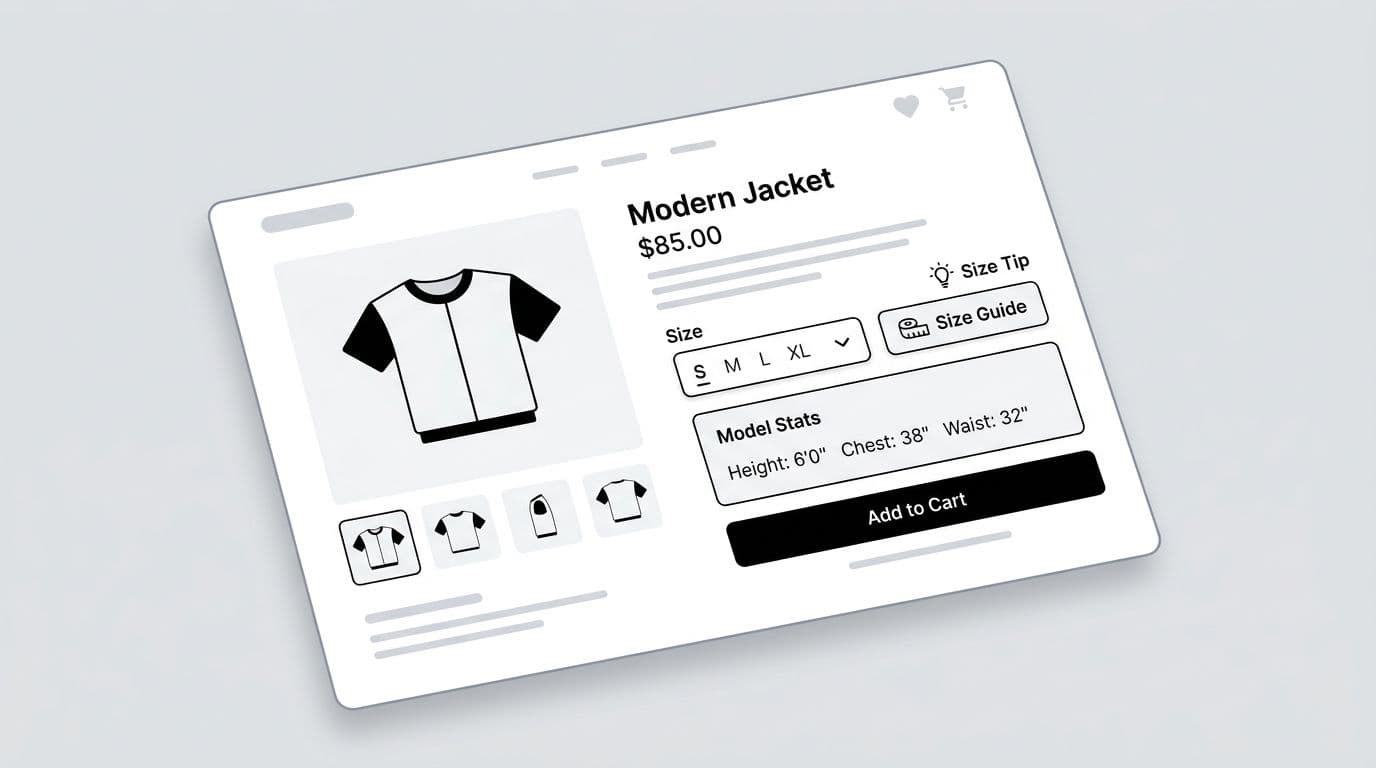
Wireframe-style placement (what to build)
A practical layout sketch for a product description page above the fold:
Size row: Size: [ S ][ M ][ L ][ XL ] (Size guide) (Find my size)
Quick-fit hint (one line under size row): “Runs slightly slim in the shoulders.”
Model context (small block): “Model: 5’10”, chest 38″, wears M.”
That pattern supports confidence without pulling attention away from the product. This layout ensures the product page remains uncluttered.
Microcopy that prevents the “wrong expectations” return
Avoid vague lines like “True to size” with no context. Instead, write fit guidance that matches how people describe clothing.
A few high-performing examples:
- “Between sizes? Size up for a relaxed fit.”
- “Prefer a snug fit? Choose your usual size.”
- “If you’re broad-shouldered, consider sizing up.”
- “Waist has minimal stretch, match your waist measurement.”
Returns drop when you replace “pick a size” with “pick a fit.”
Quick checklist: size help entry points that get used
Use this short checklist when auditing a product page:
- Inline link: Vital for mobile shoppers, show “Size guide” within thumb reach of the size options on mobile.
- Secondary CTA: Add “Find my size” for shoppers who don’t measure.
- Sticky support: Repeat size help in the sticky add-to-cart bar, because doubt often shows up after scrolling.
- Cart confirmation: On cart lines, show size and a small “Change size” action to fix mistakes early.
- Policy pairing: Put a short returns line near sizing (not in the footer), because reducing fear reduces over-ordering.
If you want a broader view of how product-page clarity affects revenue, tie this work to the bigger impact of UX design on conversion rates. Optimizing this workflow enhances the overall user experience and directly improves the conversion rate.
For additional context on why sizing guides matter in retail, Shopify’s overview of how to create a sizing guide is a useful reference for teams aligning merchandising and UX.
Build a size chart people can understand in 10 seconds
A measurement chart fails when it forces mental math. Shoppers scan, they don’t study. Your job is to make the right comparison obvious.
The table pattern that reduces confusion
A return-friendly size guide usually includes three parts in one place:
- A clear table with sizes across the top and key measurements down the side.
- A toggle for “Garment measurements” vs “body measurements,” part of your brand-specific size chart.
- A “How to measure” panel with a clear measurement method, simple diagrams, and short steps.
Also, be consistent about units. If you support both centimeters and inches on localized sites for international shoppers, provide international size conversion and let shoppers switch units without losing context or resetting scroll position.
Here’s a compact table structure that works well on mobile (with horizontal scroll and sticky headers), while still readable on desktop:
| Measurement | S | M | L | XL |
|---|---|---|---|---|
| Chest (garment) | 38 in | 40 in | 42 in | 45 in |
| Waist (garment) | 30 in | 33 in | 36 in | 39 in |
| Length | 27 in | 28 in | 29 in | 30 in |
Takeaway: include only the product measurements that predict fit for that product type. For tees, chest and length usually beat a long list of niche numbers.
“Between sizes” guidance (where most returns begin)
Most size-related returns come from edge cases: between sizes, tall vs short, athletic builds, or shoppers who want a certain drape.
Put “between sizes” help right above the chart and tailor it by category:
- Denim: “Between sizes? Choose the smaller size for stretch denim, larger for rigid denim.”
- Outerwear: “Layering planned? Size up.”
- Dresses: “If your bust and hips fall in different sizes, choose the size that fits the larger area, then tailor if needed.”
Accessibility details that keep the guide usable
Size guides can break accessibility fast, especially in modals and tables.
WCAG-minded fixes that also reduce returns:
- Table semantics: Use real table headers so screen readers announce row and column context.
- Keyboard support: If the guide opens in a modal, move focus into it, trap focus inside, and return focus to the “Size guide” trigger on close.
- Touch targets: Make unit toggles and size tabs large enough for thumbs.
- Color and contrast: Don’t rely on color alone to show the recommended size or selected unit.
- Plain labels: Write “Chest (product measurements)” or “Waist (body dimensions)” instead of “Bust circ.”
If you’re cleaning up the wider experience around sizing, shipping, and checkout, this list of common UX mistakes in e-commerce is a solid QA companion.
Add a fit finder that cuts guesswork and respects privacy
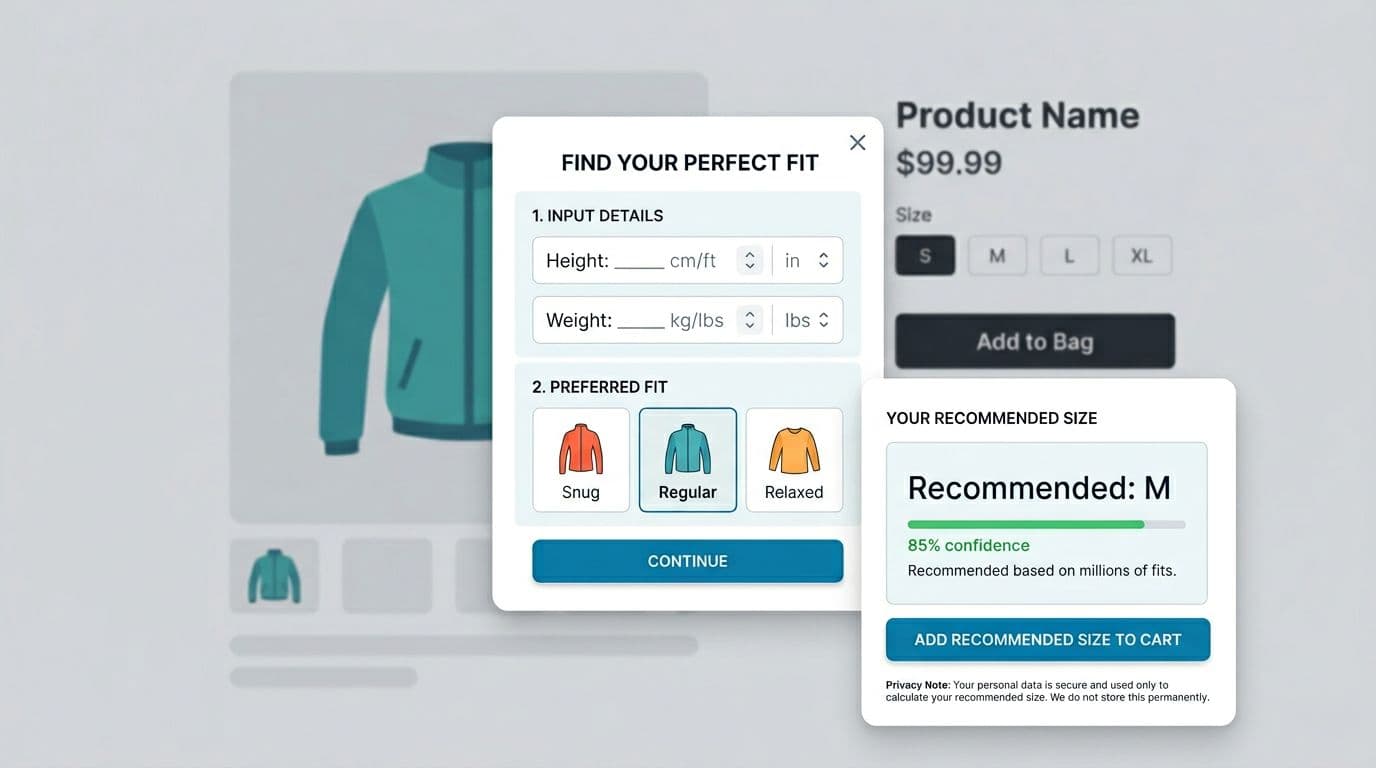
A fit finder, an AI size recommendation engine, helps when shoppers don’t have a tape measure, or don’t trust charts. The best ones stay short, show their reasoning, and avoid creepy vibes.
Wireframe-style flow (2 to 3 steps max)
Keep it tight:
Step 1: Basics
Height, weight, and one body anchor (selected from a dropdown menu) that matches the category (for example, waist for denim, bust for dresses, chest for menswear).
Step 2: Fit preference
Snug, regular, relaxed (with one-line explanations).
Result screen
“Recommended: M” plus a confidence indicator and a link to “See size chart.” Clear feedback like this increases user confidence. Add a second option when confidence is low: “If you prefer extra room, choose L.”
Microcopy examples that reduce regret:
- “Recommended: M (high confidence).”
- “Low confidence because measurements straddle two sizes. Consider your preferred fit.”
- “Want room for layering? Size up.”
For more context on how sizing friction hurts margins in global ecommerce, leading to international returns and more customer service tickets, Sizebay’s write-up on poor sizing UX and returns is a helpful framing piece for stakeholders.
Responsible data collection (keep it helpful, not invasive)
Fit tools can cross a line if they collect more than they need. You don’t need to infer sensitive traits to recommend a size.
A safer approach:
- Ask only what you can explain, and explain why you ask.
- Use clear consent for saving profiles, with a “Continue without saving” option.
- Avoid sensitive inferences (health status, pregnancy, or body-shape labeling).
- Set retention rules, delete stale profiles, and honor deletion requests.
Use simple privacy microcopy at the point of input: “Used only to recommend a size. Saved only if you choose.”
If you’re looking for more sizing-guide ideas that tie back to return reduction tactics, Glaze Digital’s article on size guides that reduce returns offers additional angles you can borrow and test.
QA checklist: what to test before shipping a fit finder
Keep this list short, but don’t skip it:
- Accuracy guardrails: Handle out-of-range inputs with helpful messages, not errors.
- Mobile ergonomics: Numeric keyboards for height and weight, no tiny radio buttons.
- Accessibility: Labels, error text that’s announced, and visible focus states.
- Honesty: Show low confidence when the match is close, don’t fake certainty.
- Analytics: Track “opened size help,” “used fit finder,” and “changed size in cart,” then compare to size-related return reasons. These metrics provide UX insights and help target long-tail keywords related to specific fit needs.
Conclusion
Better size guide UX, with a well-placed size guide, doesn’t just add a chart; it prevents the guess that triggers a return. Put size help next to the decision, make charts scannable with a clear size chart as a pillar of high-quality user experience, teach measuring in plain language, and offer a short fit finder with clear consent. Start with one category, run an A/B test, and compare size-related return codes before and after. These patterns are the most effective way to reduce returns for apparel brands. The real win is simple: fewer “wrong size” surprises showing up at the warehouse door.