

On mobile, the add to cart button is less like a button and more like a doorway to higher mobile conversions. If shoppers can’t find it fast, trust it, and tap it with confidence, they back out.
Good news, most mobile add to cart button drops come from a handful of fixable issues many e-commerce sites struggle with in the user experience: the button sits below the fold (not above the fold), the tap target is too small, the UI doesn’t confirm the action, or the page makes people wonder about shipping and returns.
Below are practical design patterns you can apply to product pages in February 2026, with measurable heuristics, accessibility checks, and a simple A/B plan you can run next sprint. For broader mobile UX foundations, see these mobile-first UX strategies for e-commerce conversions.
Make the add to cart button easy to reach (and hard to miss)
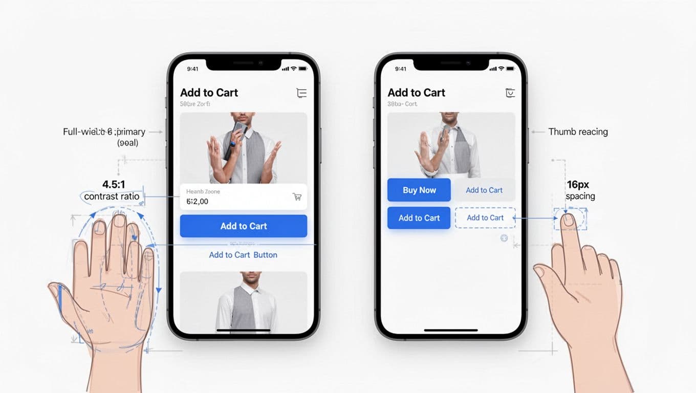
On a phone, the “happy path” prioritizes thumb-friendly navigation and one-handed interaction. That’s why bottom navigation bars with a sticky add to cart button often lift mobile conversions: it keeps the add to cart button inside the thumb zone while users scroll photos, reviews, and details. If you want supporting research for button patterns and prioritization, Baymard’s guidance on button design best practices is a solid reference point.
Use these heuristics as defaults in your mobile-first design, then tune per your catalog and audience:
- Touch targets and button size: at least 44 × 44 CSS px (48 × 48 is safer for larger hands and lower dexterity).
- Button width: full-width inside the sticky bar, with a clear primary style.
- Spacing: keep 12 to 16 px between the button and any secondary actions (wishlist, share) to prevent mis-taps.
- Sticky CTA buttons height: usually 64 to 80 px, enough to breathe without stealing content.
- Safe-area padding: add 16 to 24 px bottom padding plus iOS safe-area inset so the CTA never sits on the home indicator.
- One primary action: if the page shows multiple CTAs, the add to cart button should stay visually dominant.
Implementation note for common commerce stacks on product pages: on theme-based storefronts, teams typically add a “sticky add-to-cart” section that reads the selected variant and updates price. On custom apps or headless builds, treat it as a reusable component that subscribes to the same variant state as the main CTA. Either way, keep behavior consistent across templates, otherwise returning users hesitate.
If you’re building a broader conversion-focused design system, this roundup of research-backed e-commerce design patterns for better conversions pairs well with sticky CTA work because it covers PDP structure, navigation, and trust cues that feed into add-to-cart intent.
Reduce hesitation at the tap moment with clear info and clean CTA hierarchy
Even when users find the add to cart button, doubt can stop the tap. Think of doubt like sand in a zipper: the motion starts, then sticks.
Two patterns reduce this friction fast:
First, add microcopy directly under the call-to-action button. Keep it short and concrete, because mobile users scan. Good examples include trust signals such as transparent pricing, delivery range, free returns window, or pickup availability. Avoid long policy sentences here; link out if needed.
Second, handle variants and validation without punishment using inline form validation. If a product requires a size or color, don’t let users “fail” after tapping add to cart. Instead:
- Keep the button enabled, but change the label to “Select size” (or similar) until a required option is chosen.
- When tapped, open the variant picker and move focus to the first missing field.
- Persist selections in the sticky bar so users don’t lose context.
CTA hierarchy matters, especially when you also offer “Buy now.” The pattern depends on how often people truly want a one-step checkout.
Here’s a quick decision table for mobile product pages focused on mobile optimization and reducing cart abandonment:
| Pattern | Best for | Mobile rule of thumb | Risk to watch |
|---|---|---|---|
| Full-width Add to Cart | Most catalogs | Keep as the only primary CTA | Lower urgency for fast buyers |
| Split CTA (Buy now + Add to cart) | High-repeat, high-intent products | Make one primary, the other secondary | Choice overload, wrong taps |
| Sticky bar + secondary icons | Long PDPs, heavy content | Secondary actions use icons with labels on tap | Icon-only confusion |
If you need a proof point that persistent purchase UI can lift outcomes, ConversionTeam reports a mobile persistent cart banner test that drove a revenue lift in a case study on mobile cart banner performance. Results vary by site, but the pattern is test-worthy.
If shoppers pause at the button, they’re often asking, “What happens next?” Your UI should answer that before the tap.
Confirm the action fast: button states, accessibility standards, and performance
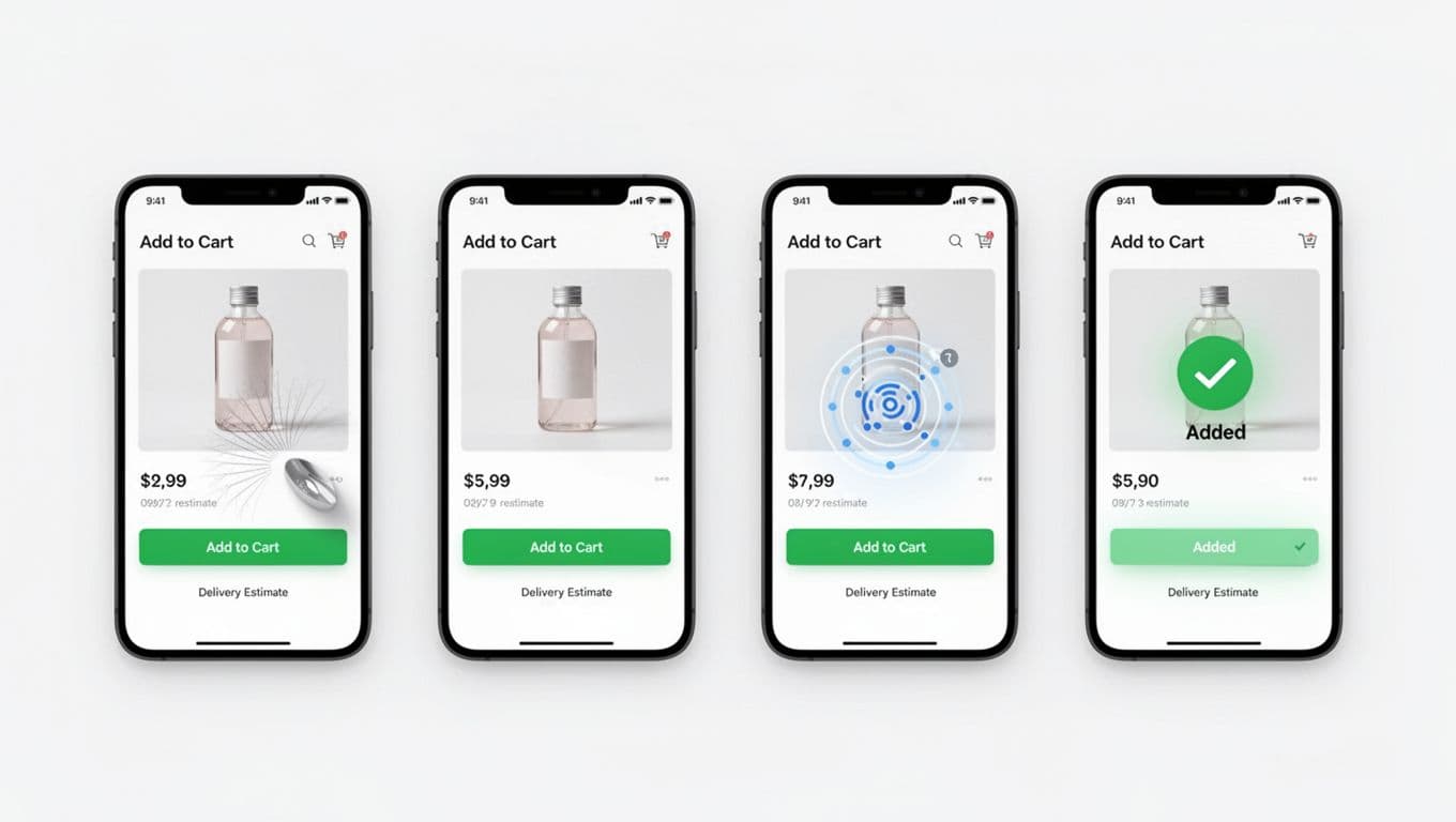
Mobile shoppers often tap twice when nothing seems to happen. That creates duplicate cart lines, “is my order real?” anxiety, and support tickets. Strong visual feedback states prevent that.
Aim for four clear states, with no layout shift:
- Default: “Add to cart” (or “Add to bag”), using high-contrast colors.
- Pressed: a short visual press response within 50 ms.
- Loading: replace the label with a spinner, keep width fixed, and disable repeat taps.
- Success: show “Added” with a checkmark for 800 to 1,200 ms, then return to default (or switch to “View cart” if that matches your flow).
Performance also shapes perceived trust. If cart requests can take time, show feedback immediately, then reconcile. Teams often use an optimistic UI update, paired with a fast rollback on failure. If the request fails, keep the user on the PDP and show a clear inline error plus a retry.
Accessibility standards cannot be an afterthought, because the add to cart button sits at the center of the purchase flow. Start with WCAG 2.2 guidance and bake these into your component:
- Name: use an explicit label (for example, “Add size 10 to cart” via accessible name when variants are selected).
- Focus: show a visible focus ring (at least 2 px) and don’t remove outlines.
- Contrast: meet 4.5:1 for text on the button, and ensure disabled states still read clearly. If your buttons blend into the page, apply these color contrast fixes for visible add to cart buttons.
- Announcements: for success, use an
aria-liveregion so screen readers hear “Added to cart.”
Quick mobile add-to-cart checklist (PDP product pages)
- Button tap target is at least 44 × 44 CSS px.
- Sticky bar includes safe-area padding and doesn’t cover key UI.
- Required variants guide the user with progressive onboarding instead of throwing errors.
- One primary CTA is visually dominant in card-based layouts with ample whitespace.
- Shipping and returns microcopy appears near the CTA.
- Loading and success states prevent double taps.
- Focus styles and screen reader labels are in place.
- Cart updates don’t cause layout jump (watch CLS).
A/B testing plan you can run this month
| Test | Hypothesis | Primary metric | Guardrails |
|---|---|---|---|
| Sticky bottom add-to-cart bar | Keeping the CTA in thumb reach increases adds | Add-to-cart rate (ATC per PDP view) | CLS, bounce rate, checkout process conversion, refund or return rate |
| Button feedback states (loading + success) | Clear confirmation reduces hesitation and repeat taps | ATC rate and time to first ATC | Duplicate line items, support contacts, error rate, INP |
Run tests long enough to cover weekday and weekend behavior, then segment results by device type and OS. Mobile UX improvements often show up differently across smaller screens.
Conclusion
Mobile conversions often rise when the add-to-cart button feels obvious, reachable, and trustworthy on e-commerce sites. Start with placement (sticky), remove doubt (microcopy and variant handling), then make feedback instant (states and performance). When you pair those with WCAG-minded accessibility and embrace mobile-first design, you get a CTA that works for more shoppers, not just the fastest tappers.