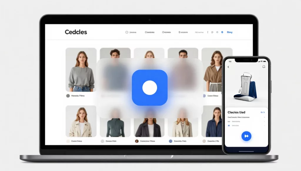
Quick View Modal UX Patterns That Increase Product Adds
Shoppers use product listing pages like a shelf scan in a store, fast, selective, and impatient. A quick view can...

Better On-Site Personalization Without Creepy Vibes: Rules, AI Recs, and User Controls
Most teams want on-site personalization that lifts conversion without making people feel watched. That’s the tightrope. If your message sounds...

Returns and Exchanges Page UX That Cuts Refund Requests
Refund requests in ecommerce returns don’t start at the warehouse. They start when a customer feels stuck, unsure, or suspicious....
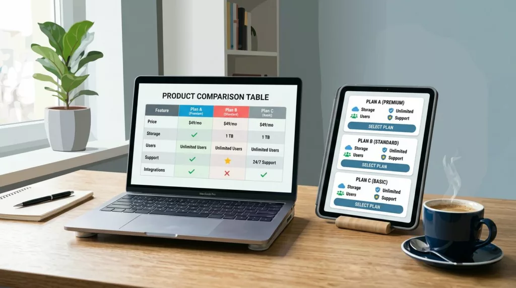
Product Comparison UX: How to Design “Compare” Tables People Actually Use
A comparison table should feel like a helpful salesperson aiding decision making, not a math test. Yet many “compare” tables...
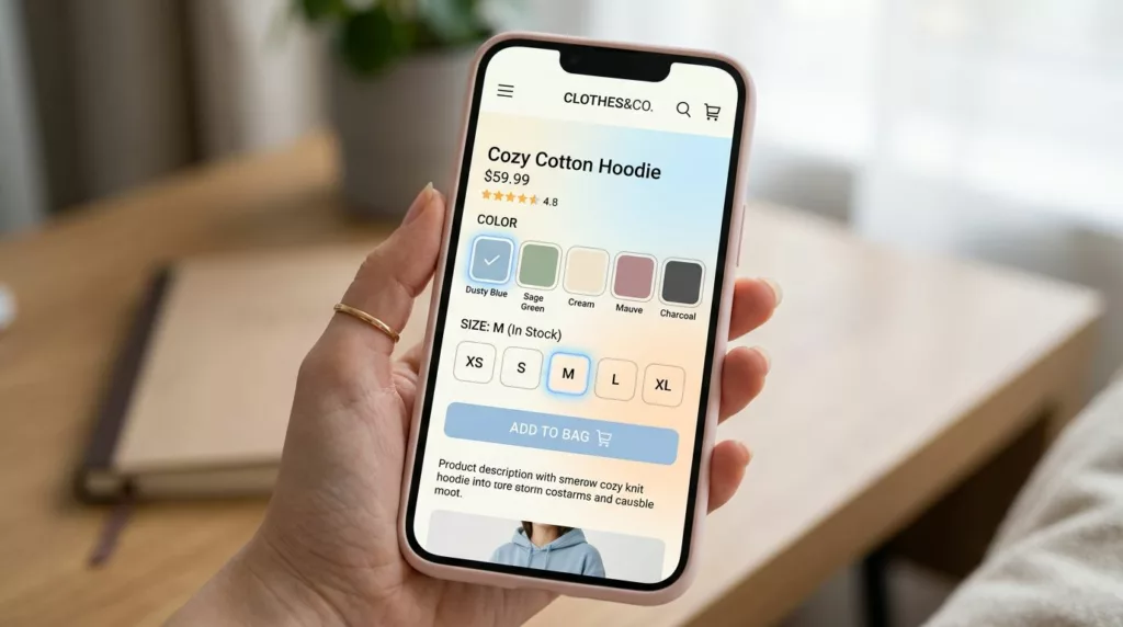
Variant Picker UX Patterns That Reduce Option Confusion On Mobile
Picking a size and color on a phone should feel like ordering coffee: quick, familiar, and hard to mess up....

Thank You Page UX Playbook for More Upsells and Fewer Tickets
Most teams treat the thank you page like a receipt. Customers treat it like a front desk. Right after purchase,...
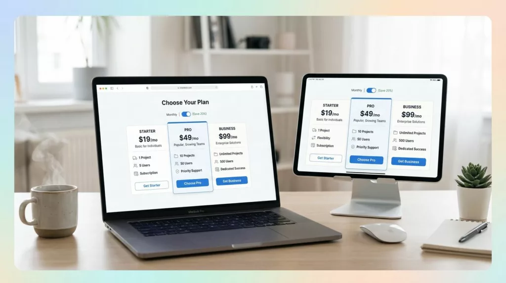
Pricing Page Design for DTC Subscriptions: Clarity, Anchoring, and Comparison Tables
If your best customers subscribe, why does your pricing page feel like a math test? Brands often seek landing page...
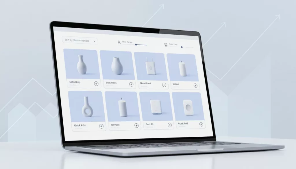
Category Page Design for Higher AOV, sorting rules, filter UX, and “quick add” patterns
Your category page is like a store aisle with a cart at the entrance. If the signs confuse people, they...

The Role Of UX In Boosting E-commerce Sales
Understanding UX, or User Experience, is like cracking the code to your favorite game. It’s all about making things easy,...