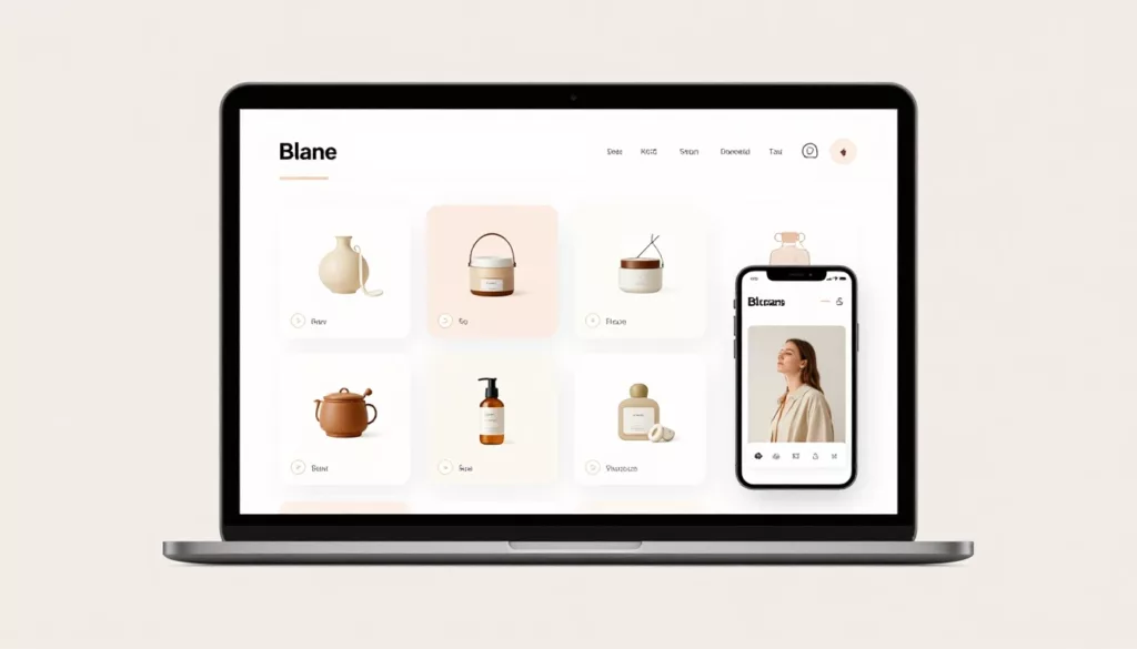
Shopify Collection Sorting UX That Improves Product Discovery
Bad sort order hides good products in plain sight. On a Shopify collection page, the first screen shapes clicks, filter...

Guest Checkout UX Patterns That Cut Friction and Cart Abandonment
A shopper who wants to buy now isn’t looking for a registration chore. They’re trying to finish a task with...
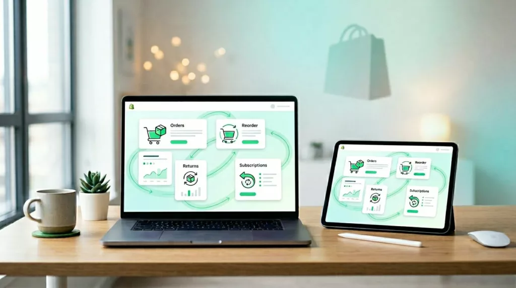
Shopify Customer Account Page UX That Drives Repeat Purchases
Most merchants spend hard to win the first order, then send repeat buyers into an account area that feels like...
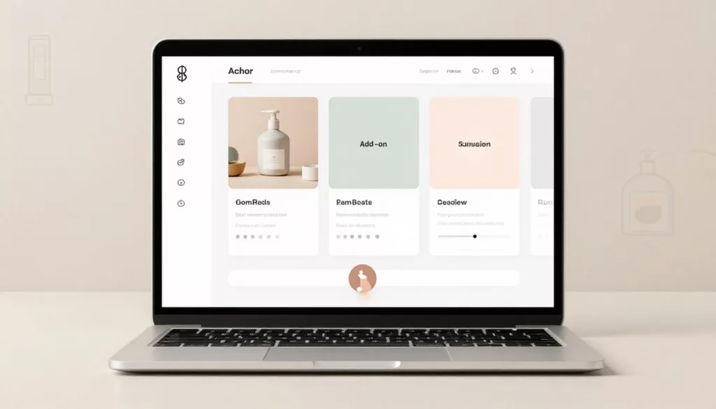
Bundle Builder UX That Increases AOV Without Shopper Confusion
A bundle should feel like help, not homework. When shoppers see clear steps, honest pricing, and fewer chances to make...
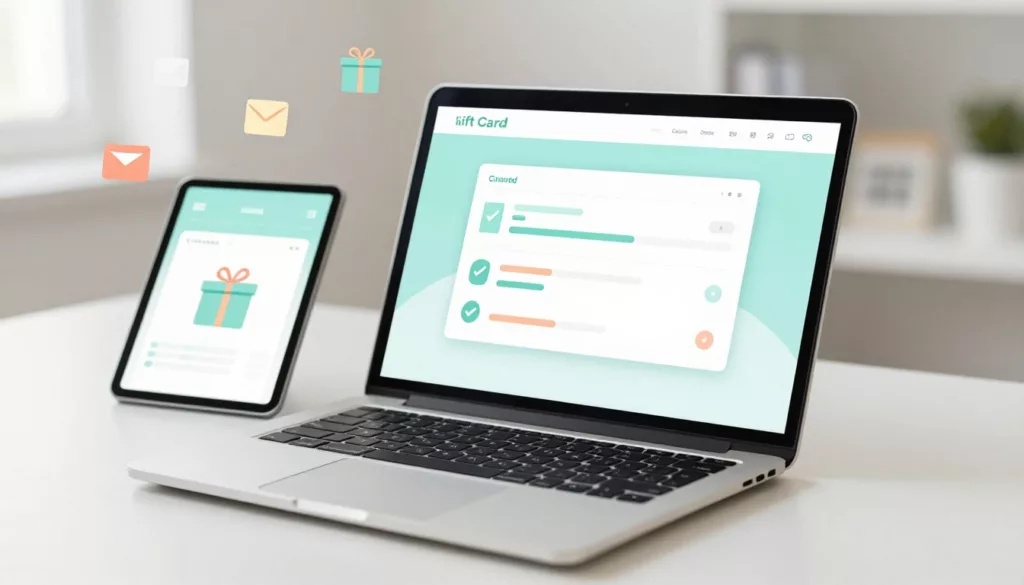
Gift Card Page UX That Increases Purchases and Cuts Confusion
Gift cards should be the easy win in your store. The shopper already wants to buy, they just need to...
Quick View Modal UX Patterns That Increase Product Adds
Shoppers use product listing pages like a shelf scan in a store, fast, selective, and impatient. A quick view can...

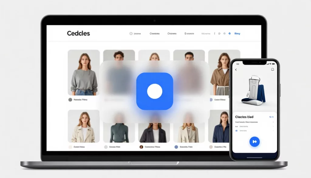
Better On-Site Personalization Without Creepy Vibes: Rules, AI Recs, and User Controls
Most teams want on-site personalization that lifts conversion without making people feel watched. That’s the tightrope. If your message sounds...

Returns and Exchanges Page UX That Cuts Refund Requests
Refund requests in ecommerce returns don’t start at the warehouse. They start when a customer feels stuck, unsure, or suspicious....
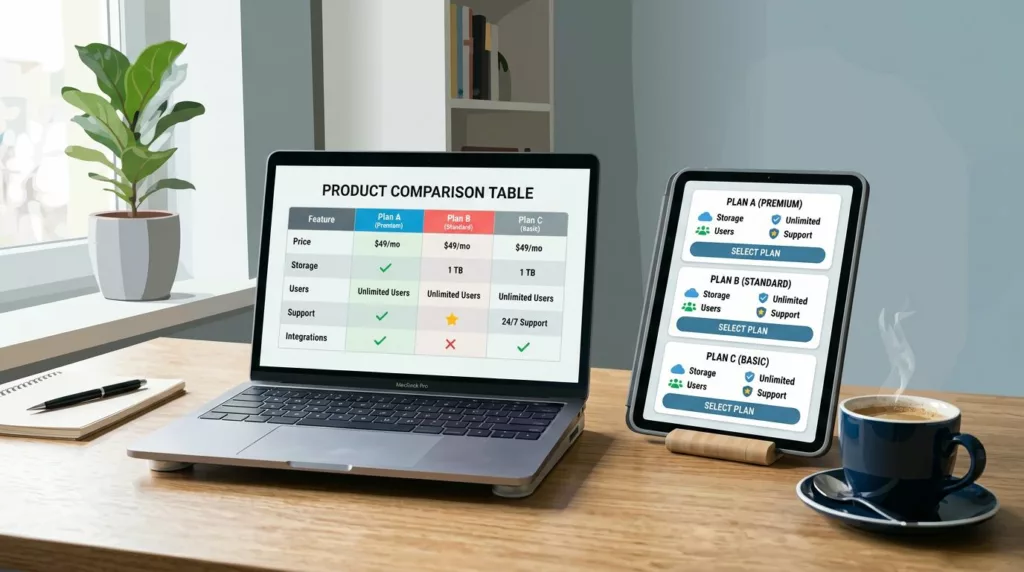
Product Comparison UX: How to Design “Compare” Tables People Actually Use
A comparison table should feel like a helpful salesperson aiding decision making, not a math test. Yet many “compare” tables...
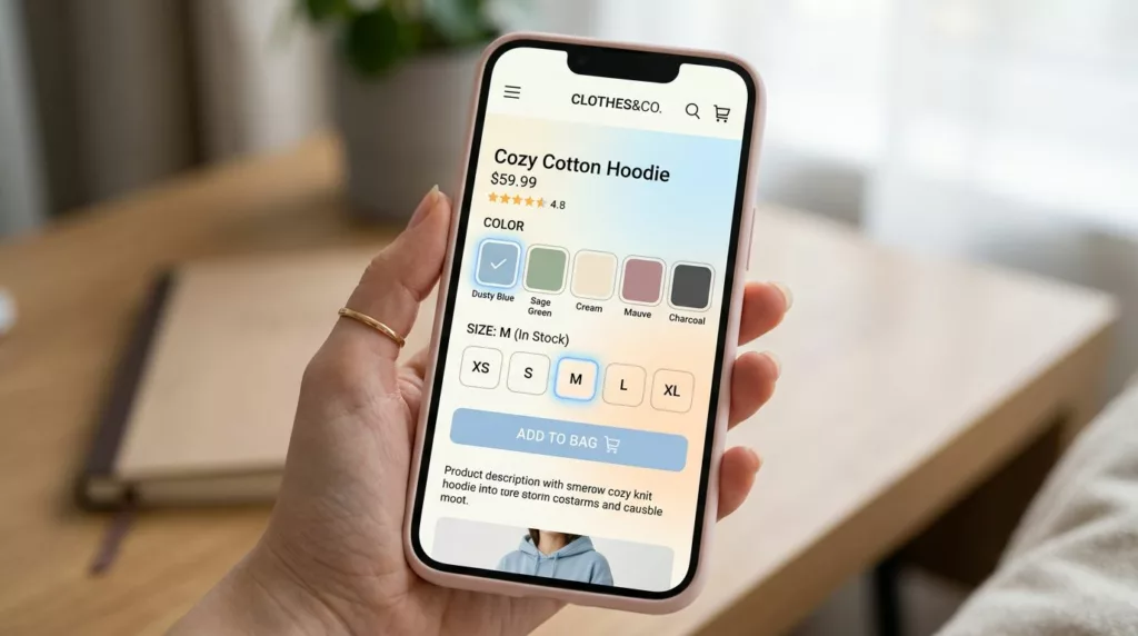
Variant Picker UX Patterns That Reduce Option Confusion On Mobile
Picking a size and color on a phone should feel like ordering coffee: quick, familiar, and hard to mess up....