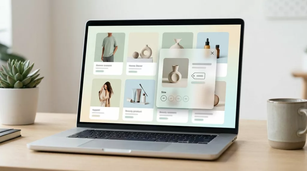
Quick View Modal UX Patterns That Boost Product Discovery
A quick view modal should feel like a tasting spoon, not a full meal. It lets shoppers sample key details,...
Headless Commerce UX Guide for Small Teams (2026): When It’s Worth It and How Workflows Change
Headless sounds like freedom: design what you want, ship faster, and stop fighting a rigid theme. Then reality hits. A...
Gift Card Page UX That Increases Purchases and Cuts Confusion
Gift cards should be the easy win in your store. The shopper already wants to buy, they just need to...
Quick View Modal UX Patterns That Increase Product Adds
Shoppers use product listing pages like a shelf scan in a store, fast, selective, and impatient. A quick view can...
Shipping Calculator UX Patterns That Reduce Surprise Costs
Nobody likes getting to the register and hearing, “Oh, plus fees.” In eCommerce, that moment often happens in shipping, when...

Product Page FAQ Section UX That Lifts Conversion
A shopper gets to your product page, likes the photos, and pauses. Not because they’re unsure about the product, but...

Free Shipping Threshold UX That Increases AOV Without Feeling Pushy
Free shipping can lift average order value, but it can also backfire. Shoppers don’t mind a nudge, they mind feeling...

Better On-Site Personalization Without Creepy Vibes: Rules, AI Recs, and User Controls
Most teams want on-site personalization that lifts conversion without making people feel watched. That’s the tightrope. If your message sounds...

Pre-Order Page UX Patterns That Prevent Refunds And Chargebacks
Pre-orders run on trust. The buyer is paying for a promise, not a box on a doorstep. When that promise...

Reorder Flow UX in 2026: Repeat Purchases, Subscriptions, and Account Pages That Sell
A first-time purchase is a handshake. A second purchase is trust, and trust is where margins get healthier. In 2026,...