Discount Code Field UX Patterns That Reduce Checkout Abandonment
The discount code box can feel like a trap door on the checkout page. Shoppers spot it, think “Maybe I...
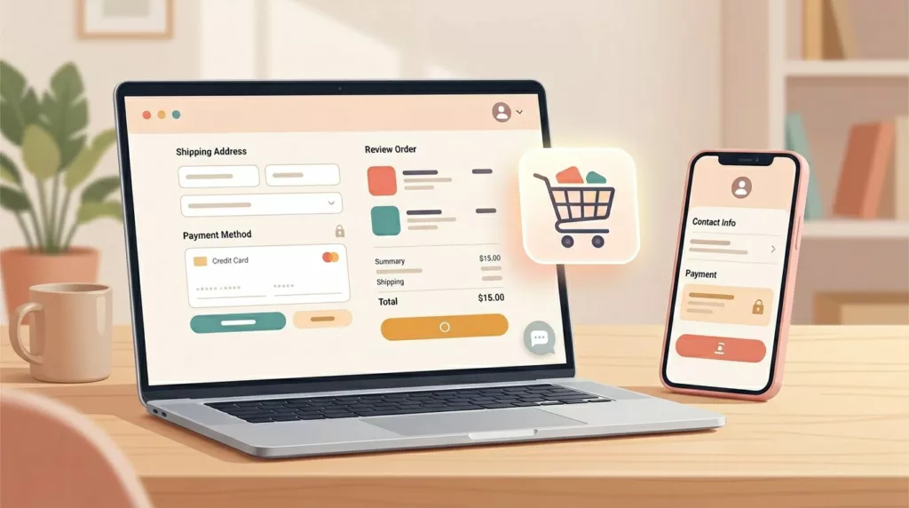
Microcopy for E-commerce UX: 100 Button, Error, and Shipping Lines You Can Copy and Tweak
Ever watched a shopper hesitate at checkout like they’re standing at a locked door, key in hand? That door is...
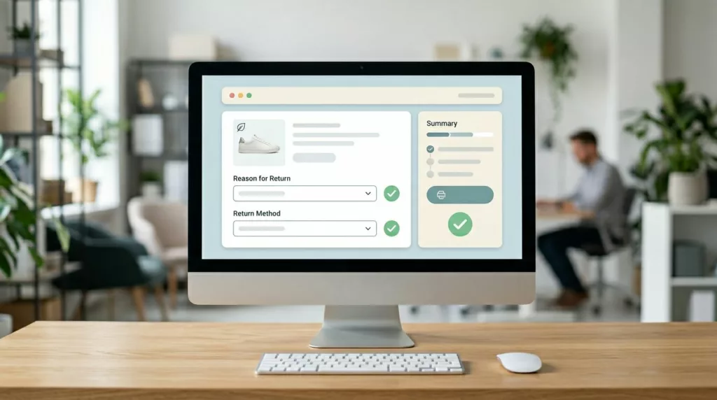
Returns and Exchanges Page UX That Cuts Refund Requests
Refund requests in ecommerce returns don’t start at the warehouse. They start when a customer feels stuck, unsure, or suspicious....

Returns and Exchanges Portal UX That Builds Brand Trust and Cuts Support Tickets
Ecommerce returns in a branded returns portal are where customer trust gets tested. When the portal feels vague, shoppers don’t...

Passwordless Login UX for Ecommerce: Magic Links and OTP
Passwords are like a spare key hidden under the doormat, easy to use, but also easy to misuse. For online...
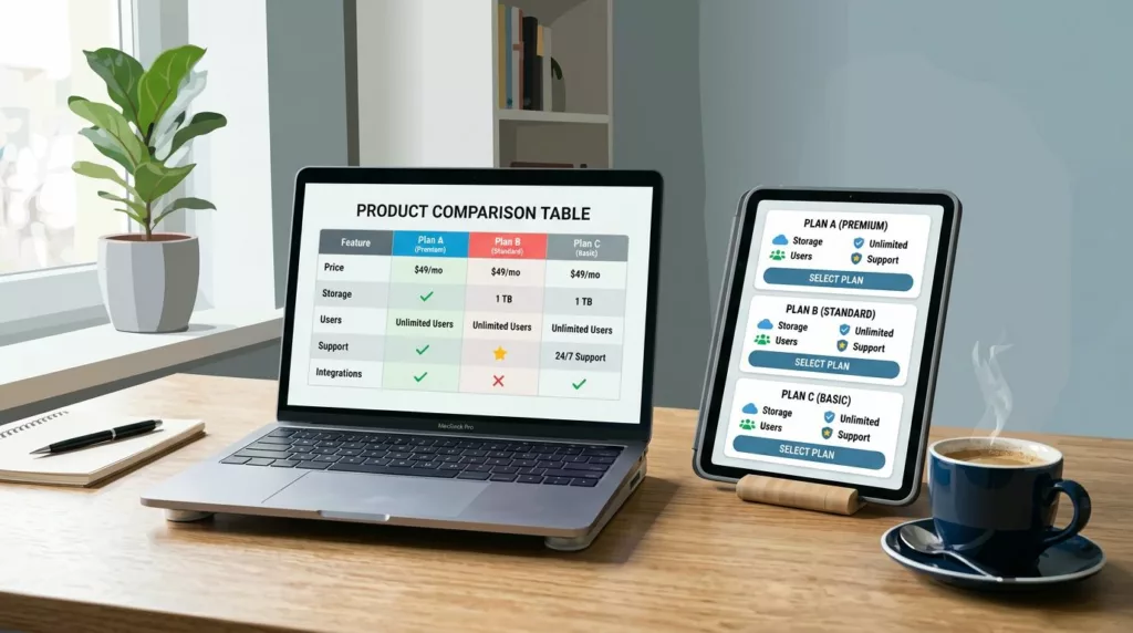
Product Comparison UX: How to Design “Compare” Tables People Actually Use
A comparison table should feel like a helpful salesperson aiding decision making, not a math test. Yet many “compare” tables...

Size Guide UX Patterns That Reduce Returns for Apparel Stores
Most returns for apparel items start as a simple guess. The shopper likes the product, but sizing feels like a...
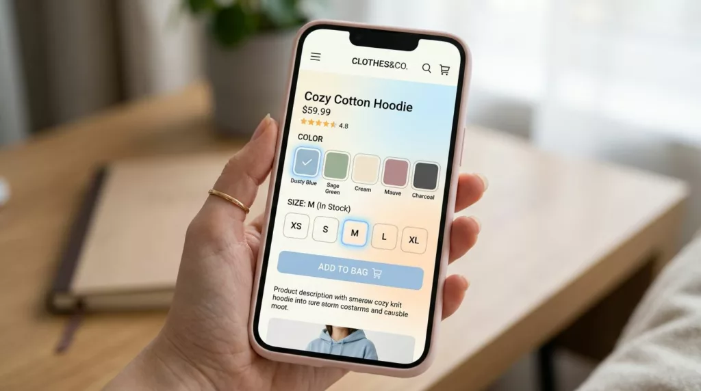
Variant Picker UX Patterns That Reduce Option Confusion On Mobile
Picking a size and color on a phone should feel like ordering coffee: quick, familiar, and hard to mess up....
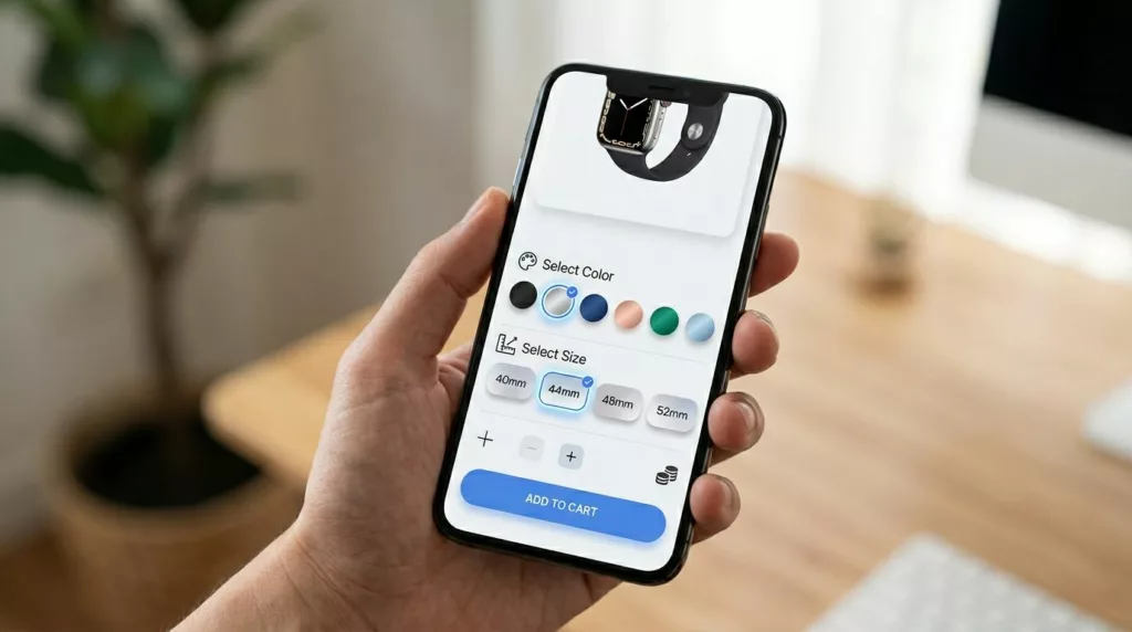
Product Variant UX For Mobile: Size And Color Pickers That Prevent Add-To-Cart Errors
If a shopper wants a medium in blue, your UI shouldn’t make them “solve” it. On mobile, variant selection is...

Discount Banner Design: On-Site Promo Banner UX That Boosts Clicks Without Banner Blindness
Most on-site promo banners fail for a simple reason: they look like banners. Users learn the pattern, filter it out,...