BNPL UX That Increases Conversion Without Trust Gaps
The fastest way to lose a BNPL sale is to make it feel slippery. Shoppers use buy now, pay later...
Guest Checkout UX Patterns That Cut Friction and Lift Conversion
Checkout is the toll booth at the end of the buying trip. If the gate sticks, revenue backs up fast....
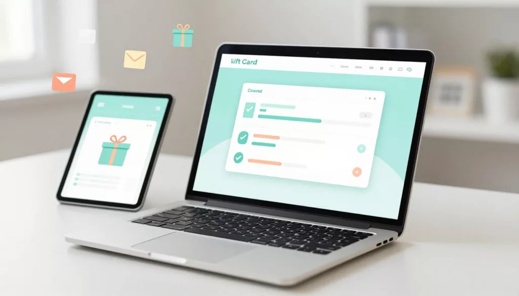
Gift Card Page UX That Increases Purchases and Cuts Confusion
Gift cards should be the easy win in your store. The shopper already wants to buy, they just need to...
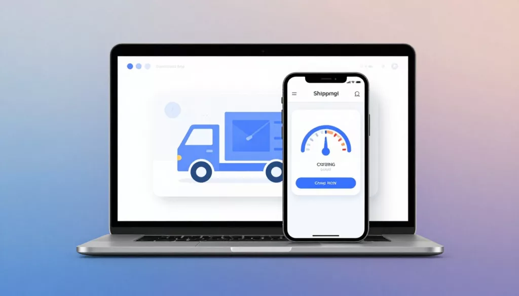
Shipping Calculator UX Patterns That Reduce Surprise Costs
Nobody likes getting to the register and hearing, “Oh, plus fees.” In eCommerce, that moment often happens in shipping, when...

Product Page FAQ Section UX That Lifts Conversion
A shopper gets to your product page, likes the photos, and pauses. Not because they’re unsure about the product, but...
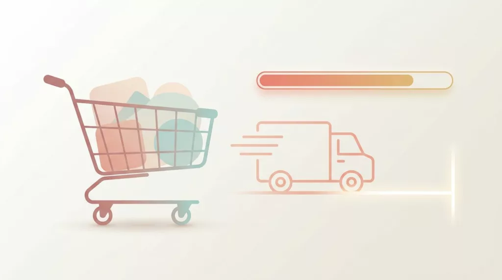
Free Shipping Threshold UX That Increases AOV Without Feeling Pushy
Free shipping can lift average order value, but it can also backfire. Shoppers don’t mind a nudge, they mind feeling...

Email Capture Without Annoying Popups: First Visit, Exit Intent, and Mobile Patterns
Nobody visits your site hoping to be greeted by a modal. They came for a product, an answer, or a...
Discount Code Field UX Patterns That Reduce Checkout Abandonment
The discount code box can feel like a trap door on the checkout page. Shoppers spot it, think “Maybe I...
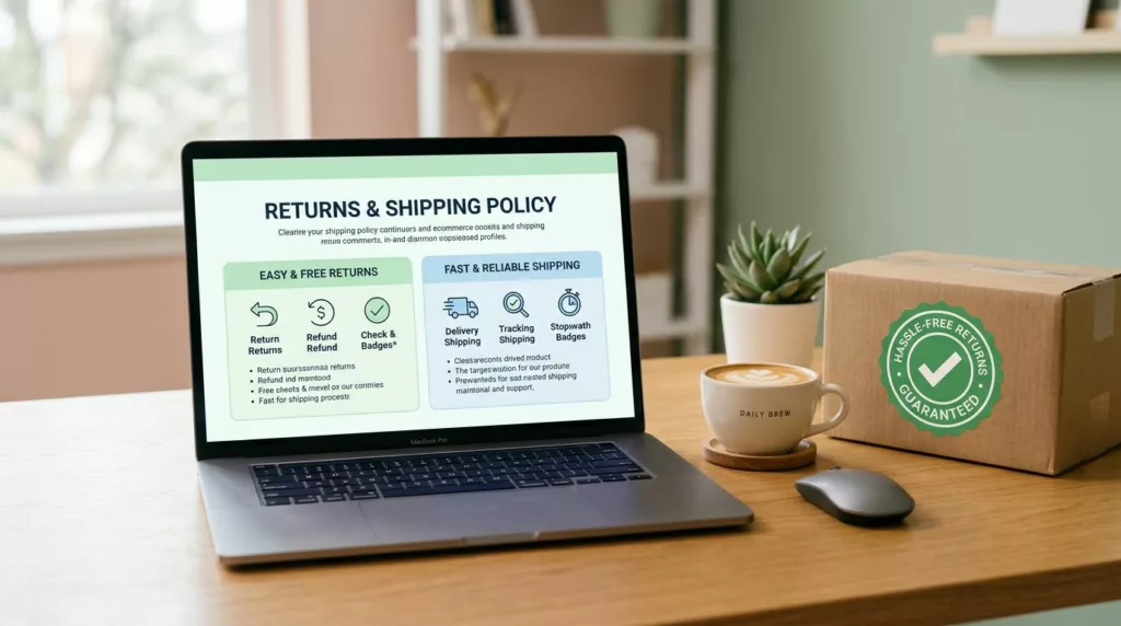
Returns and Shipping Policy Page Design That Builds Trust and Reduces Support Tickets
Most shoppers don’t read ecommerce return policy pages for fun. They read them to decide if they can trust you...
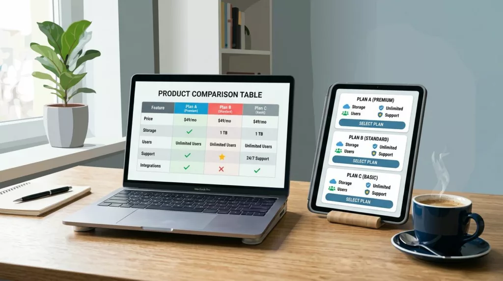
Product Comparison UX: How to Design “Compare” Tables People Actually Use
A comparison table should feel like a helpful salesperson aiding decision making, not a math test. Yet many “compare” tables...