

Nobody likes getting to the register and hearing, “Oh, plus fees.” In eCommerce, that moment often happens in shipping, when the UI hides real costs until the last step.
Good shipping calculator UX doesn’t just show a number. It explains what’s included, what might change, and why. It also does it early enough that shoppers can decide with confidence, not frustration.
Below are practical patterns you can ship in your next sprint: clearer estimates, better breakdowns, and microinteractions that make recalculations feel fair.
Replace “Calculated at checkout” with an estimate shoppers can trust
“Calculated at checkout” reads like a shrug. It tells shoppers you either don’t know the cost, or you don’t want to say. Either way, it raises defenses. A real-world example of this problem (and a redesign approach) shows up in this case study on “Calculated at checkout” friction.
Instead, surface an estimate as soon as a shopper shows intent. For many stores, that means one of these places:
- Product page near the primary CTA (especially for bulky items).
- Cart and mini-cart, before the checkout click.
- First checkout step, before payment details.
If you’re already tuning PDP actions, pair this with your CTA work. A sticky CTA with nearby shipping clarity often reduces hesitation, see mobile add-to-cart button patterns.
A simple, low-friction estimator works well:
- Field label: “Ship to”
- Input hint: “ZIP or postal code”
- Helper text: “We’ll show options and delivery windows.”
UI copy that lowers anxiety without overpromising:
- “Estimated shipping to 94107: $6.95 to $9.95”
- “Final cost updates after full address.”
- “Oversize items may add a handling fee.”
Two interaction details matter more than teams expect. First, persist the location once entered (don’t make users retype it). Second, show a timestamp when rates can drift: “Updated 2 min ago.” That one line explains why numbers may move.
If your catalog needs deeper guidance on where to place estimates, this guide to showing shipping estimates is a useful reference, even if you’re not on WooCommerce.
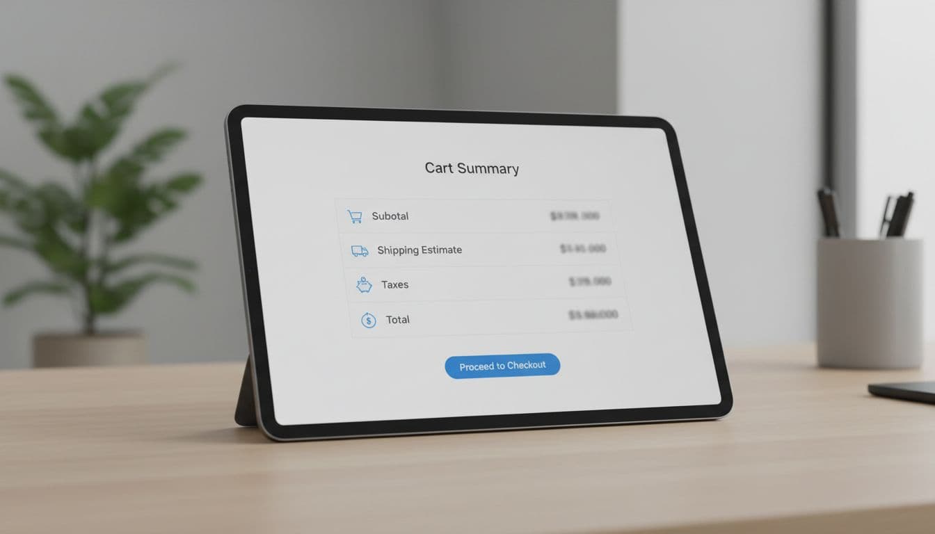
Make the price breakdown read like a receipt (not a mystery)
Surprise costs aren’t only about shipping price. They’re about missing structure. Shoppers need a breakdown that matches how they think: item subtotal, shipping, taxes, duties, then total. Like a receipt.
Here’s a before/after that shows why “one total” fails. This format also makes experimentation easier because each line item becomes measurable.
| Line item | Before (unclear) | After (clear) |
|---|---|---|
| Items subtotal | $84.00 | $84.00 |
| Shipping | Calculated at checkout | Standard (3 to 5 days): $6.95 |
| Taxes | Calculated at checkout | Estimated tax: $5.88 |
| Duties and import fees | Hidden | Estimated duties: $0.00 (may change at customs) |
| Surcharges | Hidden | Oversize handling: $0.00 |
| Total | $84.00 | $96.83 |
The “After” column does three jobs: it shows the number, labels the reason, and sets expectations about change. If you sell cross-border, don’t bury duties behind a generic “tax.” Call them out. Also keep currency and settlement consistent, because mismatches feel like hidden fees. For global stores, align this with multi-currency checkout features for global e-commerce.
Microcopy that prevents the “why did it jump?” moment:
- “Tax is estimated until you enter a full address.”
- “Duties are set by the destination country.”
- “Remote area fees apply to some ZIP codes.”
If a shopper can’t explain the total in one glance, they’ll assume the worst.
One more pattern that helps: show “Included” when you truly include something. Example: “Carbon-neutral shipping: Included.” That turns a potential fee into a benefit, without changing the math.
Use microinteractions to make recalculation feel fair (and measurable)
Recalculation is where trust is won or lost. If the total changes and the UI stays silent, it feels like the system is sneaking numbers in.

Start with a predictable loading state. Don’t freeze the whole summary. Instead, keep the last known values, then mark changing rows as “Updating…” with a subtle spinner. When the update completes, highlight only the changed lines for 1 second.
A small UI detail goes a long way: show deltas. For example, “Shipping +$2.10” in a muted chip next to the updated row. It answers the real question: what changed?
Inline validation is the other big reducer of surprise costs. Bad ZIP codes, missing apartment numbers, and PO box restrictions can all cause late-stage shipping failures.
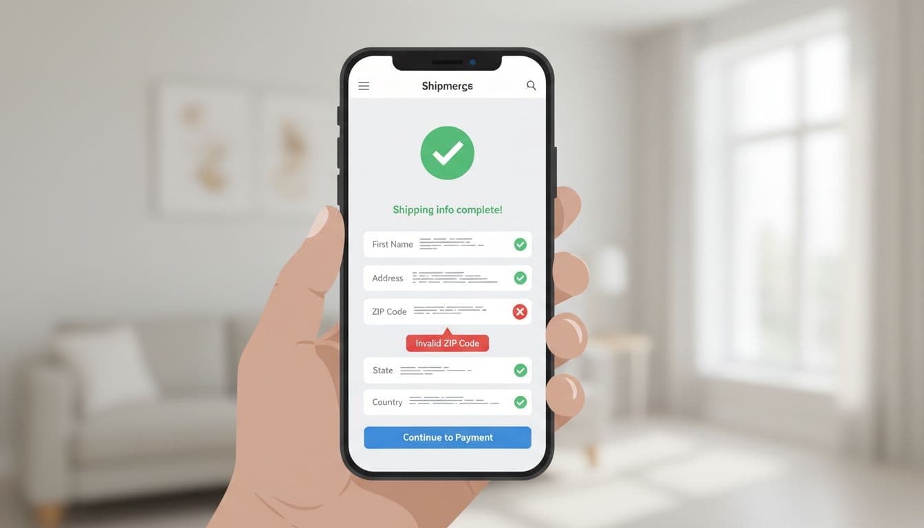
Use short, fixable error copy:
- “That ZIP code looks incomplete.”
- “We can’t ship this item to PO boxes.”
- “Apartment or unit number helps delivery, add it if you have one.”
Also add a graceful fallback when rate services fail:
- Inline notice: “Rates are taking longer than usual.”
- Secondary action: “Use standard shipping estimate”
- Support link only after the retry fails.
Finally, treat this as an optimization loop. If you don’t measure “surprise,” you’ll debate opinions forever. A solid diagnostic flow helps, see this framework to diagnose cart drop-offs.
Track events that map to cost confusion and rate instability:
- shipping_estimate_shown (with location type: none, ZIP, full address)
- shipping_rate_request_started / succeeded / failed (include latency)
- shipping_total_changed (include changed lines and delta amount)
- shipping_method_changed (and whether it changed total up or down)
- checkout_abandoned_after_total_change (time window: 10 to 60 seconds)
A/B tests worth running:
- Show estimate on PDP vs cart only.
- Show a range ($6.95 to $9.95) vs a single value.
- Itemized breakdown expanded by default vs collapsed with “View details.”
- Delta chips on change vs no delta chips.
When your shipping promises match post-purchase reality, trust continues after the click. If you’re tightening that end-to-end experience, connect estimates to what customers see later in order tracking UX to cut WISMO tickets.
Conclusion
Surprise costs usually come from silence, not math. The fix is consistent: show an early estimate, present an itemized receipt-style breakdown, and make every recalculation obvious. Then measure where totals change and where people leave. When your shipping calculator UX explains costs like a good cashier would, shoppers stop bracing for bad news and start finishing checkouts.