
Ecommerce returns in a branded returns portal are where customer trust gets tested. When the portal feels vague, shoppers don’t “wait and see.” They open a ticket.
A strong returns portal UX enhances the post-purchase experience and boosts customer loyalty while doing two things at once: it enforces policy and lowers customer effort. The best portals don’t hide rules, they explain them in plain language, at the exact moment a shopper needs them.
Below is a practical playbook: a portal flow that prevents the most common “where do I…” questions, microcopy you can paste into UI, and a measurement plan that proves ticket reduction.
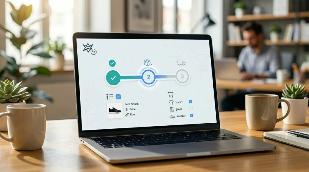
Build the self-service returns portal like a reverse checkout (and keep it to 3 to 5 steps)
Most returns tickets come from uncertainty, not the complexity of reverse logistics. Customers ask a human when the system feels unpredictable. So treat your branded returns portal like checkout: clear steps, visible progress, and no surprises.
Here’s a flow that consistently reduces “how do I return,” “where is my label,” and “can I exchange” contacts.
- Order lookup screen
- Inputs: email + order number (or SMS OTP) via your order management system
- Add trust text: “We’ll only use this to find your order.”
- Select items
- Show thumbnails, size, price paid, and “final sale” badges
- Let users choose quantity and condition (if needed)
- Eligibility and options (refund, exchange, store credit)
- Gate options by policy, but explain why
- Show store credit value if it differs (bonus credit, fees, shipping)
- Return method
- Choices: printable label, QR code labels, drop-off, pickup (if offered)
- Support printerless returns via QR code drop-offs
- Give “what you’ll need” before selection (printer, box, ID)
- Summary and confirmation
- One screen that shows: items, refund total, fees, method, timeline
- Send confirmation via email and SMS (if opted in)
- Return status page
- Timeline with dates: “Requested,” “Dropped off,” “In transit,” “Received,” “Refund issued”
- A single “Get help” entry with context attached (order ID, step) for seamless return tracking
Two design details matter more than fancy UI.
First, keep the portal fast with a mobile-first interface. Most shoppers start self-service returns from email on a phone. Second, unify post-purchase entry points. If your order tracking page is already a hub, link returns from there and keep the experience consistent. This complements order tracking UX that cuts WISMO tickets because “Where is my order?” and “Can I return this?” often happen back-to-back as part of ecommerce returns.
Microcopy and UI patterns that stop “policy debate” and “refund anxiety”
Support teams can predict return tickets by reading the first line. “Am I eligible?” “What do I do now?” “When will I get my money?” Good returns portal UX answers those questions about your return policy and refund process inside the flow, not in a help center tab.
Use microcopy that is short, specific, and time-bound.
Eligibility moment (on the options screen)
- “Eligible for return per our return policy until April 18, 2026.”
- “Not eligible for return because it’s final sale. If it arrived damaged, start a claim instead.”
- “Instant exchanges available only for the same item. Color and size swaps ship after we receive your return.”
Fees and deductions (before confirmation)
- “A $6.95 label fee will be deducted from your refund.”
- “No fee if you choose store credit.”
- “Estimated refund: $42.10 (after label fee and tax adjustment).”
Refund timing (set expectation, then repeat it later)
- “Expect fast refunds usually posting 2 to 5 business days after we receive your package.”
- “You’ll get an email when we issue the refund. Your bank may take extra time.”
Status updates (on the return status page)
- “Dropped off. Tracking updates can take up to 12 hours to appear.”
- “Received at our warehouse management system. Refund process review in progress (usually 24 hours).”
- “Refund issued on March 10. Look for it on your statement by March 15.”
If a shopper can’t predict the next step in 10 seconds, they’ll ask a person.
Also, design a user-friendly interface for the “can’t proceed” states. Many portals fail quietly, then tickets spike.
- If an item is blocked: show the reason and the next best action.
- If inventory blocks an exchange: offer store credit, a substitute, or “notify me if back in stock.”
- If fraud prevention checks slow approval: say so without accusing anyone, for example, “This return needs a quick review. Most reviews finish in under 12 hours.”
For policy alignment and portal content structure, cross-check your flow against returns program best practices like Optoro’s return initiation best practices and platform-level guidance such as Narvar’s returns optimization guide. Even if you don’t use those tools, the UX patterns apply.
Measure what matters: KPIs for self-service returns automation, instrumentation, and an A/B plan that proves deflection in return management software
Ticket reduction is a product metric for ecommerce returns. Treat it like one.
KPIs to track (with practical target ranges)
Use ranges, because category and policy change outcomes.
- Deflection rate for self-service returns (returns completed without agent help): target 70% to 90% for mature programs.
- Contact rate per return (tickets per initiated return): aim under 10% to 15%.
- Drop-off rate (started, not completed): keep it under 20%, then push lower.
- Time-to-label (start to label or QR issuance): shorten it to under 2 minutes for most users.
- Time-to-refund (return received to refund issued): target under 5 days when ops allow.
- CES and CSAT: collect both. CES catches friction impacting customer satisfaction, CSAT catches trust issues affecting customer retention.
If you’re also working on reducing overall ecommerce return volume, pair portal metrics with prevention work like parcelLab’s overview on reducing ecommerce return rates in 2026. Fewer returns also means fewer return-related contacts, plus savings on logistics costs and better inventory management.
Instrumentation that makes the portal debuggable
At minimum, track a funnel with event properties that explain “why,” not just “what.”
- Events:
return_started,item_selected,reason_selected,resolution_selected,method_selected,label_generated,return_confirmed,status_viewed,help_clicked - Properties: return reasons code, resolution, fee shown, device, auth method, error type, inventory availability for exchange
- Link support data: tag tickets with
portal_step,reason_code, andresolutionso you can map UX fixes to ticket types.
One table your CX and product teams can share is a “ticket prevention map.” Start with this version, then customize to your top contact drivers:
| UX fix in the portal | Support tickets it prevents | What to show in the UI | KPI to watch |
|---|---|---|---|
| Eligibility banner per item | “Why can’t I return this?” | “Not eligible because final sale. Damaged? Start a claim.” | Contact rate per return |
| Refund estimator before submit | “How much will I get back?” | “Estimated refund: $42.10 (includes label fee).” | Drop-off rate |
| Timeline on status page | “Where’s my refund?” | “Received March 8, refund issued within 24 hours.” | Time-to-refund, CSAT |
| Shipping labels in one tap | “Where’s my label?” | “Download shipping label” button with real-time updates | Time-to-label |
| Exchange inventory check inline | “My size isn’t available” | “Out of stock. Choose credit or get notified.” | Help clicks, completion rate |
| Tracking-delay disclaimer | “Tracking isn’t updating” | “Updates can take up to 12 hours after drop-off.” | Ticket volume by carrier |
A/B testing plan (simple, fast, and safe)
Run tests that change comprehension, not just styling.
- Hypothesis: “Showing refund timing and amount before confirmation reduces ‘refund status’ tickets.”
- Variants: Control vs. a summary panel that includes refund range, fees, and timeline.
- Primary metrics: contact rate per return, drop-off, CES. Guardrail: refund disputes and chargebacks.
- Run rules: keep the test on for at least one full business cycle (including weekends), then segment by device and return method.
Optional automation tooling like Loop, Narvar, or ReturnGO return management software can support these flows, but the UX principles still decide whether tickets drop.
Conclusion
Returns will always create questions, but most don’t need a human answer. A branded returns portal plays a key role; when its returns portal UX explains eligibility, money, and timing as part of the post-purchase experience while the user moves through the steps, support volume falls and trust rises.
Pick one high-friction moment, add clear microcopy, instrument it, then test it. Self-service returns drive customer loyalty by removing friction. Which ticket category would you most like to delete from your queue next month?