
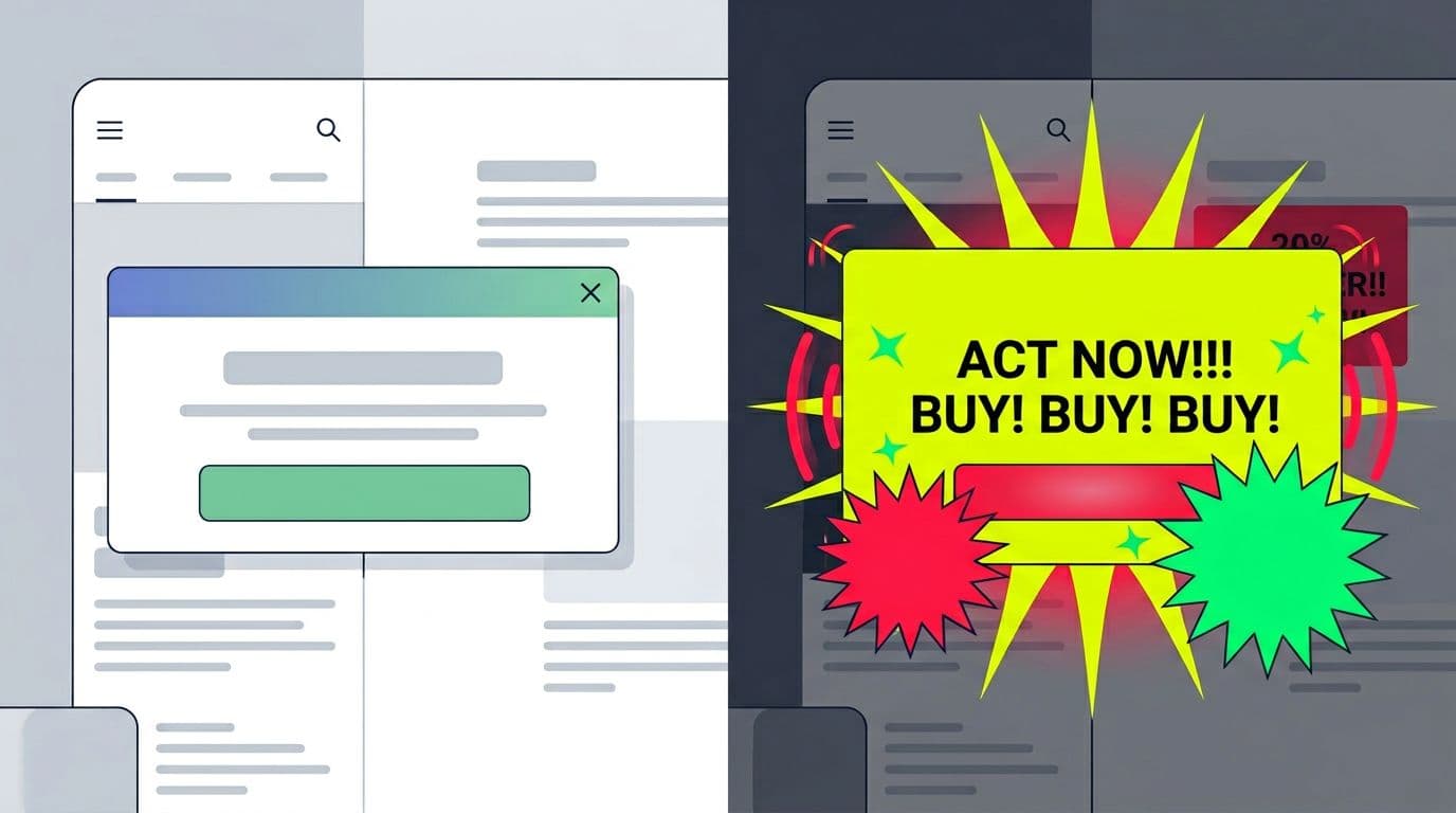
Most on-site promo banners fail for a simple reason: they look like banners. Users learn the pattern, filter it out, and keep moving. That’s banner blindness, and it’s brutal on CTR.
Good promo banner UX, unlike a busy “black friday flyer” or an oversized “hero banner”, doesn’t “grab attention” with louder colors or bigger boxes. It earns attention by being timely, clear, and easy to dismiss. In this post, you’ll get placement patterns, copy formulas, and control rules that raise clicks while lowering annoyance, plus a checklist and a Do/Don’t table you can hand to your team.
Banner blindness is a design tax (pay it with relevance, not noise)
Banner blindness is selective attention rooted in behavioural psychology. People scan for what helps them finish a task, and they ignore what feels like ads. If your promo looks like an ad unit, it gets treated like one. LogRocket’s breakdown of why this happens is a useful refresher, especially around familiarity and placement cues in UI patterns (banner blindness and attention design).
So what actually changes outcomes?
Start by reducing cognitive load through visual hierarchy, following UI/UX best practices. A promo banner should answer three questions fast: What is it, is it for me, what happens if I tap? Coupon promotions should be part of a broader conversion-oriented design strategy.
A practical test: if a user can’t understand the offer in one glance, it’s not “subtle.” It’s just confusing.
The fastest way to kill CTR is to make users decode your promotion before they can act on it.
Also, don’t borrow “ad creative” patterns, which are typical mistakes in landing page design. Animated confetti, fake urgency, and repeated interruptions train users to dismiss everything. That’s a long-term conversion leak, not a short-term win.
Finally, treat trust as part of the interface. If a discount appears only after someone hesitates, users feel manipulated. Skip dark patterns, and you’ll keep attention longer.
Promo banner placement that feels helpful (sticky banners, promotional callouts, and cart-adjacent)
Placement does most of the work in promo banner UX, especially for coupon promotions. Pick positions that match intent, not your calendar.
Sticky banners (good for broad, low-friction offers like site-wide promotions)
Sticky banners work when the offer applies to most visitors, like free shipping thresholds or site-wide promotions. Keep it short, keep it stable, and avoid pushing content down repeatedly.
Mini-template (sticky banner copy):
- Value: “Free shipping over $50” or “10% off site-wide”
- Constraint: “Ends Sunday”, “countdown timer”, or “US only”
- Action: “See details” or “Apply discount code”
CTA examples that fit the space: “Shop now”, “Get free shipping”, “View eligible items per eligibility rules”.
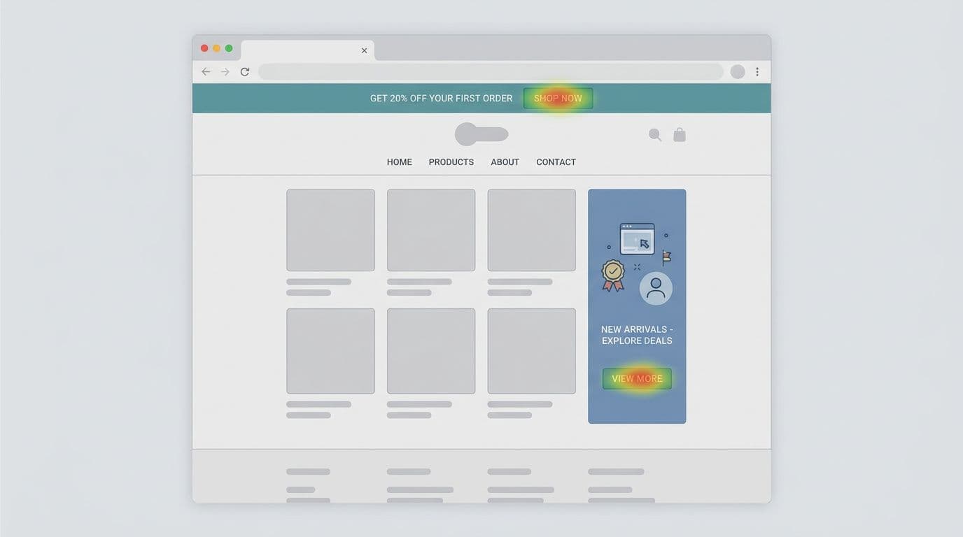
Promotional callouts (best for browsing and product-listing pages)
Promotional callouts work because they behave like content. Place them inside the product grid or between sections on product-listing pages, aligned to the same rhythm as cards and headlines, and styled with unique badge design. When users scroll, it appears as part of the journey, not an interruption.
Mini-template (promotional callout copy):
- “Bundle and save, pick any 3” or “Use discount code BUNDLE30”
- “New here? Take 10% off your first order with coupon promotion”
One rule: don’t fake product cards. Make it clearly promotional for coupon promotions, but visually native.
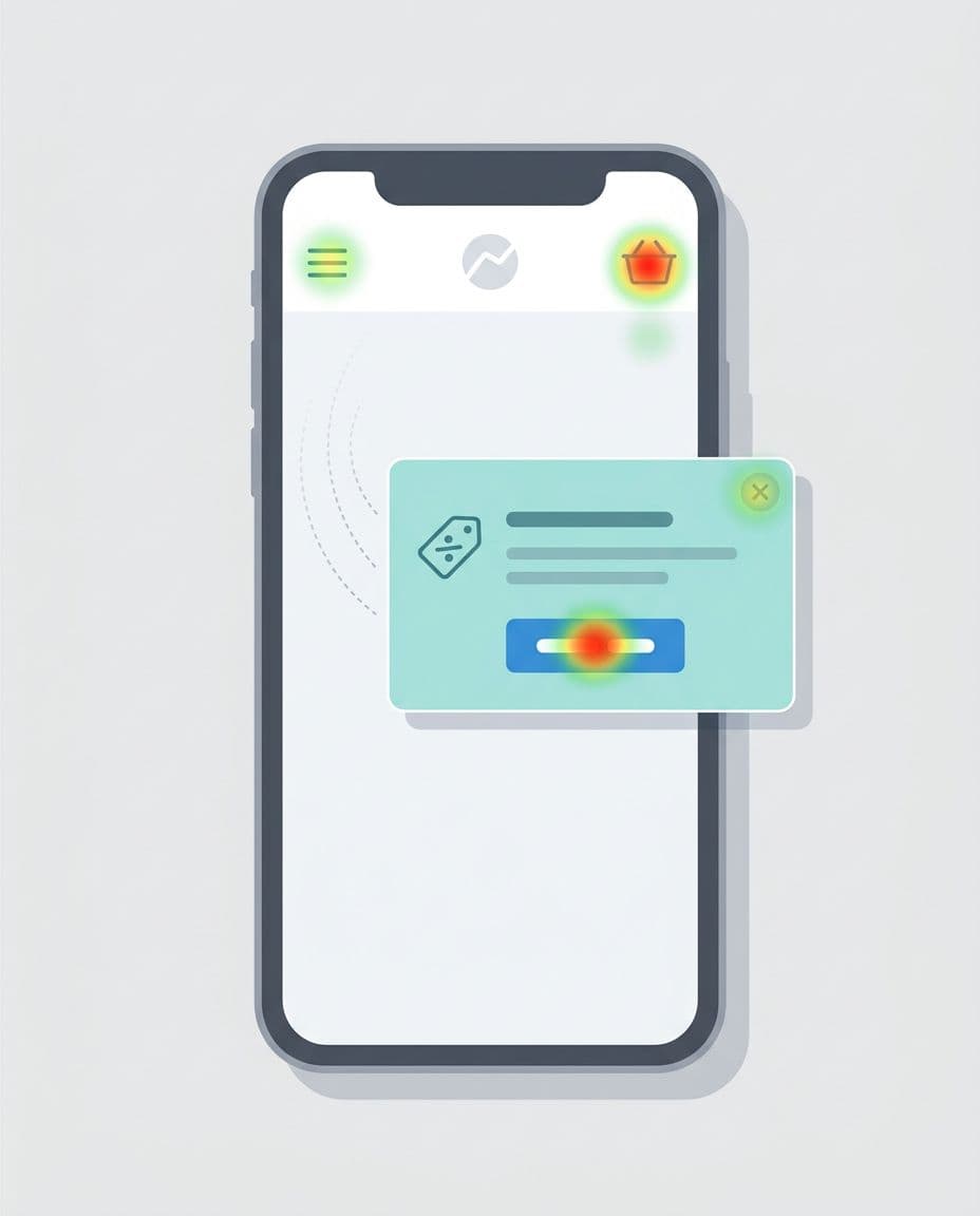
The cart-adjacent banner (highest intent, lowest tolerance)
Near-cart banners work for shipping upgrades tied to minimum-spend thresholds, add-ons, or “complete your set” prompts. They also backfire fastest if they feel like a trap. Keep the offer tightly tied to what’s already in the cart, with clear eligibility rules.
Mini-template (cart copy):
- “Add $12 to unlock free shipping” or “Hit minimum-spend threshold for discount code FREESHIP”
- CTA: “Add eligible item” or “Apply coupon promotion”
For extra pattern ideas, skim a current roundup like banner design best practices that improve CTR. Use it for inspiration, then apply the guardrails in this post.
Copy, CTA design, and motion that increase clicks without pressure
Once placement is right, wins come from clarity, especially in shopping cart UX near the promo code field.
Use one primary CTA, and make it match the user’s next step
Two equal CTAs force a choice too early. If you need a secondary action, make it a link, not a button. Leverage visual hierarchy to emphasize one primary CTA that aligns with the user’s next step, like accessing the promo code field or redemption UI.
CTA formulas that work without hype for coupon promotions and discount codes:
- Get the benefit: “Apply discount code for 10% off”
- See the rules: “Check discount code eligibility”
- Keep browsing: “Continue shopping”
Avoid “Buy now” on informational promos. It’s a mismatch. Opt for automatic application of discount codes in redemption UI to reduce checkout friction.
Write like a label, not an ad
A strong promo banner reads like interface text. That means short, concrete, and honest for coupon promotions.
Copy formulas you can reuse:
- Benefit + condition: “Free returns on orders over $40”
- Problem + fix: “Running low? Subscribe and save 15% with discount code”
- Progress to reward: “You’re $12 away from free shipping. Enter promo code field now”
If you create personalized offers, do it in a privacy-aware way using first-party signals from the customer cockpit (pages viewed, cart state, account status) and consented preferences, not third-party tracking. Automatic application of coupon promotions via the promo code field cuts checkout friction even further.
Keep motion optional, and don’t sacrifice performance
Subtle motion can help discoverability, but only if it respects user settings and page speed. Support reduced motion, and default to no animation when prefers-reduced-motion is on.
If motion makes the banner feel urgent, users will treat it like spam.
Also watch Core Web Vitals. Promo banners often ship extra scripts, fonts, or large images. Prefer CSS-only treatments, compress assets, and avoid layout shifts from late-loading bars, particularly around shopping cart UX and promo code field interactions.
For creative testing ideas that focus on fast comprehension, this 2025 guide has good notes on hierarchy and “blink test” thinking (creative elements that earn clicks).
Respect user preferences (dismissal memory, frequency caps) and ship the checklist
If users dismiss a coupon promotion, remember it. If they ignore it, stop showing it so often. This is the easiest way to reduce banner blindness over time. Users can always find active discount codes in the offers hub.
Practical rules that keep you honest:
- Store dismissal for a reasonable window (for example, 7 to 30 days), and reset only when the coupon promotion or discount codes truly change.
- Use frequency caps per session and per day. Repeated exposure to discount codes doesn’t “educate,” it irritates.
- Don’t block content with promos unless the user asked for it (like “show my promo code field”).
- Make close targets easy on mobile, and keep contrast WCAG-compliant.
Here’s a quick pre-launch checklist you can paste into a ticket:
- Offer clarity: Value (discount codes), constraint, and next step are readable in one glance, with clear error messages if a code fails.
- One main action: Only one primary button; secondary action is a link to the promo code field.
- Context fit: Placement matches intent (landing page design vs shopping cart UX vs account).
- Dismiss works: Close button is obvious, keyboard accessible, and remembered.
- Frequency capped: Session and daily limits are set and tested for coupon promotions.
- Performance safe: No layout shift, no heavy assets, no extra blocking scripts.
- Motion respectful: Reduced-motion users get a stable experience.
- No dark patterns: No fake timers, no forced opt-ins, no hidden closes. Provide clear error messages for invalid discount codes in the promo code field.
One last scan tool: use this Do/Don’t table during reviews. Watch checkout friction as a key metric.
| Do | Don’t |
|---|---|
| Match placement to intent (landing page design, shopping cart UX, checkout) | Show the same coupon promotion everywhere, all the time |
| Use a clear value prop with one CTA for discount codes | Add two equal CTAs that compete for promo code field attention |
| Keep copy short and concrete on discount codes | Write “marketing” headlines that say nothing about coupon promotions |
| Offer a visible close, and remember dismissal | Reappear right after close or on every page with the promo code field |
| Cap frequency across sessions for coupon promotions | Spam users until they convert or bounce with discount codes |
| Respect reduced-motion and WCAG-compliant accessibility | Use flashing motion or low-contrast text |
| Protect Core Web Vitals | Add heavy scripts that slow the page |
Conclusion
Banner blindness isn’t a creativity problem. It’s a relevance and respect problem. When promo banner UX is contextual, light on effort, and easy to dismiss, clicks go up and complaints go down. These strategies lead to a successful conversion-oriented design, where coupon promotions feel like a natural part of the user journey, not an afterthought. Pick one placement pattern, apply the copy formulas, then ship with dismissal memory and frequency caps. Your users will notice, because it won’t feel like a banner anymore.