Pre-orders run on trust. The buyer is paying for a promise, not a box on a doorstep. When that promise feels fuzzy, people cancel, ask for refunds, or go straight to their bank.
Good pre-order page UX reduces disputes by making three things painfully clear: what’s being sold, when money moves, and what happens if plans change. Below is a practical playbook you can copy into your next build, with UI patterns, microcopy, checklists, and measurement ideas.
Make the promise concrete before the customer pays
A pre-order page should read like a clear receipt, not a teaser. The goal is fewer “I didn’t realize…” moments after purchase.
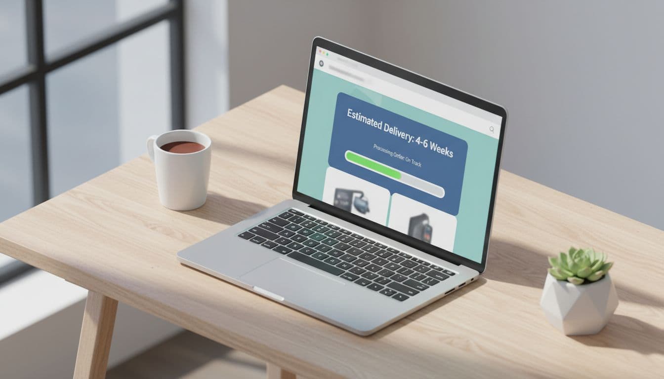
Pattern: Delivery window that behaves like a spec, not a slogan
Use a delivery range and show what it depends on. If the date is an estimate, say that in the same visual block as the price and CTA.
UI building blocks (annotated):
- Primary ETA range near the CTA (not buried in FAQs).
- Confidence hint (for example, “High confidence” vs “Subject to production”).
- Update cadence (how often customers will hear from you).
- Last updated timestamp for the shipping estimate.
Microcopy examples
- ETA block: “Estimated ship date: May 20 to June 10 (updates every Friday)”
- Confidence line: “This is a pre-production batch. Dates may move by 1 to 3 weeks.”
- Expectation guardrail: “Need it by May 15? Don’t pre-order.”
If a customer can’t repeat the ship window back to you, the page didn’t do its job.
Pattern: Payment timing disclosure, in plain language
Most disputes start with “I didn’t authorize” or “I didn’t expect to be charged yet.” Put payment timing next to the price and CTA, and repeat it at checkout.
If you’re choosing between charge-now, deposit, installments, or charge-later, align UX with the model. For background on how these models work in practice, see pre-order payment model options.
Microcopy examples
- Charge now: “You’ll be charged today. We’ll email updates until it ships.”
- Deposit: “Pay $20 today, pay the rest when it’s ready to ship.”
- Charge later: “We’ll authorize your card today, then charge when it ships (you’ll get an email first).”
Do and don’t table for expectation setting
Use this as a quick review during design critique.
| Area | Do (reduces refunds) | Don’t (creates disputes) |
|---|---|---|
| Delivery | “Ships May 20 to June 10 (estimate)” beside CTA | “Ships soon” or “Coming in Spring” |
| Inventory | “Limited to 3,000 units in Batch 1” | “Limited” with no meaning |
| Payment | “Charged today” in the price block | Reveal charge timing only in terms |
| Changes | Link “Cancel or edit anytime before shipping” | Force people to contact support |
| Product | Show what’s included and what’s not | Rely on lifestyle images alone |
Build self-serve cancellation and refund paths (so banks don’t become support)
When customers can’t find a simple way to cancel, they look for a bigger button: “Dispute charge.” Your UX should make the honest path the easy path.

Pattern: “Manage pre-order” entry points in every message
Add a single destination customers learn to trust: a manage page that shows status, ETA, address, and cancellation rules.
Place “Manage your pre-order” links in:
- Order confirmation email
- Delay notifications
- Account area
- Shipping update emails
Microcopy examples
- Button label: “Manage pre-order”
- Helper text: “Change address, switch color, or cancel in under a minute.”
Pattern: Cancellation that explains the outcome before the click
Don’t make “Cancel” a trap door. Show what happens, how long refunds take, and what they lose.
Cancellation modal copy (high-performing structure)
- Title: “Cancel this pre-order?”
- Summary line: “You’ll get a full refund to your original payment method.”
- Timing: “Refunds usually appear in 3 to 10 business days.”
- Confirm button: “Cancel and refund”
- Secondary action: “Keep pre-order”
If you use deposits, spell out the rules in the flow:
- “Deposit is refundable until production starts (April 2). After that, it becomes store credit.”
Adjust the pattern for your business model
The same UX components work, but the risk triggers differ.
DTC physical goods
- Biggest driver: delays and “item not received.”
- Add: shipping method, tracking expectations, and address cutoff date.
- Include: “Address changes allowed until it enters fulfillment.”
Digital access (early access, beta, licensing)
- Biggest driver: “not as described.”
- Add: feature checklist, device requirements, and what “early access” excludes.
- Include: “Beta builds may be unstable, here’s what you’ll get on day one.”
Crowdfunding-style pre-orders
- Biggest driver: long timelines and scope shifts.
- Add: milestone timeline (prototype, tooling, production, ship).
- Include: “If we miss a milestone by 30 days, you can cancel for a full refund.”
Chargeback prevention UX tied to common dispute reasons
Banks don’t care that your page looked pretty. They care about cardholder claims. Design your page and post-purchase system around the disputes you can prevent.
For a broader merchant view of dispute prevention, compare your plan with Checkout.com’s chargeback prevention tips and Shopify’s guide to managing chargebacks.
Dispute-to-UX mapping table
This table is a fast way to spot gaps.
| Cardholder dispute reason | UX and ops pattern that prevents it | Proof you should log |
|---|---|---|
| Item not received | Clear ship window, delay alerts, tracking, self-serve refund option | Delivery estimate shown at purchase, tracking events, delivery confirmation |
| Not as described | “What’s included” list, real specs, early-access disclaimers | Product page snapshot, spec list, version notes for digital |
| Unauthorized / no recognition | Clear descriptor text, confirmation email, easy support contact | Billing descriptor shown, email sent timestamp, IP/device signals |
| Recurring/ongoing charge | Make subscription opt-in obvious, confirm renewal terms | Checkbox state, checkout consent record, renewal notice logs |
A preventable chargeback is often a missing sentence, not a fraud problem.
Chargeback prevention checklist (page + post-purchase)
Keep this tight and review it before launch:
- Disclose payment timing beside the CTA and at checkout.
- Show the ship window on the page, in the cart, and in the confirmation email.
- Send a receipt immediately, with “Manage pre-order” as the primary action.
- Offer self-serve cancellation/refunds (even if rules vary by stage).
- Notify delays early, and include the updated ETA and cancellation option.
- Use a recognizable billing descriptor and tell customers what it will look like.
- Make support contact easy (email and response time), especially on mobile.
Pre-launch QA, instrumentation, and A/B tests that keep you honest
Measure what customers experience, not what you hoped they’d experience.

Pre-launch QA checklist (fast but real)
- Verify ETA appears on product page, cart, checkout, and confirmation email.
- Confirm payment timing text matches the processor behavior (auth vs capture).
- Test cancel flow on mobile, and confirm refund status messaging.
- Check delay email triggers, and confirm it includes updated ETA and manage link.
- Validate billing descriptor and business name are consistent across receipts.
- Make sure policy links open fast and are readable on small screens.
Metrics and event tracking to instrument
At minimum, track:
- Refund rate (by SKU, cohort, and reason)
- Cancellation rate (by time since purchase and by stage)
- Chargeback rate (by reason code, processor, and traffic source)
- Support tickets per 100 orders, tagged by topic (ETA, cancel, specs)
- Delivery promise accuracy (percent delivered within stated window)
Helpful events: preorder_eta_viewed, payment_timing_expanded, manage_preorder_click, cancel_initiated, refund_issued, delay_email_sent.
A/B test ideas that reduce disputes (without hiding the truth)
- ETA as a range vs single date (measure cancellations and conversion).
- “Charged today” copy above vs below the CTA (measure chargebacks later).
- Delay emails with refund option button vs text link (measure support load).
- Manage link in confirmation as primary button vs secondary (measure tickets).
Conclusion
Pre-orders don’t fail because customers are impatient. They fail because the page leaves room for a different story than the one you intended. Tighten your pre-order page UX around clear timing, clear payment behavior, and self-serve exits, then back it with consistent emails and solid tracking. When you make the honest path easy, refunds stay lower and chargebacks stop being your customers’ shortcut.