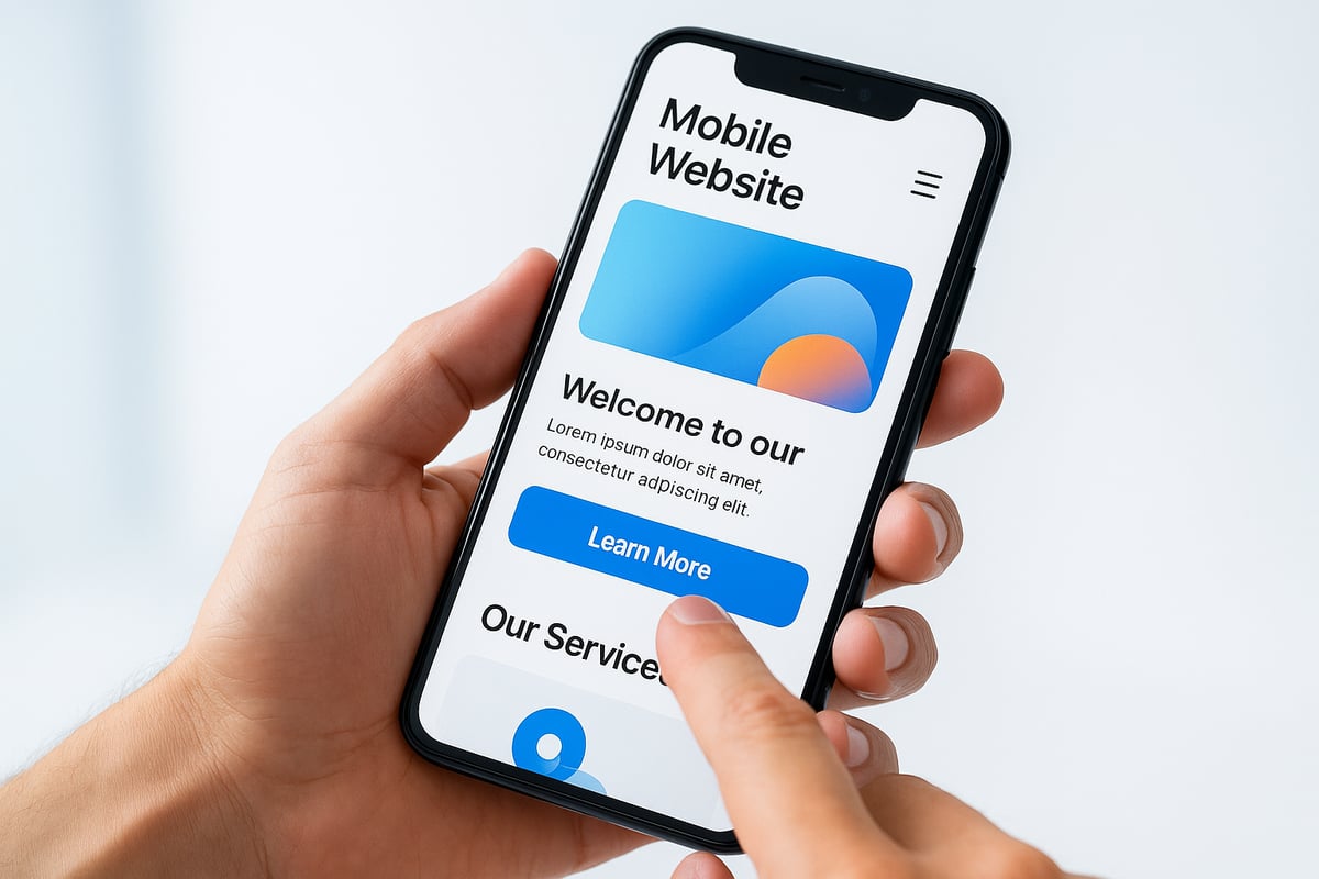
Mobile browsing is rapidly shaping the future, with over 60% of all web traffic already coming from smartphones and tablets. By 2026, mobile website design will define how users interact, search, and shop online.
This article uncovers 7 essential mobile website design tips for 2026, giving you the strategies you need to stand out. Discover how to create responsive layouts, touch-friendly navigation, fast-loading pages, accessible interfaces, and more.
Ready to gain an edge? Explore these actionable insights and make your site the go-to destination for mobile users.
The Importance of Mobile Website Design in 2026
Mobile website design is more crucial than ever as user behavior continues to evolve. Today, more than 60% of all website traffic comes from mobile devices, a figure that is expected to rise as we approach 2026. This dramatic shift means that brands can no longer afford to treat mobile optimization as an afterthought.
Since 2015, Google has prioritized mobile-first indexing, fundamentally changing how websites are ranked in search results. If your mobile website design is not up to par, your site’s visibility will suffer. Responsive and mobile-first layouts are now the standard, not a premium feature. According to Figma, users expect seamless experiences regardless of device, making mobile design a baseline expectation.
Failing to deliver a strong mobile website design can lead to high bounce rates and lost conversions. Users are quick to abandon sites that load slowly or display poorly on smaller screens. In fact, 83% of users expect a mobile page to load in three seconds or less. This user impatience highlights the importance of speed and usability. A poor experience can mean not just a lost visit, but a lost customer.
The landscape is also being shaped by the rise of AI-driven personalization. Smart recommendations and adaptive interfaces are becoming common, enhancing user experience and satisfaction. Leading brands have seen significant increases in conversions by focusing on mobile website design improvements. For example, retailers who prioritized mobile optimization reported double-digit gains in engagement and sales.
Let’s compare some essential statistics:
| Metric | Value |
|---|---|
| Share of mobile web traffic | Over 60% |
| Users expecting 3s load time or less | 83% |
| Year Google launched mobile-first index | 2015 |
For more insights, see these Mobile Web Design Statistics to understand how user behavior and performance metrics are shaping the future.
Looking ahead, mobile website design will be influenced by emerging technologies. Voice search is growing, and foldable devices are gaining popularity, requiring flexible layouts. Augmented reality (AR) features are also starting to integrate with mobile sites, creating immersive experiences. Staying ahead of these trends is essential for any business that wants to remain relevant.
In summary, mobile website design is no longer optional. It is a strategic necessity for SEO, user engagement, and business growth. Brands that invest in excellent mobile experiences today will be best prepared for the digital demands of 2026.

7 Essential Mobile Website Design Tips for 2026
Staying ahead in mobile website design is no longer optional for brands aiming to thrive in 2026. With the majority of users browsing on mobile, following forward-thinking design strategies is crucial for both engagement and conversions.
This guide delivers seven actionable tips to help you master mobile website design, from responsive layouts to preparing for AI and voice-driven experiences.

1. Prioritize Mobile-First and Responsive Design
Successful mobile website design begins with a mobile-first mindset. Start by crafting your layout for the smallest screens, then scale features up for tablets and desktops. This ensures that core content and functionality remain accessible, regardless of device.
Mobile-first design differs from simply making a desktop site responsive. While responsive design adapts an existing layout, mobile-first design builds from the ground up, prioritizing speed and usability. Here’s a quick comparison:
| Approach | Starting Point | Focus | SEO Benefit |
|---|---|---|---|
| Responsive | Desktop | Adaptation | Good |
| Mobile-First | Mobile | Core Experience | Excellent |
Using CSS media queries and fluid grids, you can create layouts that flexibly adjust to any screen size. For example:
@media (max-width: 600px) {
  body {
    font-size: 18px;
    padding: 12px;
  }
}
A retailer who rebuilt their site with a mobile-first approach saw a 30% drop in bounce rate, thanks to faster load times and improved usability. Responsive sites are also favored by Google for indexing and ranking, giving you an SEO edge. For more on strategic approaches, see these best practices for website design.
Avoid hiding desktop elements that still load in the background, as this can slow down your mobile website design. Always test on foldables, wearables, and devices with unique screen ratios to future-proof your site.
2. Streamline Navigation and Menus for Touch
Navigation is the backbone of any effective mobile website design. Simplify complex dropdowns into thumb-friendly menus that are easy to access on smaller screens. Sticky navigation bars and hamburger menus are popular choices, keeping core pages just a tap away.
To ensure touch accuracy, make tap targets at least 48×48 pixels, as recommended by Google. Use clear icons and concise labels to help users find what they need quickly. For example, one service site improved retention by reducing menu items from ten to five, making navigation less overwhelming.
If your site has a lot of content, include a prominent search feature for quick access. Test navigation with real users to spot and fix pain points. Avoid overcrowding the primary menu—limit it to your top five pages for a cleaner experience.
Key navigation tips for mobile website design:
- Use sticky or collapsible menus
- Prioritize essential pages
- Ensure large, accessible tap areas
- Test and iterate based on user feedback
Clear, touch-friendly navigation keeps users engaged and reduces frustration, supporting higher retention and conversions.
3. Optimize Page Speed and Image Performance
Speed is a non-negotiable factor in mobile website design. Users expect pages to load in three seconds or less, and anything slower risks a high bounce rate. Compress and properly size images to reduce page weight, and use next-gen formats like WebP or AVIF for better quality at smaller sizes.
Implement lazy loading so images only load when they enter the viewport. Minimize HTTP requests and leverage browser caching to keep things snappy. Choose a reliable, high-speed hosting provider tailored for mobile performance.
A site built with Leadpages loads 2.4 times faster than the industry average, thanks to robust optimization. Regularly monitor and improve Core Web Vitals, focusing on metrics such as Largest Contentful Paint and Total Blocking Time. Remove unnecessary scripts and plugins that bloat load times.
For a comprehensive approach, consult the Mobile E-commerce Optimization Checklist to ensure your mobile website design excels in performance and user experience.
Remember, 83% of users expect mobile pages to load within three seconds. Every second counts for engagement and conversions.
4. Enhance Readability with Clear Typography and Visual Hierarchy
Readability is a cornerstone of effective mobile website design. Use legible fonts of at least 16px for body text, ensuring content is easy on the eyes even on small screens. High contrast between text and background improves accessibility for all users.
Limit your font choices to two or three families for a consistent look and faster load times. Break up text with headings, bullet points, and generous whitespace to make scanning effortless. For example, a blog that increased its font size saw a 25% boost in time on site.
Avoid large blocks of text by keeping paragraphs and sentences short. Use bold headings and color cues to guide the reader’s attention to key sections. Always test readability in different lighting conditions and on various devices to ensure a seamless mobile website design experience.
Tips for readable mobile website design:
- Use large, clear fonts
- Maintain strong color contrast
- Organize content with headings and lists
- Prioritize simplicity and clarity
5. Create Touch-Friendly and Accessible Interactions
Touch interactions are at the heart of mobile website design. Design buttons and links with ample spacing, making accidental taps less likely. All interactive elements should be reachable by thumb, especially for one-handed use.
Provide visual feedback, such as hover or active states, to show users when they have successfully tapped an item. Meet accessibility standards by adding descriptive alt text to images and ARIA labels to navigation menus.
A nonprofit saw an 18% increase in donations after making their forms more touch-friendly and accessible. Avoid intrusive pop-ups that frustrate users and disrupt the experience. Instead, use skip-to-content links and focus indicators for users navigating by keyboard.
Test accessibility with tools like Lighthouse and screen readers to ensure your mobile website design is inclusive. Prioritizing accessibility not only benefits users with disabilities but also improves your site’s overall usability and reach.
6. Simplify Content and Calls to Action for Mobile Users
On mobile, less is more. Streamline your copy, focusing on concise, action-oriented messaging that guides users to the next step. Place your primary calls to action (CTAs) above the fold, and repeat them as necessary for long pages.
Use bold, visually distinct buttons for CTAs, and avoid relying solely on text links for critical actions. An e-commerce site saw a 22% increase in mobile conversions by simplifying and clarifying checkout CTAs.
Sticky CTAs can persistently engage users as they scroll, while minimizing form fields and enabling autofill speeds up the input process. Microcopy, such as brief instructions or error messages, helps users understand what to do next.
Test your CTAs for clarity and tapability across various devices. Effective mobile website design ensures every interaction is intuitive and frictionless, driving more conversions.
7. Design for Future Trends: AI, Voice, and New Mobile Experiences
The future of mobile website design is shaped by emerging technologies. Prepare your site for increased voice search and conversational interfaces by using natural, question-based content and clear calls to action.
Integrate AI-driven personalization to deliver tailored experiences based on user behavior and preferences. Consider AR and VR-ready elements as mobile hardware capabilities expand, offering immersive experiences for shoppers and learners alike.
Optimize layouts for foldable and dual-screen devices, ensuring your mobile website design adapts to new form factors. Retailers using AI chatbots have already seen a 15% higher engagement rate on mobile platforms.
Support dark mode and accessibility settings to meet user expectations and needs. Stay proactive by monitoring new browser and OS features, updating your design patterns as technology evolves. Keeping pace with these trends ensures your mobile website design remains competitive and future-ready.
Mobile Website Design Best Practices: Real-World Examples
Modern mobile website design sets leading brands apart by delivering fast, intuitive, and visually engaging experiences. Let us explore how top companies leverage these best practices to achieve remarkable results and what you can apply to your own site.
1. Retail Leader: Seamless Shopping Experience
A major retailer recently overhauled its mobile website design to focus on speed and simplicity. By adopting a mobile-first approach, they implemented thumb-friendly menus, optimized images, and reduced unnecessary scripts. The result? Users reported a 30% drop in bounce rates and a 22% increase in mobile conversions.
Large tap targets, concise navigation, and persistent call-to-action buttons made shopping effortless. This mirrors the advice in Mobile Website Design Best Practices, where minimizing distractions and streamlining checkout are key.
2. Media Platform: Readability and Engagement
A global news outlet transformed its mobile website design by prioritizing typography and visual hierarchy. Font sizes were increased for body text, and contrast ratios were improved. Headlines, summaries, and images were spaced with ample white space, making content easy to scan.
As a result, average session duration rose by 25%. Interactive elements such as swipeable galleries and sticky navigation kept readers engaged. This example highlights how clarity and structure enhance user retention on mobile.
3. SaaS Innovator: Touch-Friendly and Accessible UI
A leading SaaS provider put accessibility at the core of their mobile website design. Buttons and links were sized for easy tapping, and forms were simplified with autofill and clear microcopy. ARIA labels, alt text, and keyboard navigation ensured usability for everyone.
After these changes, the company saw an 18% boost in completed sign-ups from mobile devices. They also reduced support requests related to navigation issues, showing the value of inclusive design. For more on user-centric mobile experiences, see the UX and User Experience Guide.
4. Nonprofit Organization: Visual Storytelling and Trust
A nonprofit revamped its mobile website design by focusing on visual storytelling. High-impact images, compelling headlines, and streamlined donation forms helped build trust and inspire action. The site loaded in under three seconds, with clear calls to action placed above the fold.
This approach expanded their reach and increased mobile donations by 18%. Their commitment to accessibility opened the door to a broader audience.
Comparison Table: Impact of Mobile Website Design Improvements
| Brand/Industry | Bounce Rate | Conversion Rate | Avg. Session Duration | Accessibility Score |
|---|---|---|---|---|
| Retail | -30% | +22% | +12% | 98/100 |
| Media | -18% | +10% | +25% | 96/100 |
| SaaS | -22% | +18% | +17% | 99/100 |
| Nonprofit | -25% | +18% | +15% | 97/100 |
Key Lessons for Effective Mobile Website Design
- Prioritize mobile-first and responsive frameworks for every project.
- Keep navigation simple and content concise.
- Invest in accessibility, benefiting all users.
- Regularly test and iterate based on user data.
By following these proven strategies, your mobile website design can deliver superior results and help you stay ahead in the digital landscape.