That’s why product page speed is now part of mobile e-commerce optimization, not a nice-to-have. Google’s Core Web Vitals, which are crucial for mobile-first indexing, map closely to the user experience customers feel: how fast the main content appears (loading), how quickly the page responds to taps and swipes (interactivity), and whether the layout jumps around while they’re trying to choose a size (layout stability).
The hard part is improving those metrics without wrecking design. A common example is a beautiful, high-res hero image that ships at 4000 px wide, plus a review widget and chat pop-up that load early, all competing for bandwidth and CPU. The page can look “on brand” while still feeling laggy, jittery, or stuck.
This checklist is built for 2025 product pages. It focuses on practical fixes for images, fonts, and third-party scripts, so you can hit Core Web Vitals targets while keeping your visual system intact. If you also care about keeping pages lighter overall, these Sustainable e‑commerce design best practices pair well with the speed work.
Start with a quick speed audit that tells you what is actually slow
Before you compress images or rip out apps, get a clean baseline. A quick audit helps you spot what’s truly slowing page load times (and what just looks slow). It also keeps your mobile e-commerce optimization work focused on fixes smartphone users will feel, not vanity scores.
Start with one real product page, not a template or a collection page. Pick a “worst case” SKU, one with lots of images, variants, reviews, and related products. Then test it on mobile, with a slower connection setting (or while on cellular), and run the same test at two different times of day. Third-party scripts, CDNs, and tag managers can behave differently at peak hours.
Pick the right tests for product pages, not just your homepage
Product pages are usually heavier than the homepage for practical reasons: image galleries, zoom, variant logic, size charts, review widgets, and recommendations. These pages represent a vital part of the customer journey, so if you only test the homepage, you’ll miss the stuff that actually hurts conversions.
Use a mix of tools so you’re not flying blind:
- PageSpeed Insights: Great for a fast snapshot of page load times. It shows both lab results and (when available) real user metrics pulled from Chrome UX Report data.
- Lighthouse (in Chrome DevTools): Best when you need to reproduce issues and compare before and after changes. Run it in mobile mode and keep settings consistent.
- WebPageTest: Best when you want to see a filmstrip, waterfalls, and what loads first. It’s also helpful for testing different locations and devices.
Also check real user data if you have it:
- Chrome UX Report (CrUX) gives a reality check based on actual Chrome users (if your site has enough traffic).
- Your analytics or RUM tool (if installed) can show which templates, devices, and countries have the worst experience.
Keep the “lab vs real user” idea simple: lab tests are controlled and repeatable, like a treadmill test at a clinic. Real user data is what happens when people shop on spotty 4G, with ten browser tabs open.
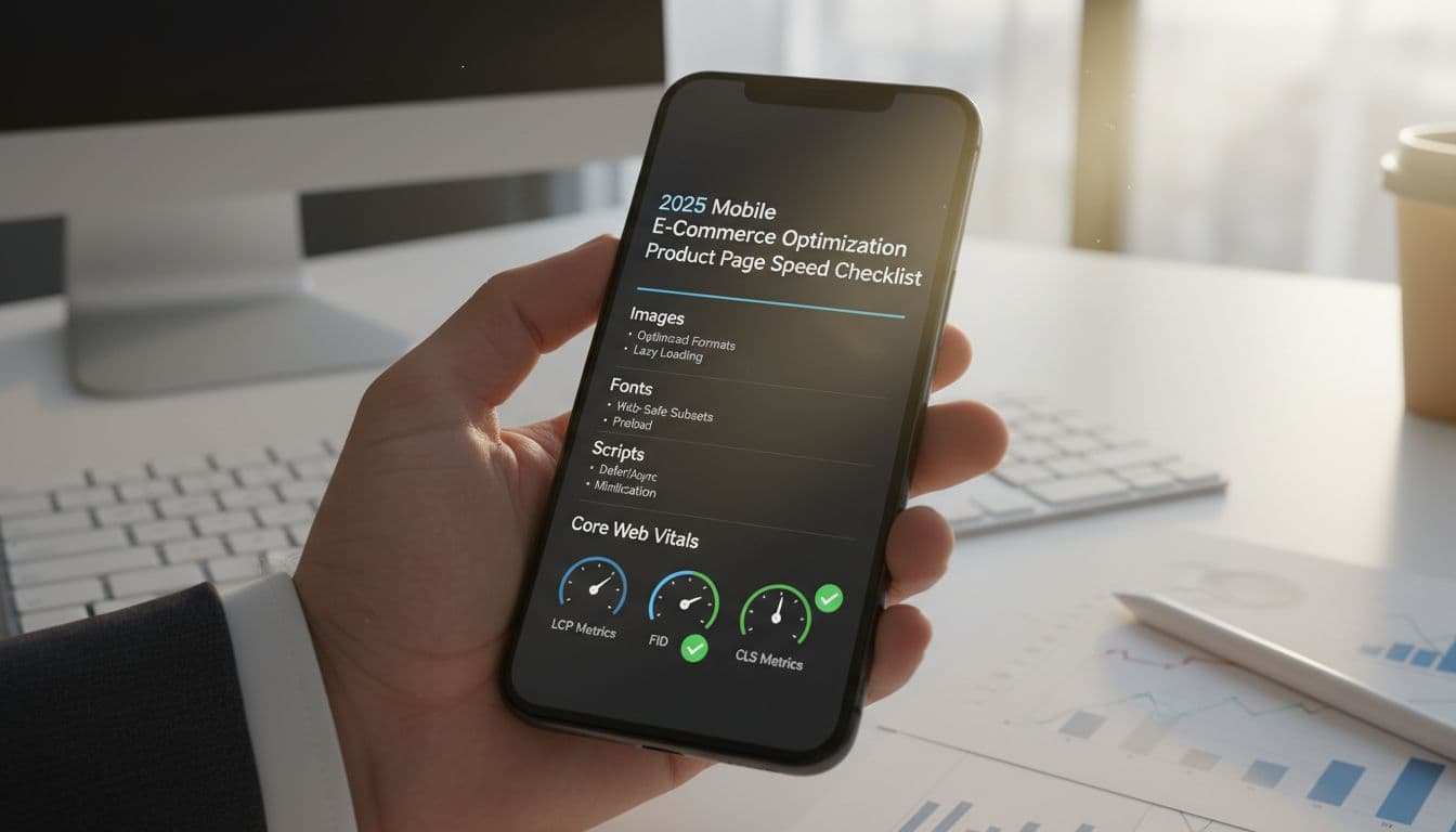
Know the 3 Core Web Vitals targets you are aiming for in 2025
Core Web Vitals are useful because they map to what shoppers feel on a product page, and following them supports key mobile SEO best practices.
- LCP (Largest Contentful Paint): How fast the main content appears. On product pages this is often the hero image or top product block. Target: Good at 2.5 seconds or less (mobile). A good LCP feels like the product shows up quickly, not a blank area with spinners.
- INP (Interaction to Next Paint): How fast the page responds when someone taps. Think Add to cart, selecting a size, opening the image gallery, using search functionality, tapping the navigation menu, or expanding a size chart. Target: Good at 200 ms or less. Good INP feels instant, like flipping a light switch.
- CLS (Cumulative Layout Shift): How much the layout jumps around while loading. Common causes on product pages are late-loading review badges, sticky promo bars, a navigation menu unfolding unexpectedly, or injected widgets that push buttons down. Target: Good at 0.1 or less. Good CLS feels steady, you can tap without the page moving under your finger.
Measure improvements mobile first, because that’s where slower CPUs and networks expose problems fast.
Make a “speed budget” so new design updates do not slow the page again
Speed budgets are simple limits that stop “just one more app” from slowly wrecking performance. They also make reviews easier, because everyone knows the guardrails before shipping.
A lightweight pre-publish checklist can be as simple as:
- Did we add any new third-party scripts or tags?
- Did the hero image or gallery assets grow?
- Did we add fonts or weights?
- Did we introduce new layout shifts (banners, sticky bars, widgets)?
- Did mobile LCP, INP, or CLS get worse compared to baseline?
Here’s an example budget for a typical mobile product page (adjust to your store and theme):
Budget itemExample limitTotal third-party scriptsMax 6Total font filesMax 2 (with no more than 2 weights)Hero image file sizeMax 200 KB on first loadCLSMax 0.10LCP (mobile)2.5 s or lessINP (mobile)200 ms or less
If a change breaks the budget, it doesn’t mean “no.” It means you ship it with a tradeoff plan, not a surprise slowdown.
Image optimization checklist that keeps product photos sharp
On a Product Detail Page, images do most of the selling, and they also cause most of the weight. The goal is simple: keep photos crisp on modern phones while sending fewer bytes and getting the main image on screen fast. Think of it like packing for a weekend trip. You want the right outfit options, not your whole closet.
Use this checklist to tighten image delivery without making your products look soft, noisy, or over-compressed. It’s one of the highest impact moves you can make for mobile e-commerce optimization, because it improves LCP, makes the page feel responsive, and boosts Conversion Rate Optimization through superior User Experience.
Serve the right formats and sizes for each device
Start by shipping modern formats, then make sure each device gets the size it can actually use, especially in Mobile Commerce.
- Use AVIF first, then WebP, then a JPEG/PNG fallback. AVIF often wins on file size at the same quality, but support and encoding speed vary, so keep fallbacks.
- Avoid PNG for photos unless you truly need transparency. PNG photo files can get huge fast.
- Treat thumbnails and zoom images as different assets, not the same file scaled in the browser.
Here’s why it matters: sending a 3000 px wide image to a 390 px wide phone is like delivering a refrigerator box when the customer ordered a phone case. The browser still has to download it, decode it, and resize it. That burns bandwidth and CPU, and it can drag down LCP.
A practical approach that keeps quality high:
- Thumbnails (grid + gallery strip): small and light. Aim for 80 to 160 px display size, serve 2x for retina, and compress harder because they’re viewed small.
- Main gallery image: match real display size. Many mobile layouts show the main image around 360 to 430 px wide, but with 2x screens you often want 800 to 1000 px sources available.
- Zoom image: don’t load it upfront. Load on tap, and only for the active image. Keep zoom assets separate so they don’t slow first paint.
Rule of thumb for sizing: set your largest “main” source to about 2x the maximum display width on mobile. If the image area is 420 px wide, make the biggest default source about 840 px (maybe 1000 px for safety). Save 2000 px plus assets for zoom only.
Also don’t forget video posters. A giant 4K poster image can be as heavy as a product photo. Encode posters like hero images, and size them to the player’s real display width.
Make the main product image load first without layout jumps
Your main product image is often the LCP element, so treat it like a priority shipment.
Focus on three things:
- Prioritize the LCP image
If the first image is always above the fold, it can be worth preloading it (or marking it high priority) so it starts downloading immediately. Be careful with preloading too many images, it can backfire and crowd the network. - Prevent CLS by reserving space
Always setwidthandheight(or an aspect-ratio) for the main image area. This keeps the layout stable while the image loads, so the Add to Cart button doesn’t jump around and cause errors. - Use placeholders with restraint
A subtle blur-up or low-quality placeholder can reduce the “blank box” feeling, but keep it light. Overly heavy placeholders, inline base64 blobs, or fancy shimmer effects can add more work than they save.
One common trap: a heavy slider that initializes before showing the first image. If your gallery script blocks rendering, the page can sit there waiting on JavaScript while the shopper waits on the product. If you use a slider, make sure the first image renders without waiting for the whole carousel.
Also keep lazy loading in the right place: lazy load below-the-fold images only. The main hero should not be lazy loaded on product pages.
Do not let image effects and apps quietly add seconds
Image “extras” often look harmless, but they can pile up into real delay, extra network calls, and jank on mid-range phones, including Augmented Reality features alongside standard images.
Watch for these common slowdowns:
- Hover-zoom or pinch-zoom libraries that load early, attach many listeners, or force large image downloads.
- Third-party CDN rewrites that add redirects, block caching, or strip modern formats.
- Badges and overlays (sale tags, low-stock labels, shipping countdowns) injected as images or canvases.
- Personalization layers that re-render the hero image area after load, causing flicker or layout shifts.
A simple way to catch the real cost is to test with and without each feature:
- Load the product page and record LCP, CLS, and total image bytes.
- Disable the gallery effects (or remove the app) and retest.
- Turn off overlays (badges, labels, personalization) and retest.
- Compare the waterfall for extra requests, redirects, or late-loading image swaps.
- Check if the main image changes source after load (that can create a “double download”).
If the feature adds noticeable delay, keep the benefit but change the timing: load it after the main image is stable, or only on interaction (tap to zoom, open gallery, view video). This keeps photos sharp and the page quick, which is exactly what shoppers feel.
Font and CSS fixes that protect your brand look and improve CLS
Fonts and CSS are quiet troublemakers on mobile product pages. A page can “load” fast, but still feel jumpy when a custom font arrives late, a promo banner pops in, or a sticky bar changes height. Jumpy layouts increase Bounce Rate, frustrating shoppers. The goal here is simple: keep your brand look, reduce bytes, and keep the layout steady so shoppers can tap Add to cart without the page moving under their thumb. These fixes support mobile e-commerce optimization because they improve both speed signals and real shopping comfort.
Use fewer font files, and load them in the smartest order
Every font file is a request, a download, and extra work for the browser. On mobile, that cost adds up fast. Start by trimming what you ship:
- Limit families: One brand font plus a system fallback is usually enough for product pages.
- Limit weights: Use 2 weights (regular and bold) before you add more.
- Use a variable font when it replaces multiple separate files. One file that covers many weights is often lighter than several static files.
- Subset characters: If you only need basic Latin for your product pages, don’t ship entire character sets “just in case.”
- Preload only what’s above the fold: Preload your primary body font (or the heading font) if it appears in the first screen. Don’t preload every variant and style.
Fonts also affect what shoppers see while the page is loading. Two common behaviors matter:
- FOIT (Flash of Invisible Text): Text stays hidden until the custom font arrives. It feels like the page is missing content.
- FOUT (Flash of Unstyled Text): Text shows right away in a fallback font, then switches to the brand font later. It’s readable sooner, but you may see a brief style change.
For product pages, readability wins. A safe default is font-display: swap; so text appears immediately using a fallback, then swaps to your font when ready. It’s better to show text in a “close enough” font for a moment than to show nothing while a shopper waits. Adopting these practices aligns with Mobile-First Design, prioritizing fast, stable text rendering on mobile devices.
Prevent layout shift from fonts, banners, and sticky UI
CLS usually comes from elements that arrive late and push everything down. Treat these like reserved seats, not surprise guests. Use this checklist to keep the layout stable in the User Interface:
- Announcement bar: Set a fixed min-height from the start, even if the message is injected later.
- Promo badges (sale, limited stock): Reserve space in the image area, don’t overlay with late-loading scripts that change the product image height.
- Trust icons and payment marks: Don’t let them load after the buy box renders. Give the row a set height.
- Sticky Add to Cart bar: Define its height in CSS upfront, and avoid expanding it after load (like adding extra text or a second row).
Fonts can also cause subtle shifts when the fallback and custom font have different letter widths and line heights. Choose fallbacks with similar proportions, then fine-tune with size-adjust (and related font metric overrides) so the swap doesn’t reflow your headings or price block. Font and CSS choices must support Responsive Design to keep layouts fluid across devices.
CLS watch list for product pages (these are frequent culprits):
- Variant or size selectors that expand after JS loads
- Review stars and “X reviews” injected above the fold
- Shipping timers, coupon banners, and chat bubbles
- Late-loading product media (video, 3D, UGC widgets)
- Sticky headers that change height on scroll
Ship less CSS to the product page, not the whole theme
A lot of stores ship one giant stylesheet to every page. Product pages pay for CSS they never use, and the browser still has to parse it. The fix is to send less CSS where it counts:
- Critical CSS for above the fold: Inline the small set of styles needed for the first screen (header, gallery shell, buy box, key buttons) as part of a Mobile-First Design. Load the rest after.
- Remove unused CSS: Old components, unused sections, and abandoned experiments often leave big CSS behind.
- Split CSS by template: Product pages need product CSS, not blog, account, or collection styling.
Be cautious with page builders and big utility frameworks that load everywhere. They can add thousands of rules you don’t need on a single product page.
To spot CSS bloat fast, open Chrome DevTools, go to Coverage, reload the page, and look for stylesheets with a high unused bytes percentage. If your product page uses only a small slice of a large CSS file, that’s a clear sign to split and slim it down.
Third party scripts, reviews, chat, analytics, and A B tests without the slowdown
Product pages attract “just one more” tool because they sit closest to revenue. Reviews build trust, chat answers questions, analytics tracks performance, and A B tests help you learn. The catch is that many of these scripts compete for the same limited resources on mobile: CPU time on the main thread, network bandwidth, and memory. That shows up as slow taps, delayed button feedback, and poor INP, which can spike cart abandonment rate and disrupt the transition to the checkout process.
The goal for mobile e-commerce optimization is not to strip the page bare. It’s to keep the tools that pay for themselves, while controlling when they load and how much work they do before a shopper can choose a variant and hit Add to cart.
Make a script inventory, then decide what loads before a shopper can act
Start by listing every third-party request on a product page, especially in the context of mobile commerce. Product templates often carry the most scripts because they include galleries, variant logic, reviews, recommendations, upsells, and push notifications all at once.
Create a simple inventory with three columns: tool, what it does, and keep, delay, or remove. You can build it from:
- The Network waterfall (filter by third-party domains)
- Tag manager containers (all tags, triggers, and exceptions)
- App embeds (theme app blocks, snippets, pixels, and hidden script loaders)
- Checkout and fraud tools that still inject on product pages
Then label each item based on whether it must run before the shopper can act:
- Keep (critical): Required for the product page to function or for compliance. Examples: variant selection logic, core analytics needed for essential measurement (page view, add-to-cart event), required consent banner, payment messaging that is part of the buy box including mobile payment options and digital wallets.
- Delay (helpful): Useful, but not needed for the first interaction. Examples: reviews widget, UGC galleries, personalized content or product recommendations, heatmaps/session replay, most marketing pixels, A B testing (often), some fraud tools that can wait until checkout steps.
- Remove (nice to have): Low impact tools, duplicates, or tools you can replace with simpler alternatives. Examples: multiple chat tools, overlapping analytics, “all-in-one” widgets that add popups, sticky bars, and trackers in one bundle.
This classification gives you a shared language with marketing and CX. You’re not saying “no tools.” You’re saying “tools, on a schedule.”
Delay or lazy load non essential tools until after interaction
INP usually suffers when third-party code runs early, attaches lots of event listeners, and blocks the main thread right when a shopper starts tapping. The fix is to move non-essential work out of the “first screen” window, ensuring a smooth transition to the checkout process.
Practical delays that protect Add to cart:
- Chat: Load after a clear intent signal, like 10 to 20 seconds on page, a scroll past the hero, or a tap on “Help.” Chat is valuable, but it doesn’t need to compete with variant selection or mobile payment options.
- Reviews: Render a lightweight star summary near the title if you must, then load the full widget after the main content is visible (or when the shopper scrolls near the reviews section). This avoids late layout shifts and heavy DOM work up top.
- A B testing: When possible, delay tests that don’t affect above-the-fold UI. If you only test below-the-fold modules (like “You may also like”), there’s no reason to run the test before the buy box is ready.
Also align tags with privacy rules. Use consent mode (or an equivalent approach) so marketing tags only fire after consent where required. That reduces early script activity and avoids loading trackers that can’t legally run yet anyway.
A simple rule: if a script doesn’t help the shopper pick a variant or add to cart, it shouldn’t run before those actions feel instant.
Replace heavy embeds with lightweight versions
Some third-party features are slow because they ship a full app when you only need one small behavior. Replacing heavy embeds often improves both speed and stability.
A few high-impact swaps:
- Video: Use a static poster image with a play button, then load the real player on tap. You get the same story, without the early JS and network cost.
- Social feeds: Replace live feeds with social media integration via cached content (or a curated grid of images stored locally). Live embeds can be chatty and unpredictable.
- Small widgets: If a widget is simple (size chart, shipping note, trust signals), consider self-hosting a lightweight version instead of a full third-party loader.
- All-in-one apps: If one app adds popups, sticky promos, badges, and tracking, test replacing it with a couple of native theme features. You often cut weight and reduce conflicts.
Make changes one at a time. It’s easier to prove what helped, and it lowers the risk of conversion swings.
Track the impact so you do not break conversion while chasing speed
Speed wins only matter if conversion holds, including support for guest checkout in the overall flow. Track both experience metrics and business outcomes side by side.
At minimum, monitor:
- Speed: INP, LCP, CLS (ideally via real user monitoring)
- Commerce: add-to-cart rate, checkout start rate, purchase conversion rate
- Behavior: time to first interaction, engagement with reviews, chat opens, video plays
Keep a basic safety net so teams feel comfortable shipping changes:
- Change log: date, what changed, on which templates, and expected outcome.
- Rollback plan: a quick toggle in tag manager, a theme setting switch, or a feature flag to disable the new loading rule.
- Compare windows: measure at least a few days before and after, and segment mobile traffic.
When you can show “INP improved and add to cart stayed flat or rose,” you stop arguing about scripts and start making confident tradeoffs.
Conclusion
Fast product pages for mobile commerce in 2025 come from small, repeatable choices, not one big redesign. Keep your visuals strong, but make them cheaper to load: right-sized images, fewer font files, and scripts that wait their turn. When you protect LCP, INP, and CLS, shoppers feel it as faster browsing, steadier layouts, and taps that respond right away. That balance enhances the customer journey and is the point of mobile e-commerce optimization, speed that supports the brand instead of fighting it. Looking ahead, advanced architectures like progressive web apps help maintain speed, while voice search optimization prepares your mobile-optimized pages for emerging trends.
Monthly checklist following mobile SEO best practices (15 minutes per SKU):
- Images: confirm the LCP image is not lazy-loaded, check hero file size, validate
srcsetsizes, keep zoom assets on tap. - Fonts and CSS: limit to 1 to 2 families and weights, confirm
font-display: swap, remove unused CSS, reserve space for bars and badges. - Scripts: review tag manager and apps, delay chat and full reviews, remove duplicates, load heavy widgets only after scroll or intent.
- Core Web Vitals tracking: spot-check PageSpeed Insights and a mobile Lighthouse run, log LCP, INP, CLS, compare to last month.
Pick one product page today, run a quick audit, then fix the single biggest bottleneck first.