

If a shopper wants a medium in blue, your UI shouldn’t make them “solve” it. On mobile, variant selection is often the biggest speed bump on the product page, even when the product is great.
Good product variant ux does two things at once. It helps people choose fast, and it prevents invalid add-to-cart attempts without feeling strict or annoying. The goal is simple: fewer mis-taps, fewer dead ends, more confident taps.
Below are practical patterns for better size and color pickers, plus an add-to-cart flow that’s hard to break.
Mobile size pickers: make availability obvious, selection effortless
A size picker is a decision control, not a decoration. Treat it like a compact form field with clear rules and instant feedback.
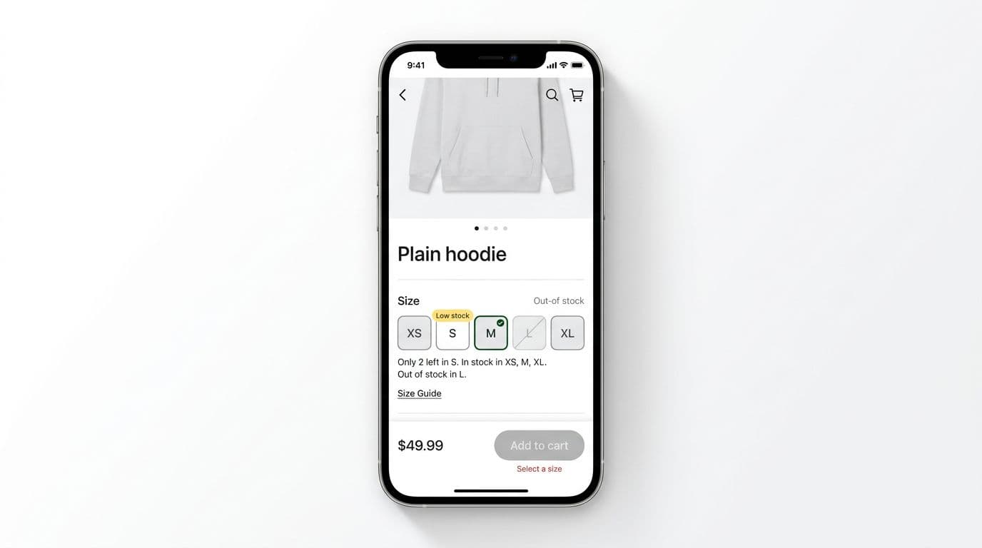
Start with chips or segmented buttons instead of a dropdown. Chips scan faster, reduce taps, and keep context visible. Each size needs three states that are visually distinct:
- Available: normal style, tap selects.
- Low stock: same tap behavior, plus a small “Low stock” badge or helper text.
- Out of stock: disabled (not hidden), so shoppers understand what’s missing.
Hiding out-of-stock sizes can backfire. The UI looks “broken,” and customers assume you never carried that size.
A quick do/don’t guide helps align design and dev:
| Do | Don’t |
|---|---|
| Disable out-of-stock sizes with a clear style change | Remove sizes entirely and make the row jump |
| Keep the selected state unmistakable (border + fill change) | Rely on color alone to show selection |
| Show “Low stock” near the picker, not in a toast | Use vague warnings like “Hurry!” |
| Keep the sticky CTA in view while scrolling | Force users back up to find the button |
Interaction rules that prevent wrong selections
Set these as component defaults:
- Default selection strategy: don’t auto-select a size for apparel. Let the shopper choose. Auto-selection inflates add-to-cart, then increases returns.
- Disable vs hide: disable invalid sizes. Hide only when the list is extremely long (for example, 30+ widths), and even then provide a “Show unavailable” toggle.
- Preserve selections: if the shopper zooms photos, watches a video, or expands reviews, keep their size selection locked in. Nothing is more irritating than “Why did it reset?”
Microcopy that nudges without nagging
Use short, specific helper text. Keep it near the picker, not only on button tap.
- Inline helper: “Runs small, consider sizing up.”
- Low stock helper: “Only 2 left in M.”
- Missing selection prompt: “Select a size to add to cart.”
If your team is also revisiting the CTA itself, these mobile add-to-cart button patterns pair well with variant picker changes, because the sticky bar and the picker should behave as one system.
Color pickers for mobile: swatches need labels, states, and trust
Color swatches look simple until you test them. On mobile, swatches fail when they depend on perfect vision, perfect lighting, and perfect color perception.
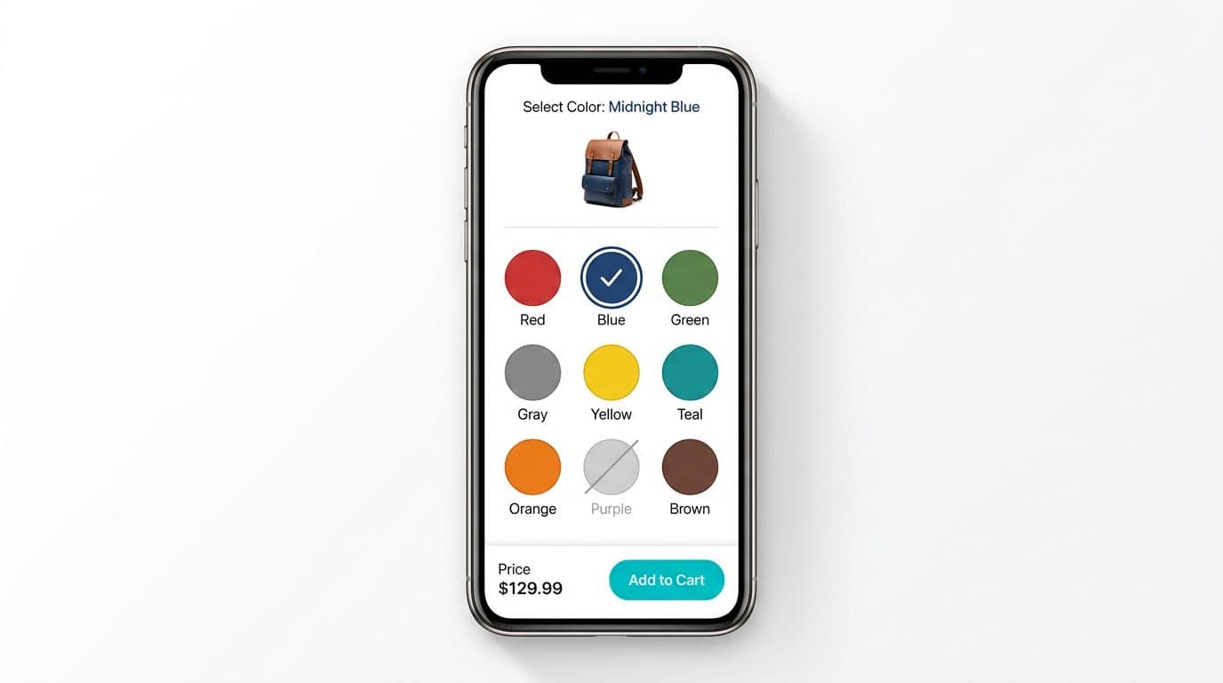
First rule: every swatch needs a text label (visible or revealed on selection). “Navy” and “Black” look identical in a tiny circle. Patterns also need names, because a texture swatch can’t be read reliably.
Second rule: a swatch must communicate stock and selection without guesswork:
- Selected state: thick outline plus an internal mark (or a check icon).
- Out of stock: disabled styling with a diagonal strike, and still focusable for screen readers if you announce “Unavailable.”
A helpful reference for swatch-focused patterns is designing mobile-friendly product swatches, especially when you’re tuning spacing and tap behavior.
Make the gallery and the picker feel connected
Shoppers use images to confirm color. So treat color selection as a “photo filter” too.
- When color changes, update the main image and keep the user’s current zoom or carousel position when possible.
- If they swipe to image 4, then pick a new color, don’t snap back to image 1 unless the new color lacks that angle.
- When an image corresponds to a color, highlight the swatch as the gallery changes (quietly, without animation fireworks).
Accessibility requirements (non-negotiables)
Small controls fail fast for accessibility and for conversion.
- Hit targets: at least 44 × 44 CSS px per size chip and swatch. Add padding even if the dot looks small.
- Programmatic labels: swatches need accessible names like “Color, Navy.” Sizes need “Size, Medium.”
- Visible focus states: keep a clear focus ring for keyboard and switch control users.
- Contrast: selected borders and disabled states must be readable. A faint gray ring on white disappears in sunlight.
If a shopper can’t tell what’s selected, they won’t trust the add-to-cart moment. Trust is a conversion factor.
Error-proof add-to-cart: validation that feels helpful, plus measurable signals
Think of add to cart like a gate. A good gate doesn’t slam on fingers, it guides people to the handle.
When to disable vs when to allow a tap
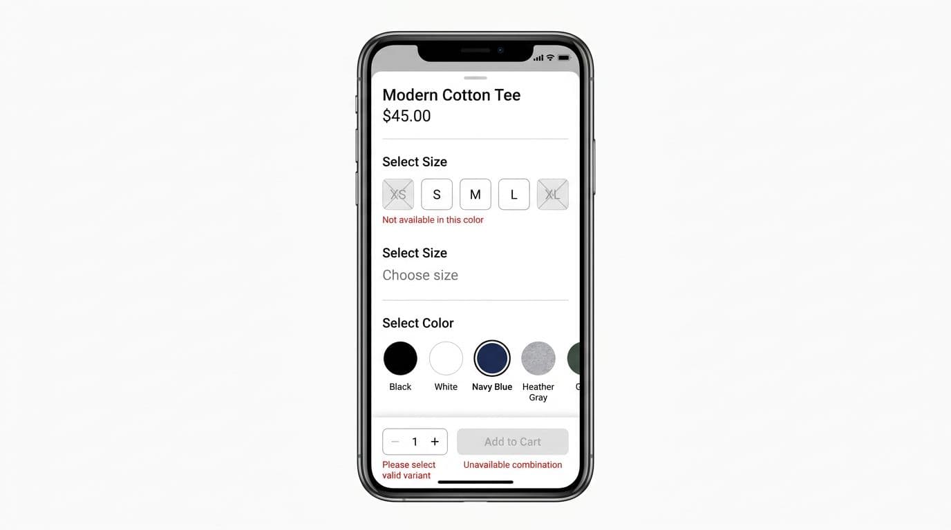
For most catalogs, the safest pattern is: disable Add to cart until required variants are valid. That prevents error toasts and keeps the UI honest. However, pair the disabled state with a clear reason right beside the control.
Here’s a quick do/don’t table for add-to-cart validation:
| Do | Don’t |
|---|---|
| Show a disabled reason like “Select size” | Disable with no explanation |
| Scroll to the first missing option on error | Show a toast that disappears |
| Keep a sticky CTA visible near the thumb | Put the only CTA below long content |
| Prevent double taps with loading state | Allow repeated taps and create duplicates |
If you’re refining your sticky bar and feedback states, this guide on add-to-cart design patterns for mobile is a strong companion to variant work.
Microcopy examples for error states (short, specific)
Use inline messages near the failing field, plus a summary near the CTA if needed.
- Inline prompt: “Choose a size.”
- Combination error: “M isn’t available in Blue.”
- Disabled reason under CTA: “Select color and size.”
- Network failure after tap: “Couldn’t add to cart. Try again.”
“Error-proof add-to-cart” checklist
Keep this as your QA pass for every PDP template:
- Disable until valid for required variants, and show the disabled reason.
- Sticky CTA stays visible, respects safe areas, and doesn’t cover content.
- Scroll-to-error: if a user taps a blocked CTA, scroll and focus the first missing option.
- No lost selections when the user changes images, opens size guide, or returns from reviews.
- Optimistic vs confirmed cart updates:
- Use optimistic UI only if you can reliably roll back on failure.
- Otherwise, show a clear loading state, then confirm “Added to cart” when the server responds.
- Loading and success states prevent double taps and reduce anxiety.
For broader PDP context, it helps to compare your variant flow against common ecommerce product page design patterns so the picker, gallery, and CTA don’t feel like separate widgets.
Analytics events to prove what’s working
Instrument variant UX like a funnel, not a single click.
variant_view(when variant module enters viewport)variant_select(include attribute, value, and availability)add_to_cart_disabled_reason(size_missing, color_missing, combination_unavailable)validation_error_shown(message id, field, scroll distance)- Optional but useful:
variant_auto_disabled(when selecting a color disables sizes)
A/B test ideas that stay close to the money
Keep tests small and measurable:
- Disabled CTA + inline reason vs enabled CTA that triggers validation on tap.
- Show unavailable sizes disabled vs hide them behind “Show unavailable.”
- Swatch labels always visible vs labels on selection only.
- Scroll-to-error with focus vs inline message only (no scroll).
The best product variant ux tests usually win by reducing confusion, not by adding urgency.
Conclusion
Variant pickers are where intent turns into action, or falls apart. Clear size and color controls, strong accessibility basics, and guarded add-to-cart behavior remove friction without adding noise. Most importantly, instrument the flow so you can see where shoppers get stuck and why. Build it so choosing is easy, and adding to cart becomes the simplest step on the page.