
Checkout is the toll booth at the end of the buying trip. If the gate sticks, revenue backs up fast. That’s why guest checkout UX matters so much, especially on mobile, where patience is short and typing is slow.
For most stores, the right answer isn’t guest checkout or account checkout. It’s both. The first purchase should feel easy, and the account relationship should come after the order, not before it.
Make guest checkout the default fast lane
Current 2026 checkout data points to a clear pattern. Guest shoppers drive a large share of orders, yet registered shoppers still convert better over time. That’s why the best checkout flow is a hybrid model. Lead with guest checkout, keep sign-in available, and avoid putting a password wall in front of intent.
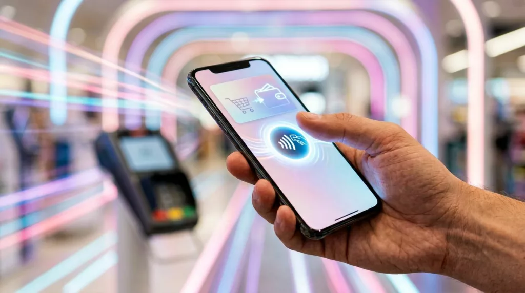
On mobile, put wallet payments where thumbs land first. Recent 2026 benchmarks show that stores offering four or more express methods can reach 67% conversion, while stores with no express option sit closer to 52%. Apple Pay, Google Pay, PayPal, and Shop Pay cover most of the demand. If BNPL fits your price point, place it below the core wallets, not ahead of them.
Still, more buttons don’t always help. Too many payment choices can crowd the screen and slow decisions. Test one wallet row above the form, then compare it to a layout with wallets under the order summary. Patterns in Salesforce’s 2026 checkout guide line up with a lot of what teams already see in practice.
A strong guest path also needs honest structure. Show progress, shipping cost, delivery timing, and cart summary early. Keep the flow short, with tap-sized controls and clean spacing. If you’re reviewing the whole journey, these mobile-first ecommerce UX design strategies help keep the experience consistent from product page to payment.
Make the first purchase easy, then make the second purchase easier.
This pattern backfires when the guest option looks hidden, when phone is required without a delivery reason, or when fees appear late. Start by testing three variables: guest-first versus equal login choice, wallet placement, and one-page versus two-step checkout on mobile.
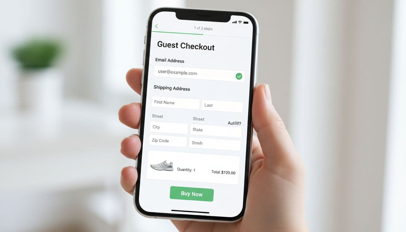
Design forms that prevent errors before submit
Every field adds effort. Yet the real problem isn’t always field count. It’s field behavior.
The best forms do small jobs well. They trigger the right keyboard, support browser autofill, remember billing equals shipping by default, and let shoppers paste codes without fighting input rules. Address lookup matters too. A good address field should feel like ride-share pickup, start typing, then tap the right match.
Inline validation is one of the highest-value patterns in guest checkout UX because it catches problems while shoppers still have momentum. A small hint on email format or apartment number helps. A full-page error after submit feels like a dead end. Session data in Fullstory’s analysis of checkout friction shows how errors and broken feedback often trigger exits, retries, and rage clicks.
However, inline validation can also annoy people if it fires too early. Don’t flash red while someone is still typing a phone number. Wait until blur, or until the input is clearly invalid. Also, never wipe completed fields after a failed payment attempt. That’s one of the fastest ways to lose a mobile shopper. Many teams can catch these issues early by reviewing avoiding UX mistakes in ecommerce checkout processes.
Track these five metrics by device, browser, and payment type:
| KPI | How to measure it | Useful split |
|---|---|---|
| Checkout completion rate | purchases / checkout starts | mobile vs desktop |
| Form completion time | median seconds from first field to submit | wallet vs manual |
| Error rate | validation errors / checkout starts | field name |
| Guest-to-purchase conversion | guest purchases / guest starts | new vs returning |
| Post-purchase account creation rate | accounts created / guest purchases | thank-you page vs email |
Watch the metrics together, not in isolation. Faster form time means little if address errors rise. Likewise, higher wallet use means little if manual checkout gets worse for Android or desktop users.
Turn guest orders into repeat buyers after purchase
Retention starts after the order, not with forced registration before it. That’s the key balance many teams miss.
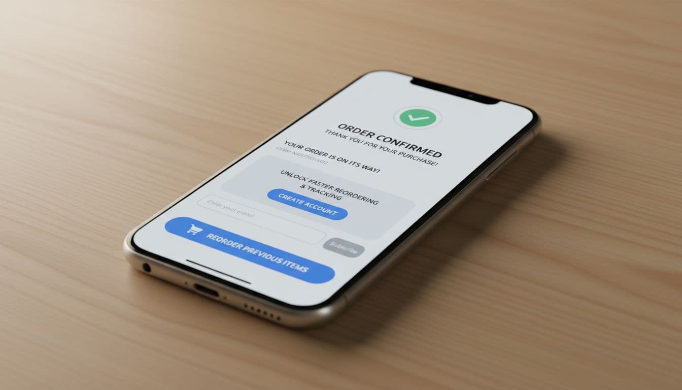
The cleanest pattern is a post-purchase account invitation on the thank-you page, order status page, and confirmation email. Prefill what you already know. Use a magic link or one-time passcode instead of asking for a new password. Then make the value concrete: faster reorders, shipment tracking, receipts, saved addresses, and easier returns.
Examples in this guest checkout roundup show the prompt works best when it follows success. In other words, don’t say “create an account to continue.” Say “save this order to track it and reorder faster.” That small wording shift changes the frame from obligation to benefit.
This can backfire if the invite feels like extra work after payment. Keep it one step, easy to skip, and never cover tracking details with a blocking modal. Then support the account with useful follow-up UX. A dead settings page won’t drive a second order. A practical dashboard with order history, reorder shortcuts, and subscription controls might. These ideas pair well with optimizing account pages for conversion rate growth.
Test the invite location, the message, and the activation method. Then compare optional account creation rate, second-purchase rate, and support contacts from guest buyers who accept versus skip.
The checkout win is usually a friction win
The best guest checkout UX does five things well: it makes guest checkout visible, favors mobile wallets, uses autofill, catches errors early, and invites account creation after purchase with a real reason to say yes. Measure completion rate, form time, error rate, guest conversion, and post-purchase account opt-in by segment. Then keep testing, because a better checkout rarely comes from one big redesign, it comes from removing one small point of drag at a time.