
A small add-on can change order economics fast and boost average order value. Yet many stores still hide gift wrap UX in a cart note, or push it so hard that checkout feels heavier.
Good gift wrap UX does the opposite. It makes the option easy to spot, easy to price, and easy to skip. When the gifting flow feels natural in ecommerce UX, shoppers add value without pausing or second-guessing, especially during holiday season gifting.
Key Takeaways
- Place gift wrap options where purchase intent is high, such as the cart page, cart drawer, or early checkout, to align with shopper mindset without competing with main actions.
- Price gift wrap clearly upfront in the label with a flat fee for simplicity, nesting upsells like premium tiers or messages only after opt-in to avoid surprises.
- Keep interfaces clean by revealing extra fields like gift messages only after selection, avoiding preselection to maintain trust and low friction.
- Prioritize mobile accessibility with large touch targets, real text labels, and screen reader support, while measuring AOV lift alongside checkout completion and abandonment.
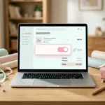
Put the gift wrap option where intent is already high
Placement decides whether gift wrap meets user expectations or feels distracting. Think of it like shelf position in a store; near the register works, blocking the aisle doesn’t.
For most brands, the best spot is the cart page, cart drawer, or early checkout process. That’s where purchase intent is already strong, and the shopper is thinking about delivery. On the product page, gift wrap can work for clearly giftable items, but it should stay secondary to the main add-to-cart action.
This quick comparison helps frame the choice:
| Placement | Works best when | Main risk |
|---|---|---|
| Product page | One-item gift purchases are common; shoppers can designate gift orders early | It competes with the main buy action on the product page |
| Cart page or cart drawer | The store wants an order-level add-on to support gift ordering | Per-item vs whole-order scope can be unclear |
| Early checkout | The buyer is choosing delivery details like shipping address | It can appear too late for custom gift notes |
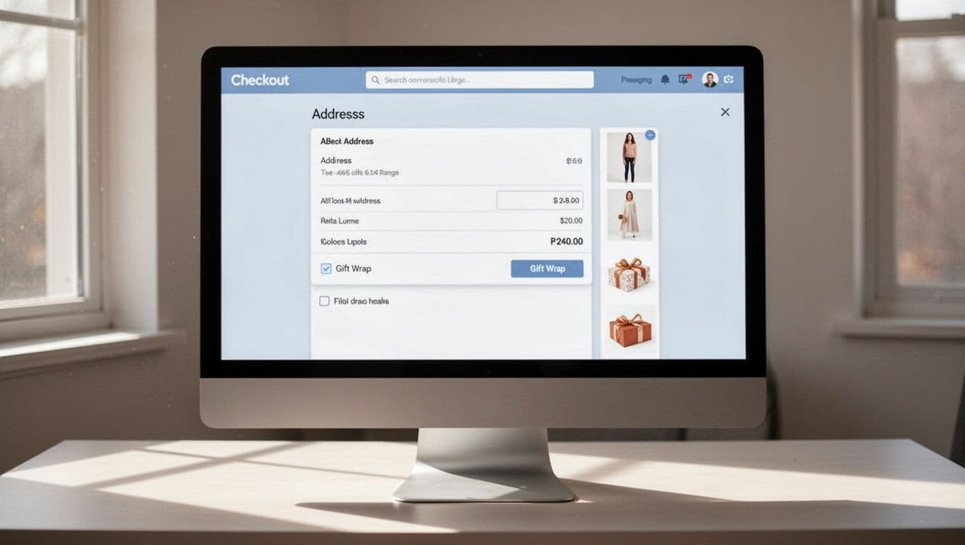
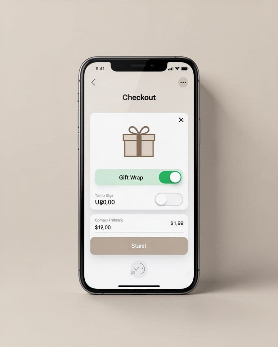
The simplest pattern is often the strongest. If wrap applies to the full order, place one checkbox or toggle near shipping details or the order summary, such as below the shipping address, billing address, or shipping field labels. Use plain copy such as “Add gift wrap for this order.” If wrap applies per item, show the control at the line-item level in the cart page, not as one vague global option to designate gift orders.
If the shopper can add a gift message, reveal that field only after gift wrap is selected. That keeps the page clean and lowers form anxiety.
A calm label beats a bright badge or pop-up. Also, don’t preselect the option. Forced add-ons may lift attachment in the short term, but they often hurt completion and trust. Teams that still have friction in checkout will usually get more value by fixing broader patterns to cut checkout friction first. For Shopify teams, this guide to adding gift wrap to the cart is a practical reference for common setup paths including checkout extensions.
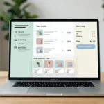
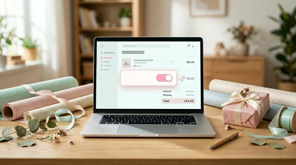
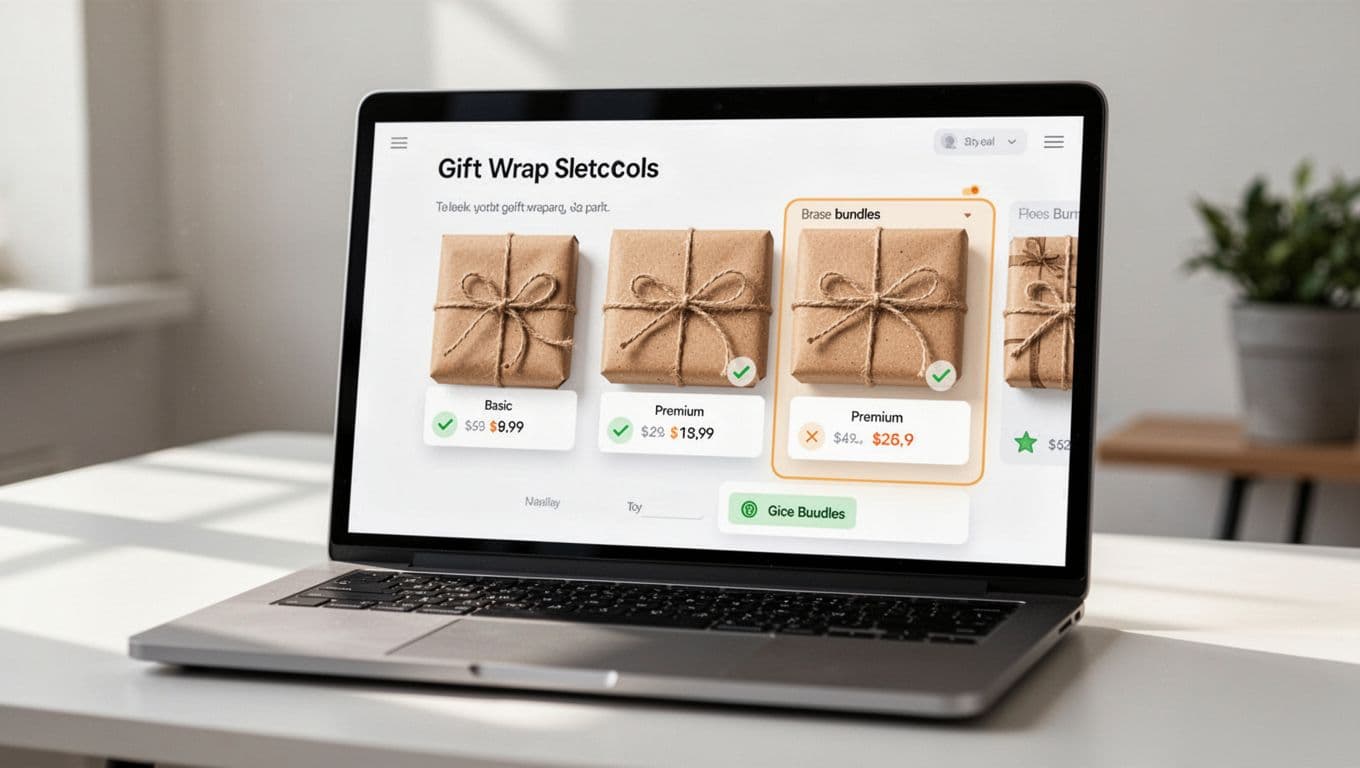
Price gift wrap clearly, then upsell only after opt-in
Gift wrap pricing should feel like shelf labeling, not a surprise fee at the register. If wrap costs $3.99, put that price inside the control label. Don’t hide prices in a tooltip overlay, and don’t wait until review step totals to reveal it.
The first decision should be simple, add gift wrap or skip it.
For lower-priced orders, a flat fee usually works best because it removes math. For premium products, two tiers can work well, basic wrap and premium presentation, as long as the choice stays compact. Keep upsell gift options nested under the main opt-in, either in an accordion or a short inline panel, to support smooth gift ordering.
Bundles are strongest when they save effort. A gift box, ribbon, and note card can raise AOV because the shopper sees one complete service for the gift recipient. By contrast, a random extra product beside gift wrap feels like noise. The same rule that improves product recommendation widget UX applies here too, context comes first.
Be explicit about scope. Say whether pricing is per order, per item, or only for eligible products. If the store offers “wrap all eligible items,” show the total before the shopper commits. Nobody likes surprise multiplication.
Wording matters as much as layout. “Add gift wrap for $4” is better than “Upgrade your moment,” especially with options like a personalized message for the gift recipient. Clear copy performs because it asks for less interpretation. That’s also why this pattern sits close to free shipping threshold UX, shoppers respond better to calm value cues than pushy prompts.
Timing matters too. Checkout-stage offers often beat product page or cart page offers because the buyer has already decided to purchase. This overview of checkout upsell timing mirrors what many CRO teams see in testing, the strongest add-ons arrive after commitment, but before payment feels final.
Make gift wrap mobile-friendly, accessible, and measurable
On mobile app UX, gift wrap breaks for small reasons. The control is tiny, the price drops below the fold, or the note field opens a long detour. Each small hit chips away at completion.
Follow these UX best practices for a better mobile pattern: use a large checkbox or toggle, keep the price beside the label, and reveal extra fields only after selection. Keep touch targets large, ideally easy to hit with one thumb, and avoid placing the option next to promo-code distractions. Ensure gift wrap availability stays visible across devices; if express pay sits high on the page, keep it visible before that jump, or repeat the selection in the order review step.
Accessibility deserves the same care. Use a real text label, not only a gift icon. Connect helper text to the field, announce price changes to screen readers, and keep error messages next to the input. If you collect a gift message or personalized message, support keyboard use, strong focus states, and a character counter that doesn’t rely on color alone. Teams working on gift card page UX patterns will notice the overlap; optional fields work better when they stay hidden until needed in the gifting flow.
Measure more than attachment rate. Track average order value, checkout completion, abandonment rate, revenue per visitor, mobile completion, gift message error rate, and support tickets tied to missing wrap or unclear pricing. Monitor ecommerce UX in the checkout process for friction points. If average order value rises while checkout completion drops, the pattern needs work.
Run focused tests using a case study approach and change one variable at a time:
- Compare cart placement against checkout placement, then review both attachment rate and checkout completion.
- Test a flat fee against a two-tier offer, then segment by category and device.
- Test collapsed versus open gift message fields, then watch form errors and time to complete.
That discipline matters because the gain should come from cleaner choices, not louder prompts. The same principle drives how better UX lifts conversion rates across the rest of the store.
Gift wrap earns its place when it behaves like a service, not a trick. Placement, pricing, and clarity do more for average order value than flashy design.
If shoppers can add it in one tap, understand the fee at a glance, and keep moving without friction, gift wrap UX can raise average order value without dragging down conversion, creating a seamless gifting experience.
Frequently Asked Questions
Where is the best place to put the gift wrap option?
The cart page, cart drawer, or early checkout works best, as purchase intent is already strong and shoppers think about delivery. On product pages, keep it secondary for giftable items to avoid competing with add-to-cart. Place it near shipping details with plain copy like “Add gift wrap for this order” for full-order scope, or per item in the cart.
How should gift wrap pricing be displayed?
Show the exact price inside the control label, like “Add gift wrap for $3.99,” without hiding it in tooltips or revealing later. Use flat fees for lower orders and compact tiers for premium, always explicit about per-order or per-item scope. Nest upsells in accordions after opt-in to keep the first decision simple.
Should gift wrap be preselected by default?
No, avoid preselecting to prevent hurting completion rates and trust; let shoppers opt-in freely. Forced add-ons may boost short-term attachment but increase abandonment. Focus on clear, calm cues near high-intent spots instead.
How can I make gift wrap mobile-friendly and accessible?
Use large checkboxes or toggles with prices beside labels, keeping touch targets thumb-friendly and visible above folds. Add real text labels over icons, screen reader announcements for prices, and keyboard support for messages. Repeat options in review steps if needed and test for completion across devices.
What metrics should I track for gift wrap UX?
Monitor average order value, checkout completion, abandonment rate, revenue per visitor, mobile completion, and gift message errors beyond just attachment rate. Segment tests by placement, pricing tiers, and devices, changing one variable at a time. If AOV rises but completion drops, refine for less friction.