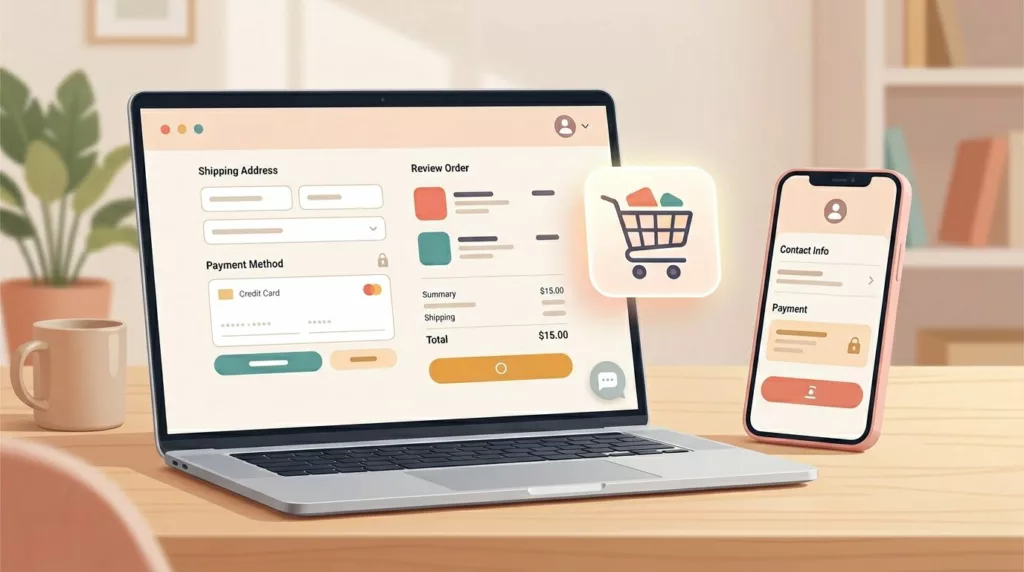
Ever watched a shopper hesitate at checkout like they’re standing at a locked door, key in hand? That door is often ecommerce microcopy. This form of ecommerce microcopy answers, reassures, or corrects, right when it matters. Optimizing these small interactions is key to a smooth user experience and guiding the customer journey during the checkout process.
Below is a copy-and-tweak library for buttons, forms, errors, shipping, and post-purchase. These lines help reduce cart abandonment by providing a clear call to action on product pages. Use it as a starting point, then tune tone and details to fit your brand.
Before you paste: quick UX writing rules that minimize user friction
Microcopy works best when it’s concrete. Use clear placeholder text and tooltips to guide users before they encounter error messages. Name the outcome, not the feature. “Save address” beats “Submit”.
Errors should feel like a helpful nudge, not a scolding. Adopt a conversational tone that aligns with your brand voice to make the experience feel helpful rather than robotic. Say what happened, then how to fix it. Also, don’t rely on color alone to communicate status. Pair color with text, icons, and focus management.
Accessibility check: Prioritize accessibility and adhere to WCAG guidelines. Avoid blamey wording (“You did…”), provide the fix, and announce key updates (success, errors) for screen readers (aria-live) to ensure the shop is inclusive.
Account, Login, 2FA/OTP, and Site Search Microcopy (10)
Use case
Microcopy
When to use
Notes/variables
Login CTA
Sign in to track orders
Cart, header
Create account
Create account (optional)
Checkout
Password reset
Send reset link
Forgot password
Reset sent
Check your inbox for the link
Reset
{email}
Wrong login
Email or password doesn’t match
Login error
offer reset
OTP send
Send a code
2FA start
{channel}
OTP retry
Resend code in {secs}s
2FA
{secs}
OTP fail
Code didn’t work, try again
2FA error
aria-live
Device trust
Don’t ask again on this device
2FA
checkbox
Session
You’ve been signed out
Timeout
save cart
Subscriptions and Recurring Orders (10)
Use case
Microcopy
When to use
Notes/variables
Subscribe CTA
Subscribe and save {pct}%
PDP
{pct}
Frequency
Deliver every {weeks} weeks
Plan picker
{weeks}
Skip
Skip next delivery
Account
Pause
Pause subscription
Account
Edit
Change date or address
Account
Reminder
We’ll remind you {days} days before
Subscription
{days}
Payment fail
Update payment to continue
Dunning
link
Reactivate
Resume subscription
Account
One-time
Switch to one-time purchase
PDP
Cancel
Cancel anytime in your account
PDP, cart
policy link
Return Policies, Refunds, Confirmation Messages, and Tracking (10)
Use case
Microcopy
When to use
Notes/variables
Return window
Returns accepted until {date}
PDP, receipt
{date}
Return start
Start a return
Account
Return condition
Item must be unused
Returns page
category rules
Refund timing
Refunds in 3 to 5 days
Returns
{days}
Exchange
Prefer an exchange?
Returns
size/color
Store credit
Choose store credit (faster)
Returns
{amount}
Confirmation
Order confirmed, thanks
Thank-you page
{order}
Tracking
Track package
Order status
{carrier}
Delivery proof
Delivered at {time}
Tracking
{time}
Support
Report an issue with delivery
Tracking
{order}
Conclusion
Good ecommerce microcopy is a fundamental pillar of conversion rate optimization. It is small, but it carries weight. It reduces user friction and cart abandonment, prevents dead ends, and makes your user experience feel calm. Ensure your value proposition shines through even in short-form copy. Start by swapping lines at the highest friction points: variant selection, shipping clarity, and checkout errors. Then subject your UX writing to A/B testing for tone and timing to find the highest-performing versions for the customer journey, because the best copy is the copy users never have to think about. Do not forget 404 pages as a final touchpoint for a cohesive user experience.